kage
kage
saidtrace.com

Design analysis
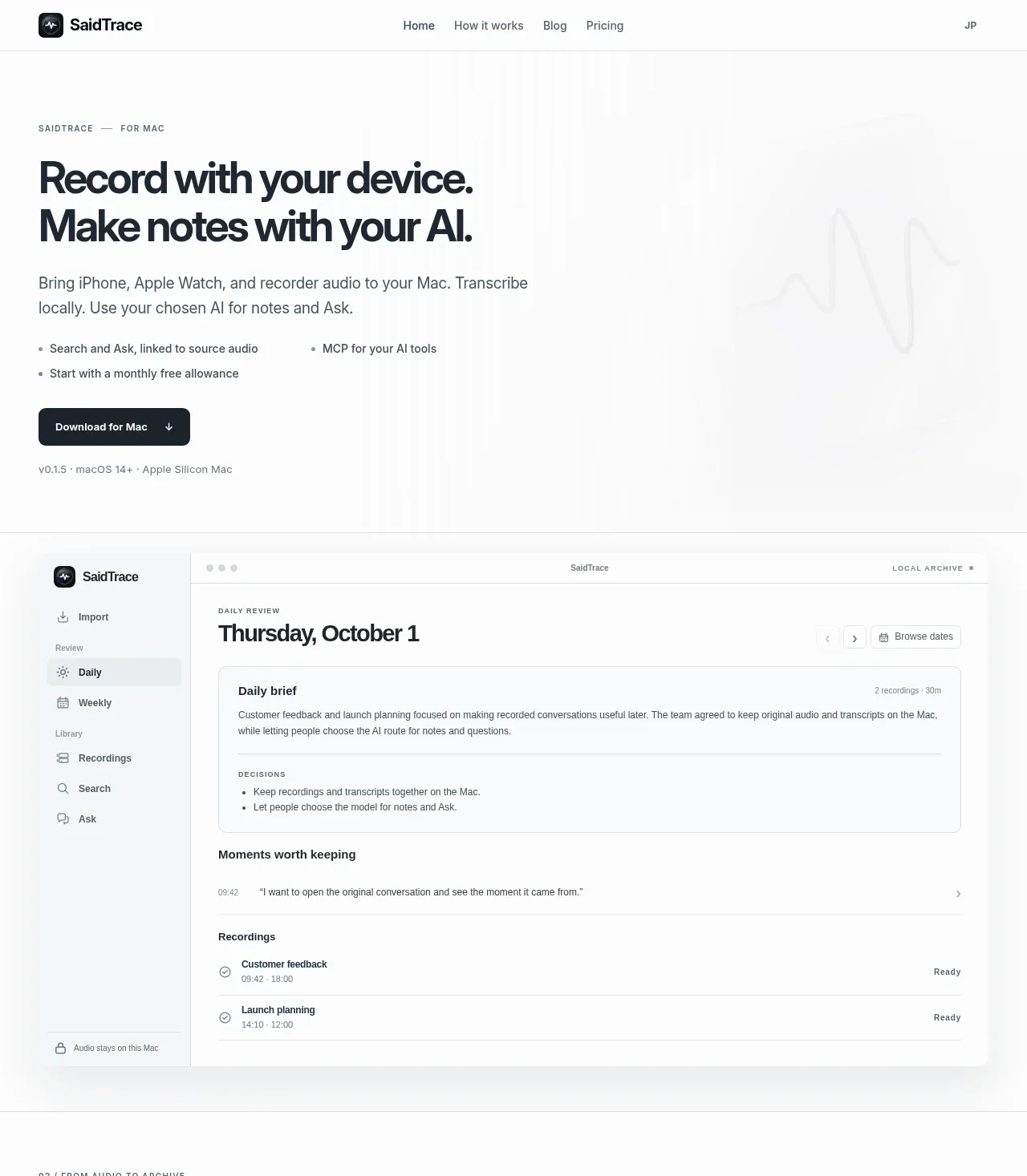
A near-monochrome landing page where product artefacts do the persuading: a shadowed macOS app window, a curved-connector system diagram, a terminal snippet and captioned mockup cards each occupy a full-width chapter. An editorial scaffold of letterspaced numbered eyebrows (02/, 03/, 04/) and hairline rules paces the page, alternating heavy artefact sections with quiet 40/60 asymmetric text splits. Hierarchy comes from oversized tight-tracked display type on warm off-white, giant price numerals, and an unusually candid competitor comparison table closed out with dated footnotes.
Prompt preview
## Reference images

Study these alongside the description below: hierarchy, rhythm, spacing, colour. Build for the product you are asked about, using this design language.

- Full page: https://kage-design-assets.t3.tigrisfiles.io/screenshots/saidtrace/da2a1190-1b0d-4dc6-9c61-691af1a5c9a8-1792130502177-full.webp
- Above the fold: https://kage-design-assets.t3.tigrisfiles.io/screenshots/saidtrace/da2a1190-1b0d-4dc6-9c61-691af1a5c9a8-1792130500145.webp
- Design on Kage: https://kage.design/designs/saidtrace-landing-page

## Before you start
Ask the user what they are building, who it is for, and what brand assets they already have (name, colours, type). Wait for the answers before writing any code. Everything below is a design language to apply to *their* product — not the reference site.

## Page structure
1. **Top bar** — left logo lockup (small rounded mark + wordmark), centred nav (4–5 links), right-side locale toggle. Hairline bottom border, near-white background.
2. **Hero** — small uppercase eyebrow ("PRODUCT — FOR PLATFORM"), two-line display headline, one short supporting paragraph, three terse benefit bullets set in two columns, solid dark pill CTA with icon, then a meta line (version · OS requirements · architecture). A faint grey waveform motif sits right of the copy, unobtrusively.
3. **App window showcase** — full-width macOS-style app screenshot in a rounded, softly shadowed frame on a grey panel: left sidebar (Import / Review: Daily, Weekly / Library: Recordings, Search, Ask / footer note "audio stays on this Mac"), main panel showing a dated daily review with a brief card, decisions list, timestamped highlights, and recordings rows with status. This proves the product before any claim.
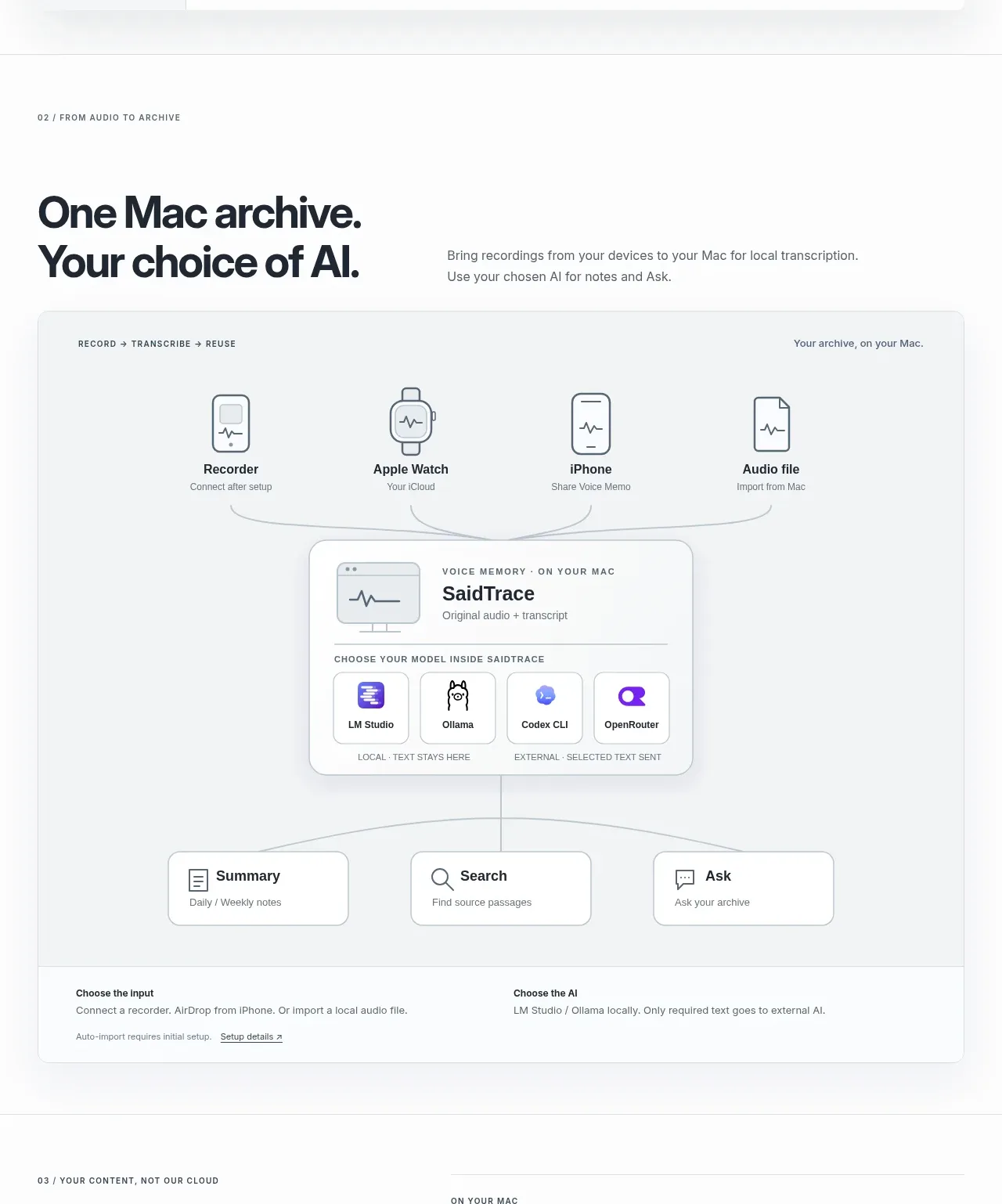
4. **Section 02 — how it works diagram** — numbered eyebrow, then an asymmetric row: large two-line headline left, two-sentence explainer right. Below, a large rounded grey canvas holding a flow diagram: four source nodes (devices/file) on top connected by thin curved lines to a central archive card that contains four model tiles explicitly labelled LOCAL vs EXTERNAL, then three output nodes (Summary, Search, Ask). Beneath the canvas, a two-column footnote strip ("Choose the input" / "Choose the AI") with a small setup link.
5. **Section 03 — privacy split** — 40/60 two-column: left, big headline ("Your data. Not our servers." pattern) plus one paragraph and an underlined policy link; right, three stacked definition blocks, each with an uppercase micro-label, a bold one-line claim, 2–3 lines of body text, separated by hairline rules.
6. **Section 04 — pricing** — left headline + copy, right pricing card: a free-tier row with the $0 figure and allowance text, then two columns with enormous numerals ($/month and $/year, annual flagged "50% off"), fine print below. Then a sub-section introduced by a micro-label and headline with a right-aligned intro sentence, followed by a four-column comparison table (plan, upfront device cost, monthly, annual) where the owner's row gets a light grey highlight and each competitor row carries footnote detail; close with a dated source footnote.
7. **Section 05 — integration** — left: headline, explanatory paragraph, a mono terminal box with a single one-line setup command, and a dependency note with link. Right: a stacked series of captioned mockup cards — a client-picker window (traffic lights, three AI-client icons, prompt input), a labelled answer card (kicker, answer bullets, source line, "still open" list), a muted warning strip about verifying transcripts, a follow-up prompt line, an "example only" caption — then a three-row connection-check mini table with per-client status text and a disclaimer caption.
8. **Closing CTA** — eyebrow, one giant statement headline, one supporting sentence, small "Back to top ↑" link at right.
9. **Footer** — logo + tagline left, two link columns (Product, Support), legal bar with year, a one-line platform/privacy reminder, and an analytics-settings link.

## Design language
- **One quiet voice.** Page background is warm off-white (#F5F5F2–#F7F7F5), cards are white, ink is near-black (#14161A), secondary text #565B63, hairlines #E3E3DF. Colour appears only inside product imagery (small model/app icons, status text in check tables). The primary CTA is a solid ink pill with white text; there is no accent colour doing layout work.
- **Type carries hierarchy.** A grotesque display face for headings with tight tracking (−0.02 to −0.03em), scaling from ~2.5rem sub-heads to ~4.5rem chapter headlines; body is 15–16px at 1.6 line height. Micro-labels are 11px uppercase with 0.08–0.14em letter-spacing and used consistently as eyebrows and card kickers. Use a mono face for code, timestamps and the terminal box only.
- **Editorial rhythm.** Number the chapters (02 /, 03 /, 04 / …) with the eyebrow pattern "NN / LABEL". Alternate the page's weight: heavy full-width artefact (window, diagram, mockup stack) → quiet asymmetric text section (headline column ≈40%, detail column ≈60%). Section padding is generous (96–140px) with hairline rules between chapters so the eye gets a beat after each artefact.
- **Artefacts over adjectives.** Every claim is backed by a rendered proof: app window, diagram, price table, terminal command, captioned mockups. Diagrams read as documentation — thin line icons, curved grey connectors, small uppercase labels, and explicit trust annotations (LOCAL · text stays here / EXTERNAL · selected text sent).
- **Surfaces.** Radii 12–20px on cards and frames; soft wide diffuse shadows only on floating artefacts (the app window and central diagram card); hairline 1px borders on data cards; pills for buttons and links.
- **Tables.** Hairline row rules, uppercase micro column headers, generous row padding, the vendor's own row highlighted with a light grey fill, and footnotes set smaller with dates and external-link arrows. Honesty captions ("illustrative", "synthetic data", "example only") are part of the style — reuse them wherever a mockup could be mistaken for a live result.
- **Motion.** Restrained: underline or arrow-nudge on link hover, at most a small lift on card hover. No parallax, gradients, or colour floods.

## Never
- Do not copy the SaidTrace name, wordmark, waveform logo, icon set, copy, pricing figures, competitor rows, or the specific diagram labels from the reference.
- Do not present the result as SaidTrace or imply affiliation; build a page in the user's own brand using this structure and language.
Components from this page
All components
 Minimal product navigation
SaidTrace · Navigation
Minimal product navigation
SaidTrace · Navigation
 Local recording hero with product preview
SaidTrace · Hero
Local recording hero with product preview
SaidTrace · Hero
 Connected archive workflow
SaidTrace · Feature grid
Connected archive workflow
SaidTrace · Feature grid
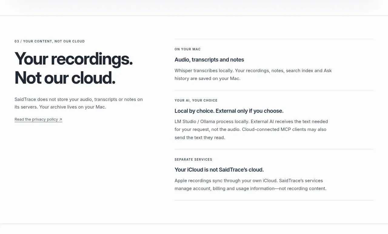 Privacy and local-first principles
SaidTrace · Feature grid
Privacy and local-first principles
SaidTrace · Feature grid
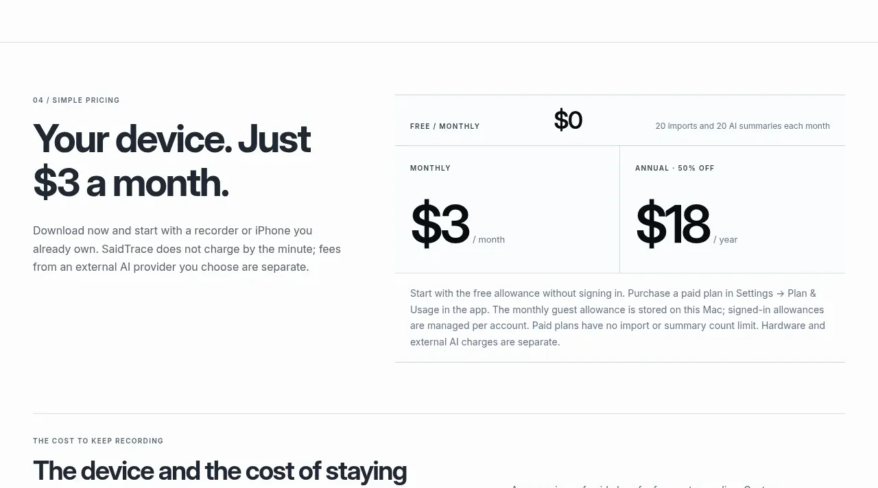 Simple monthly pricing
SaidTrace · Pricing table
Simple monthly pricing
SaidTrace · Pricing table
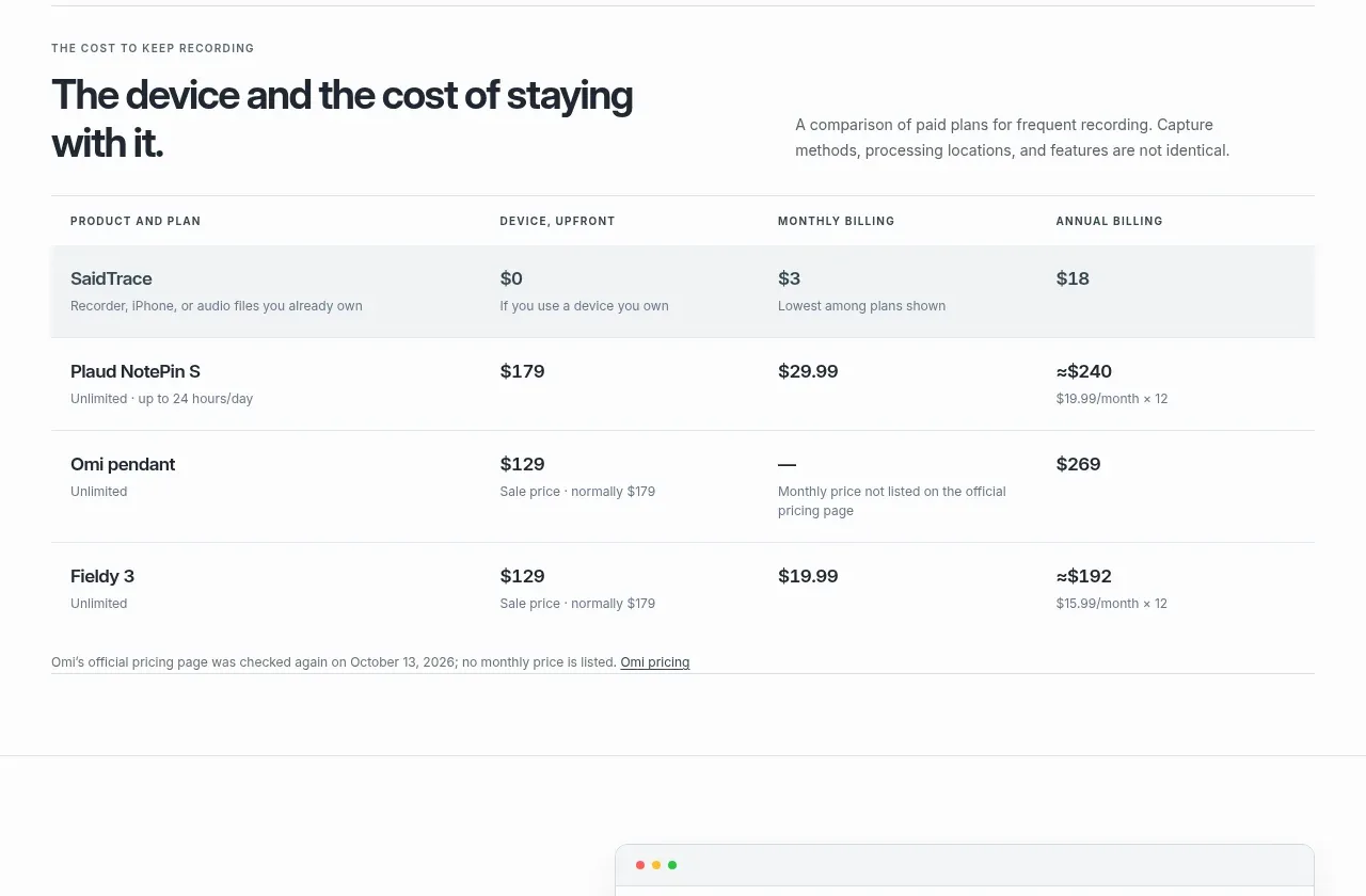 Cost comparison table
SaidTrace · Table
Cost comparison table
SaidTrace · Table
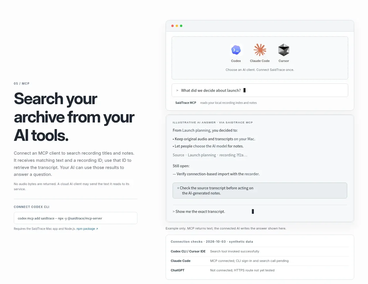 MCP and AI tool workflow
SaidTrace · Feature grid
MCP and AI tool workflow
SaidTrace · Feature grid
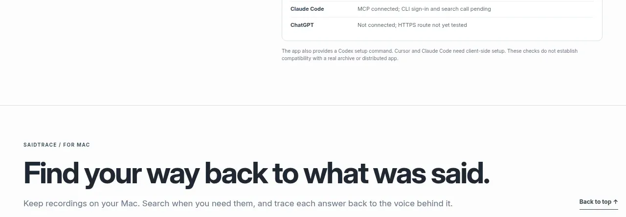 Closing return-to-product CTA
SaidTrace · Call to action
Closing return-to-product CTA
SaidTrace · Call to action
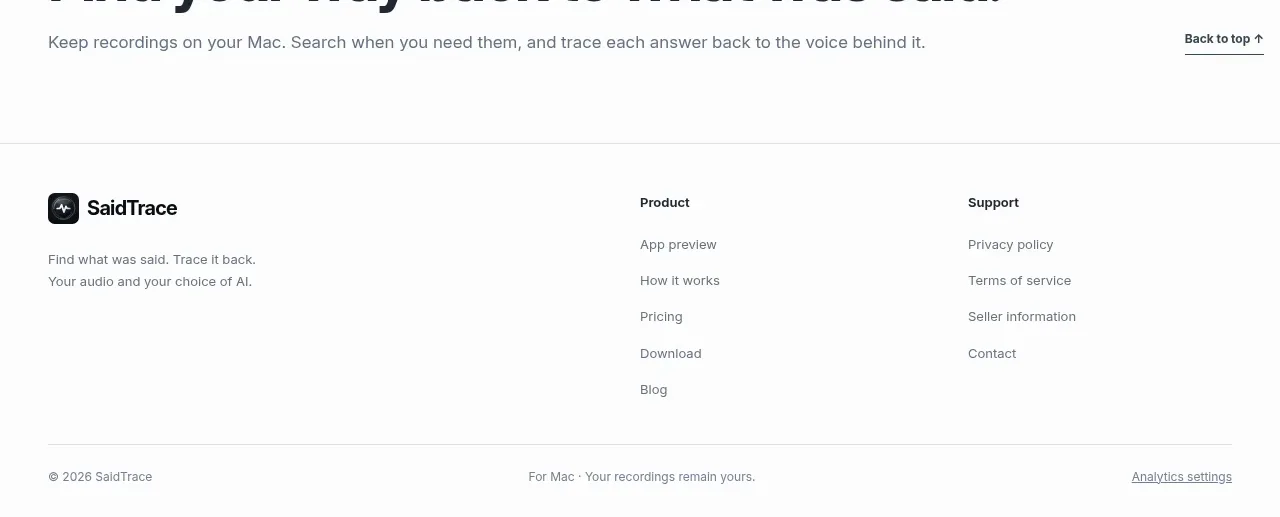 Product footer with link columns
SaidTrace · Footer
Product footer with link columns
SaidTrace · Footer