 kage
kage
saidtrace.com
Design analysis
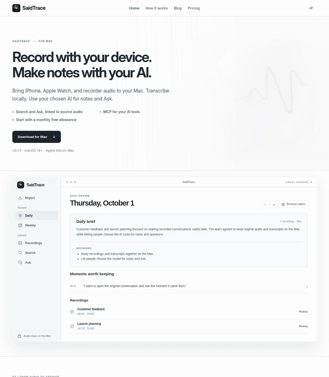
The hero pairs a forceful two-line headline and concise explanation with a download action, then uses a large quiet product interface preview to make the local workflow tangible.
Prompt preview
## Reference images

Study these alongside the description below: hierarchy, rhythm, spacing, colour. Build for the product you are asked about, using this design language.

- Component: https://kage-design-assets.t3.tigrisfiles.io/components/saidtrace/da2a1190-1b0d-4dc6-9c61-691af1a5c9a8-1792130574-1.webp
- Full page it was cut from: https://kage-design-assets.t3.tigrisfiles.io/screenshots/saidtrace/da2a1190-1b0d-4dc6-9c61-691af1a5c9a8-1792130502177-full.webp
- Component on Kage: https://kage.design/component/saidtrace-hero

## Before you start
Ask what the user's product and brand are, then apply the principles below to that product rather than copying the reference.

Create a spacious hero directly below the navigation. Use a two-column or asymmetric composition: a small uppercase eyebrow, a large dark headline of roughly 44–58px with tight line height, supporting copy limited to a readable measure, two short benefit bullets, and one high-contrast primary download or signup button. Add a faint oversized product UI preview below or beside the copy, with plenty of white space so the interface feels calm rather than promotional. Use #fbfbfa or white, charcoal #20252b, muted body text #5f666d, and one brand accent for the button. Use 32–56px section padding, 12px eyebrow lettering, 10–14px gaps between text groups, 8px button radius, and very subtle #e3e6e8 borders. The preview should resemble a believable desktop workspace with sidebar, toolbar, cards, and list rows; it should be responsive and collapse below the text on narrow screens. Make the CTA and any secondary link keyboard accessible.

Never use the reference's logo, product name, copy, illustrations, or imagery.
More components
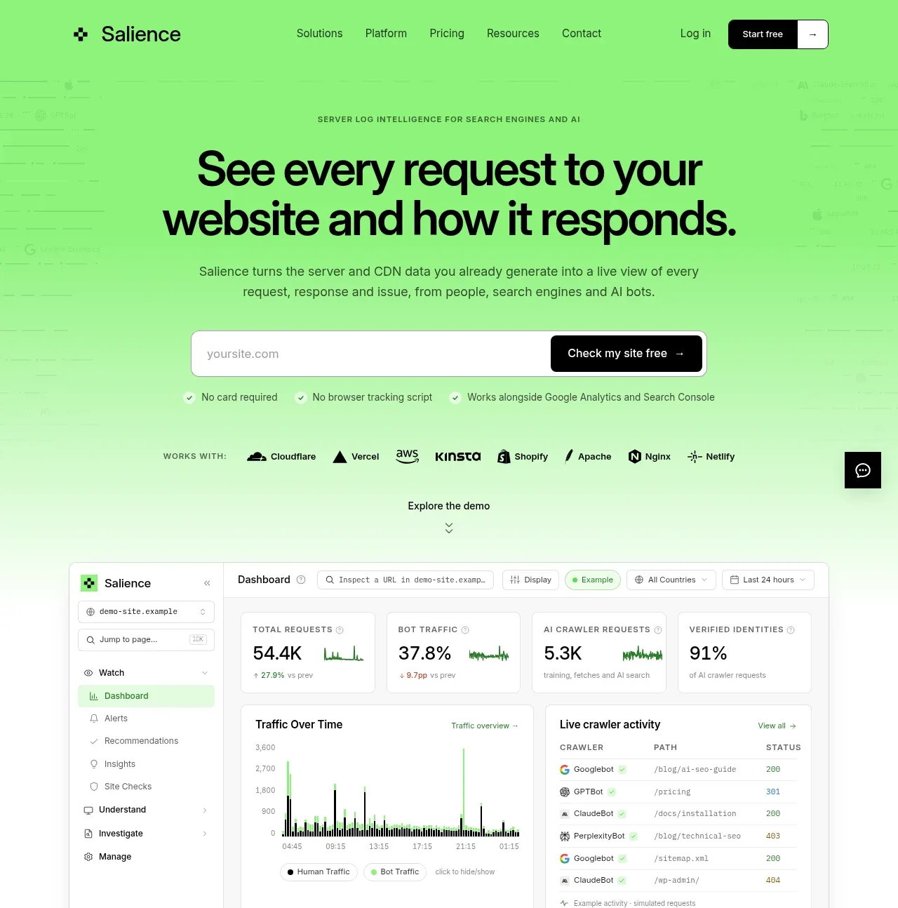
 Product promise and site checker hero
Salience · Hero
Product promise and site checker hero
Salience · Hero
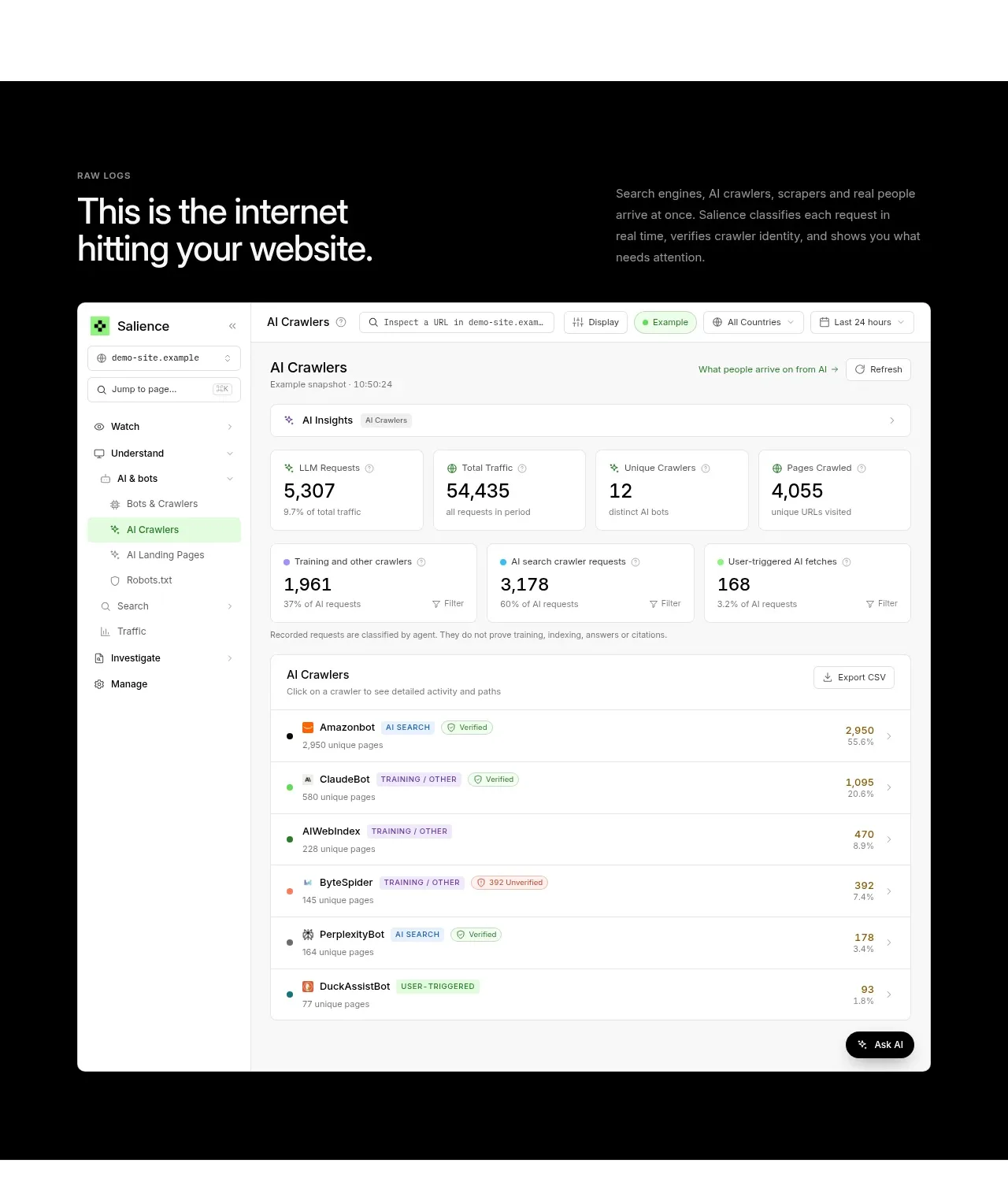 Raw activity dashboard showcase
Salience · Hero
Raw activity dashboard showcase
Salience · Hero
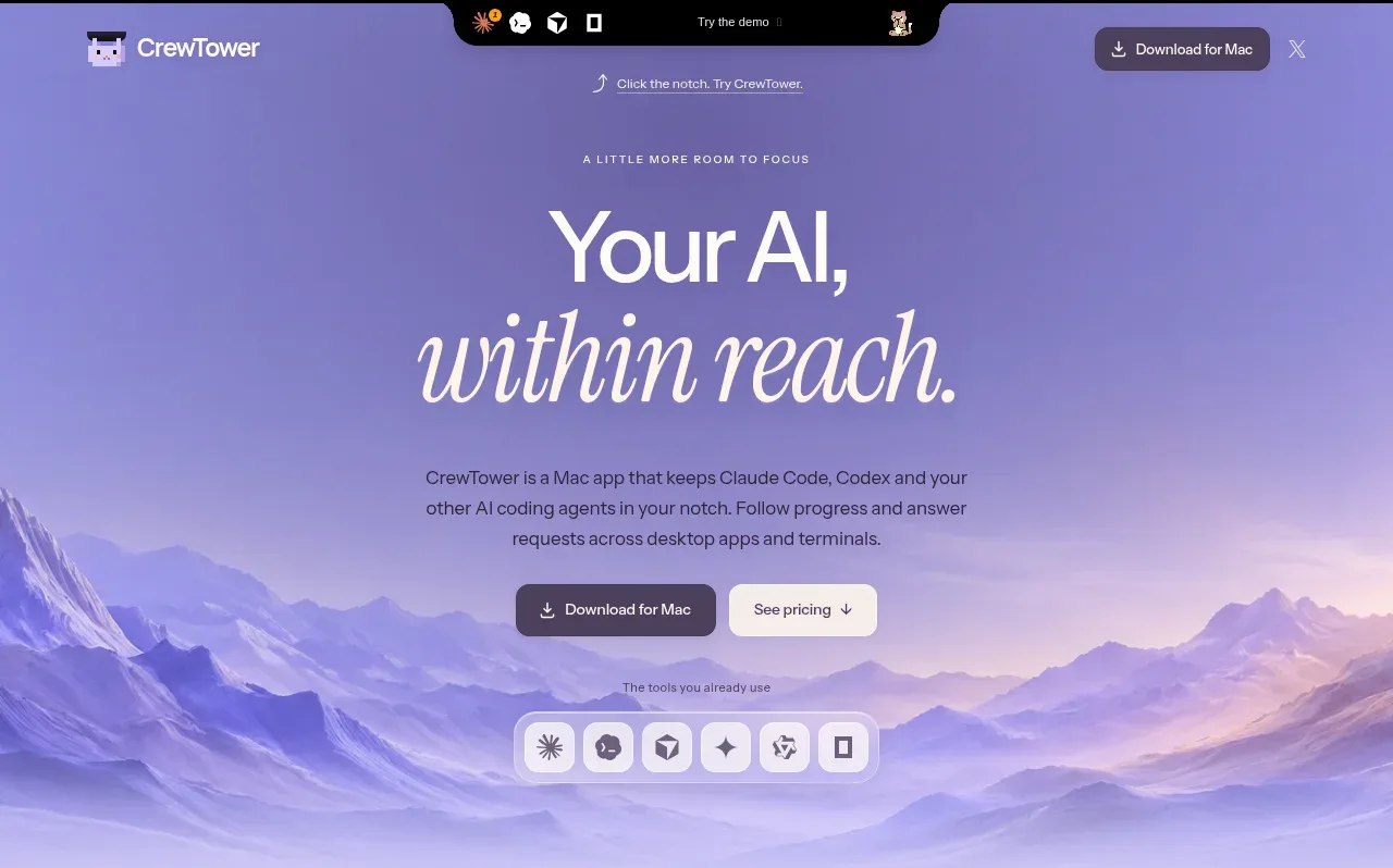
 Focus-oriented hero
CrewTower Mod for Claude Code · Hero
Focus-oriented hero
CrewTower Mod for Claude Code · Hero
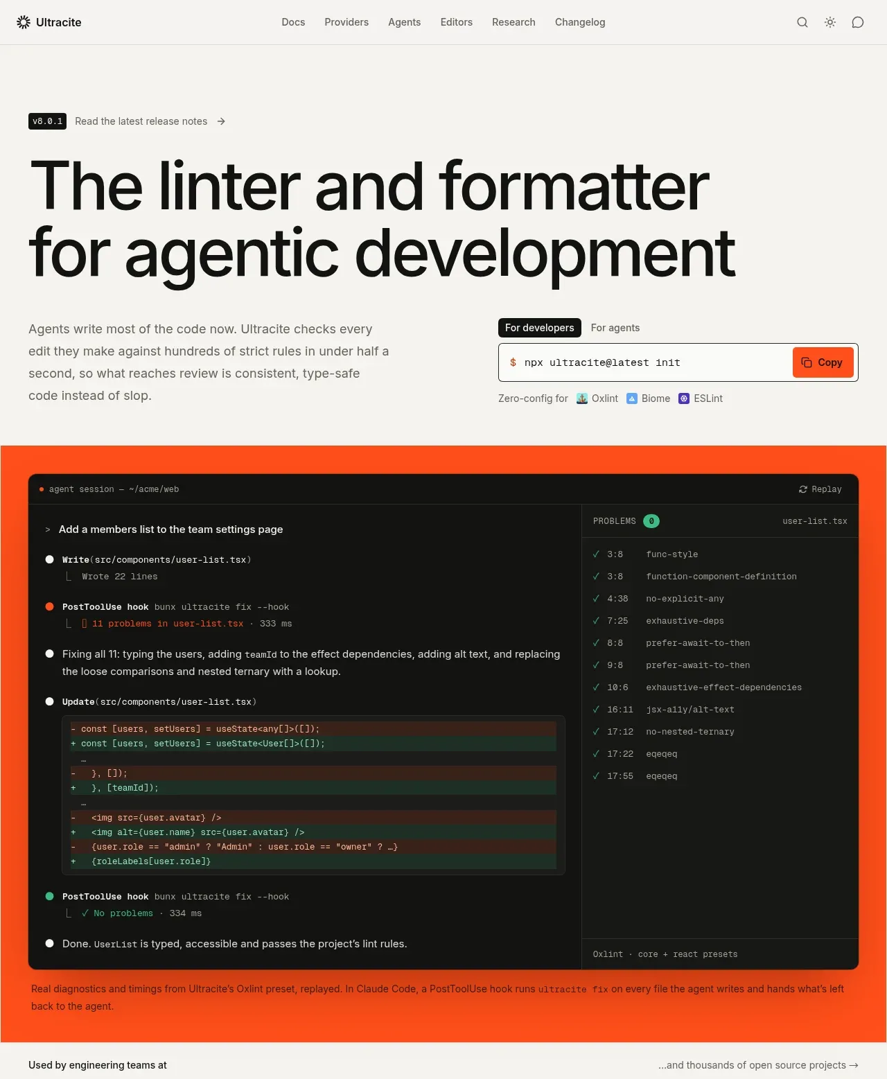
 Agentic development hero with live terminal preview
Ultracite v8 · Hero
Agentic development hero with live terminal preview
Ultracite v8 · Hero
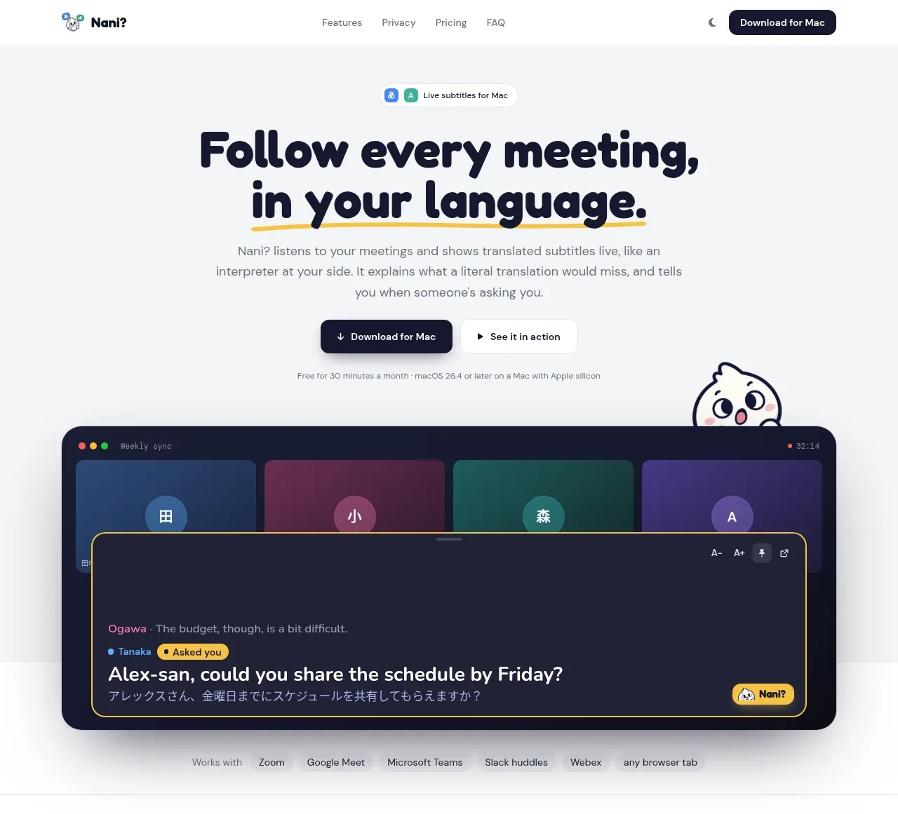
 Translation meeting hero
NANI??? · Hero
Translation meeting hero
NANI??? · Hero
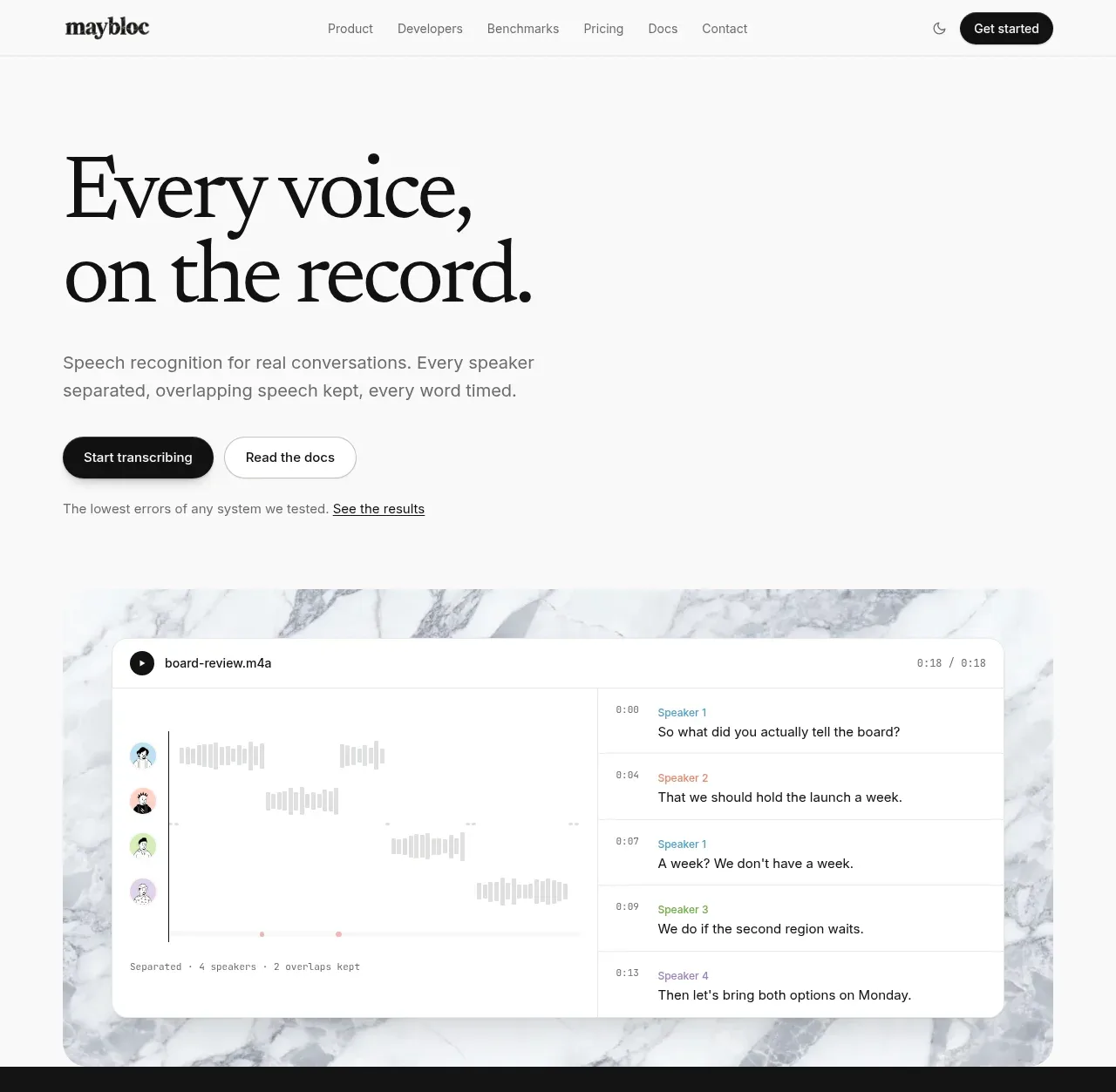
 Editorial speech transcription hero
Maybloc · Hero
Editorial speech transcription hero
Maybloc · Hero