kage
kage
asksapien.ai
Design analysis
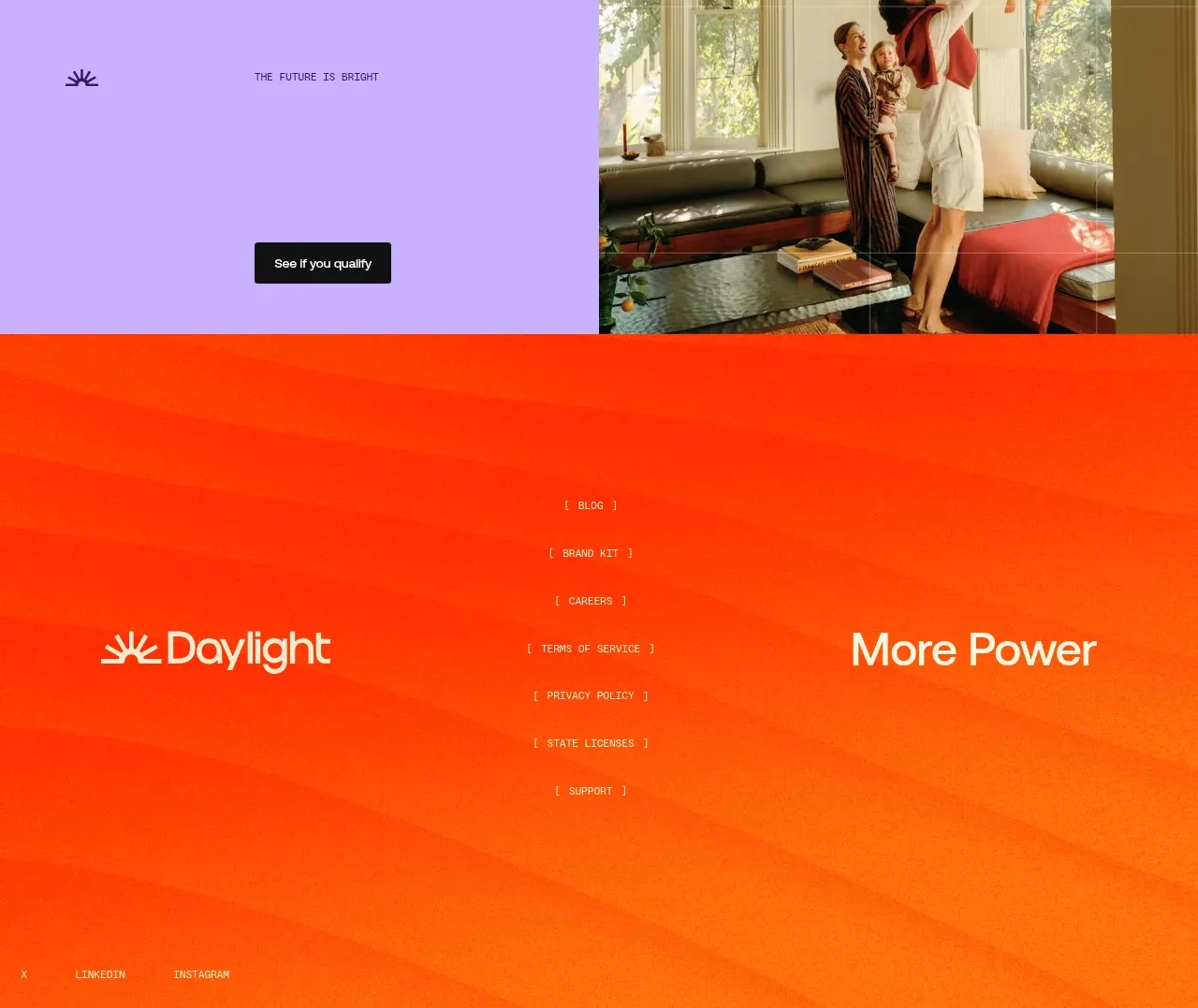
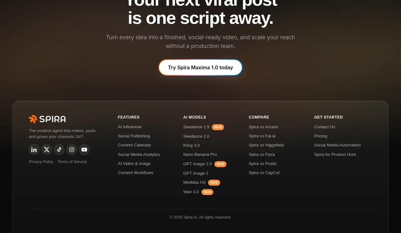
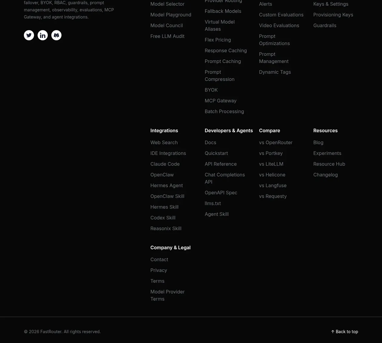
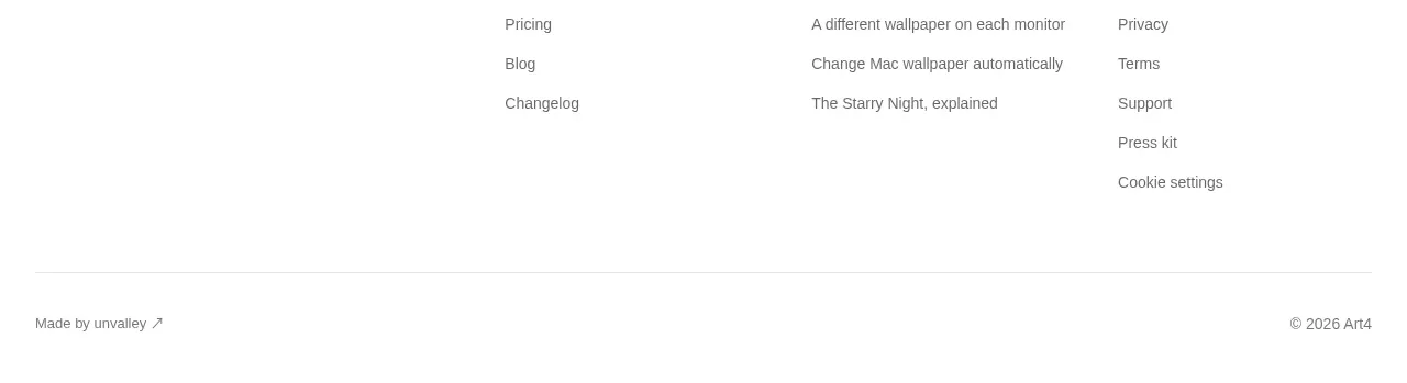
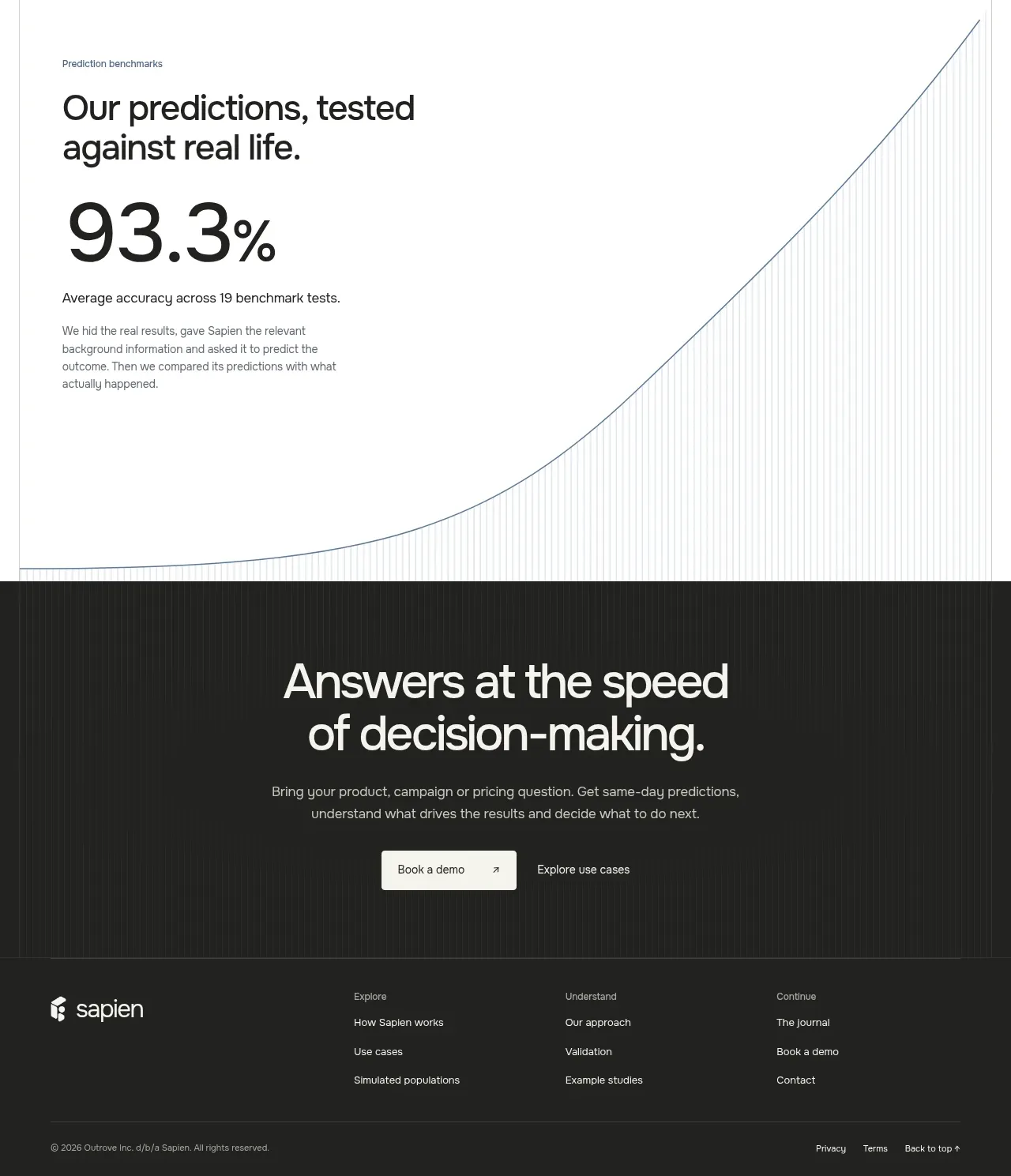
A dark footer continues the CTA palette with a brand mark, grouped navigation columns, and a compact legal utility row.
Prompt preview
## Reference images

Study these alongside the description below: hierarchy, rhythm, spacing, colour. Build for the product you are asked about, using this design language.

- Component: https://kage-design-assets.t3.tigrisfiles.io/components/sapien/bf276bc9-8a7f-4325-84fe-38ac6dd29868-1791093740-8.webp
- Full page it was cut from: https://kage-design-assets.t3.tigrisfiles.io/screenshots/sapien/bf276bc9-8a7f-4325-84fe-38ac6dd29868-1791093700749-full.webp
- Component on Kage: https://kage.design/component/sapien-footer

## Before you start
Ask what navigation groups, support links, legal links, and contact paths the user's product needs. Apply the information architecture to that product and brand.

Build a dark footer continuing the CTA background, around #20211f, with a centered max-width layout. Place the brand lockup in the left column and three or four link groups to the right, each with a small muted heading and vertically spaced links. Use 13–14px text, #f4f4ed for important links, and #9a9a93 for secondary text. Add a thin top or internal divider, then a bottom row containing copyright, privacy/terms links, and a back-to-top affordance. Maintain generous padding and a clear grid; collapse to stacked groups on mobile. Keep the footer visually quiet and functional.

Never: use logos, product names, copy, illustrations, or imagery from the reference.