kage
kage
asksapien.ai
Design analysis
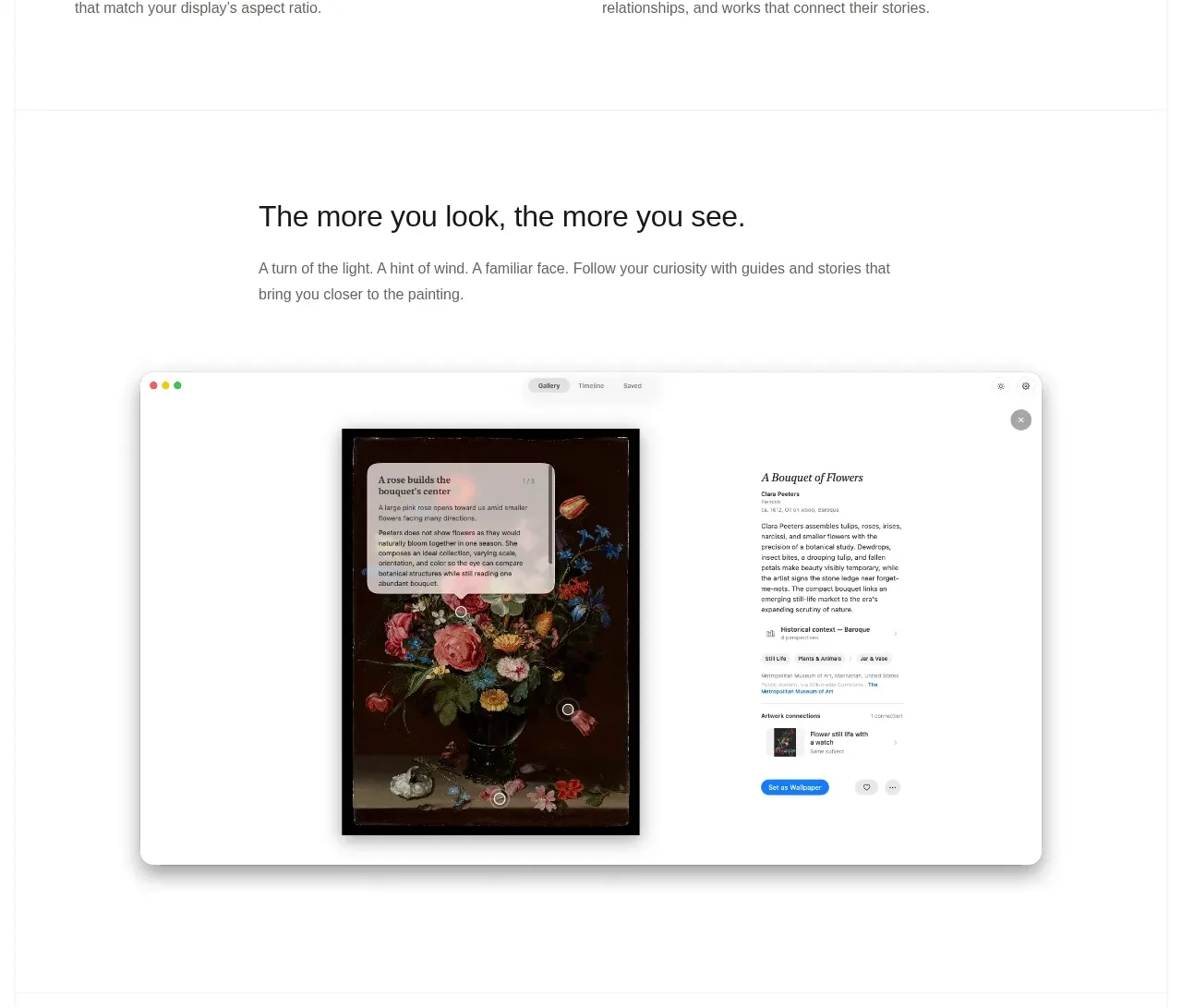
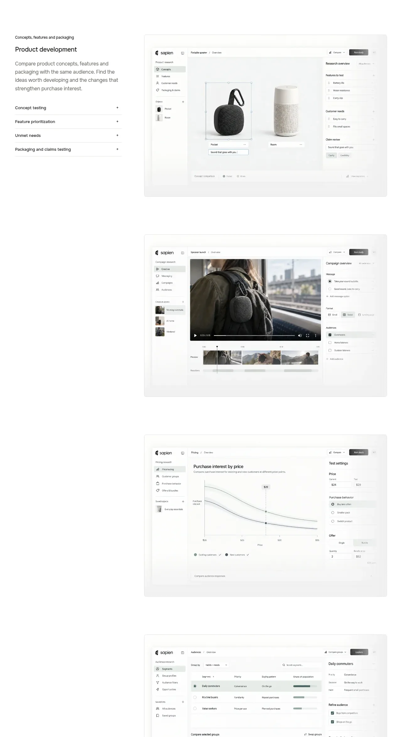
A long showcase alternates concise use-case labels and descriptions with large application screenshots, making product capabilities concrete without overcrowding the page.
Prompt preview
## Reference images

Study these alongside the description below: hierarchy, rhythm, spacing, colour. Build for the product you are asked about, using this design language.

- Component: https://kage-design-assets.t3.tigrisfiles.io/components/sapien/bf276bc9-8a7f-4325-84fe-38ac6dd29868-1791093739-5.webp
- Full page it was cut from: https://kage-design-assets.t3.tigrisfiles.io/screenshots/sapien/bf276bc9-8a7f-4325-84fe-38ac6dd29868-1791093700749-full.webp
- Component on Kage: https://kage.design/component/sapien-gallery

## Before you start
Ask what product workflows should be showcased, which screenshots or demos are available, and what action users should take after understanding each workflow. Apply these principles to the user's product.

Create a vertical use-case gallery with four or five showcase items. Each item should use a wide two-column composition: a narrow text panel with a small category label, bold title, short explanation, and a compact list of expandable or selectable subtopics; beside it place a large rounded screenshot or product visual. Alternate or vary alignment subtly while preserving a consistent reading order. Use white #ffffff, thin #e7e7e1 borders, 8–12px image radius, soft shadows only where needed, and muted gray interface chrome. Keep each item separated by 90–150px of whitespace. Add visible plus icons or accordion affordances to the subtopic list. On mobile, place text above the visual and make the subtopics full-width.

Never: use logos, product names, copy, illustrations, or imagery from the reference.