 kage
kage
asksapien.ai
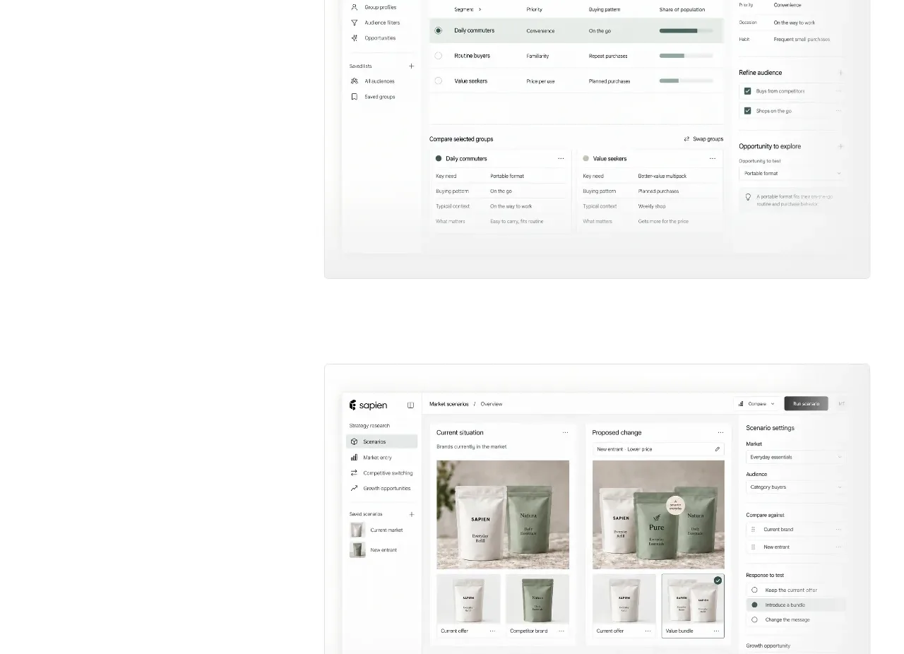
Design analysis
A benchmark section turns validation into a single memorable percentage, supported by explanatory copy and a restrained rising line chart.
Prompt preview
## Reference images

Study these alongside the description below: hierarchy, rhythm, spacing, colour. Build for the product you are asked about, using this design language.

- Component: https://kage-design-assets.t3.tigrisfiles.io/components/sapien/bf276bc9-8a7f-4325-84fe-38ac6dd29868-1791093739-6.webp
- Full page it was cut from: https://kage-design-assets.t3.tigrisfiles.io/screenshots/sapien/bf276bc9-8a7f-4325-84fe-38ac6dd29868-1791093700749-full.webp
- Component on Kage: https://kage.design/component/sapien-stats

## Before you start
Ask what result the user's product can credibly quantify, what benchmark context makes it meaningful, and what evidence should accompany it. Use the pattern without inventing unsupported claims.

Build a bordered benchmark panel on white with a left text block and a right-side minimalist chart. Include a small eyebrow, a 34–42px heading, one exceptionally large metric around 76–100px, a short metric descriptor, and a concise methodology paragraph. Draw a thin gray rising curve with delicate vertical guide lines or a pale area treatment; keep the chart decorative but legible and avoid unnecessary axes. Use #1e1e1c for primary text, #66706f for the line, and #e4e7e2 for guides. Use a thin #deded8 border and generous internal padding. On mobile, stack the metric above the chart and reduce the number size.

Never: use logos, product names, copy, illustrations, or imagery from the reference.
More components
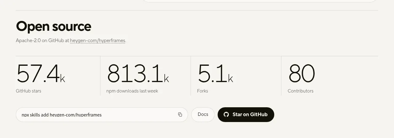
 Open-source proof and repository stats
HyperFrames Studio (Desktop) · Stats
Open-source proof and repository stats
HyperFrames Studio (Desktop) · Stats
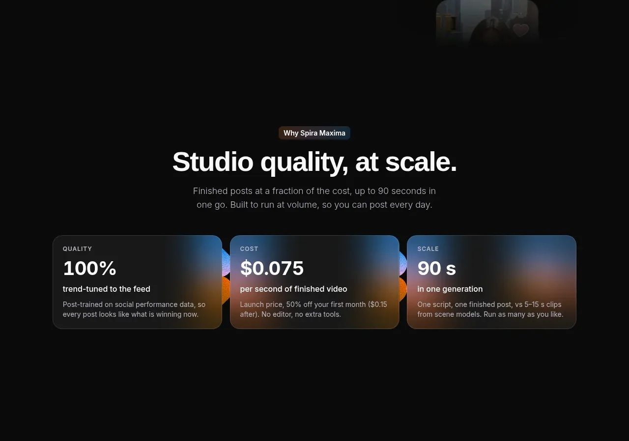
 Quality, cost, and scale metrics
Spira Maxima · Stats
Quality, cost, and scale metrics
Spira Maxima · Stats
P
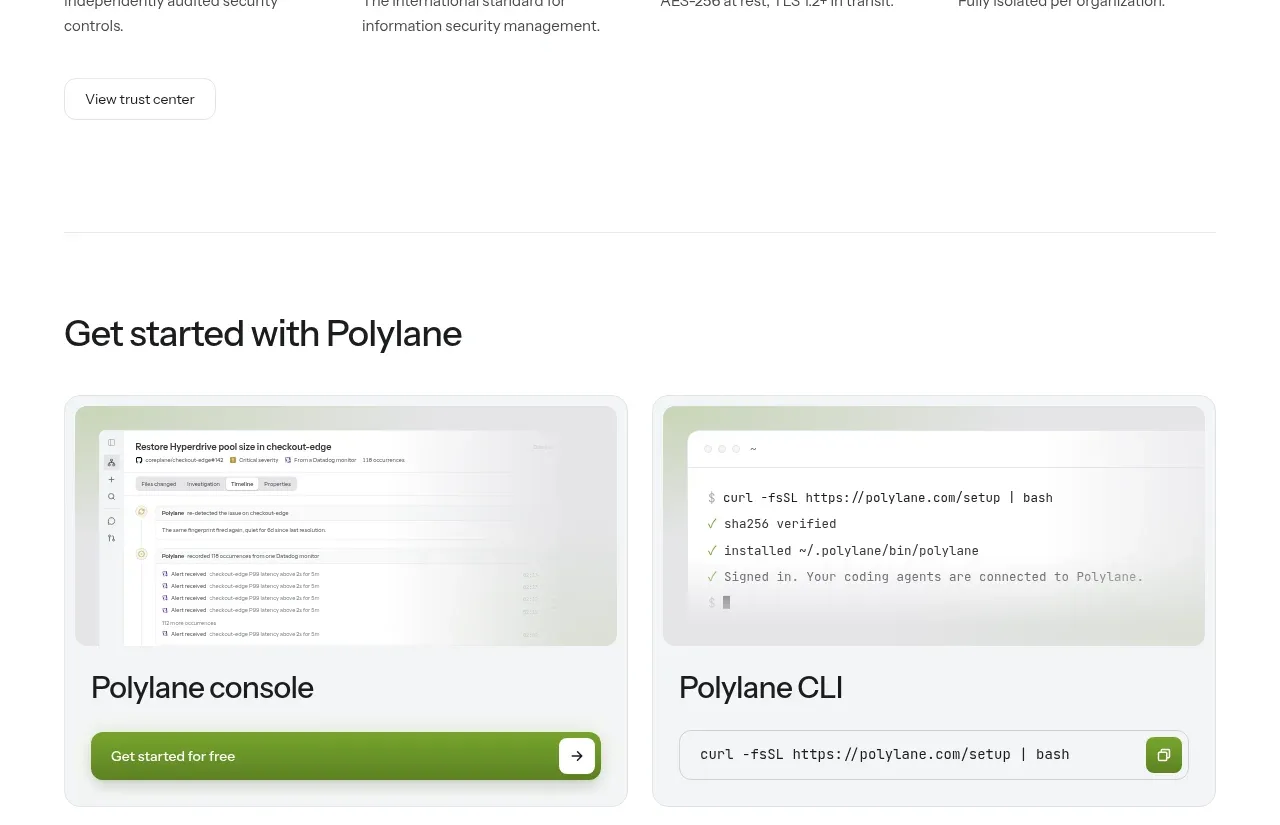
Security and trust assurances
Polylane · Stats

 Safety and control principles
Omnia Agent · Stats
Safety and control principles
Omnia Agent · Stats

 Customer proof and outcome grid
ColdIQ x Slack · Stats
Customer proof and outcome grid
ColdIQ x Slack · Stats

 Real-world proof section
Humalike x GTA RP · Stats
Real-world proof section
Humalike x GTA RP · Stats