 kage
kage
scalebrowser.net

Design analysis
A highly legible centered headline and dual CTA lead into a large atmospheric browser demonstration, followed by three ways to connect with the product.
Prompt preview
## Reference images

Study these alongside the description below: hierarchy, rhythm, spacing, colour. Build for the product you are asked about, using this design language.

- Component: https://kage-design-assets.t3.tigrisfiles.io/components/scalebrowser/2a4622f4-ebe3-4b20-ac5d-aef2ae1302c9-1792216896-1.webp
- Full page it was cut from: https://kage-design-assets.t3.tigrisfiles.io/screenshots/scalebrowser/2a4622f4-ebe3-4b20-ac5d-aef2ae1302c9-1792216866183-full.webp
- Component on Kage: https://kage.design/component/scalebrowser-hero

## Before you start
Ask what the user's product does, what outcome it promises, and which brand colours and visual assets are available. Apply these principles to that product rather than copying this page.

Create a spacious centered hero directly below the navigation. Start with a small announcement pill, then a two-line oversized headline, concise supporting paragraph, and two adjacent CTAs with one outlined and one dark filled. Below it, place a wide demo visual inside a 1px #e9edf0 frame: use the user's own product UI or abstract demo backdrop, with a floating input/action panel layered over it. Under the visual, add three equal columns for distinct integration paths, separated by subtle vertical rules and ending in small arrow links. Use a white canvas, #171c24 text, #66707a body copy, restrained blue accents around #1769d2, 16px card radius, and generous vertical rhythm: roughly 72px between text groups and 64px around the demo. Ensure the visual is decorative but the headline and CTA remain understandable without it; stack all columns on mobile.

Never use logos, product names, copy, illustrations, or imagery from the reference.
More components
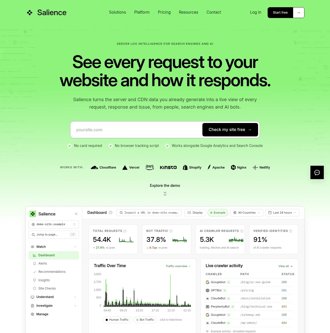
 Product promise and site checker hero
Salience · Hero
Product promise and site checker hero
Salience · Hero
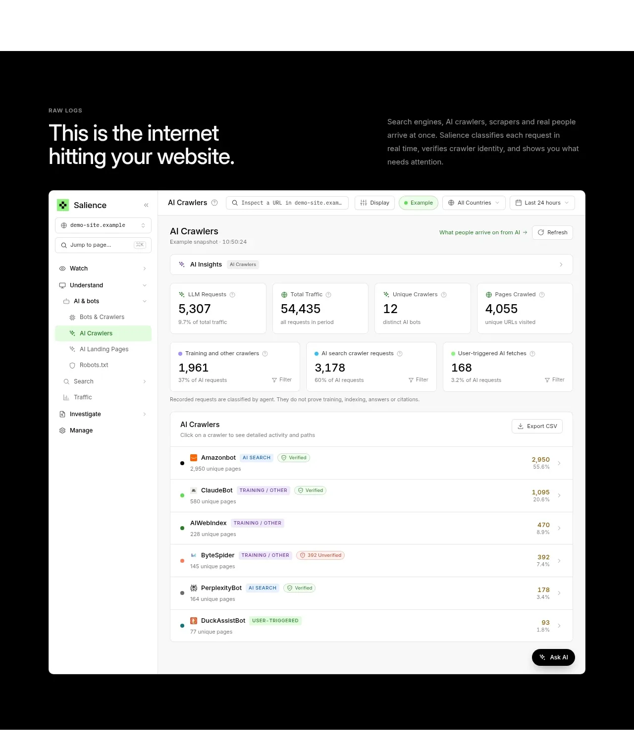 Raw activity dashboard showcase
Salience · Hero
Raw activity dashboard showcase
Salience · Hero
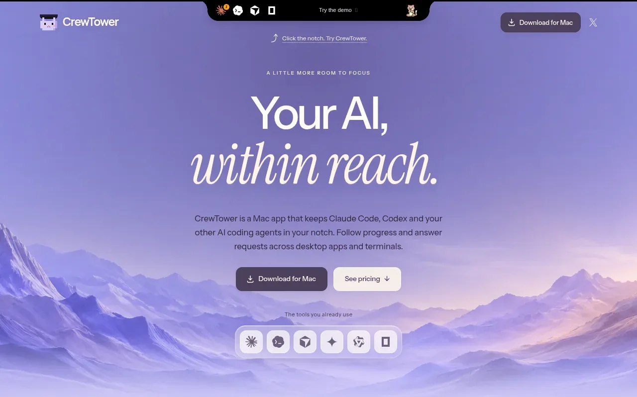
 Focus-oriented hero
CrewTower Mod for Claude Code · Hero
Focus-oriented hero
CrewTower Mod for Claude Code · Hero
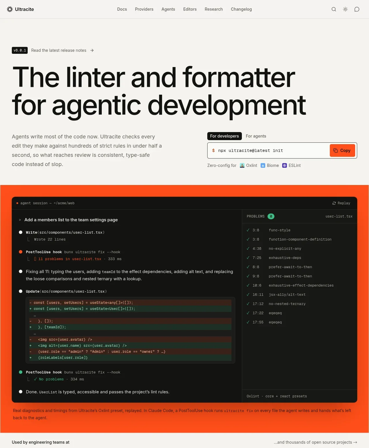
 Agentic development hero with live terminal preview
Ultracite v8 · Hero
Agentic development hero with live terminal preview
Ultracite v8 · Hero
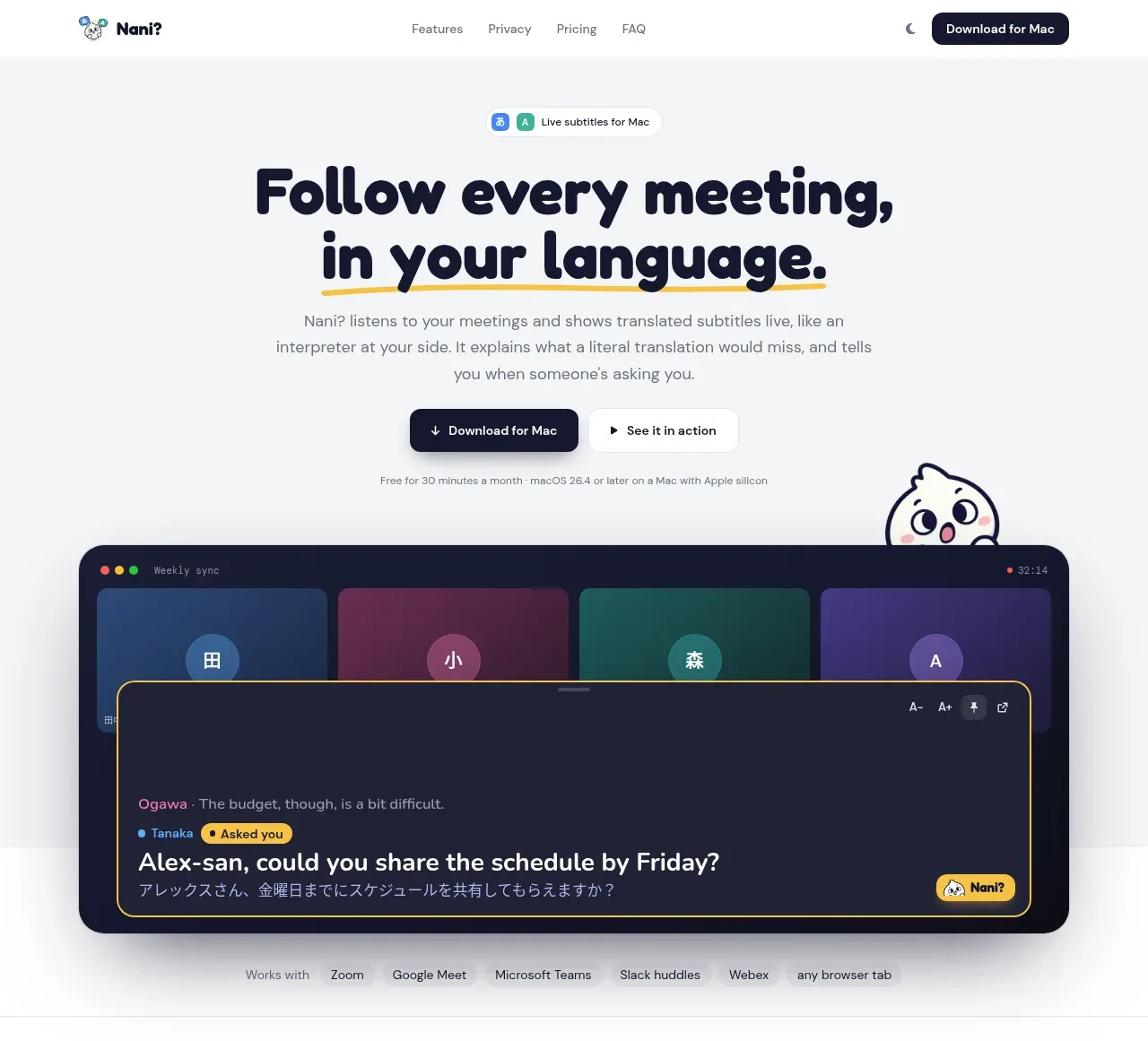
 Translation meeting hero
NANI??? · Hero
Translation meeting hero
NANI??? · Hero
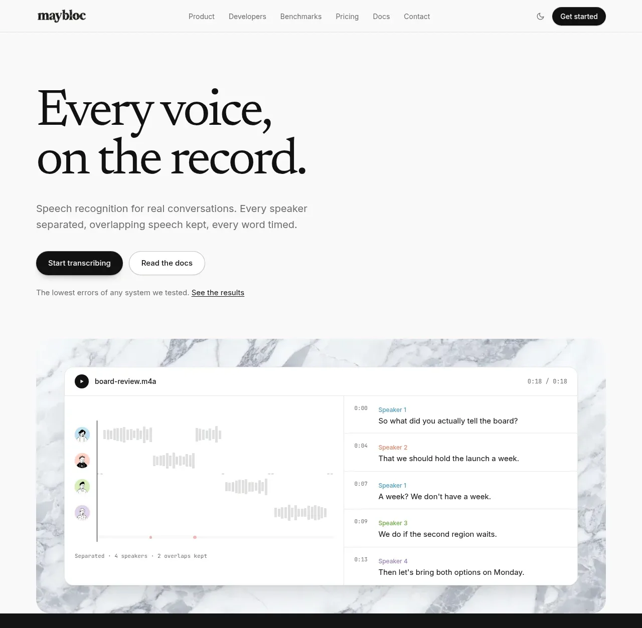
 Editorial speech transcription hero
Maybloc · Hero
Editorial speech transcription hero
Maybloc · Hero