kage
kage
scalebrowser.net

Design analysis
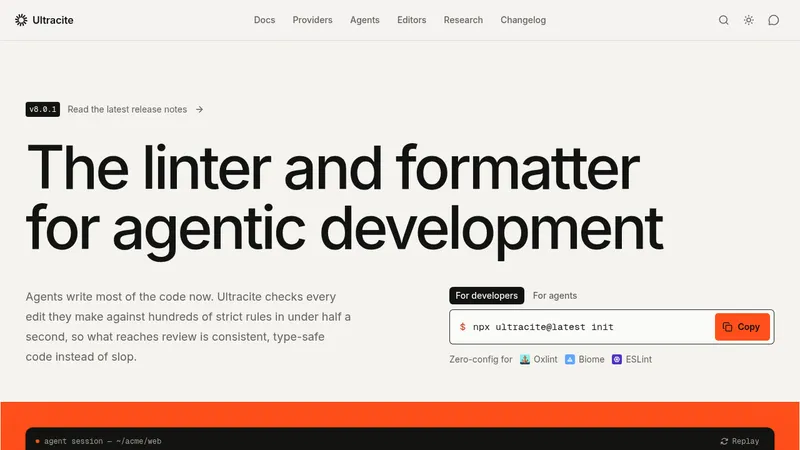
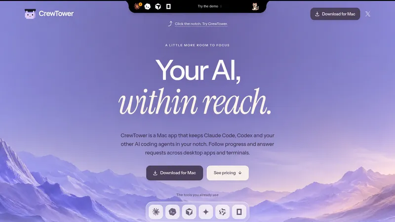
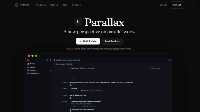
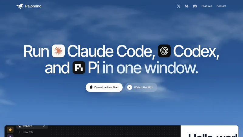
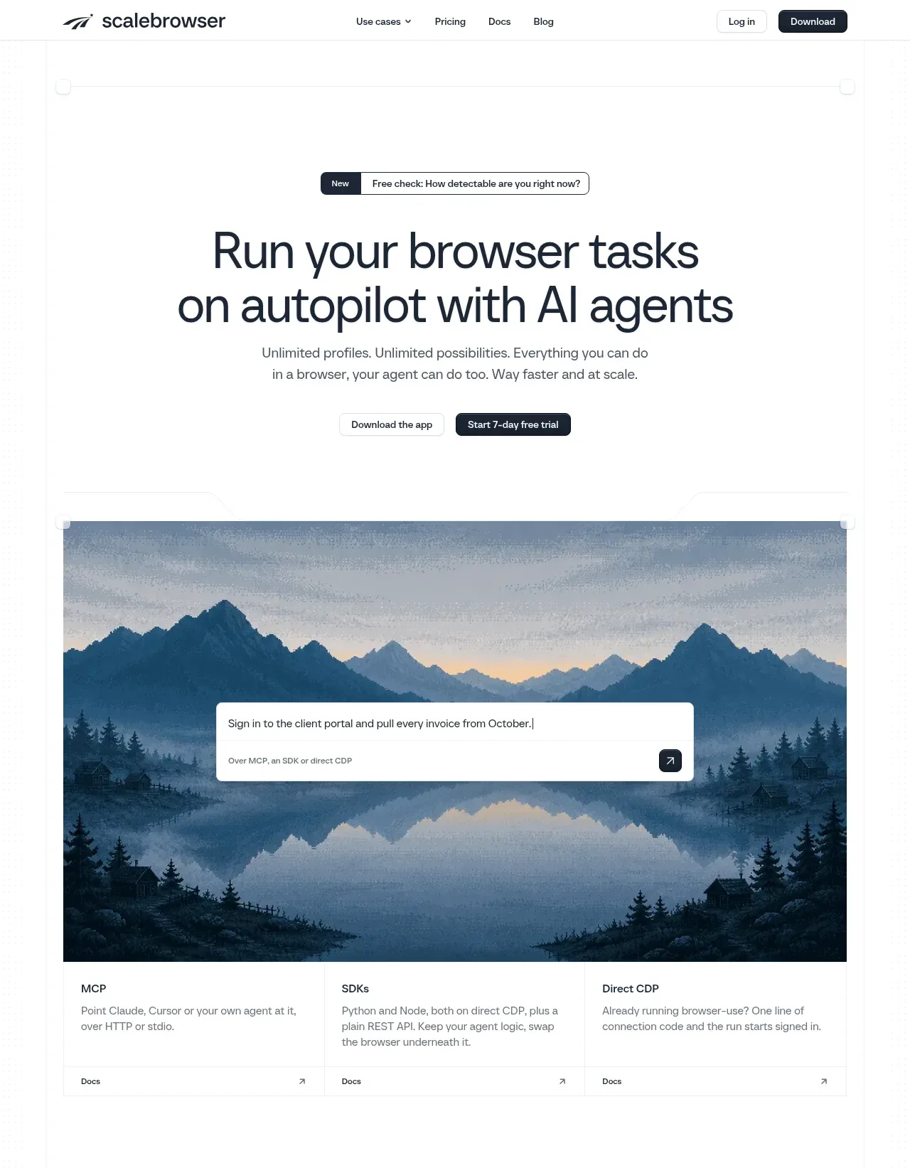
A restrained white landing page uses a narrow centered container, hairline gray borders, compact navigation, and oversized dark sans-serif headings to create a technical, editorial rhythm. After the hero and scenic product demo, the page moves through platform coverage, proof metrics, three alternating capability modules with blue section accents and UI screenshots, then supporting video, integrations, testimonial, model-check CTA, dense footer navigation, and credibility badges; generous whitespace keeps the long page legible while bordered grids add structure.
Prompt preview
## Reference images

Study these alongside the description below: hierarchy, rhythm, spacing, colour. Build for the product you are asked about, using this design language.

- Full page: https://kage-design-assets.t3.tigrisfiles.io/screenshots/scalebrowser/2a4622f4-ebe3-4b20-ac5d-aef2ae1302c9-1792216866183-full.webp
- Above the fold: https://kage-design-assets.t3.tigrisfiles.io/screenshots/scalebrowser/2a4622f4-ebe3-4b20-ac5d-aef2ae1302c9-1792216861453.webp
- Design on Kage: https://kage.design/designs/scalebrowser-landing-page

## Before you start
Ask the user what they are building, who it is for, and what brand assets they already have (name, colours, type). Wait for their answers before proceeding. Apply every instruction below to that product, not to the reference product.

## Page structure
1. **Top navigation:** Use a slim, persistent-feeling header with a small brand mark area on the left, centered or compact links with one dropdown, and restrained secondary and primary actions on the right.
2. **Hero announcement:** Place a small segmented announcement pill above the headline, with a dark label segment and a light bordered message segment.
3. **Hero copy and actions:** Center a large two-line sans-serif headline, a short muted supporting paragraph, and two compact CTAs with one dark filled button and one light outlined button.
4. **Hero product demonstration:** Follow with a wide scenic or atmospheric product visual inside a bordered frame. Overlay a centered white command/input card with a short task example and a dark submit icon button.
5. **Access-mode cards:** Directly below the visual, use three equal columns separated by fine vertical rules to explain the supported ways to use the product. Give each a short heading, muted description, and small documentation link.
6. **Platform coverage statement:** Add a centered sentence explaining breadth of supported platforms, followed by a large multi-row grid of small monochrome platform marks. Keep the grid airy and separated by hairline rules.
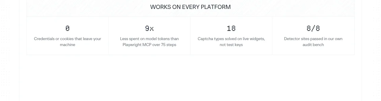
7. **Proof metrics:** Introduce a compact all-caps or small uppercase label, then show four equal metric cells with large numeric values and concise explanatory captions.
8. **Capability section one:** Create a bordered feature module labeled with a coloured numbered eyebrow. Use a large left-aligned heading, a vertical list of four capabilities on the left, and a framed product screenshot or UI mockup on the right. Highlight the active list item with a thin blue left border. Finish with a centered text link below the module.
9. **Capability section two:** Repeat the same bordered two-column pattern for authentication and persistence, changing the eyebrow colour and screenshot content. Keep the section rhythm consistent while varying the heading and feature list.
10. **Capability section three:** Repeat the pattern for the agent interaction layer, again pairing four detailed rows with a right-side analytical or operational UI screenshot and a centered follow-up link.
11. **Video feature teaser:** Use a pale bordered two-column card. Put a small coloured category label, a dark “coming soon” badge, headline, and muted explanatory paragraphs on the left; put a large framed media placeholder or browser window on the right.
12. **Agent integrations:** Build a wide bordered section with a large heading on the left and a compact two-column grid of integration tiles on the right. Each tile contains a small service symbol, label, and external-link arrow.
13. **Testimonial:** Place a spacious quote card with a thin top rule, multiple lines of testimonial copy, a small avatar and attribution at the lower left, and a subtle customer mark at the lower right.
14. **Model-check CTA:** Add a final bordered two-column callout. Use a large question-style heading and muted supporting text on the left; use a grid of model links on the right, followed by one full-width row for the primary check action.
15. **Footer navigation:** Use a dense, pale-gray footer grid with multiple labelled columns such as product, use cases, docs, blog, account, and legal. Keep links small, dark, and tightly vertically spaced.
16. **Footer identity and badges:** Finish with a separated bottom row containing the brand identity and copyright on the left, plus several small press, directory, or trust badges on the right.

## Design language
- Build hierarchy through scale and whitespace rather than decoration: use a very large, dark, lightweight sans-serif hero and section headings, medium-weight card headings, and small muted utility text.
- Keep the page on a centered, wide canvas with generous outer margins. Let content move from open hero whitespace to denser bordered grids, then back to spacious feature and testimonial cards.
- Use a mostly white palette: approximately `#FFFFFF` background, `#151A22` near-black text, `#6F747C` muted copy, and `#E8EAED` hairline borders. Reserve dark navy-black `#17202B` for primary buttons and small badges.
- Use blue sparingly as a functional accent, approximately `#2F80D9`, especially for active feature-row borders and occasional section labels. Allow small, purposeful category colours rather than broad gradients.
- Pair a clean geometric or humanist sans-serif throughout. Use a display scale around 48–64px for the desktop hero, 32–44px for major section headings, 14–16px for body copy, and 10–12px for metadata and navigation.
- Treat borders as a primary layout device: use 1px pale-gray rules, rectangular grid cells, and minimal corner rounding. Reserve modest 4–8px radii for buttons, pills, media frames, and input cards; avoid floating shadows.
- Frame screenshots and demos as part of the grid, often with a dark atmospheric image or muted browser chrome behind a crisp white UI panel. Keep the product visuals more tactile than the surrounding typography.
- Make interaction quiet and utilitarian: use compact arrow links, clear hover states, subtle border or background changes, and no loud animation. If adding motion, use gentle reveal or image transitions that preserve the editorial pacing.
- Maintain repeated vertical rhythm: large blank gaps separate major proof and feature groups, while feature rows and footer links become intentionally dense. Alternate colour accents and screenshot content to distinguish long sections without changing the overall system.

## Never
- Do not use the reference product’s logos, wordmarks, product names, copy, illustrations, photography, screenshots, icon sets, customer names, or exact integration marks.
- Do not present the result as Scalebrowser or imply affiliation with it. Replace all reference-specific content with the user’s own product, brand assets, examples, and terminology.
Components from this page
All components
 Minimal product navigation
Scalebrowser · Navigation
Minimal product navigation
Scalebrowser · Navigation
 Autopilot browser hero
Scalebrowser · Hero
Autopilot browser hero
Scalebrowser · Hero
 Platform compatibility grid
Scalebrowser · Logo cloud
Platform compatibility grid
Scalebrowser · Logo cloud
 Proof points
Scalebrowser · Stats
Proof points
Scalebrowser · Stats
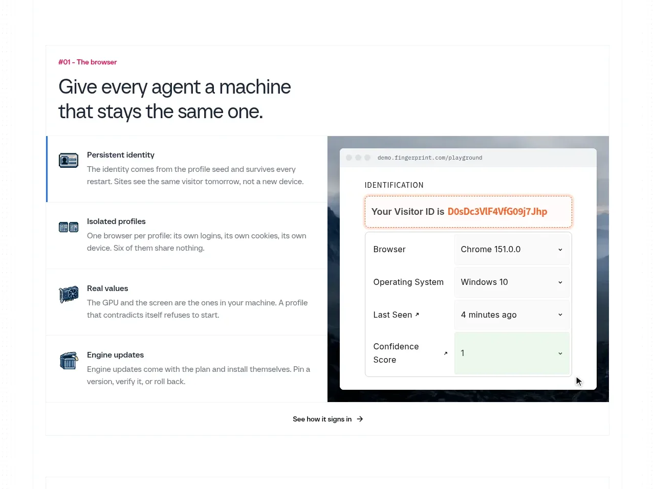 Persistent browser identity
Scalebrowser · Feature grid
Persistent browser identity
Scalebrowser · Feature grid
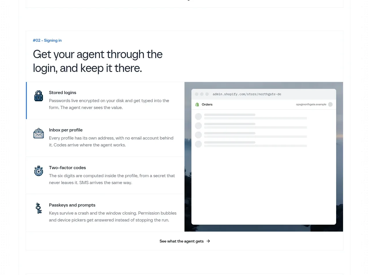 Reliable sign-in flows
Scalebrowser · Feature grid
Reliable sign-in flows
Scalebrowser · Feature grid
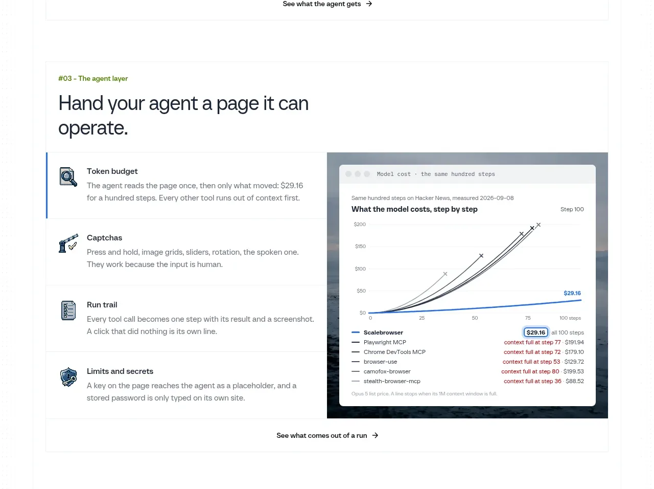 Agent control layer
Scalebrowser · Feature grid
Agent control layer
Scalebrowser · Feature grid
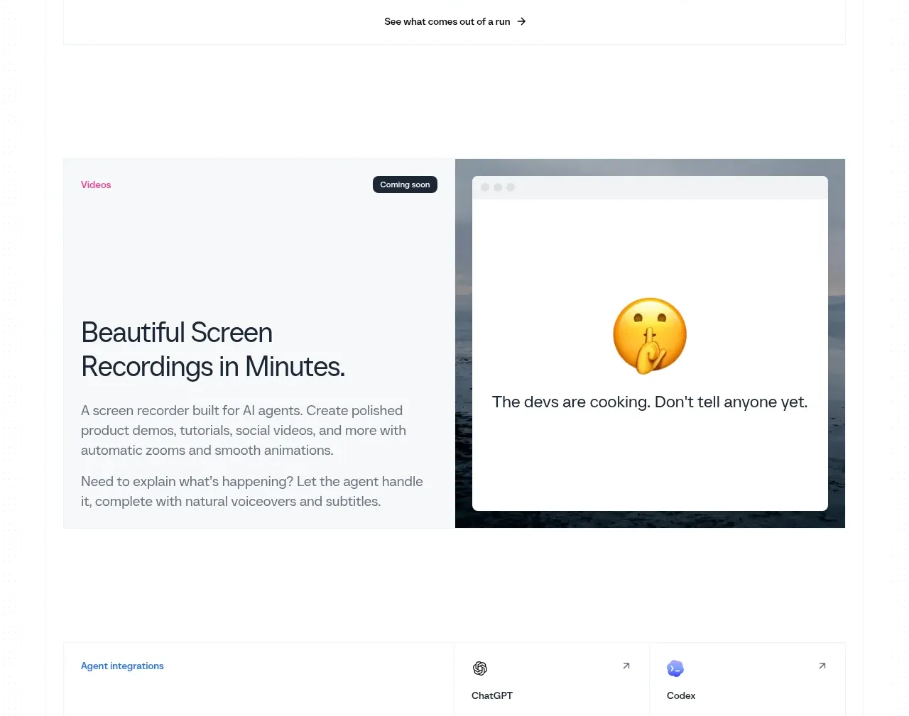 Screen recording teaser
Scalebrowser · Card
Screen recording teaser
Scalebrowser · Card
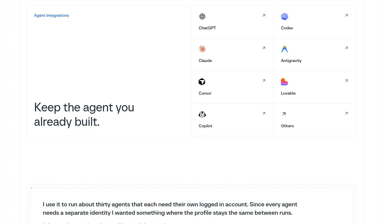 Agent integrations
Scalebrowser · Card
Agent integrations
Scalebrowser · Card
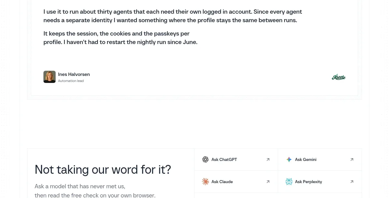 Customer proof quote
Scalebrowser · Testimonials
Customer proof quote
Scalebrowser · Testimonials
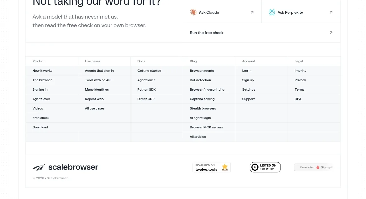 Question prompt and site footer
Scalebrowser · Footer
Question prompt and site footer
Scalebrowser · Footer