kage
kage
incredible.one

Design analysis
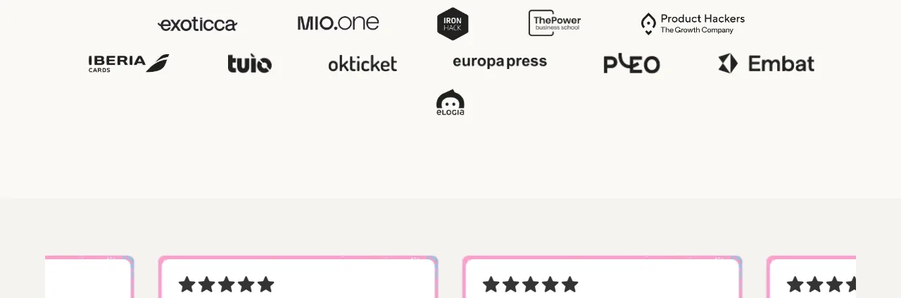
A quiet horizontal logo row provides credibility through recognizable customer marks while maintaining a low-contrast visual footprint.
Prompt preview
## Reference images

Study these alongside the description below: hierarchy, rhythm, spacing, colour. Build for the product you are asked about, using this design language.

- Component: https://kage-design-assets.t3.tigrisfiles.io/components/incredible/a967b774-2b17-4a91-b40d-fd5f367a0b1c-1791353134-3.webp
- Component on Kage: https://kage.design/component/incredible-logo-cloud

## Before you start
Ask what kind of customer or partner proof the user's product has and which brands they are permitted to show. Apply the principles below to that product and brand.

Build a restrained full-width customer logo strip with a centered max-width inner row. Use a white background, generous top and bottom whitespace, and 6–9 monochrome wordmarks spaced evenly across the row. Render marks in soft gray (#8f9397) with varied natural widths, aligned to a shared visual baseline rather than forcing identical boxes. Keep this section visually quieter than the hero: no heading is required, but an optional tiny eyebrow can be used if context is needed. On narrow screens allow horizontal scrolling or a two-row wrap while preserving comfortable gaps. If logos are clickable, add a subtle opacity-to-full-color hover state and accessible labels.

Never: use the reference's customer logos, product name, exact copy, illustrations, imagery, or unlicensed brand assets.