kage
kage
context.dev

Design analysis
A long-form developer API landing page uses a restrained white grid, oversized black typography, and blue gradient accents to move from a visual hero demo into progressively denser product proof. The page alternates editorial two-column explanations, interface mockups, feature cards, numbered integration steps, testimonials, a dark customer-and-blog section, FAQ rows, and a saturated closing CTA before a near-black documentation-style footer.
Prompt preview
## Reference images

Study these alongside the description below: hierarchy, rhythm, spacing, colour. Build for the product you are asked about, using this design language.

- Full page: https://kage-design-assets.t3.tigrisfiles.io/screenshots/scrape-anything-by-context-dev/b0e64468-3924-45db-a4d8-d7cbe8044a77-1791871314047-full.webp
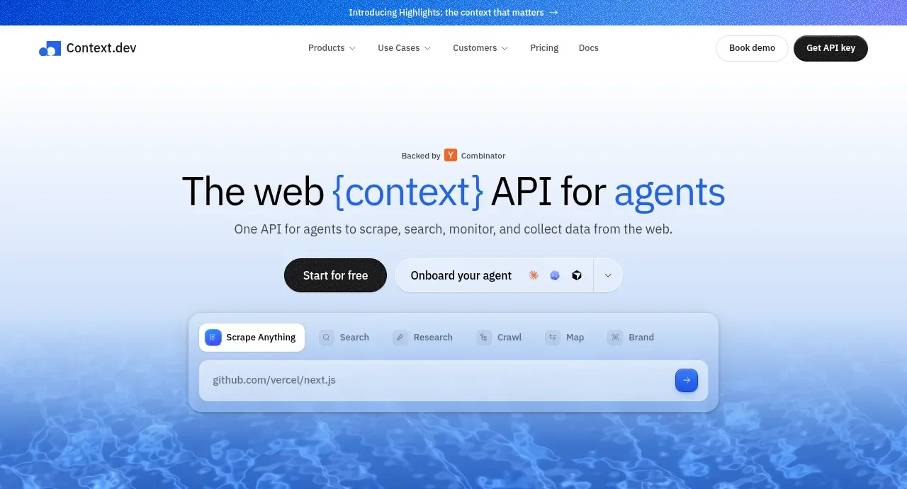
- Above the fold: https://kage-design-assets.t3.tigrisfiles.io/screenshots/scrape-anything-by-context-dev/b0e64468-3924-45db-a4d8-d7cbe8044a77-1791871278434.webp
- Design on Kage: https://kage.design/designs/scrape-anything-by-context-landing-page

## Before you start
Ask the user what they are building, who it is for, and what brand assets they already have (name, colours, type choices, logos, and imagery). Wait for their answers before proceeding. Apply everything below to their product, not to the reference product.

## Page structure
1. **Announcement bar and navigation** — Begin with a slim blue announcement strip, followed by a white navigation row with a small product mark, compact dropdown links, and contrasting secondary and primary actions.
2. **Hero** — Center a large headline with one or two accent-coloured words, a short API-focused subheading, paired CTAs, and a browser/API input mockup floating over a pale blue gradient that transitions into a textured blue lower edge.
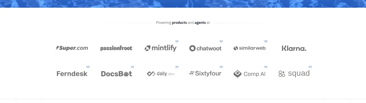
3. **Customer logo strip** — Add a quiet white proof section with a small supporting label and two rows of muted customer marks.
4. **Web data overview** — Use a spacious, lightly ruled content frame with a left text column and a purple textured product/output mockup on the right; follow it with four small capability summaries in a row.
5. **Agent setup** — Introduce the section with a small uppercase eyebrow and centered heading, then show two side-by-side setup cards: a plain self-serve checklist and a vivid purple agent-generated code card.
6. **API feature demonstration** — Center a heading about APIs powering features, then place a large split demonstration: a pale vertical feature selector on the left and a dark code editor inside a vivid purple panel on the right.
7. **Reliability section** — Return to a two-column layout with a large success-rate statistic and operational copy on the left, and a blue textured browser/status panel on the right; finish with three explanatory columns.
8. **Use-case grid** — Introduce a broad section about scraping, answers, and automation, followed by a two-column grid of six softly bordered cards containing product descriptions and small interface illustrations.
9. **Three-step integration** — Use a split layout: a left headline and CTA, and a right vertical sequence numbered 01–03 with large pale numerals, short titles, descriptions, and divider lines.
10. **Platform overview** — Center a statement about scraping URLs, crawling sites, and extracting data, include a small row of API/category links, then show one wide extraction card above two smaller feature cards.
11. **Developer testimonials** — Add a centered heading and subtitle, then arrange an asymmetric testimonial mosaic with one larger quote card and several smaller cards, all using light borders and restrained shadows.
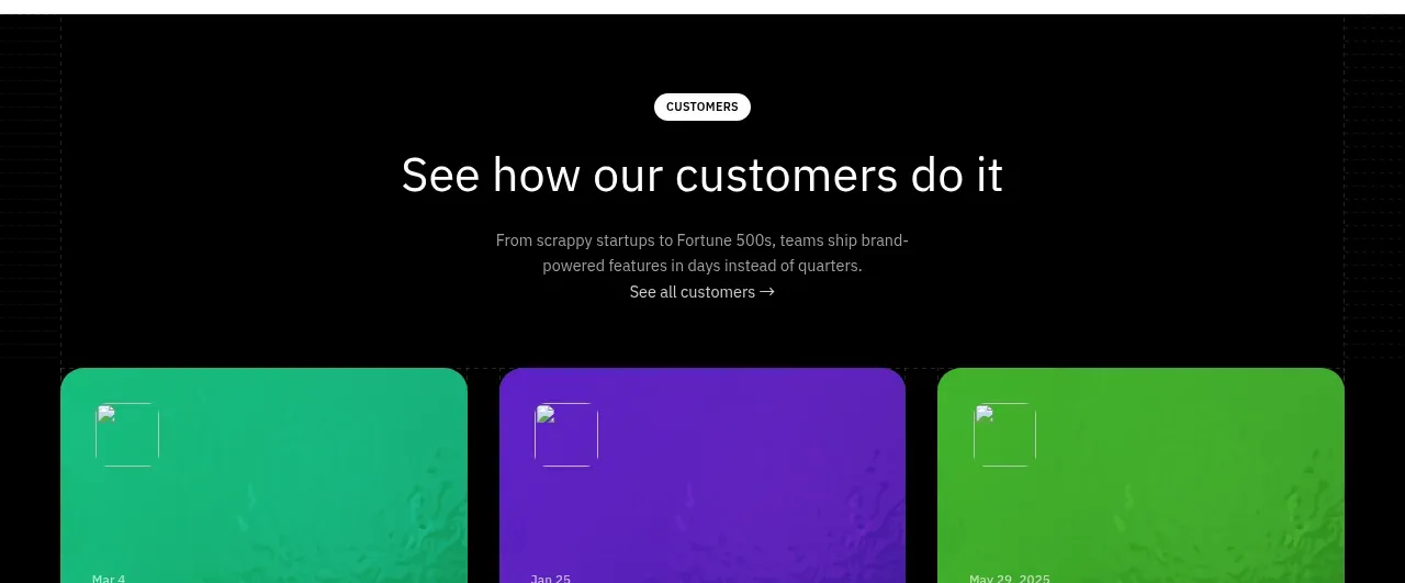
12. **Customer stories and blog** — Switch to a near-black section. Place a centered customer-stories heading above three bright green, purple, and lime story cards with carousel dots; below, add a blog heading and three blue article cards with a second carousel control.
13. **FAQ** — Return to the white ruled grid with a left-aligned FAQ heading and subtitle, followed by two columns of compact rounded accordion rows with plus controls.
14. **Closing CTA** — Use a full-width blue textured banner with centered white heading, supporting copy, and two pill buttons.
15. **Footer** — Finish with a near-black multi-column footer containing brand/about content, compliance badges, link groups, social details, legal metadata, and a large cropped outlined wordmark treatment along the bottom edge.

## Design language
- Build hierarchy with very large, lightweight sans-serif headlines, short paragraphs, uppercase micro-labels, and selective blue emphasis on key words rather than heavy decoration.
- Keep the main body spacious and editorial: use a centered narrow content frame, generous vertical gaps, two-column compositions, and faint vertical guide lines that continue through long sections.
- Increase density gradually down the page. Start with a simple hero and proof strip, move into interface-led product explanations and card grids, then use denser testimonials, FAQ rows, and footer navigation.
- Use white and near-white surfaces as the default, with black text around `#101114`, cool gray copy around `#70747d`, and thin borders around `#e7e9ed`.
- Treat blue as the primary accent, approximately `#2563d9` to `#3e7df0`; use electric purple around `#5524df` and blue-purple gradients for product mockups, while reserving green and lime for customer-story cards.
- Pair a clean modern grotesk sans-serif for all interface and body text. Scale hero headlines around 56–72px desktop, section headings around 38–52px, card headings around 16–22px, and supporting text around 12–15px; use relaxed line-height for display copy.
- Keep cards lightly rounded, generally 10–16px, with 1px borders and very soft shadows. Use stronger colour, texture, and glow only inside demos, status panels, CTA banners, and customer-story cards.
- Make interface mockups feel functional: browser chrome, tabs, code panes, status dots, tables, and small controls should be legible but subordinate to the section message.
- Use pill-shaped buttons with compact labels, solid black or white fills, and subtle hover lift or colour changes. Accordions should expand in place with a simple plus-to-close transition; carousel dots and arrows should provide understated feedback.
- Use the page's rhythm intentionally: alternate centered statements with left/right editorial sections, then end with high-contrast dark content and a bright CTA before the footer.
- For the background treatment, prefer subtle texture or blurred liquid/noise imagery behind blue and purple panels rather than gradients across every surface. Keep the white content areas calm so the coloured demonstrations carry attention.

## Never
- Do not reuse any logos, wordmarks, product names, copy, illustrations, photography, customer names, testimonials, article titles, or icon sets from the reference.
- Do not present the result as Context.dev or as “Scrape Anything.”
- Do not reproduce the exact API wording, customer logos, code samples, or brand-specific visual assets; create new content and assets for the user's product.
- Do not turn every section into a colourful card grid. Preserve the alternation between quiet editorial space, functional demos, proof, dense information, and dark contrast sections.
Components from this page
All components
 Announcement bar and primary navigation
Scrape Anything by Context.dev · Navigation
Announcement bar and primary navigation
Scrape Anything by Context.dev · Navigation
 API product hero
Scrape Anything by Context.dev · Hero
API product hero
Scrape Anything by Context.dev · Hero
 Customer logo strip
Scrape Anything by Context.dev · Logo cloud
Customer logo strip
Scrape Anything by Context.dev · Logo cloud
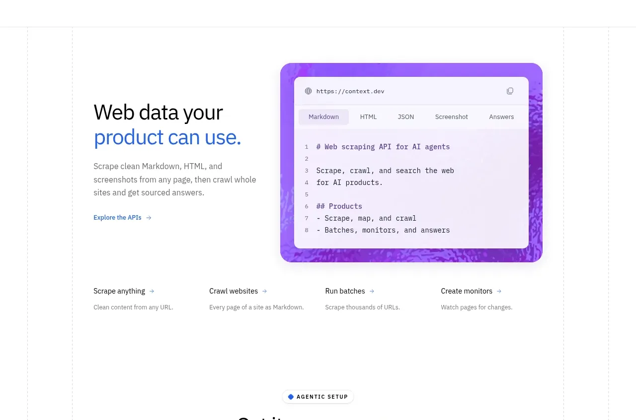 Product capabilities overview
Scrape Anything by Context.dev · Feature grid
Product capabilities overview
Scrape Anything by Context.dev · Feature grid
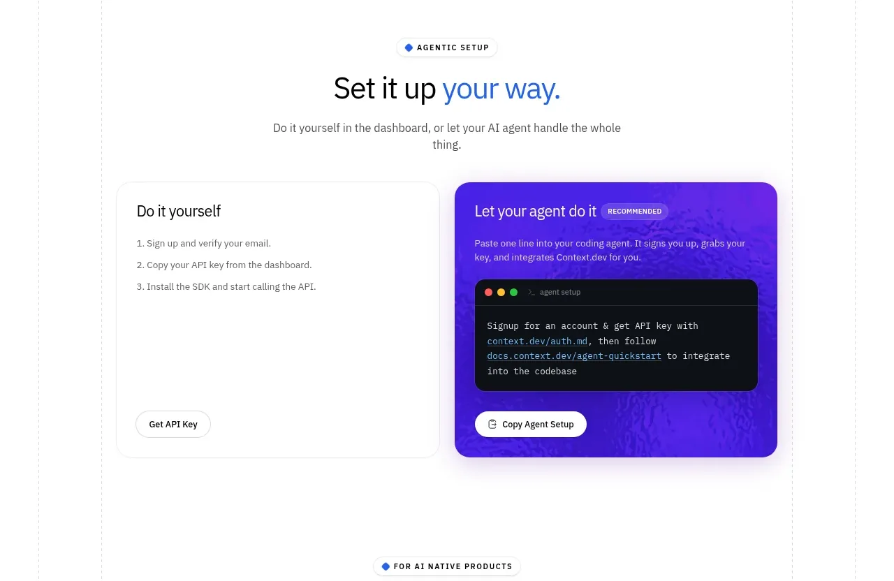 Self-serve versus assisted setup
Scrape Anything by Context.dev · Tabs & steps
Self-serve versus assisted setup
Scrape Anything by Context.dev · Tabs & steps
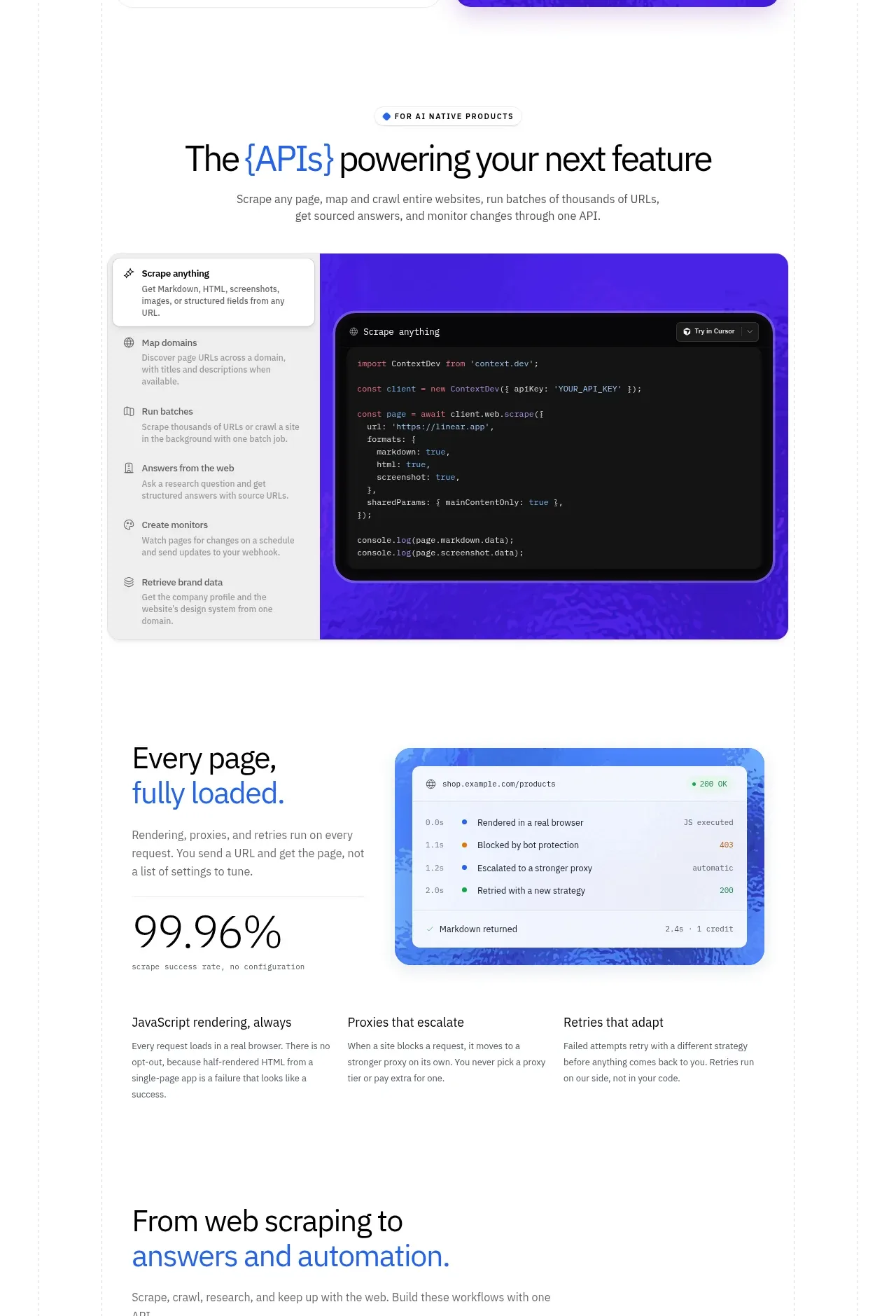 API surfaces and reliability
Scrape Anything by Context.dev · Feature grid
API surfaces and reliability
Scrape Anything by Context.dev · Feature grid
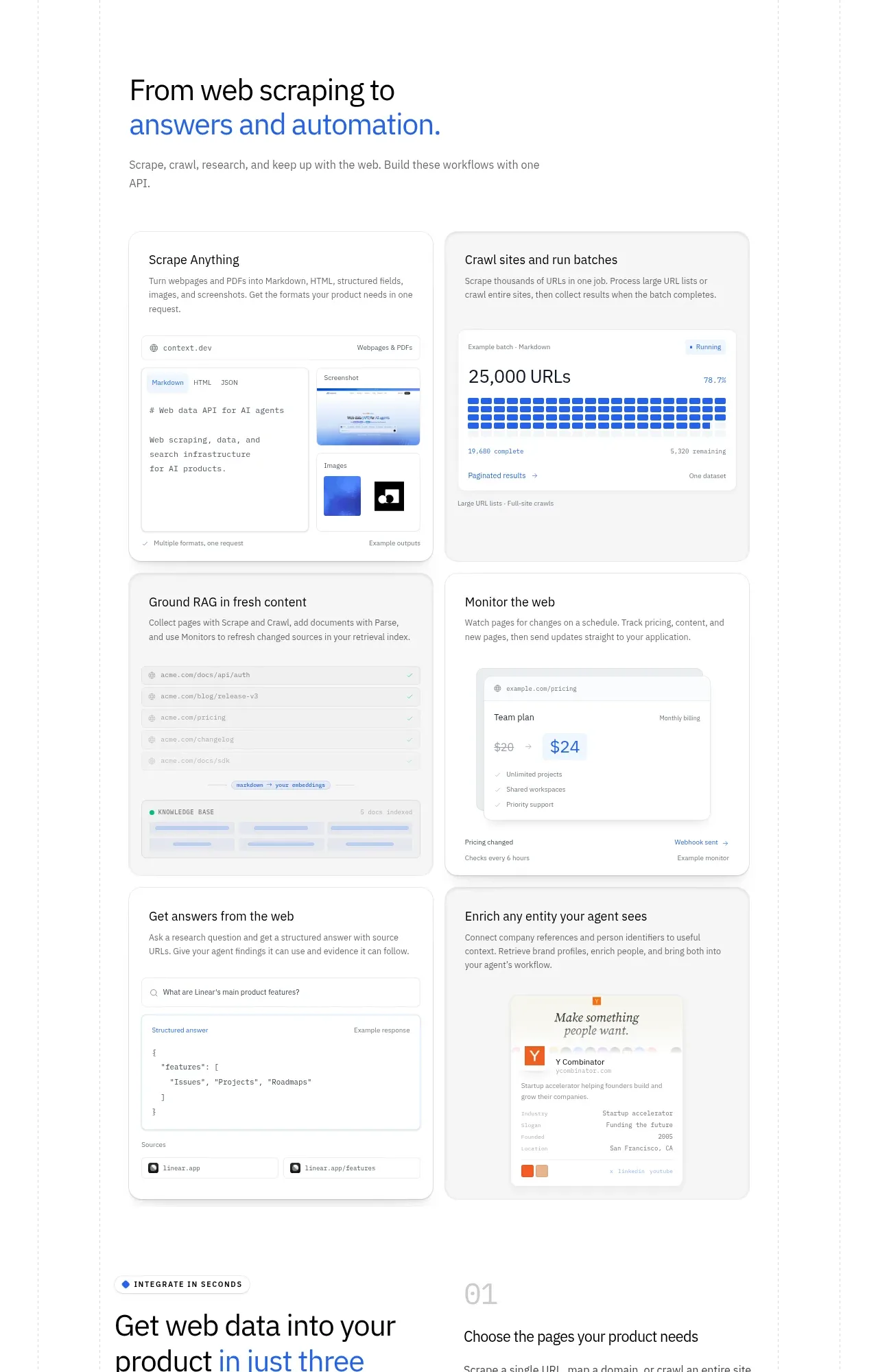 Use cases gallery
Scrape Anything by Context.dev · Feature grid
Use cases gallery
Scrape Anything by Context.dev · Feature grid
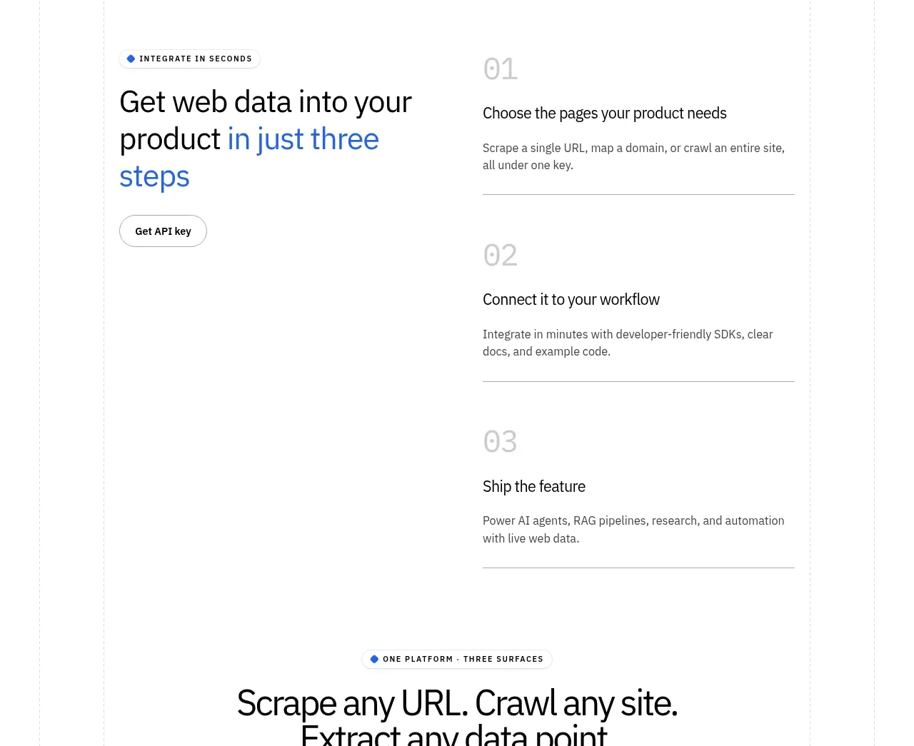 Three-step integration flow
Scrape Anything by Context.dev · Feature grid
Three-step integration flow
Scrape Anything by Context.dev · Feature grid
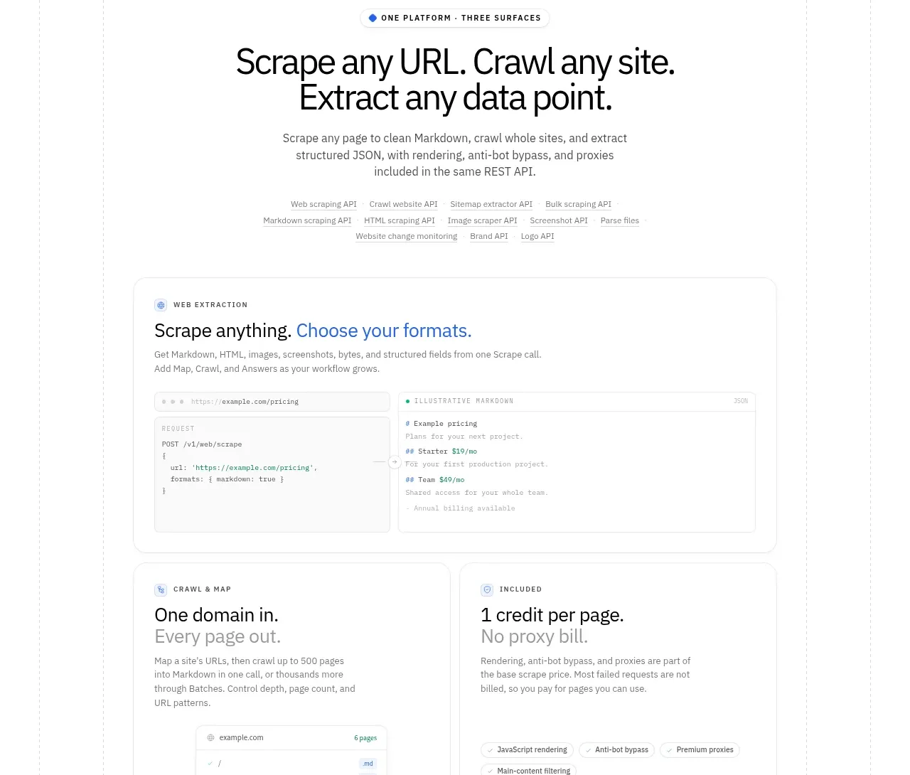 Platform surfaces overview
Scrape Anything by Context.dev · Feature grid
Platform surfaces overview
Scrape Anything by Context.dev · Feature grid
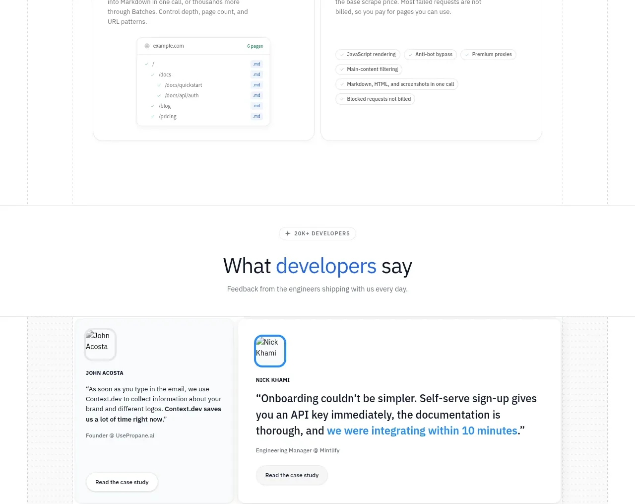 Developer testimonials
Scrape Anything by Context.dev · Testimonials
Developer testimonials
Scrape Anything by Context.dev · Testimonials
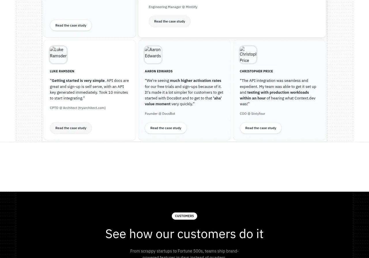 Customer stories carousel
Scrape Anything by Context.dev · Gallery
Customer stories carousel
Scrape Anything by Context.dev · Gallery
 Blog article cards
Scrape Anything by Context.dev · Gallery
Blog article cards
Scrape Anything by Context.dev · Gallery