kage
kage
sendinvo.com
Design analysis
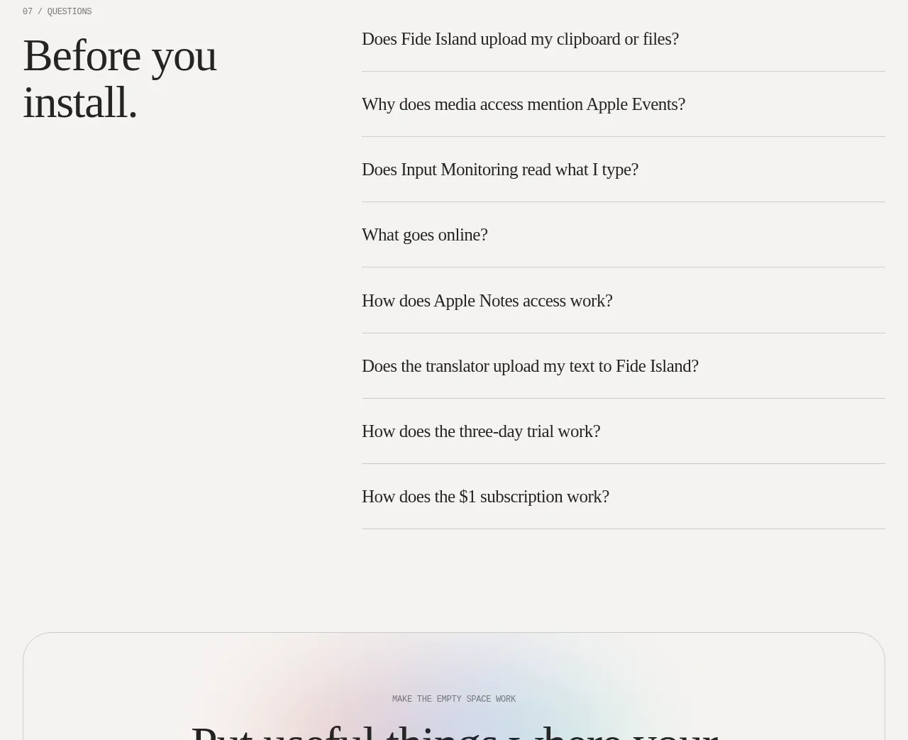
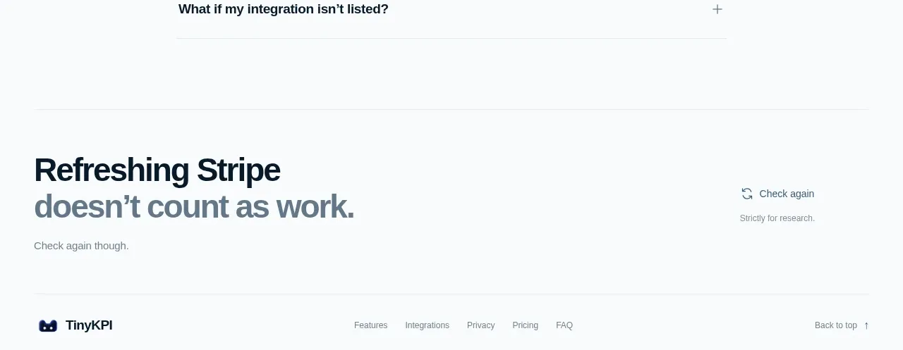
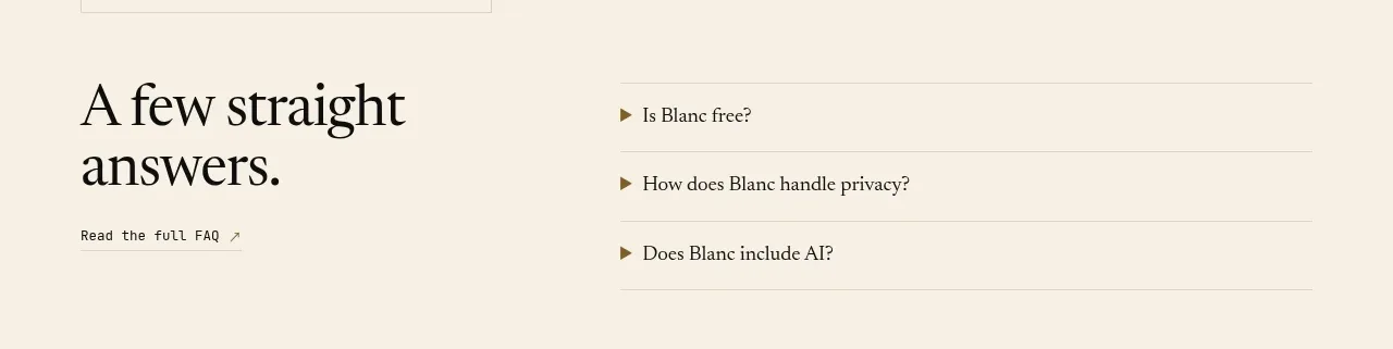
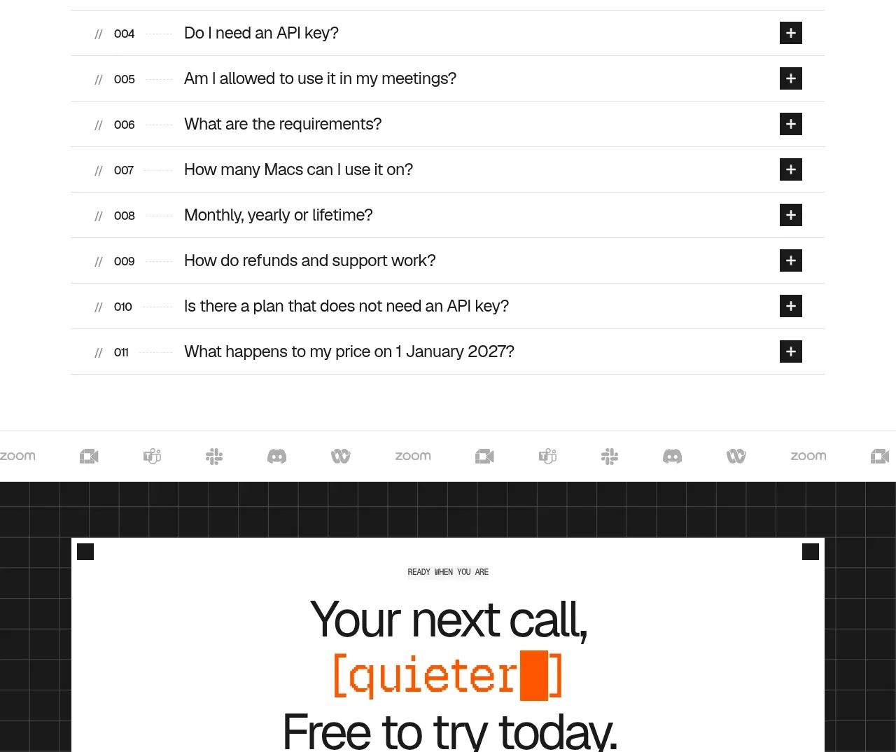
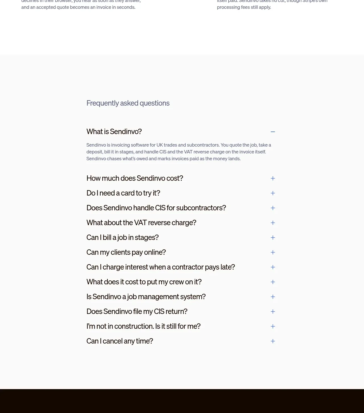
The FAQ is intentionally narrow and highly readable, with one expanded answer and a long sequence of compact collapsed questions. Plus/minus affordances make the interaction obvious without visual noise.
Prompt preview
## Reference images

Study these alongside the description below: hierarchy, rhythm, spacing, colour. Build for the product you are asked about, using this design language.

- Component: https://kage-design-assets.t3.tigrisfiles.io/components/sendinvo-com/4a31d5e4-cfef-4553-9e1a-9dbc27d89a1a-1789890399-4.webp
- Full page it was cut from: https://kage-design-assets.t3.tigrisfiles.io/screenshots/sendinvo-com/4a31d5e4-cfef-4553-9e1a-9dbc27d89a1a-1789890376670-full.webp
- Component on Kage: https://kage.design/component/sendinvo-faq

## Before you start
Ask what questions customers repeatedly ask about the user's product, pricing, security, onboarding, and limitations. Ask for the brand's type scale and accent colour, then apply the structure with original answers.

Build a FAQ section on a very light neutral background (`#FAFAFA` or `#FFFFFF`) with a constrained reading width around 470–560px, centered or offset consistently within the page grid. Start with a small section heading and then an accordion list. Use 18–20px question text in near-black `#171717`, compact vertical rows with 18–24px padding, and a thin or nearly invisible divider. Place a plus icon for collapsed rows and a minus icon for the open row, aligned to a consistent right-side column; use a restrained blue around `#547BC9` for the affordance. Show one useful expanded answer in 14–16px muted text with comfortable line height. Animate height and icon rotation subtly, support keyboard focus, and ensure all rows are accessible buttons with ARIA-expanded state. Use generous section padding above and below.

### Never
- Never reuse the reference questions, answers, product name, logo, or imagery.
- Never hide important information behind an accordion without clear labels.
- Never use ambiguous icons, tiny tap targets, or excessive borders.