kage
kage
Design analysis
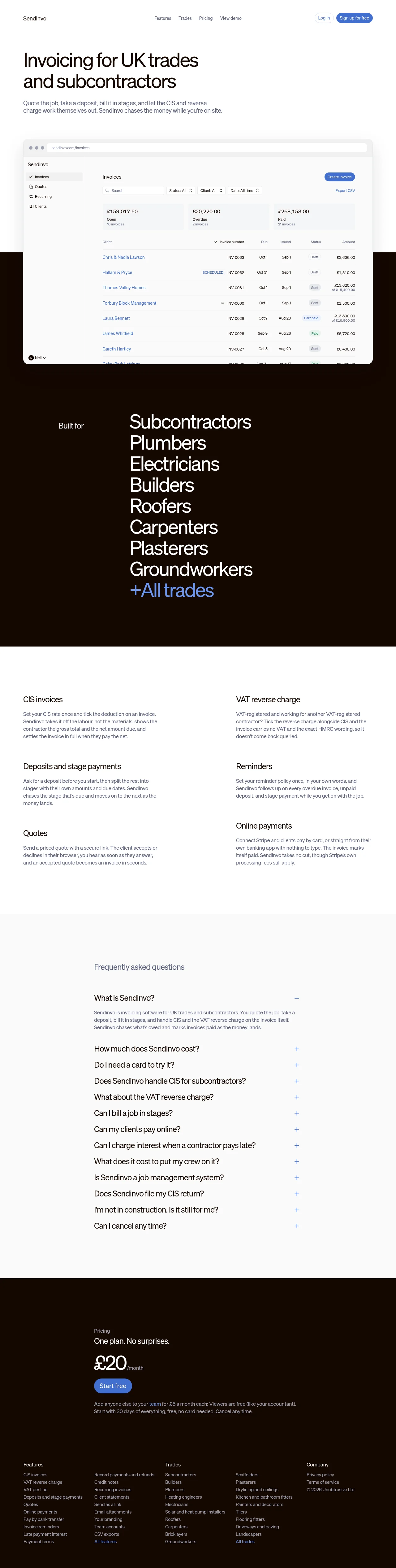
Sendinvo's one-pager works on alternation: two near-black espresso bands (the trades wall and the pricing/footer block) punch through an otherwise white page, and the dashboard mockup deliberately straddles the first white-to-dark seam so the product shot reads as a physical object. A single royal blue carries every button and link, while hierarchy comes from extreme type-scale swings — a two-line grotesque hero, a full-width wall of trade names at near-identical size, then quiet 20px feature headings and 15px gray body copy in a two-column grid. Chrome stays minimal throughout: hairline dividers instead of boxes, pill CTAs, small-radius cards and status chips, tabular numerals in the product UI, no photography or illustration anywhere — the FAQ runs as a thin-ruled accordion and the footer stays dense on the dark ground.
Prompt preview
## Reference images

Study these alongside the description below: hierarchy, rhythm, spacing, colour. Build for the product you are asked about, using this design language.

- Full page: https://kage-design-assets.t3.tigrisfiles.io/screenshots/sendinvo-com/4a31d5e4-cfef-4553-9e1a-9dbc27d89a1a-1789890376670-full.webp
- Above the fold: https://kage-design-assets.t3.tigrisfiles.io/screenshots/sendinvo-com/4a31d5e4-cfef-4553-9e1a-9dbc27d89a1a-1789890372410.webp
- Design on Kage: https://kage.design/designs/sendinvo-landing-page

## Before you start
Ask the user what they are building, who it is for, and what brand assets they already have (name, logo, colours, typefaces). Wait for the answers before writing any code. Apply everything below to *their* product — this is a design language to reuse, not a page to clone.

## Page structure
1. **Top bar** — light background, wordmark left; four plain text links centred; right side a quiet text "Log in" plus one solid blue pill CTA. ~64px tall, no border, no dropdowns.
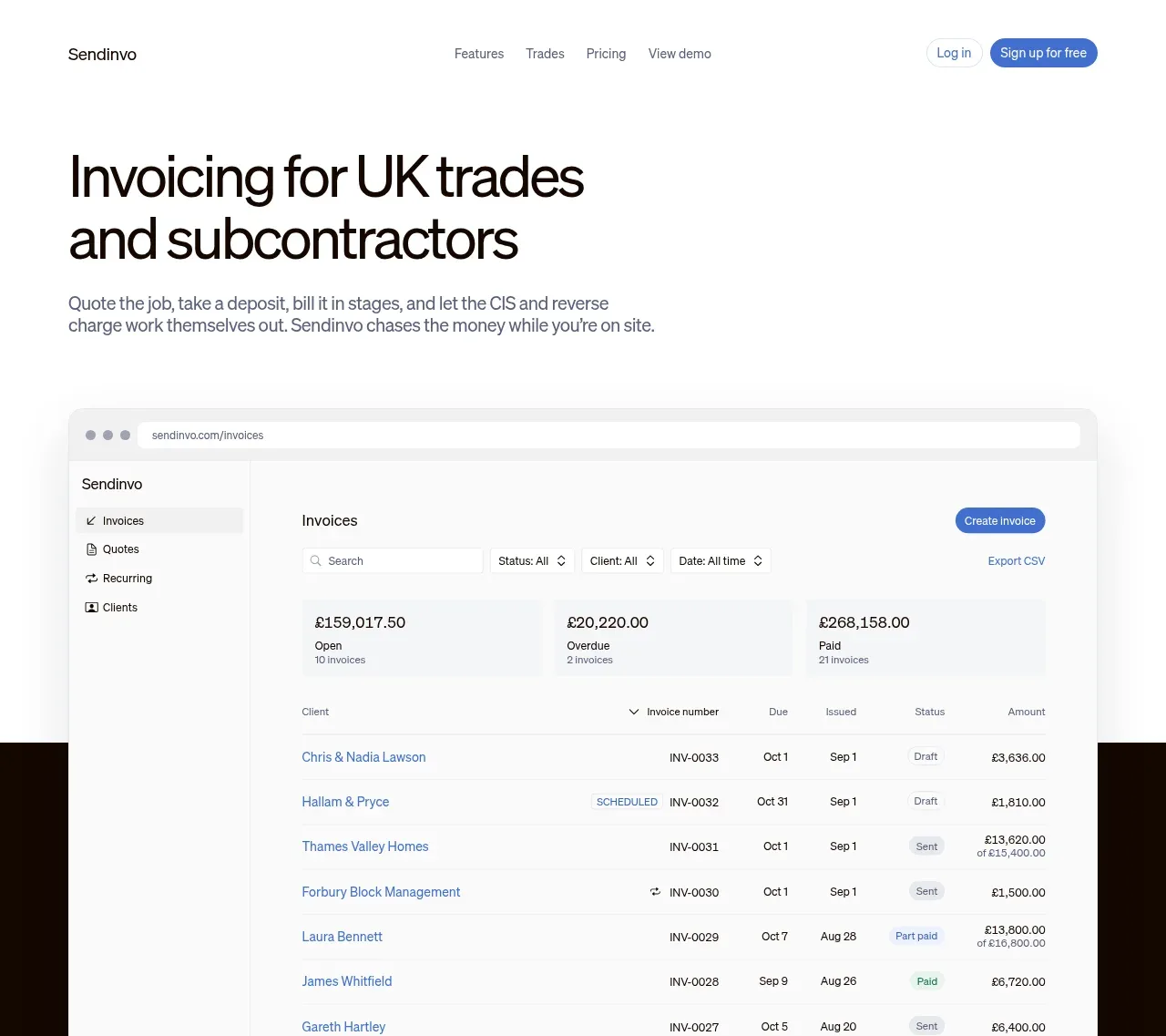
2. **Hero** — left-aligned two-line display headline (~64–76px, tight leading, near-black ink), followed immediately by a single short gray paragraph (~50ch) that names the user's workflow in plain language. No hero CTA, no imagery — the header already holds the button.
3. **Product screenshot** — a browser-frame mockup (traffic-light dots, URL bar) containing the real app: left sidebar with nav + user chip, toolbar with primary button / search / three filter dropdowns / secondary action, three money-summary cards, then a dense table (7–8 rows) with a status chip per row and right-aligned tabular amounts. Critically, the mockup **straddles the seam** where the white page becomes the dark band, slightly cropped at its bottom edge.
4. **Dark band — audience wall** — full-bleed near-black section. Asymmetric split: a small muted eyebrow ("Built for"-style) far left, and a huge stacked list of audience/job types right — 8+ lines of display-size white type, tight leading, no bullets, ending in one line in the accent blue ("+All trades"-style).
5. **Feature grid** — back on white. A 3-row × 2-column grid, generous gutters, no icons and no card boxes: each cell is a ~20px semibold heading plus a 2–4 line gray paragraph. Whitespace is the only divider; vertical padding is large (~100–120px).
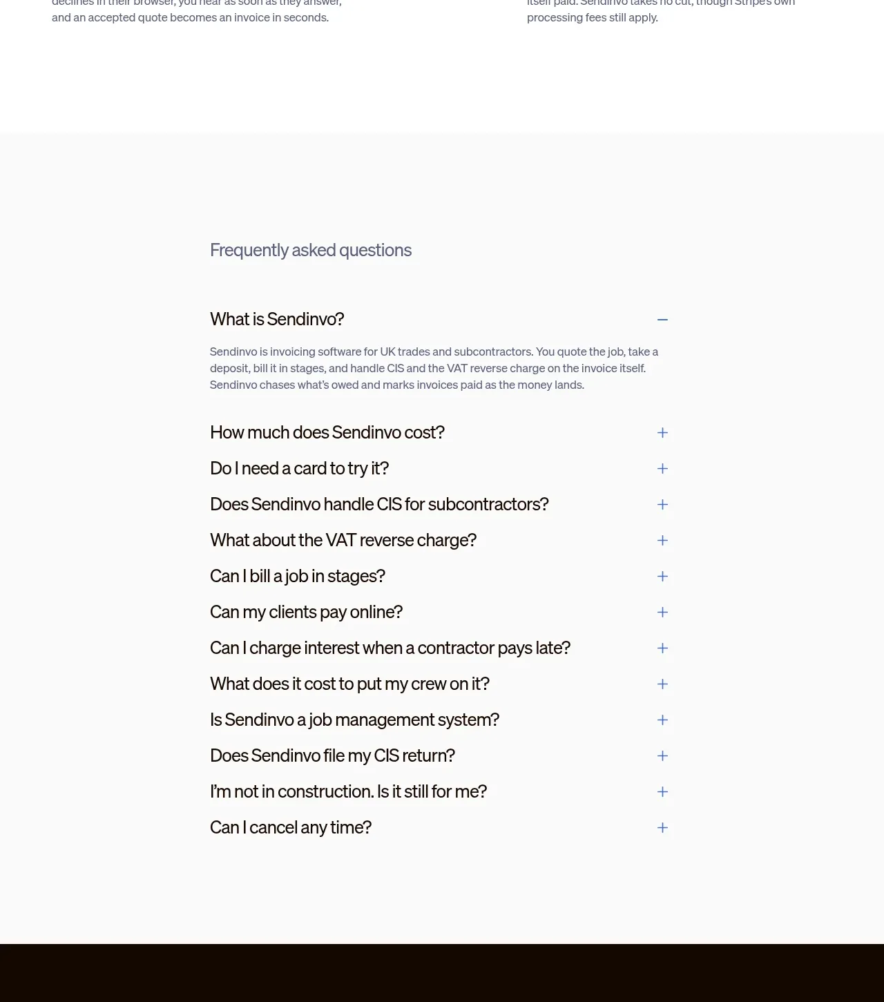
6. **FAQ** — a light-gray band (#f3f1ee-ish). Heading in muted slate, then an accordion indented toward the centre-left (~60% width): 10–14 questions, first one open by default, thin hairline rules between rows, a +/− toggle at the right edge.
7. **Pricing** — dark band resumes, running uninterrupted into the footer. Left-aligned stack: tiny eyebrow ("Pricing"), one-line claim ("One plan. No surprises."-style), an enormous price with a small unit suffix, one blue pill CTA, then two lines of fine print with one inline accent link. No columns, no pricing cards.
8. **Footer** — same dark ground. Small 13px link columns (features split across two, audience/trades split across two, a company column with legal + copyright), muted gray links with a couple of accent-blue "All …" links.

## Design language
- **Palette (approx.)**: warm white page `#faf9f7`; ink `#17140f`; warm espresso dark band `#1b110a` (not pure black — slightly brown); one royal blue accent `#3b5bf0` reserved strictly for CTAs, links and one highlight line per dark band; secondary text `#75706a`; hairlines `#e8e5e0` on light, `rgba(255,255,255,.14)` on dark. No second accent, no gradients.
- **Type**: one neutral grotesque family for everything; hierarchy is made purely by scale and colour. Display ≈ clamp(44px, 6vw, 76px) at weight 500–600 with letter-spacing −0.02em; feature/section headings 20px semibold; body 15–16px, line-height 1.6, capped near 60ch. Numbers in any product UI use tabular figures.
- **Rhythm**: alternate full-bleed bands — white → dark → white → light-gray → dark — so each dark section reads as an event. Dark bands express themselves with *giant type as the only visual*; light bands go quiet and dense with small type in asymmetric grids. Contrast down the page: huge → quiet grid → interactive list → huge again.
- **The seam trick**: let the browser-frame screenshot overlap the boundary between the white hero and the dark band, bottom-cropped, with ~12px radius, a thin light border and a barely-there shadow. It makes the product feel like an object placed on the page rather than an image in a column.
- **Components**: primary buttons are fully-rounded pills (solid accent blue, white label, 36–40px tall); every other corner radius is small (6–10px) — cards, search fields, status chips. Prefer hairline rules over boxed cards; status chips are tiny gray pills with 11px labels (e.g. sent/paid states in a table).
- **Tables**: dense but breathable — 13–14px text, generous row height, left-aligned names, right-aligned tabular amounts, one accent-coloured link per row's primary entity.
- **Accordion**: 17–18px questions, muted answers, 1px dividers only, smooth height transition, first item open.
- **Motion**: restrained — 150–200ms opacity/colour transitions on links and buttons, a gentle accordion expand. No parallax, no illustration animation, no hover lifts.
- **No imagery**: the page carries zero photography, illustration or icon sets; all texture comes from type scale, the UI screenshot, and band colour. Keep it that way unless the user's brand demands otherwise.

## Never
- Never reuse the Sendinvo name, wordmark, logo, dashboard copy, invoice rows, client names or FAQ text in the user's build.
- Never present the result as Sendinvo or include its URL/chrome text.
- Never import its icon set, illustrations or photography (it has none — do not fill the gap with stock images).
- Never turn the pricing section into multi-column comparison cards — this language is one-plan, one-CTA.
- Never add a second accent colour or gradient to "improve" the palette.
Components from this page
All components
 Minimal product navigation
sendinvo.com · Navigation
Minimal product navigation
sendinvo.com · Navigation
 Invoicing product hero with dashboard visual
sendinvo.com · Hero
Invoicing product hero with dashboard visual
sendinvo.com · Hero
 Audience and trade types
sendinvo.com · Feature grid
Audience and trade types
sendinvo.com · Feature grid
 Core invoicing capabilities
sendinvo.com · Feature grid
Core invoicing capabilities
sendinvo.com · Feature grid
 Frequently asked questions
sendinvo.com · FAQ
Frequently asked questions
sendinvo.com · FAQ
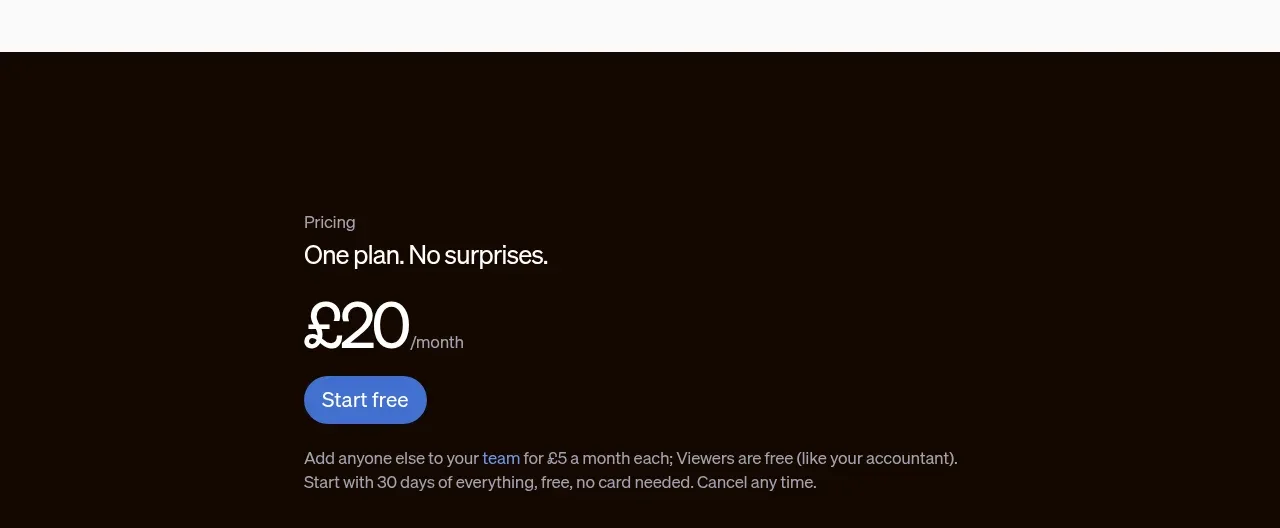 Single-plan pricing offer
sendinvo.com · Pricing table
Single-plan pricing offer
sendinvo.com · Pricing table
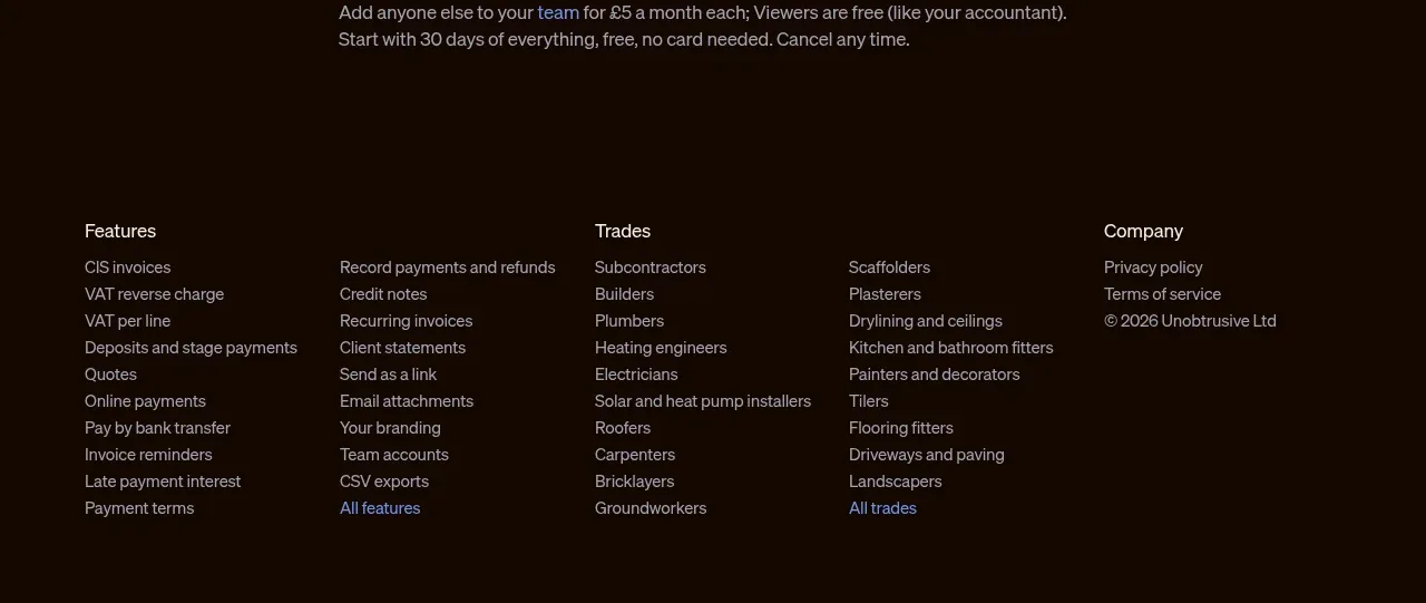 Dark multi-column footer
sendinvo.com · Footer
Dark multi-column footer
sendinvo.com · Footer