kage
kage
sendinvo.com
Design analysis
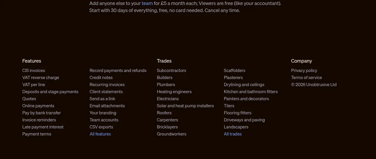
The footer continues the dark visual system and organizes a large link set into clear topic columns. Muted typography and generous spacing keep the dense information from feeling overwhelming.
Prompt preview
## Reference images

Study these alongside the description below: hierarchy, rhythm, spacing, colour. Build for the product you are asked about, using this design language.

- Component: https://kage-design-assets.t3.tigrisfiles.io/components/sendinvo-com/4a31d5e4-cfef-4553-9e1a-9dbc27d89a1a-1789890400-6.webp
- Full page it was cut from: https://kage-design-assets.t3.tigrisfiles.io/screenshots/sendinvo-com/4a31d5e4-cfef-4553-9e1a-9dbc27d89a1a-1789890376670-full.webp
- Component on Kage: https://kage.design/component/sendinvo-footer

## Before you start
Ask what legal, support, product, company, and audience-specific links the user's product needs, plus its brand colours and preferred footer tone. Use original labels and structure.

Build a dark multi-column footer using the same deep background as the pricing area, approximately `#160A03`. Inside a centered max-width container, arrange four or five link groups with clear small headings in warm white and compact links in muted beige-grey `#AAA19A`. Use 13–15px text, 8–12px vertical spacing between links, and 32–48px gaps between columns. Include a subtle lower row for copyright, legal links, or a small brand mark, but keep it quiet. Use blue around `#6B91E8` only for meaningful current or “view all” links. Preserve generous top padding and enough bottom padding for the footer to feel finished; stack columns into a two-column or one-column layout on mobile. Add visible hover and keyboard focus states and ensure contrast meets accessibility requirements.

### Never
- Never use the reference's company name, product name, logo, exact link labels, or imagery.
- Never create a wall of tiny unreadable links.
- Never let decorative footer elements compete with navigation and legal content.