kage
kage
agentshrine.com

Design analysis
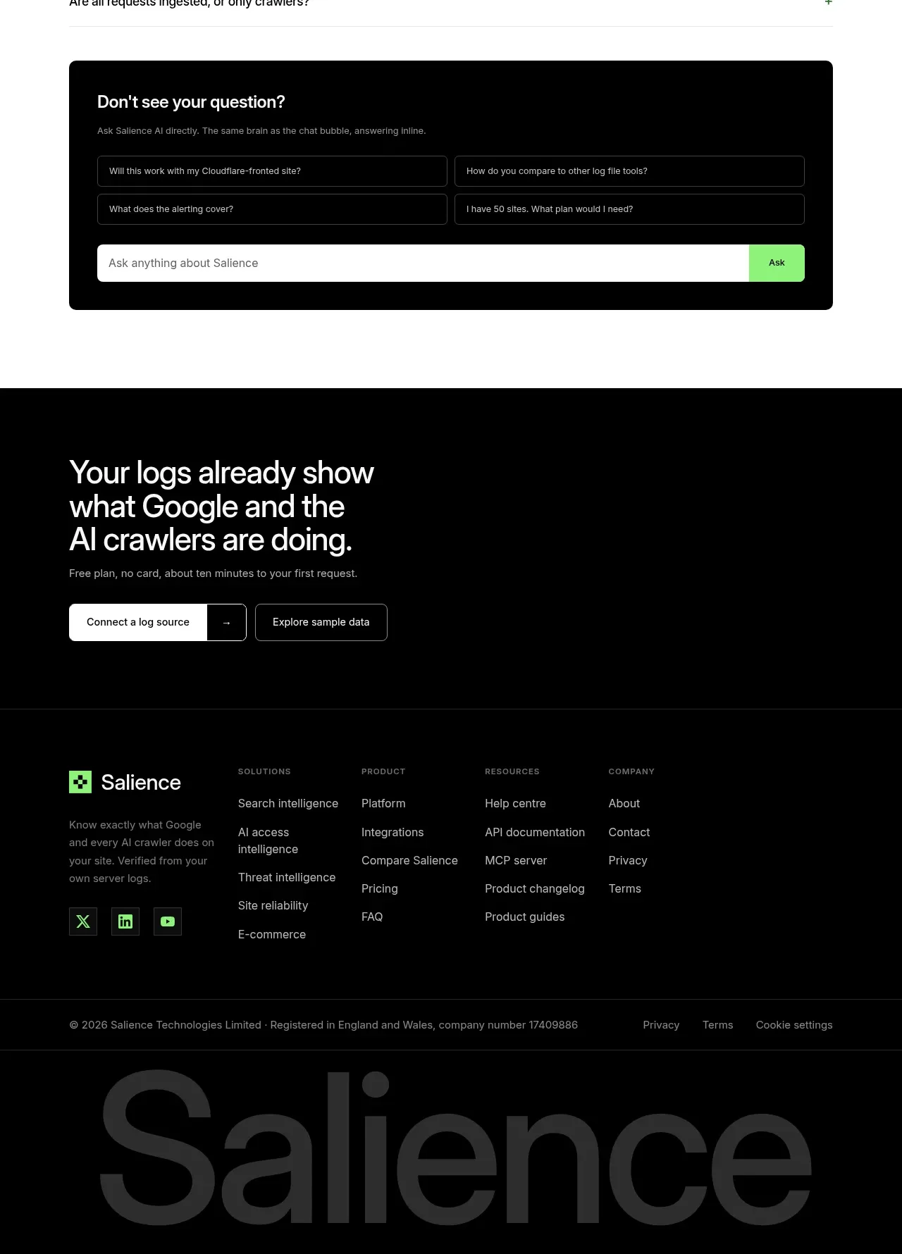
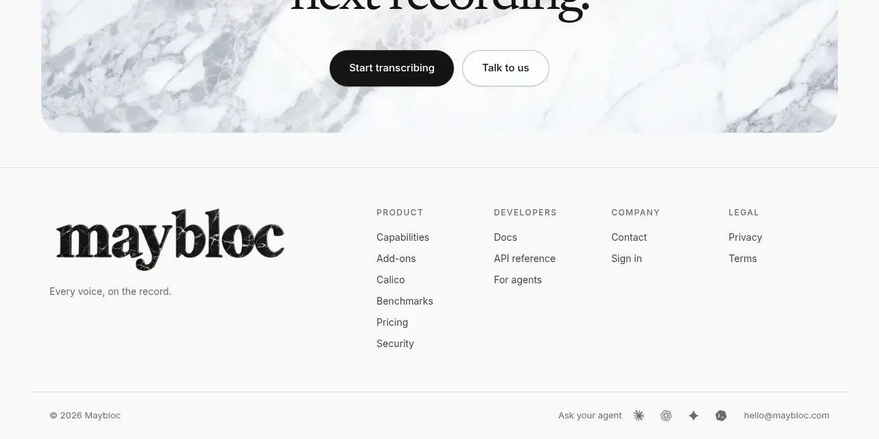
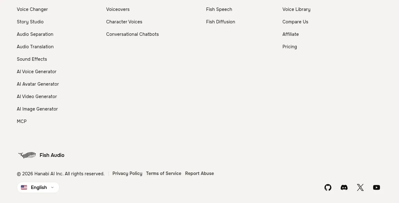
The page closes with a thin divider and a very quiet centered credit line. Its low contrast and compact height keep attention on the product while still providing attribution or a secondary link.
Prompt preview
## Reference images

Study these alongside the description below: hierarchy, rhythm, spacing, colour. Build for the product you are asked about, using this design language.

- Component: https://kage-design-assets.t3.tigrisfiles.io/components/shrine/ff477ea2-1694-4783-bdc4-4322fec31da4-1792130653-8.webp
- Full page it was cut from: https://kage-design-assets.t3.tigrisfiles.io/screenshots/shrine/ff477ea2-1694-4783-bdc4-4322fec31da4-1792130580085-full.webp
- Component on Kage: https://kage.design/component/shrine-footer

## Before you start
Ask what legal, creator, support, and secondary links the user's product needs, and ask which brand colors should carry into the footer. Then make an original footer.

- Keep the footer compact and visually quiet, with a thin top border and a centered or neatly split content row.
- Use small readable text, muted gray contrast, and generous enough padding for touch targets even when the footer is short.
- Include only necessary attribution, copyright, support, social, or secondary links; do not compete with the page's primary CTA.
- Use the same type scale and neutral colors as the rest of the design, with the brand accent reserved for links and hover states.
- Ensure links have visible focus and hover treatments and that the layout wraps cleanly on mobile.

Never: use the reference's logo, product name, copy, illustrations, imagery, or exact visual assets.