 kage
kage
simhadigital.com
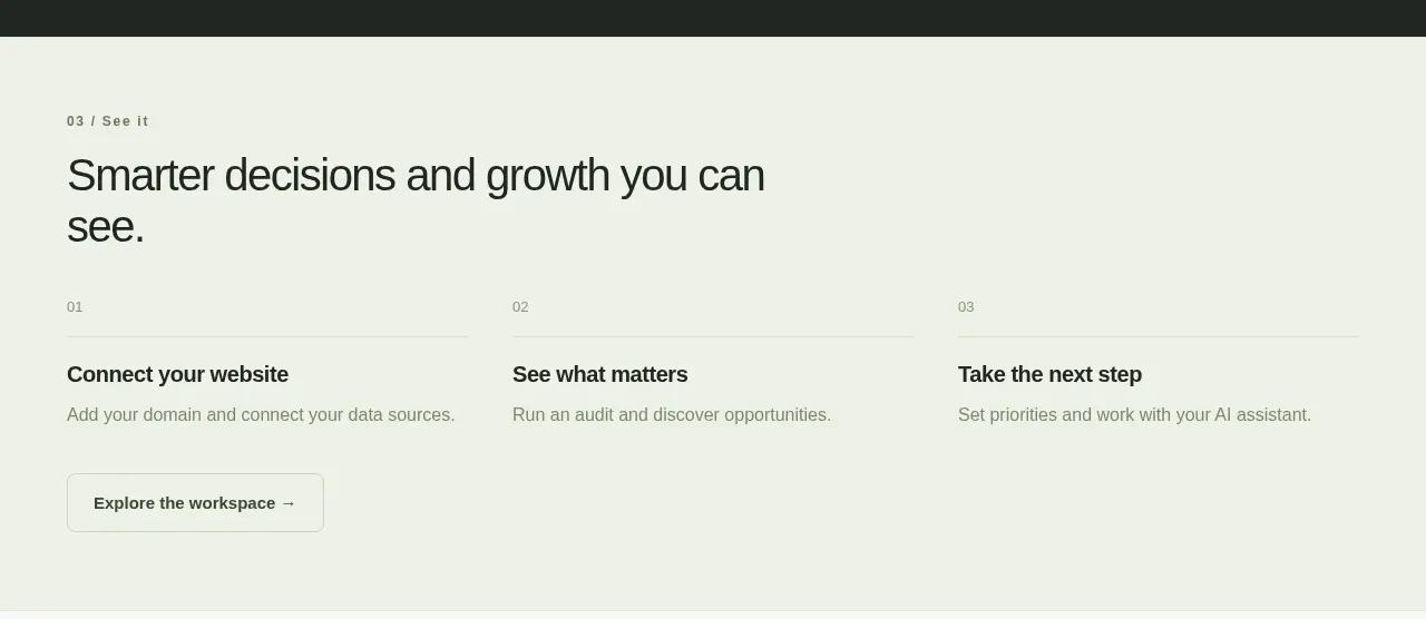
Design analysis
A light section converts the preceding promise into a simple three-step progression, ending with one outlined action and ample breathing room.
Prompt preview
## Reference images

Study these alongside the description below: hierarchy, rhythm, spacing, colour. Build for the product you are asked about, using this design language.

- Component: https://kage-design-assets.t3.tigrisfiles.io/components/simha-digital/94ffd0b7-28d3-4d9a-b697-c16514e9c8c4-1790057073-6.webp
- Full page it was cut from: https://kage-design-assets.t3.tigrisfiles.io/screenshots/simha-digital/94ffd0b7-28d3-4d9a-b697-c16514e9c8c4-1790056948469-full.webp
- Component on Kage: https://kage.design/component/simha-digital-cta

## Before you start
Ask what three steps a new user takes to reach value in the user's product and what the most useful next action is. Use that journey instead of copying the reference.

Build a light, editorial process section with a small numbered eyebrow, a concise heading, and three horizontally arranged steps. Each step has a tiny index, a divider line, a bold action title, and one sentence of explanation. Place a single understated outlined button below the first or overall sequence. Use #EFF3E8 or a similar pale sage background, #202522 text, #7A8179 body copy, and #D5DCCF dividers. Headings should be 30–34px, step titles 14px, and descriptions 12–13px. Keep the layout airy with 28–40px gaps; on mobile, stack steps vertically while retaining the numbering and dividers. Button radius 7px with a subtle hover fill.

Never use the reference's logo, product name, copy, illustrations, or imagery.
More components
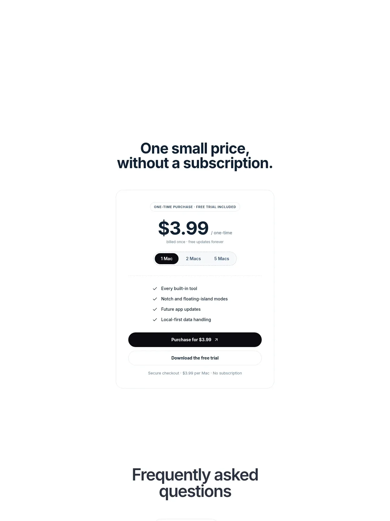
 Visual closing product statement
NotchPop · Call to action
Visual closing product statement
NotchPop · Call to action
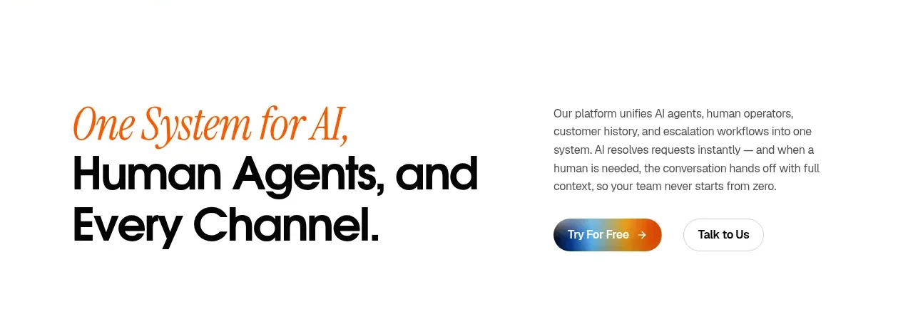
 System positioning statement
IntellAgents.io · Call to action
System positioning statement
IntellAgents.io · Call to action
 Final conversion banner
IntellAgents.io · Call to action
Final conversion banner
IntellAgents.io · Call to action
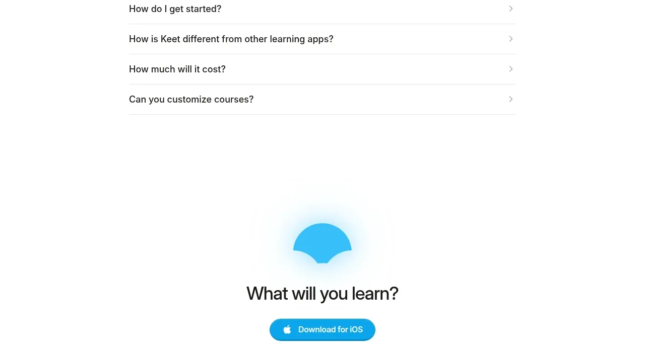
 Final app-download call to action
Keet · Call to action
Final app-download call to action
Keet · Call to action
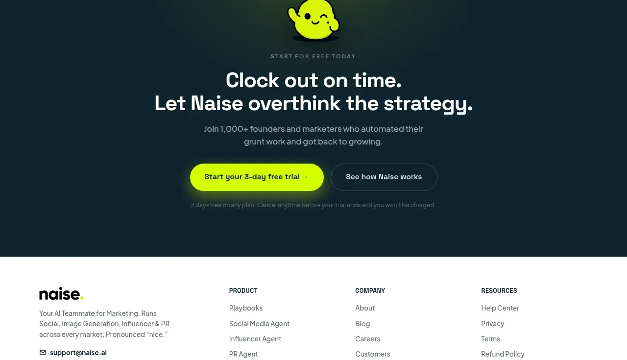
 Dark conversion call to action
Naise AI · Call to action
Dark conversion call to action
Naise AI · Call to action
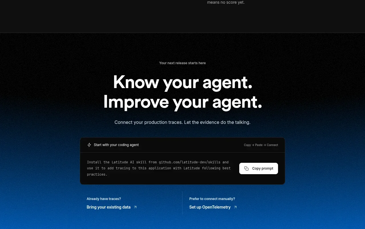
 Connect data and start improving
AgentScore · Call to action
Connect data and start improving
AgentScore · Call to action