 kage
kage
simhadigital.com

Design analysis
A pale green rounded banner delivers a final direct invitation with reassurance, CTA, and a playful abstract green burst that balances the text.
Prompt preview
## Reference images

Study these alongside the description below: hierarchy, rhythm, spacing, colour. Build for the product you are asked about, using this design language.

- Component: https://kage-design-assets.t3.tigrisfiles.io/components/simha-digital/94ffd0b7-28d3-4d9a-b697-c16514e9c8c4-1790057074-8.webp
- Full page it was cut from: https://kage-design-assets.t3.tigrisfiles.io/screenshots/simha-digital/94ffd0b7-28d3-4d9a-b697-c16514e9c8c4-1790056948469-full.webp
- Component on Kage: https://kage.design/component/simha-digital-cta-2

## Before you start
Ask what final conversion action the user's product wants, what reassurance removes hesitation, and what abstract visual language matches its brand. Then build this banner around those answers.

Create a wide rounded CTA banner inside the page container. Put a small uppercase eyebrow, strong two-line-or-less headline, reassurance sentence, and orange primary button on the left. Reserve the right side for a simple brand-neutral abstract shape or decorative graphic with low visual interference. Use a pale sage background around #EEF4E5, near-black #202522, muted #7A8179, orange #F46B43, and a soft green accent around #70B94A. Give the banner a 10–12px radius, subtle border #DDE6D5, 28–36px padding, and enough height for calm whitespace. Keep CTA hover/focus states clear. Stack text and decoration on mobile and hide or simplify the decoration if it harms readability.

Never use the reference's logo, product name, copy, illustrations, or imagery.
More components
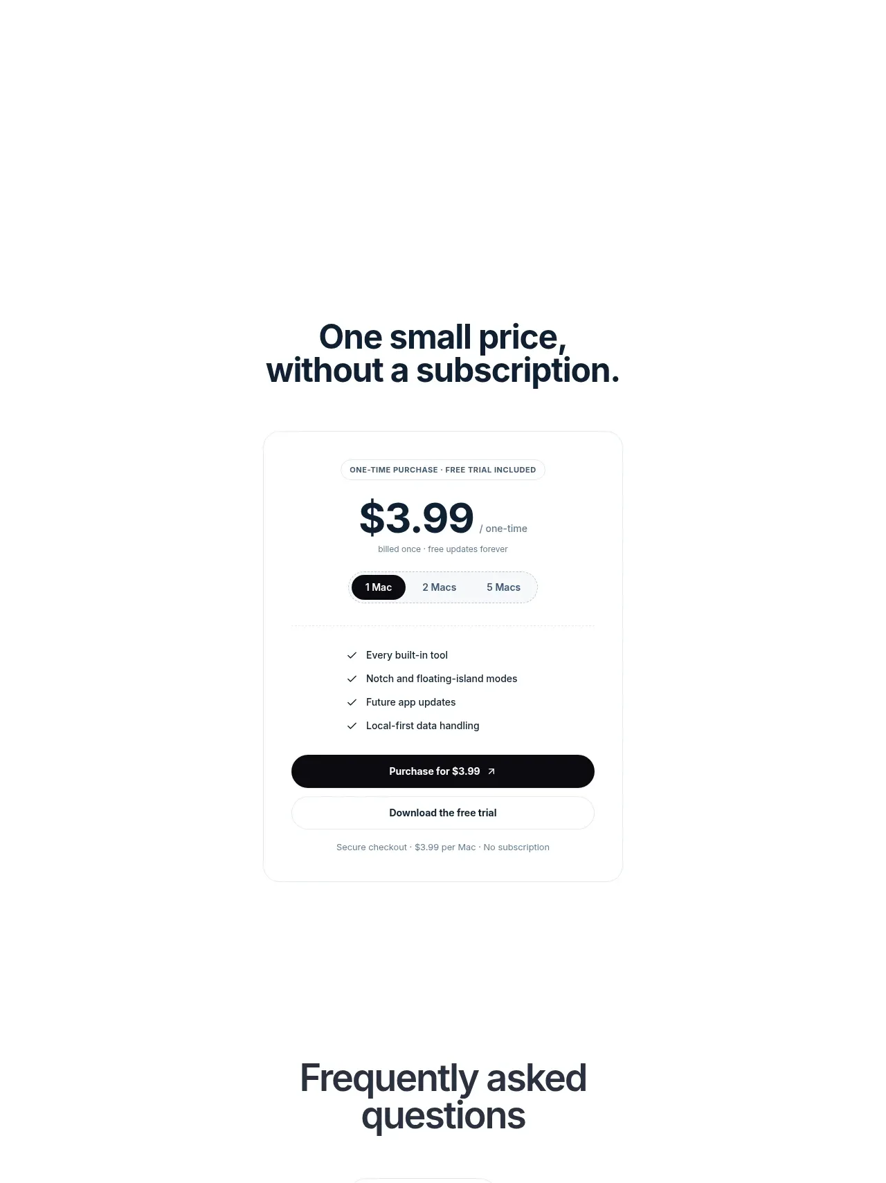
 Visual closing product statement
NotchPop · Call to action
Visual closing product statement
NotchPop · Call to action
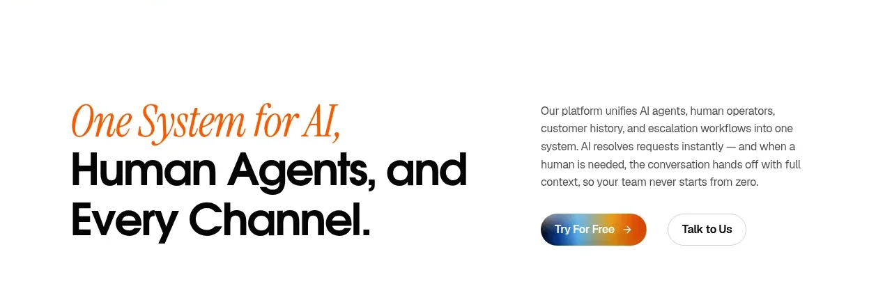
 System positioning statement
IntellAgents.io · Call to action
System positioning statement
IntellAgents.io · Call to action
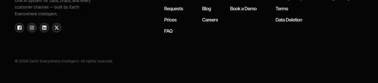 Final conversion banner
IntellAgents.io · Call to action
Final conversion banner
IntellAgents.io · Call to action
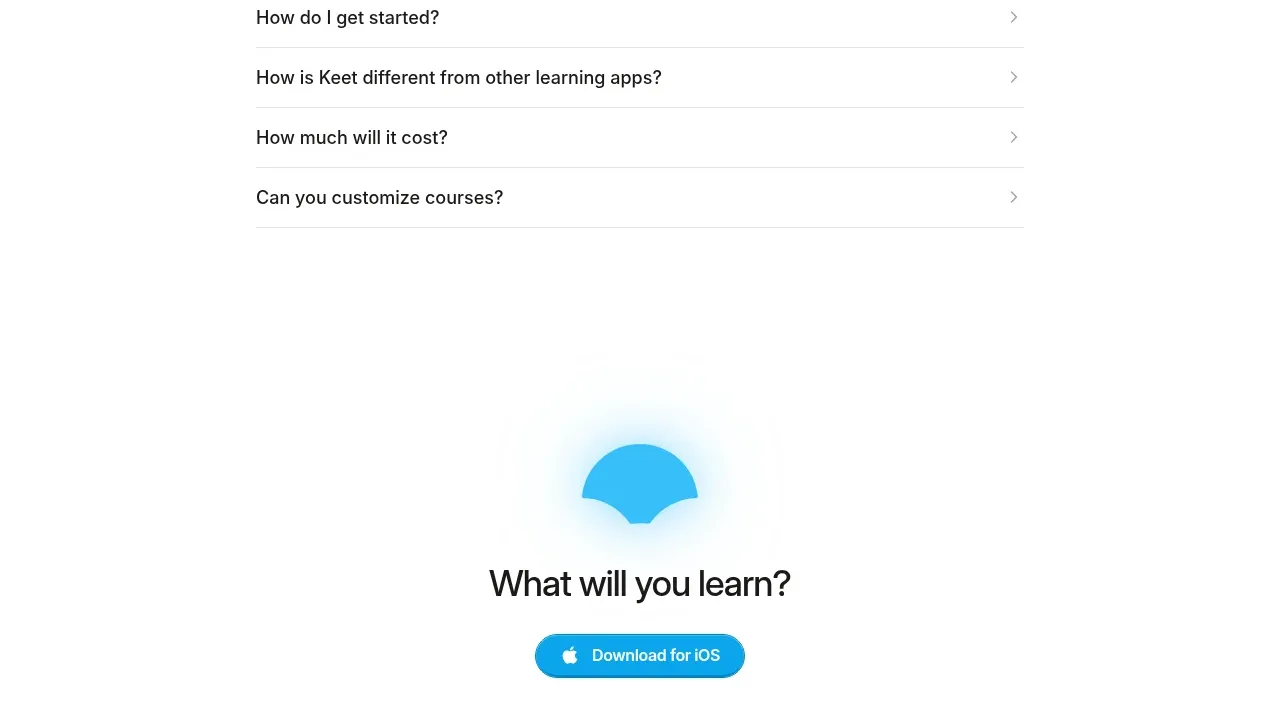
 Final app-download call to action
Keet · Call to action
Final app-download call to action
Keet · Call to action
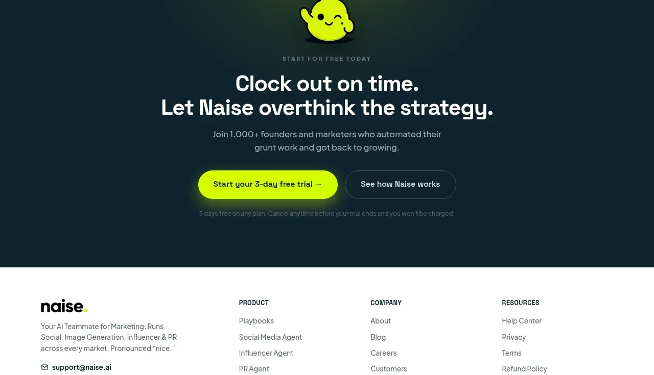
 Dark conversion call to action
Naise AI · Call to action
Dark conversion call to action
Naise AI · Call to action
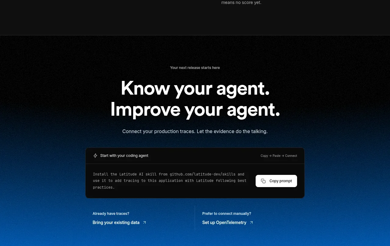
 Connect data and start improving
AgentScore · Call to action
Connect data and start improving
AgentScore · Call to action