kage
kage
simhadigital.com

Design analysis
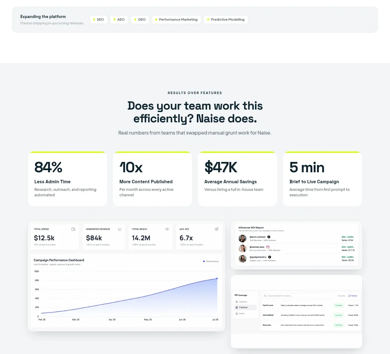
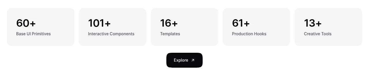
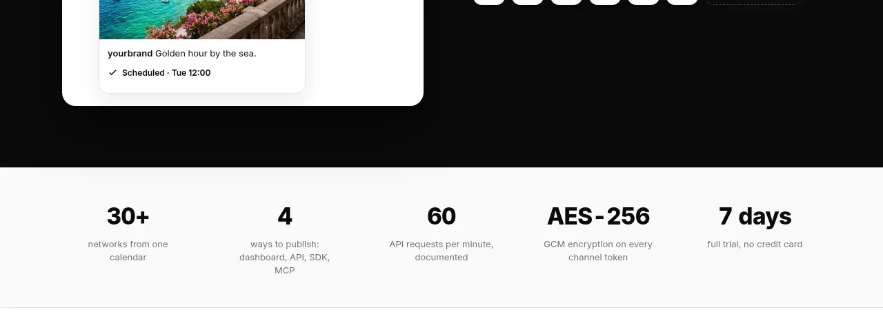
Four equal cards turn product breadth into quickly scannable proof points, with oversized values and short explanatory labels.
Prompt preview
## Reference images

Study these alongside the description below: hierarchy, rhythm, spacing, colour. Build for the product you are asked about, using this design language.

- Component: https://kage-design-assets.t3.tigrisfiles.io/components/simha-digital/94ffd0b7-28d3-4d9a-b697-c16514e9c8c4-1790057072-3.webp
- Full page it was cut from: https://kage-design-assets.t3.tigrisfiles.io/screenshots/simha-digital/94ffd0b7-28d3-4d9a-b697-c16514e9c8c4-1790056948469-full.webp
- Component on Kage: https://kage.design/component/simha-digital-stats

## Before you start
Ask what measurable proof points are credible for the user's product and whether the brand should feel analytical, friendly, or premium. Use those answers to populate this pattern.

Create a four-column metric strip inside a centered max-width container. Each card should have a large, dark value at the top and a compact muted descriptor underneath; keep the cards equal height and aligned. Use white cards on a warm-white section, 1px #E0E3DD borders, 7px corner radius, and a very soft shadow or none. Values should be 23–25px, labels 11–12px with 1.35 line-height. Maintain 14px internal padding and 14px gaps. Stack to two columns on tablet and one column on mobile.

Never use the reference's logo, product name, copy, illustrations, or imagery.