 kage
kage
temprl.org
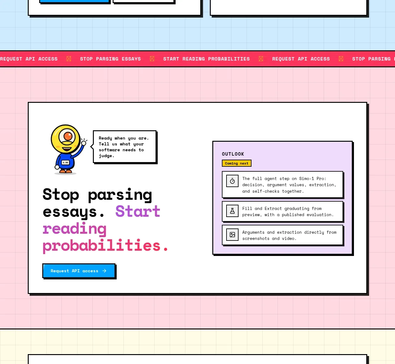
Design analysis
A pink-tinted conversion band uses an oversized imperative headline, a vivid contrasting phrase, a primary button, and a framed benefits panel. The split composition gives the CTA both emotion and concrete next steps.
Prompt preview
## Reference images

Study these alongside the description below: hierarchy, rhythm, spacing, colour. Build for the product you are asked about, using this design language.

- Component: https://kage-design-assets.t3.tigrisfiles.io/components/simo/01913313-62ce-4f89-a048-ac4500929f0e-1791525861-10.webp
- Full page it was cut from: https://kage-design-assets.t3.tigrisfiles.io/screenshots/simo/01913313-62ce-4f89-a048-ac4500929f0e-1791525747684-full.webp
- Component on Kage: https://kage.design/component/simo-cta

### Before you start
Ask the user what conversion action matters, what promise can be made honestly, and what benefits reduce hesitation. Then create an original CTA.

Build a full-width pink or blush grid section with a large off-white framed panel centered inside it. Use a two-column layout: the left side has an oversized action-oriented headline with one accent-colored phrase, a short supporting line, and a bright primary button; the right side has a compact benefits or onboarding panel with 3–4 rows, icons or simple line symbols, and short explanations. Use heavy dark borders, a hard shadow, slightly rounded corners, and a blue or yellow CTA button for contrast. Keep the CTA copy direct, make the action clear, and include reassuring microcopy such as setup expectations or access requirements. Stack the columns on mobile.

Never: copy the reference's logo, product name, copy, illustrations, imagery, or exact benefits.
More components
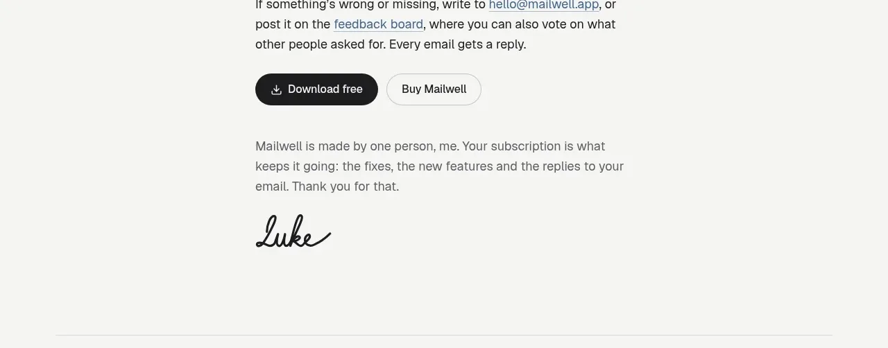
 Trial and purchase call to action
Mailwell · Call to action
Trial and purchase call to action
Mailwell · Call to action
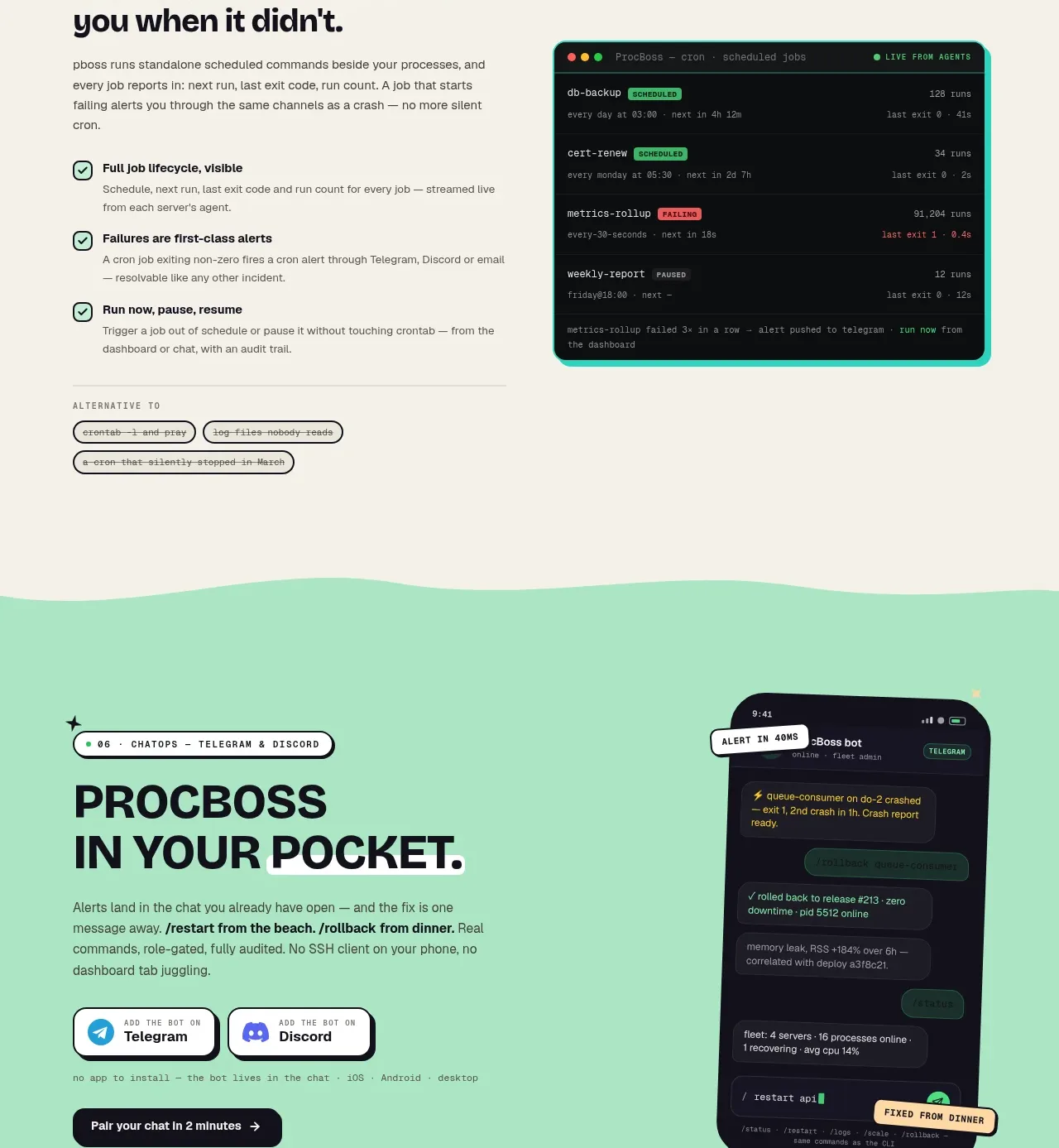
 Pocket alerts call to action
ProcBoss · Call to action
Pocket alerts call to action
ProcBoss · Call to action
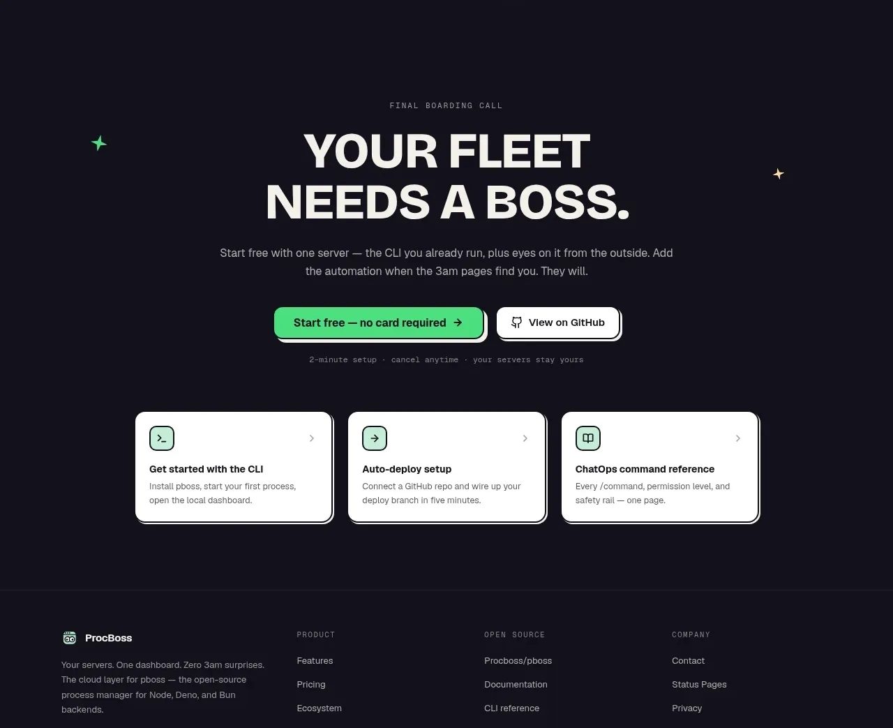 Dark final conversion band
ProcBoss · Call to action
Dark final conversion band
ProcBoss · Call to action
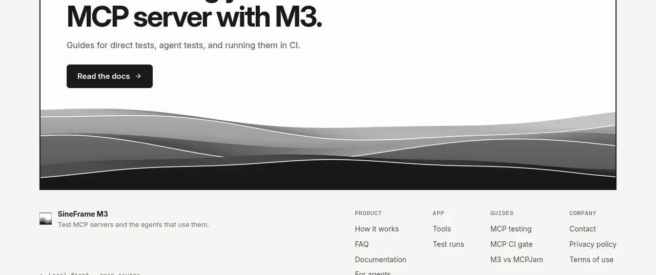
 Documentation call to action
SineFrame M3 · Call to action
Documentation call to action
SineFrame M3 · Call to action
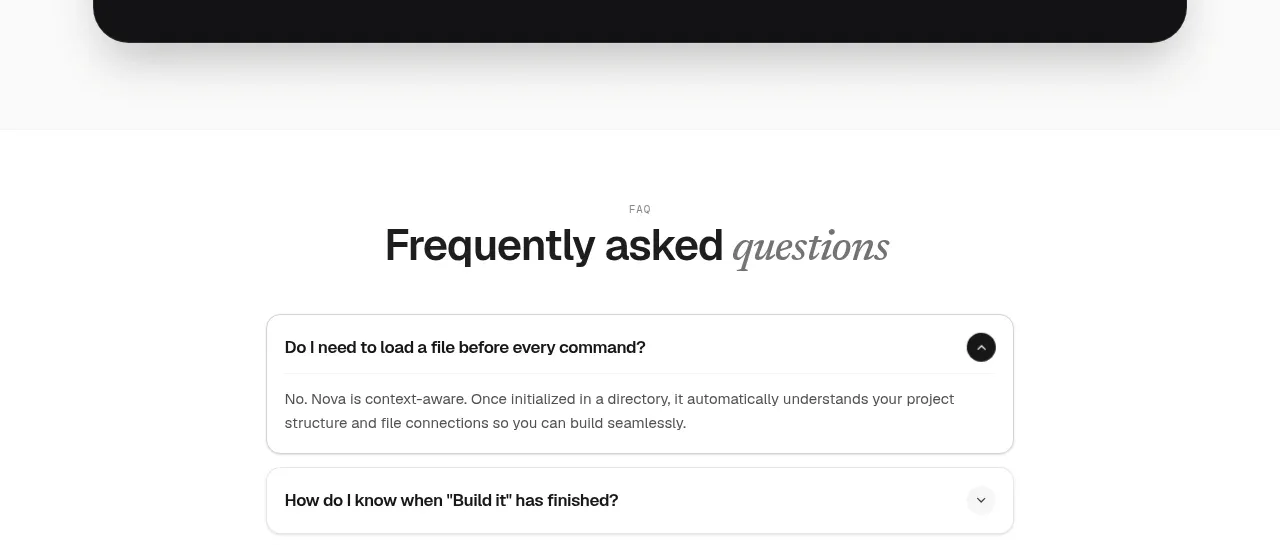
 Install command CTA
NOVA CLI v1.0 · Call to action
Install command CTA
NOVA CLI v1.0 · Call to action

 Manifesto statement
Hark · Call to action
Manifesto statement
Hark · Call to action