kage
kage
temprl.org

Design analysis
A long-form AI product landing page uses a dense editorial system: oversized condensed headlines, small monospace labels, hard black outlines, offset shadows, and hand-built interface diagrams. The blue hero establishes the visual code, then alternating cream, yellow, blue, and lilac grid sections progressively explain the product through benchmark cards, probability panels, workflow diagrams, use cases, company context, and a final conversion block; each section resets rhythm with a centered headline followed by increasingly technical evidence.
Prompt preview
## Reference images

Study these alongside the description below: hierarchy, rhythm, spacing, colour. Build for the product you are asked about, using this design language.

- Full page: https://kage-design-assets.t3.tigrisfiles.io/screenshots/simo/01913313-62ce-4f89-a048-ac4500929f0e-1791525747684-full.webp
- Above the fold: https://kage-design-assets.t3.tigrisfiles.io/screenshots/simo/01913313-62ce-4f89-a048-ac4500929f0e-1791525743640.webp
- Design on Kage: https://kage.design/designs/simo-landing-page

## Before you start
Ask the user what they are building, who it is for, and which brand assets they already have (name, colours, type choices, logo, and other visual constraints). Wait for their answers before designing. Apply everything below to that product, not to the reference page.

## Page structure
- **Utility header:** Use a very compact white top bar with a small product/brand marker at left, a centered or adjacent name treatment, and a simple high-contrast menu or action at right.
- **Hero:** Open with a saturated blue field, a tiny uppercase/monospace eyebrow, a very large multi-line headline, short explanatory copy, a bright yellow CTA, and a collage of outlined product-interface panels beneath and around the copy.
- **Ticker divider:** Insert a narrow black strip with repeated short phrases in light type to create a hard transition into the main narrative.
- **Meet the product:** On a pale yellow graph-paper background, introduce the product with a centered headline and short paragraph, then show a large bordered comparison/demo panel with tabs, multiple model or workflow columns, metrics, and a media-control-like footer.
- **Performance summary:** Follow with a bordered metrics panel containing a small character or product illustration, a highlighted claim, and three side-by-side comparison cards with bars and compact labels.
- **Simple workflow:** Show three numbered cards in one row explaining the basic flow, followed by a dashed explanatory note beneath.
- **System explanation:** Use a light cream grid section with a centered heading, a horizontal intuition-to-deliberation scale, and three large cards comparing a fast system, the product’s middle layer, and a slower reasoning system. Emphasize the middle card with a strong yellow fill.
- **Structured outputs:** Switch to a pale blue grid background and explain that answers can branch on. Include a large faux application window containing several bordered cards for choice, boolean, score, fill, and extract outputs, with distinct accent colours and probability controls.
- **Human escalation:** Return to yellow, with a centered heading and explanatory copy, then show a large split interface: confidence thresholds and an action queue, using green, yellow, pink, and white rows to distinguish execution, review, and escalation.
- **Ticker divider:** Add another narrow black/yellow or black/pink scrolling strip that summarizes the operating principles before the next section.
- **Latency section:** Use a lilac grid background with a centered heading, two large coloured latency stat cards, a line chart comparing one-question and ten-question behaviour, and two product-tier summary cards below.
- **Accuracy section:** Use a pale blue grid section with a centered heading, two benchmark cards containing oversized percentages, progress bars, and explanatory notes, plus a small supporting illustration or annotation below.
- **Use cases:** Return to a cream grid background. Present a model-orchestration diagram at the top, then a dense numbered grid of use-case cards with varied pastel fills, small category labels, and concise implementation examples. End with a centered blue CTA.
- **Company section:** Use blue again for a short company/about block. Pair a bordered identity card with an illustration and buttons on the left with three numbered principles on the right.
- **Conversion banner:** Add a vivid pink ticker divider, then a large white bordered CTA panel on a pink background. Combine an illustrated product character, a large mixed-colour headline, a blue action button, and a lavender “outlook” or upcoming-features card.
- **Footer:** Finish on a pale cream grid background with a bordered footer card. Include a compact brand/about block, numbered research or methodology notes, a multi-column sitemap, and a small copyright line.

## Design language
- Build hierarchy through extreme contrast in scale: use oversized, tightly leading display headlines, medium section headings, and very small monospace annotations, labels, metrics, and captions.
- Treat every section as a self-contained editorial plate. Alternate pale grid-paper backgrounds and saturated colour fields so the page develops a visible rhythm rather than becoming one continuous canvas.
- Use approximate background colours of electric blue `#1557F5`, warm cream `#FFFBEA`, pale yellow `#FFF3A6`, pale blue `#BDE7FA`, lilac `#EACCF5`, and pale pink `#F9C8D8`. Reserve yellow `#FFD400`, cyan `#12A9E8`, pink `#E94B85`, green `#64D982`, and lavender for data emphasis and state changes.
- Use a chunky display face for the main headlines and a readable monospaced face for technical copy, labels, tab names, numbers, chart annotations, and UI mockups. Keep body text small and compact, with generous section-level whitespace around it.
- Draw a subtle square graph-paper grid over most light backgrounds using thin, low-contrast lines. Keep the grid subordinate to cards and text.
- Use near-black `#111111` outlines, typically 2–3px, with square or minimally rounded corners. Add hard offset shadows, usually 3–6px black, instead of soft elevation; reserve small rounded corners for occasional controls or character elements.
- Make UI mockups feel authored rather than generic: use window bars, tabs, labels, progress bars, probability values, dashed notes, highlighted fields, charts, and explicit comparison columns.
- Use colour semantically: blue for the product and primary actions, yellow for emphasis and decisions, pink for escalation or attention, green for successful execution, and lavender for secondary or preview states.
- Change density down the page: keep the hero visually explosive, let explanatory sections breathe around one large diagram, then increase information density in benchmark, output, use-case, and footer panels. Alternate centered storytelling with wide technical evidence.
- Use small ticker bands and repeated microcopy as structural dividers. They should scroll or animate horizontally if motion is available, but remain legible and nonessential when static.
- Keep motion restrained and functional: allow ticker movement, subtle hover shifts on hard-shadow cards, button press offsets, and chart or progress-bar reveals. Do not use soft floating animations that undermine the print-like interface language.
- Make buttons compact, rectangular, brightly filled, black outlined, and slightly offset on hover/press. Maintain strong keyboard focus outlines and sufficient contrast.

## Never
- Do not copy the reference’s logos, wordmarks, product names, mascot, illustrations, exact copy, benchmark names, page-specific claims, or icon set.
- Do not present the result as Simo, Temprl Labs, or any other reference product.
- Do not reproduce the reference interface screenshots verbatim; create new diagrams, data, labels, examples, and brand assets for the user’s product.
- Do not turn every section into an identical card grid. Preserve the changing rhythm between headline-led explanations, large technical mockups, comparison panels, benchmarks, use cases, and conversion content.
Components from this page
All components
 Minimal utility navigation
Simo · Navigation
Minimal utility navigation
Simo · Navigation
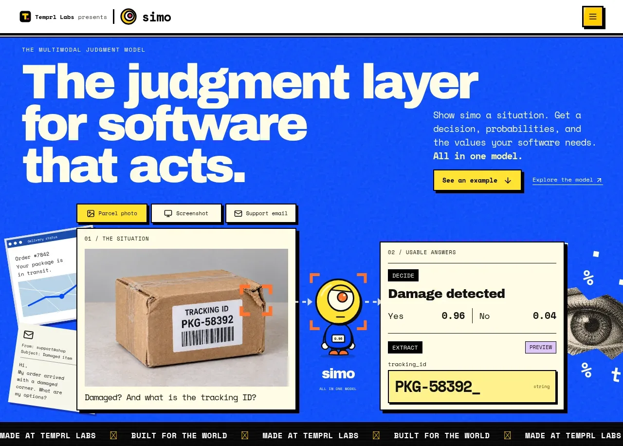 Judgment-layer hero
Simo · Hero
Judgment-layer hero
Simo · Hero
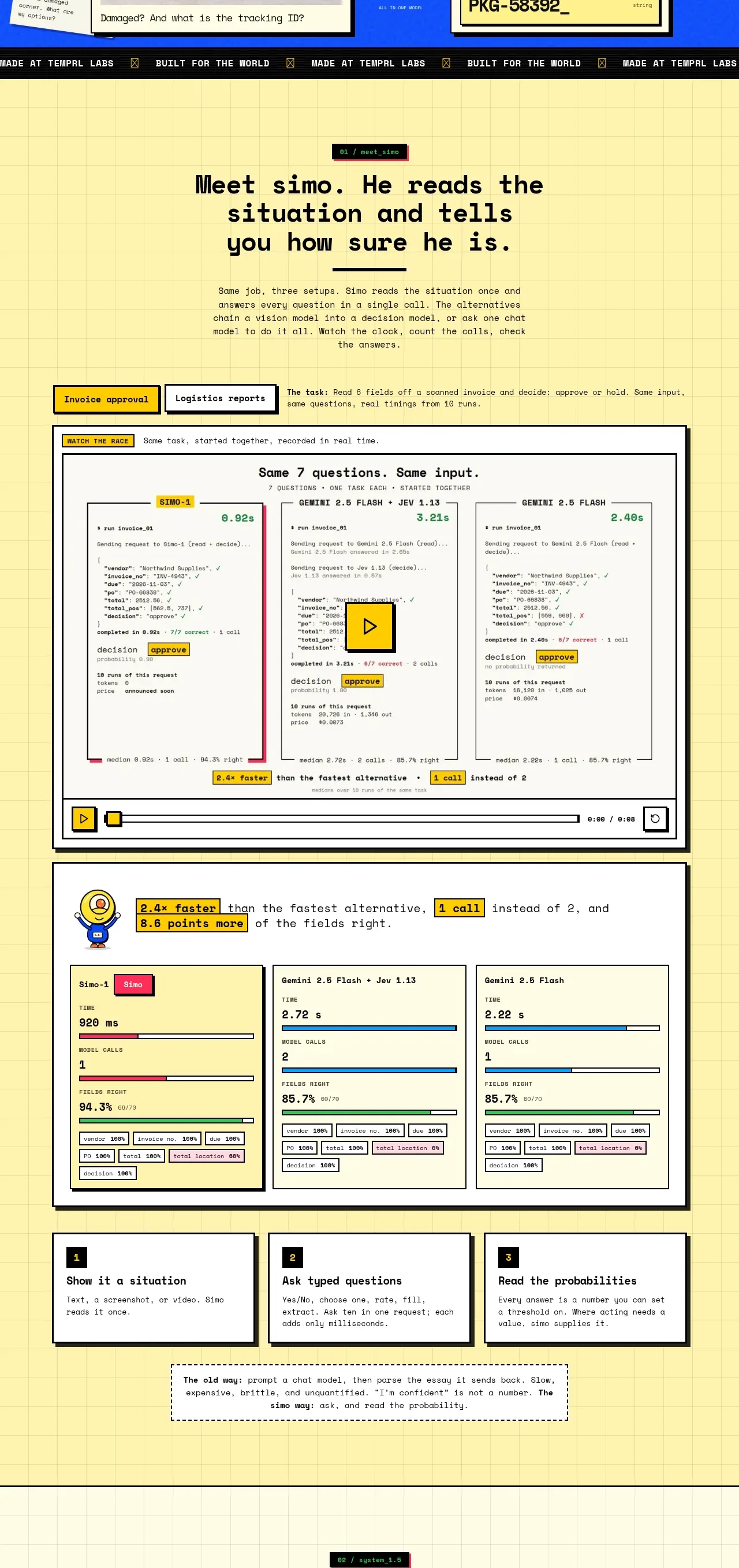 Product walkthrough and proof modules
Simo · Feature grid
Product walkthrough and proof modules
Simo · Feature grid
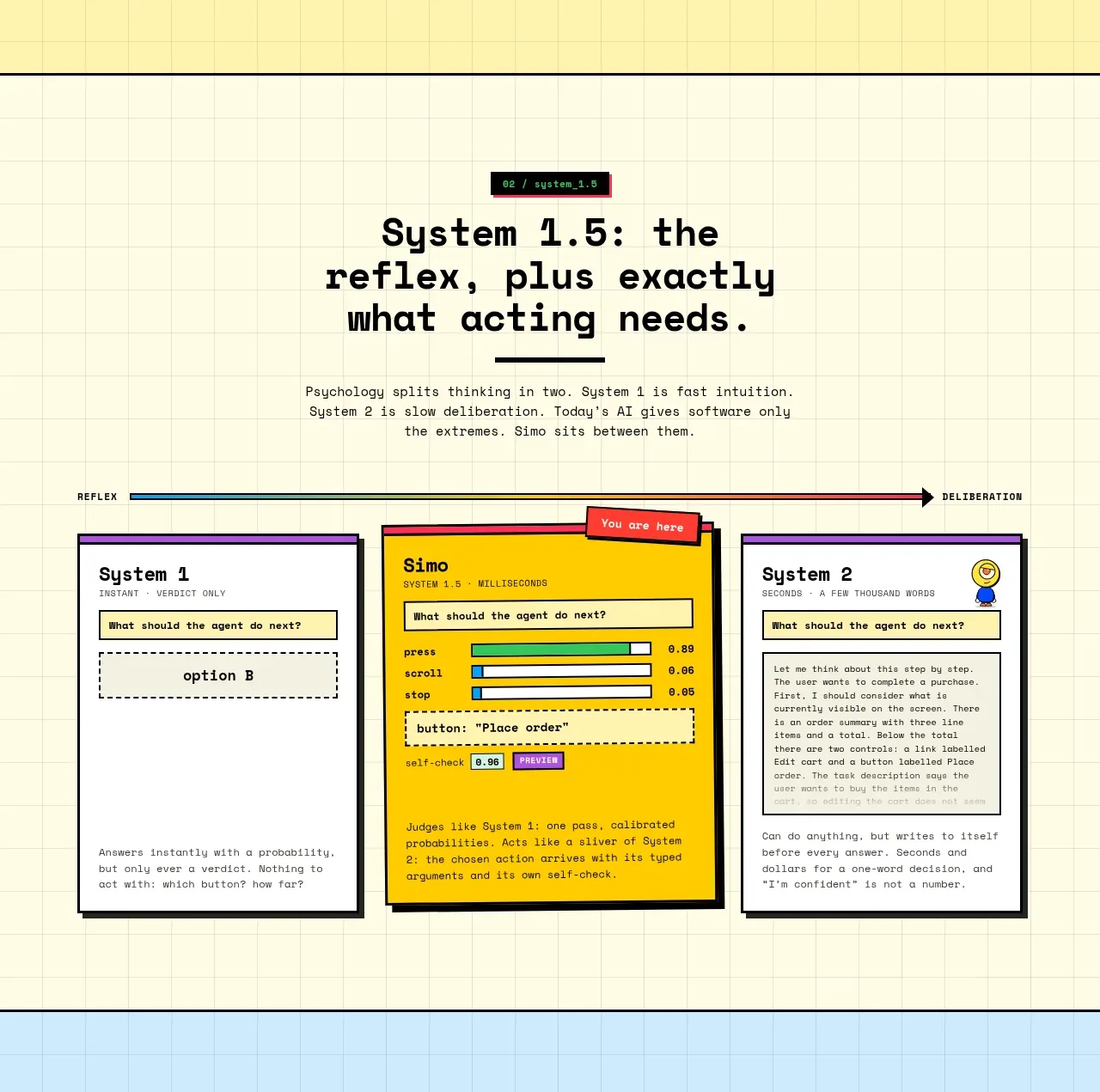 Reflex and decision architecture
Simo · Feature grid
Reflex and decision architecture
Simo · Feature grid
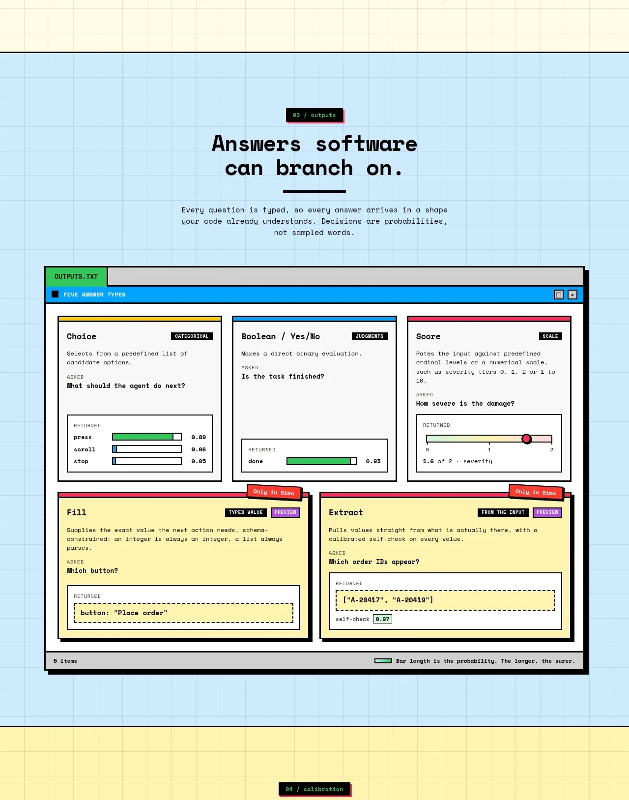 Structured answer types
Simo · Feature grid
Structured answer types
Simo · Feature grid
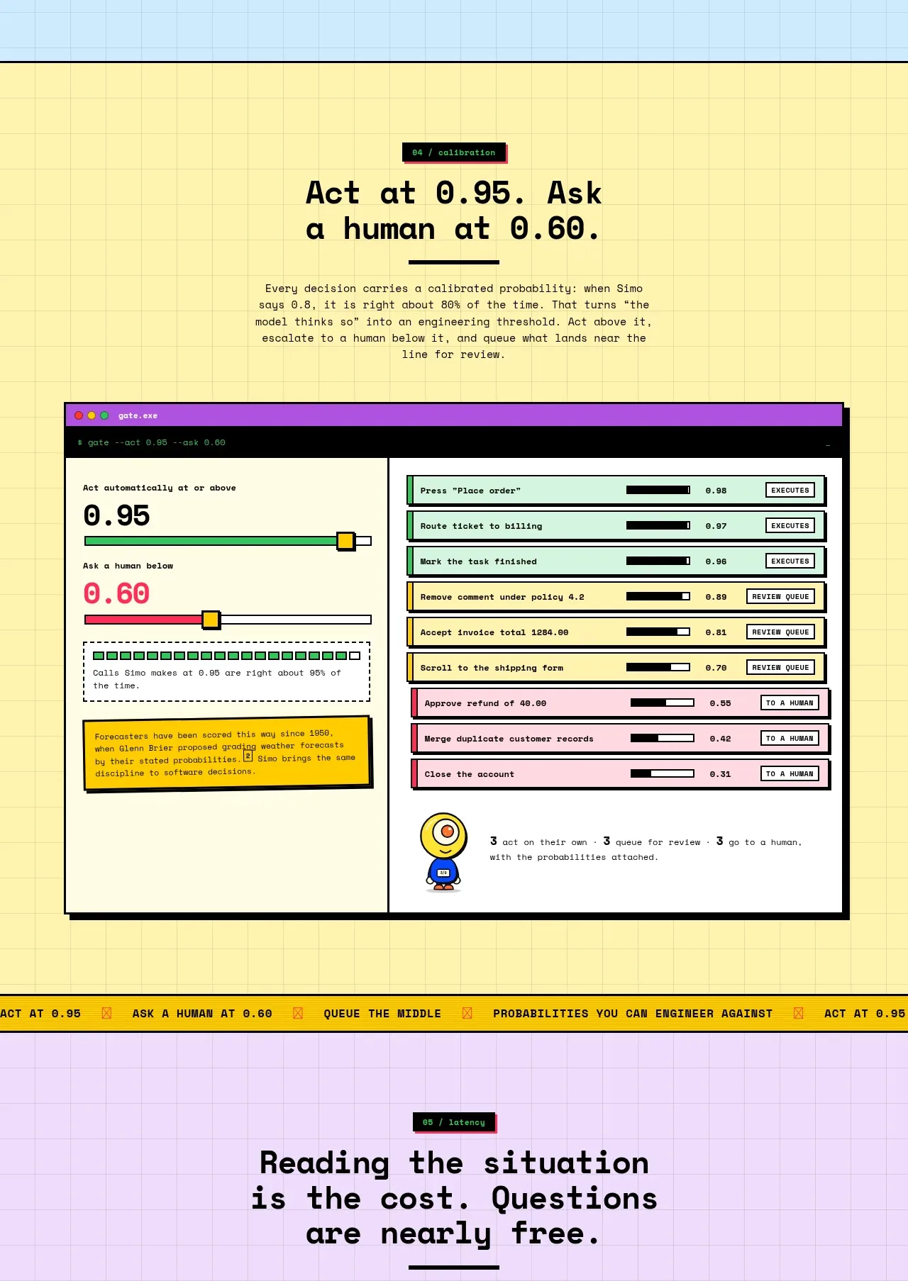 Human escalation controls
Simo · Feature grid
Human escalation controls
Simo · Feature grid
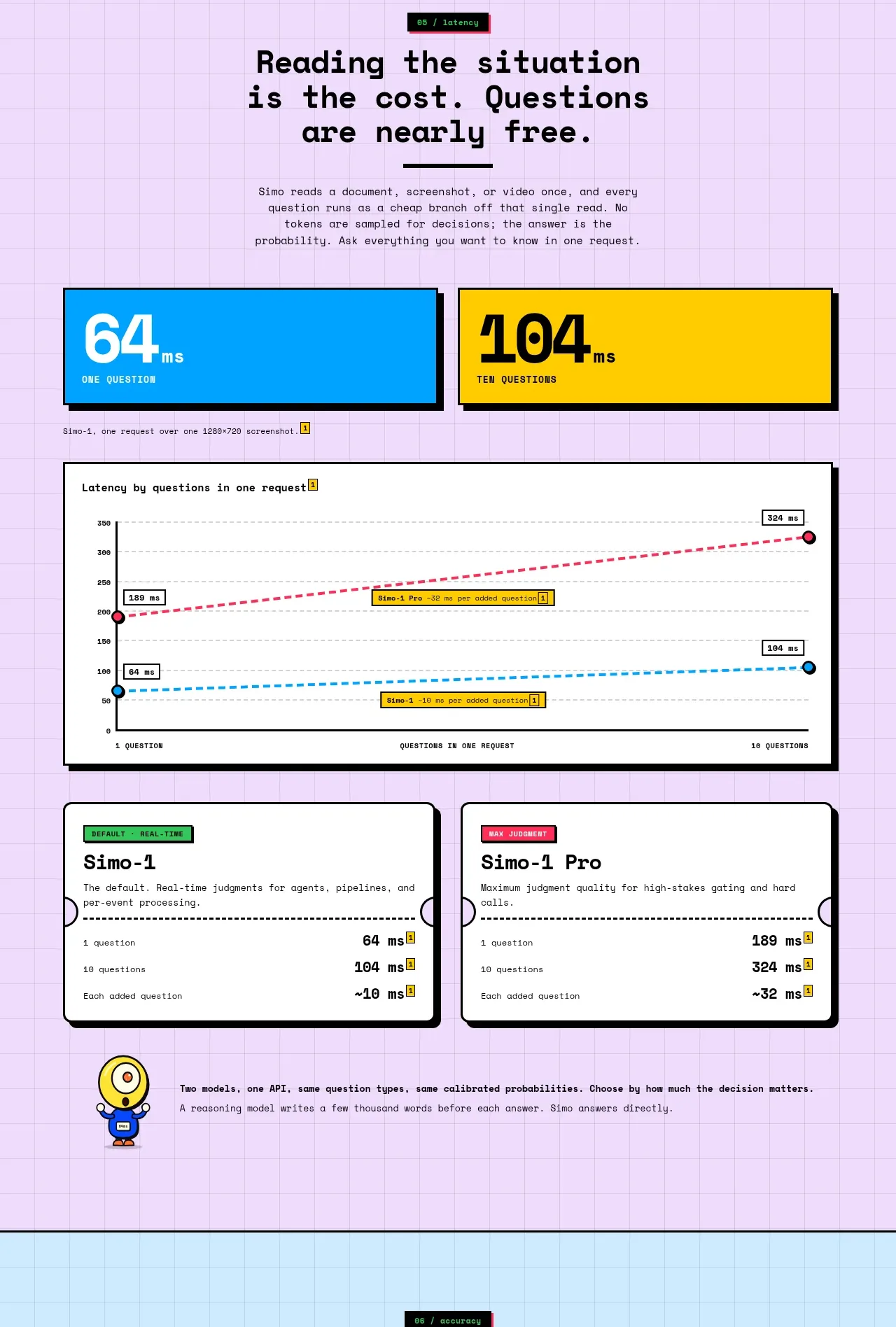 Latency and model comparison
Simo · Stats
Latency and model comparison
Simo · Stats
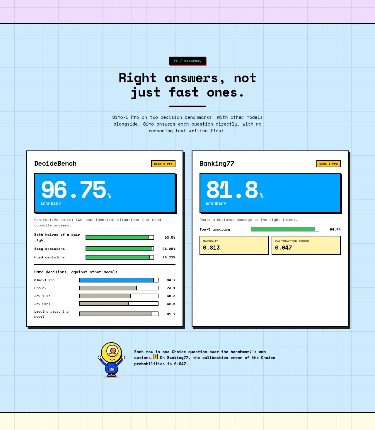 Accuracy benchmark results
Simo · Stats
Accuracy benchmark results
Simo · Stats
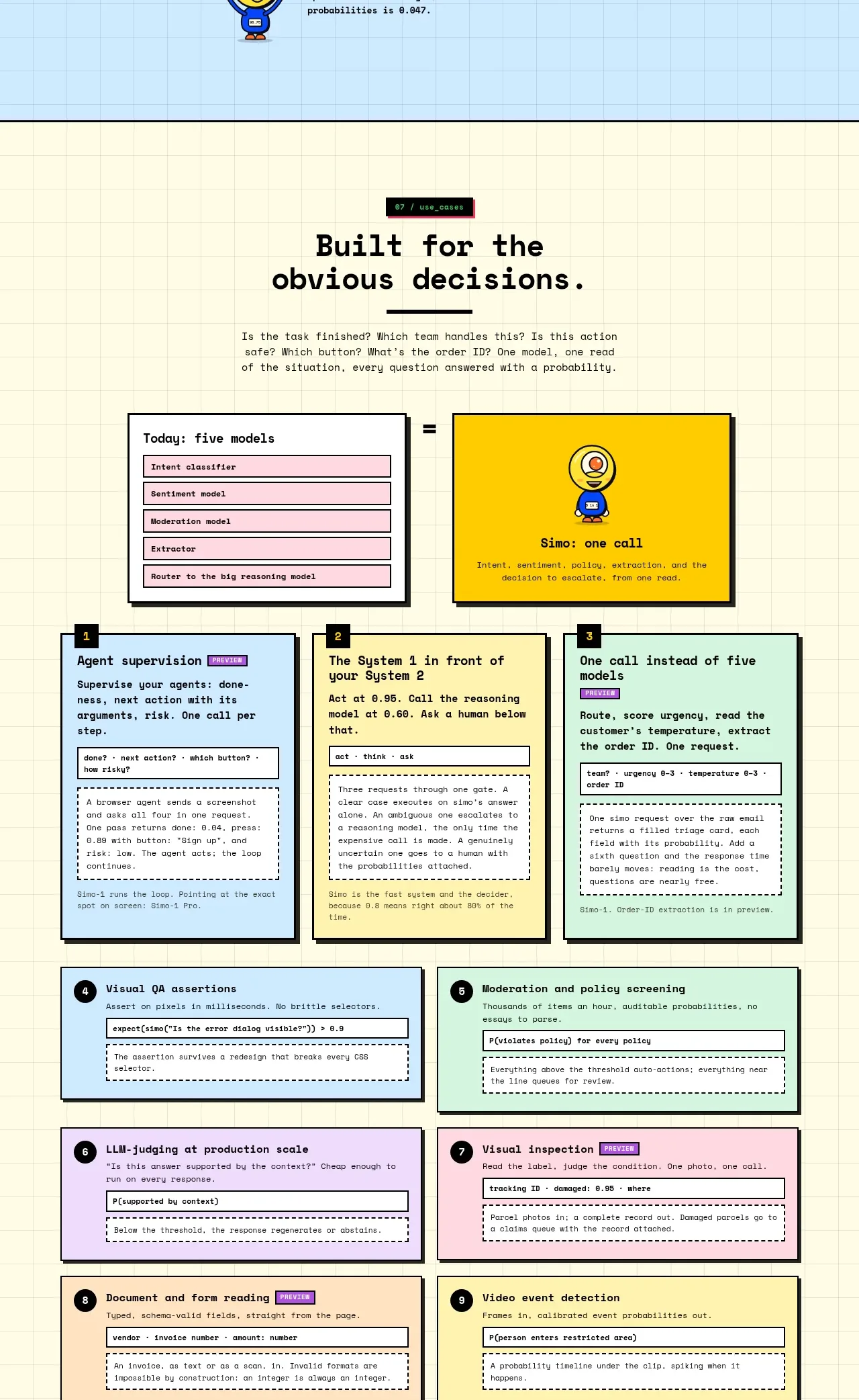 Decision use cases
Simo · Feature grid
Decision use cases
Simo · Feature grid
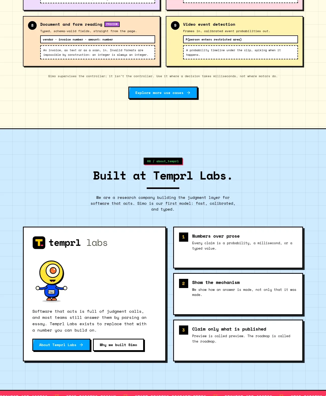 Company principles and credibility
Simo · Card
Company principles and credibility
Simo · Card
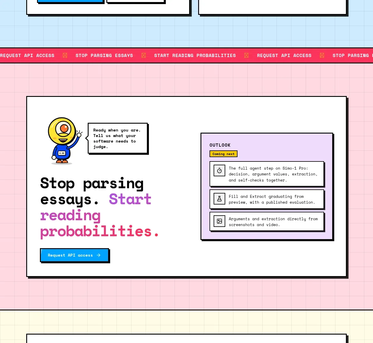 Conversion call to action
Simo · Call to action
Conversion call to action
Simo · Call to action
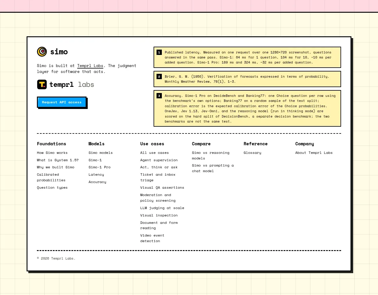 Documentation and link footer
Simo · Footer
Documentation and link footer
Simo · Footer