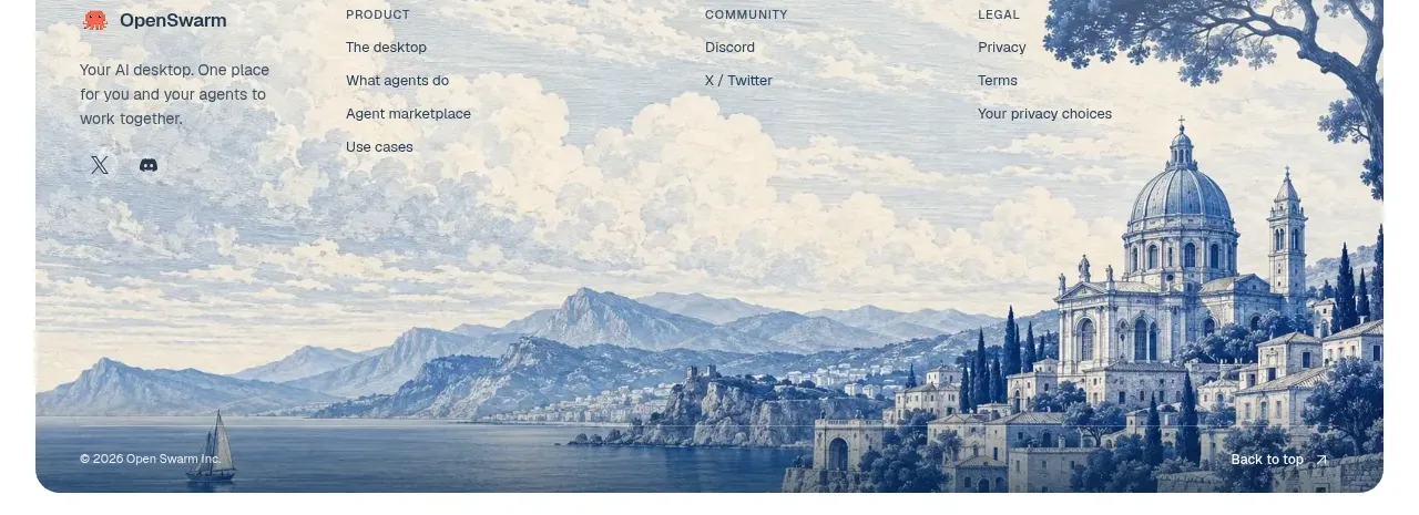
kage
kage
temprl.org
Design analysis
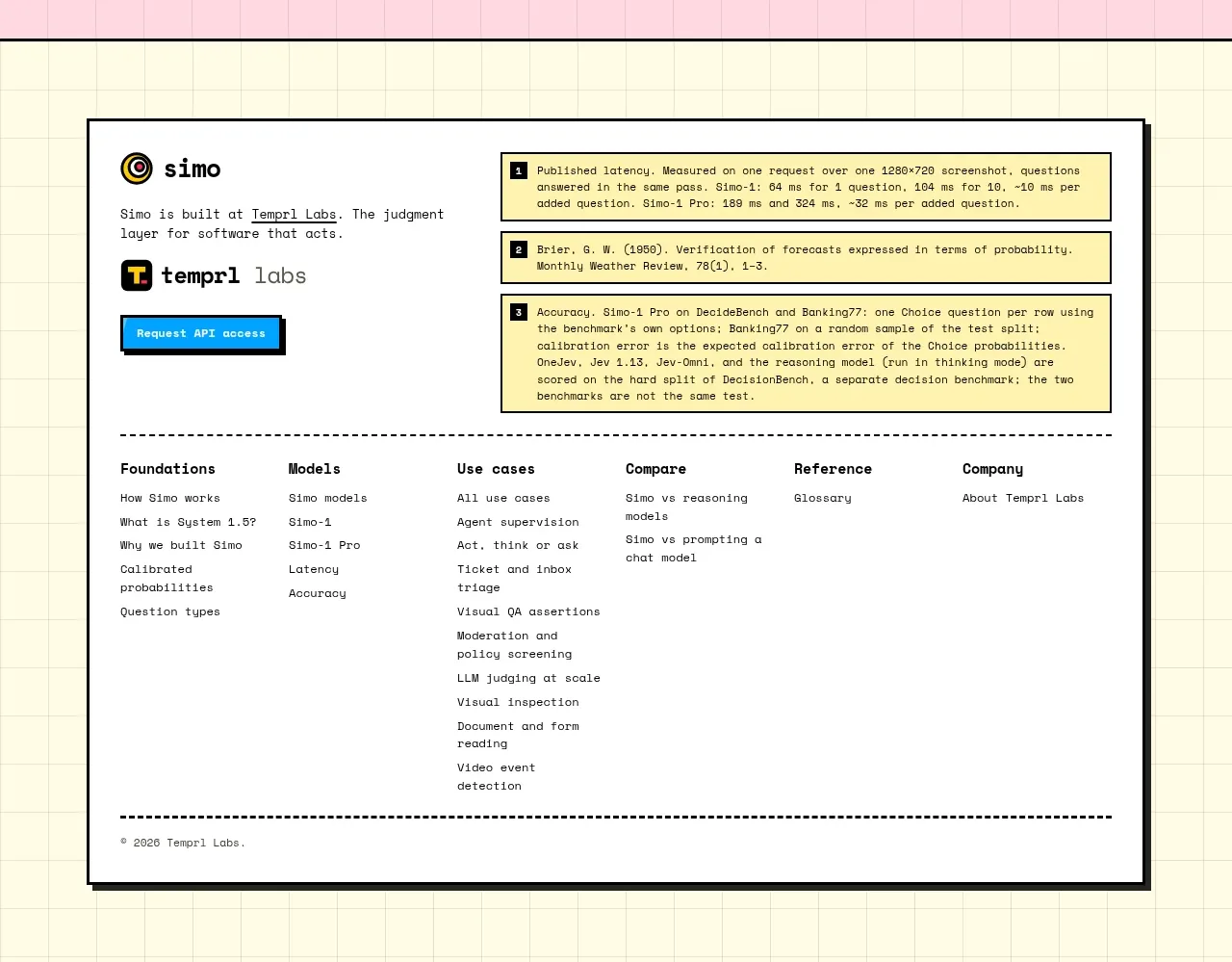
The footer is a dense off-white panel with brand information, reference notes, and a multi-column sitemap. Dashed dividers and small mono text make it feel like a technical appendix rather than a generic footer.
Prompt preview
## Reference images

Study these alongside the description below: hierarchy, rhythm, spacing, colour. Build for the product you are asked about, using this design language.

- Component: https://kage-design-assets.t3.tigrisfiles.io/components/simo/01913313-62ce-4f89-a048-ac4500929f0e-1791525862-11.webp
- Full page it was cut from: https://kage-design-assets.t3.tigrisfiles.io/screenshots/simo/01913313-62ce-4f89-a048-ac4500929f0e-1791525747684-full.webp
- Component on Kage: https://kage.design/component/simo-footer

### Before you start
Ask the user which resources, legal links, documentation, and contact paths belong in the footer. Then build an original technical footer.

Use a warm off-white page background and place a large bordered footer container with a subtle hard shadow. At the top, include a small brand block, a short description, and a compact primary contact or API button. Add a references or citations area in a highlighted panel if the product makes technical claims. Below, use 4–6 link columns with clear headings and concise links, then finish with a dashed divider and copyright/legal line. Use near-black text, a mono face for metadata, a small accent color for active links, 1px–2px borders, and modest corner radius. Keep the footer usable on mobile by stacking columns and preserving generous tap targets.

Never: copy the reference's logo, product name, copy, illustrations, imagery, or exact links.