kage
kage
spaceui.one
Design analysis
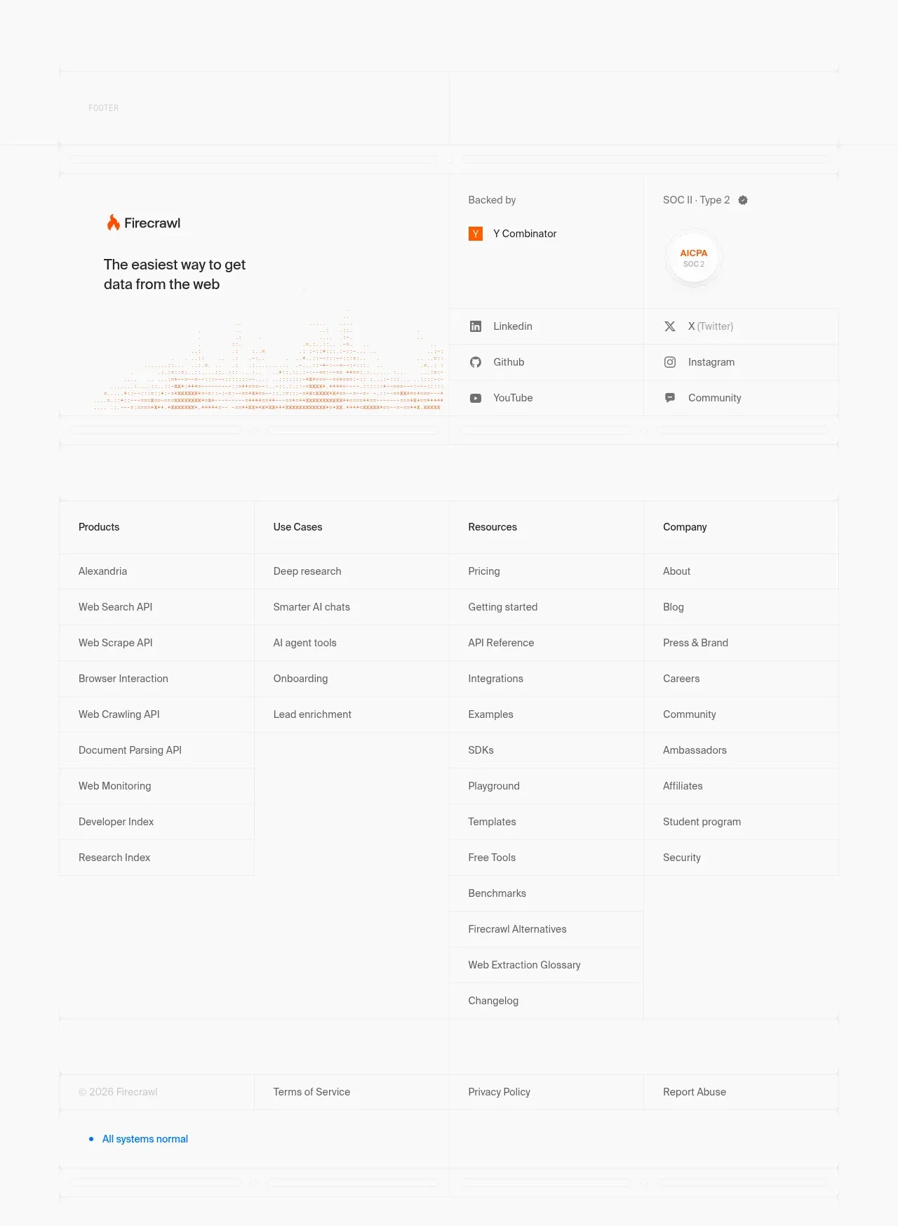
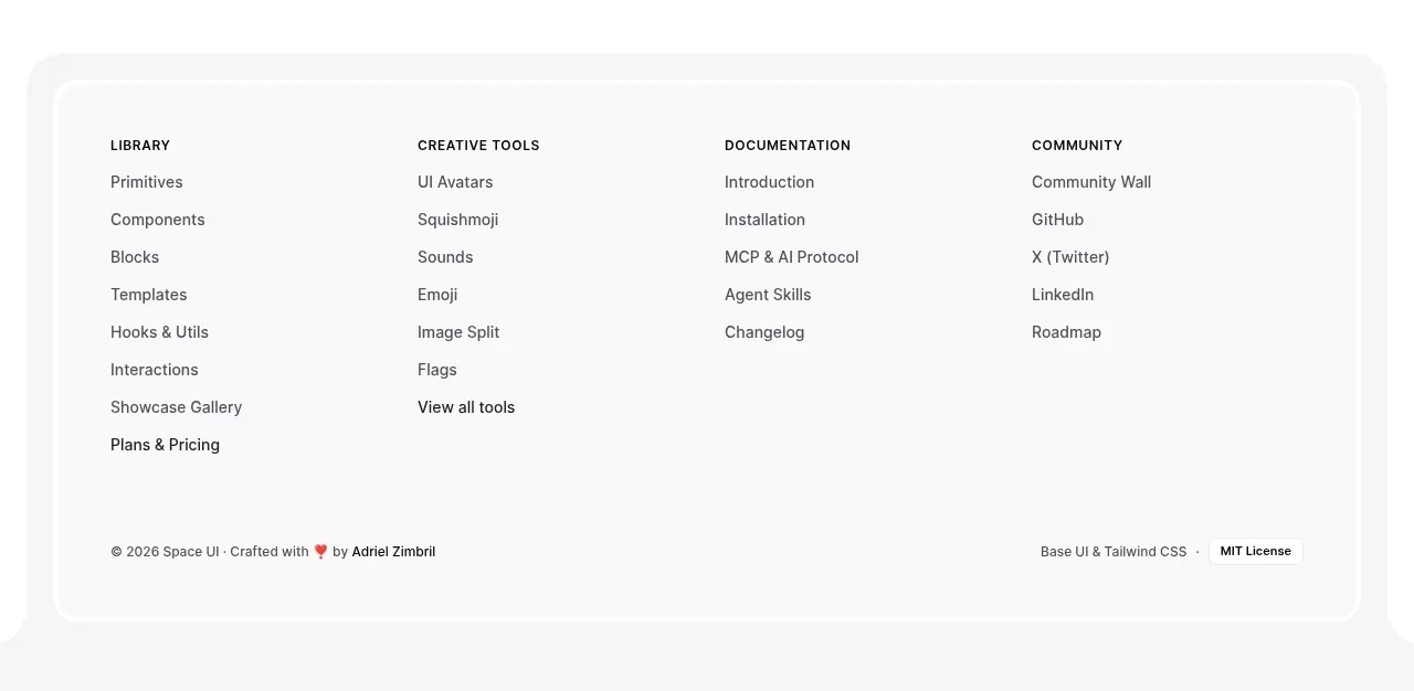
The footer sits in a large inset rounded container with four resource columns and a quiet bottom legal row. Strong grouping and ample whitespace make many links easy to scan.
Prompt preview
## Reference images

Study these alongside the description below: hierarchy, rhythm, spacing, colour. Build for the product you are asked about, using this design language.

- Component: https://kage-design-assets.t3.tigrisfiles.io/components/spaceui-one/175f9577-62b1-4f69-9b00-6ff53f853c35-1790162352-4.webp
- Full page it was cut from: https://kage-design-assets.t3.tigrisfiles.io/screenshots/spaceui-one/175f9577-62b1-4f69-9b00-6ff53f853c35-1790162331209-full.webp
- Component on Kage: https://kage.design/component/spaceui-one-footer

## Before you start
Ask what the user's product is, who it serves, and what brand direction they want. Apply the principles below to that product rather than reproducing the reference.

Build a spacious footer inside a large inset container with a very light gray background (`#f7f7f7`), thin inner border (`#eeeeee`), and 20–28px radius. Use four evenly spaced link columns with uppercase or small bold category headings at 11–12px, then stacked links at 13–14px with generous 10–14px vertical spacing. Group links by the user's information architecture: product, resources, company, community, or support. Add a bottom row separated by whitespace or a subtle divider for copyright, status, terms, and licensing. Keep contrast accessible, with near-black headings and muted gray links that darken on hover. Collapse to stacked groups on mobile and ensure focus indicators remain visible.

Never: use logos, product names, copy, illustrations, or imagery from the reference.