kage
kage
spaceui.one
Design analysis
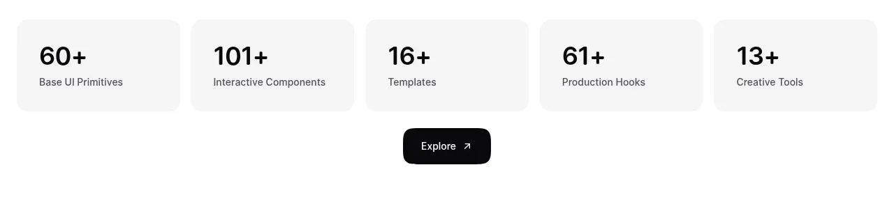
A single horizontal strip turns the library breadth into five scannable metrics, followed by a centered dark exploration button. The soft cards and oversized numerals create strong proof without visual noise.
Prompt preview
## Reference images

Study these alongside the description below: hierarchy, rhythm, spacing, colour. Build for the product you are asked about, using this design language.

- Component: https://kage-design-assets.t3.tigrisfiles.io/components/spaceui-one/175f9577-62b1-4f69-9b00-6ff53f853c35-1790162352-3.webp
- Full page it was cut from: https://kage-design-assets.t3.tigrisfiles.io/screenshots/spaceui-one/175f9577-62b1-4f69-9b00-6ff53f853c35-1790162331209-full.webp
- Component on Kage: https://kage.design/component/spaceui-one-stats

## Before you start
Ask what the user's product is, who it serves, and what brand direction they want. Apply the principles below to that product rather than reproducing the reference.

Create a proof-of-scale section with five equal metric tiles in a responsive row and one centered CTA beneath. Each tile should use a soft gray background (`#f5f5f5`), 12–16px radius, 20–24px padding, a bold 28–34px number, and a short 11–13px descriptor in muted gray. Keep the numbers aligned across the row and preserve generous whitespace around the group. Use a dark primary button (`#050505`) with white text, 12–14px radius, compact height, and a subtle arrow or directional affordance. On smaller screens, wrap the tiles into two columns and keep the CTA prominent. Add hover and focus states without turning the stats into a noisy dashboard.

Never: use logos, product names, copy, illustrations, or imagery from the reference.