kage
kage
speechka.io
Design analysis
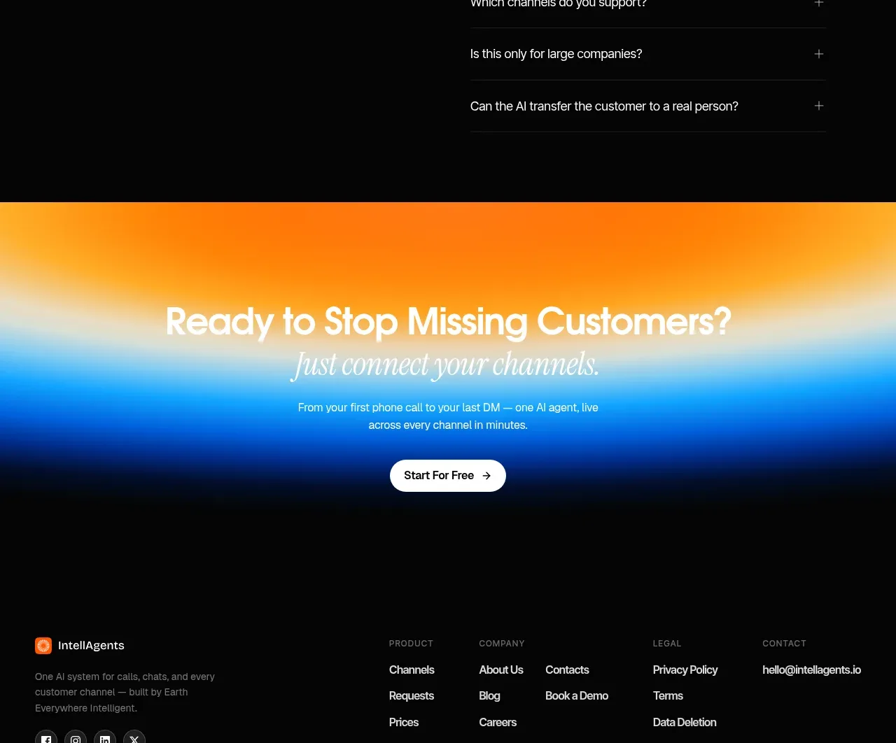
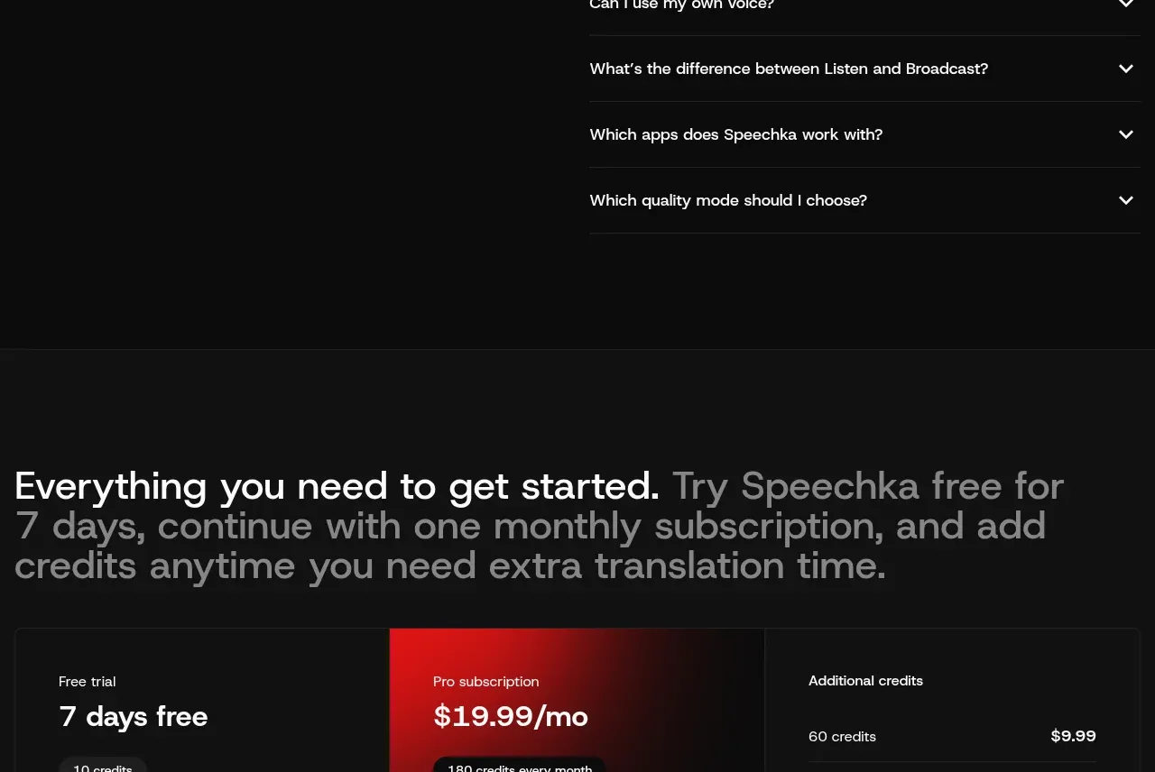
The FAQ uses a quiet two-column layout: introductory copy and a contact action on the left, with a vertically divided accordion on the right and one item expanded.
Prompt preview
## Reference images

Study these alongside the description below: hierarchy, rhythm, spacing, colour. Build for the product you are asked about, using this design language.

- Component: https://kage-design-assets.t3.tigrisfiles.io/components/speechka/662d10a3-b9d2-40f0-bccc-e5bde29d7609-1790229792-10.webp
- Full page it was cut from: https://kage-design-assets.t3.tigrisfiles.io/screenshots/speechka/662d10a3-b9d2-40f0-bccc-e5bde29d7609-1790229722330-full.webp
- Component on Kage: https://kage.design/component/speechka-faq

## Before you start
Ask what the user's product is, who it serves, and what brand personality and visual identity it should use. Apply the principles below to that product rather than reproducing the reference.

Build an FAQ section with a left intro column containing a heading, short reassurance, and secondary contact button, and a right accordion column containing clearly separated questions. Show one answer expanded by default only if useful; otherwise let the user choose. Use #111111, white headings, #858585 body text, #242424 horizontal rules, and a nearly black secondary button with a subtle border. Keep accordion rows around 56–72px tall, use generous column gaps, and animate expansion gently while supporting keyboard navigation, focus rings, screen-reader states, and reduced motion. Stack the columns on mobile.

Never use logos, product names, copy, illustrations, or imagery from the reference.