kage
kage

Design analysis
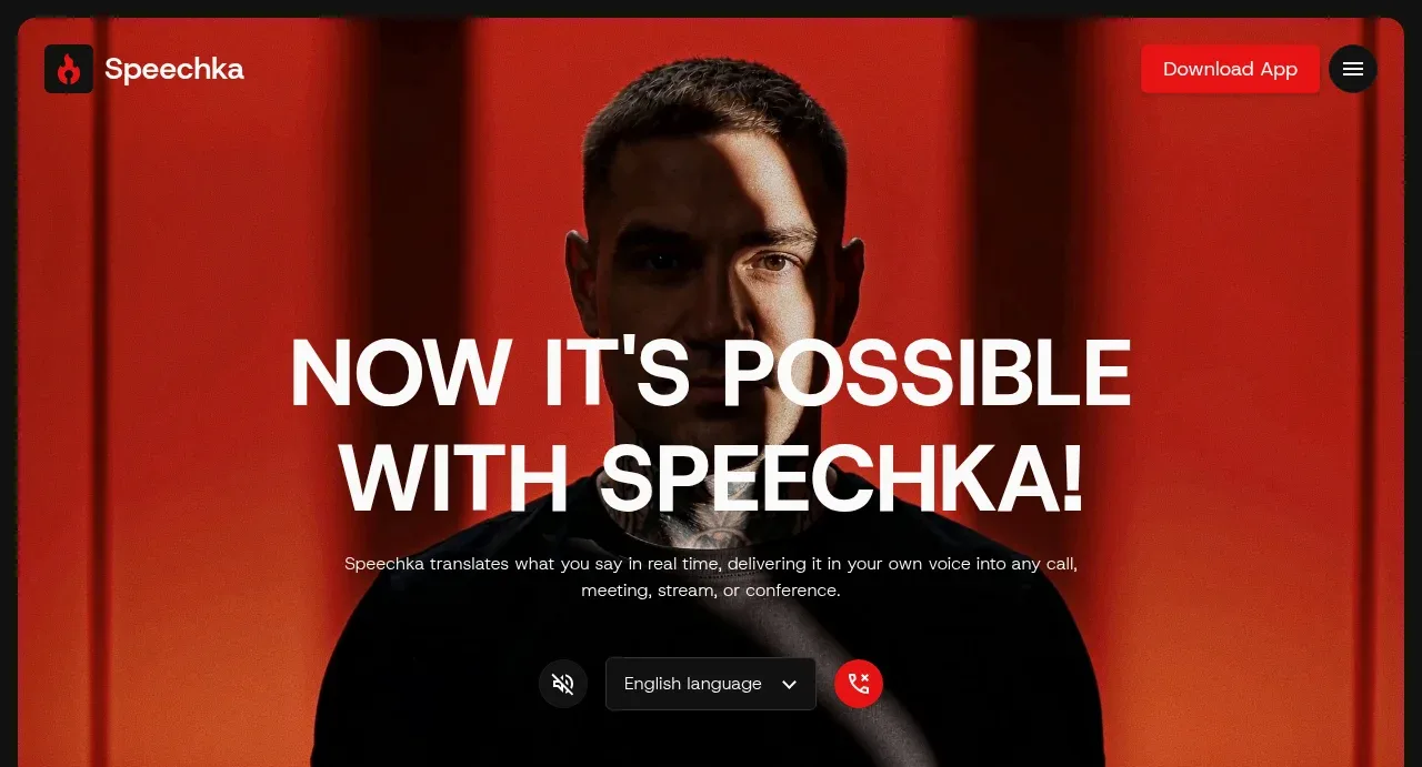
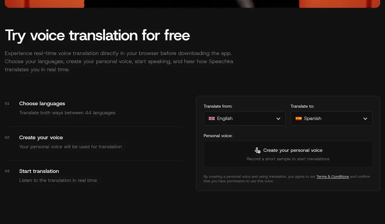
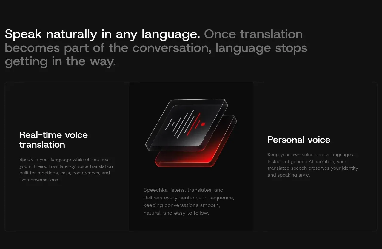
A near-black page where one crimson accent and red-lit studio photography carry the entire identity: the hero crops a blind-shadowed portrait behind condensed uppercase type, then immediately proves the product with a working translate/voice-recorder widget beside a numbered three-step list. Below, rhythm alternates between airy full-width statements (white lead clause, gray continuation), hairline-divided three-column feature bands with a glass waveform centrepiece, and mirrored photo/text use-case rows where white pill tags float over the imagery. The close stacks a size-varied language chip cloud, a divided stats row (44 / 200ms / 100+), an accordion FAQ, a red-gradient pricing trio, and a contact form paired with another red-lit portrait — density shifting from sparse to dense as the page argues its case.
Prompt preview
## Reference images

Study these alongside the description below: hierarchy, rhythm, spacing, colour. Build for the product you are asked about, using this design language.

- Full page: https://kage-design-assets.t3.tigrisfiles.io/screenshots/speechka/662d10a3-b9d2-40f0-bccc-e5bde29d7609-1790229722330-full.webp
- Above the fold: https://kage-design-assets.t3.tigrisfiles.io/screenshots/speechka/662d10a3-b9d2-40f0-bccc-e5bde29d7609-1790229718623.webp
- Design on Kage: https://kage.design/designs/speechka-landing-page

## Before you start
Ask the user what product they are building, who it is for, and what brand assets they already have (name, logo, colours, typefaces, product photography). Wait for their answers before writing any code. Everything below is a design language to apply to *their* product, not the reference site.

## Page structure
Build a single dark marketing landing page with these sections, top to bottom:

1. **Top nav** — transparent bar over the hero: small rounded icon tile + wordmark left; filled accent CTA button and a circular menu button right.
2. **Hero** — full-bleed, colour-graded photograph (one dominant hue, hard directional shadows) with a centred condensed ALL-CAPS headline set directly over it, a two-line gray subcopy block, and a compact control bar beneath: icon toggle, a language/option dropdown, and a round accent action button.
3. **Interactive demo** — left-aligned H2 "Try it free" style heading + short paragraph, then a two-column split: a numbered step list (01 / 02 / 03 with title + one gray line each) on the left, and a real functional widget card on the right (two labelled dropdowns with flag glyphs, a record-your-voice panel, and tiny legal microcopy with a link). This section answers "does it work?" immediately.
4. **Statement band** — one large two-line sentence across the full width where the first clause is white and the rest is gray.
5. **Feature band** — a three-cell row divided by hairline borders: text cell (heading + paragraph) / centred visual card (stacked glass panels with a waveform and accent glow + caption paragraph) / text cell. All cells share the same height and border.
6. **Use case 1** — two-column: heading, eyebrow label, two gray paragraphs, filled accent CTA on the left; large photo on the right with a cloud of white pill tags floating over its top edge.
7. **Integrations strip** — centred heading + one paragraph, then a single row of six partner wordmarks in gray.
8. **Use case 2** — mirrored version of use case 1: photo on the left (with floating speech-bubble pills in different languages), text + CTA on the right.
9. **Proof section** — another mixed white/gray statement, then a stats row of three oversized numerals with small gray labels separated by vertical hairlines (e.g. "44 Languages", "200ms Latency", "100+ Apps"), then a second three-cell feature band repeating the structure of section 5 with a new waveform visual.
10. **Language cloud** — centred statement line, then a centred cloud of 30–40 pill chips naming supported languages, with font sizes varying (≈15–30px) so the cloud feels organic, not tabular.
11. **Use case 3** — same mirrored two-column pattern as section 8, photo left with platform/app icon chips floating on it, text right with CTA.
12. **FAQ** — two columns: left column has the "FAQs" heading, one gray paragraph and an outlined "Contact us" button; right column is an accordion where the first item is expanded by default and the rest show chevrons on hairline dividers.
13. **Pricing** — one mixed-emphasis statement sentence, then three cards in a row: a dark free-trial card (title, big numeral offer, pill badge, paragraph, CTA), a centred card with a red gradient background for the paid plan (plan name, large price with /mo, pill badge, paragraph), and a flat card listing three add-on rows (name + price) plus a gray footnote.
14. **Contact** — small eyebrow label, H2, paragraph, support email line, then a two-column split: stacked underlined form fields (name, email, message) with an outlined submit button on the left, and a colour-graded photo with one floating white pill headline on the right.
15. **Footer** — brand name + one-sentence description on the left; three link columns (Product / Use cases / Company) on the right; bottom row with copyright and a social link.

## Design language
- **Palette:** page black `#0a0a0a`, card surfaces `#111111–#161616`, hairline borders `#232323`, primary text `#f5f5f5`, secondary text `#8a8a8a`. Exactly one accent — vivid red `#e63b2e` — reserved for CTAs, small icons, waveform bars and the gradient pricing card (`#5c130f → #b91c15 → #e63b2e`). All photography is graded into the same red family so UI accent and imagery read as one system.
- **Type:** a single neo-grotesque sans throughout. Hero: condensed uppercase, ~72–88px, tight leading. Section H2s: 36–44px, sentence case. Statement bands: 30–38px with mixed emphasis — first clause white, remainder `#8a8a8a`. Body: 14–15px gray, max ~60ch. Eyebrows/labels: 11–12px, slightly spaced. Numerals in stats and pricing are set oversized (~40–56px) against 12px gray labels.
- **Hierarchy:** built from scale jumps and the white-vs-gray sentence treatment, not from extra colours. Each use case gets a tiny eyebrow label above its heading to sequence the page (meetings → conferences → livestreams).
- **Rhythm:** alternate airy, text-only statement bands (~100–120px vertical padding) with dense bordered grid sections; alternate photo-left and photo-right so no two use-case rows repeat. Each use-case row repeats the same internal anatomy (eyebrow, H2, two short paragraphs, CTA) — consistency makes the photo swap feel intentional.
- **Borders & radius:** 1px `#232323` hairlines divide feature cells, stats, form fields and FAQ rows; cards and inputs use 10–12px radius; tags, chips and badges are full pills; buttons ~8px. Shadows are almost absent — depth comes from photography and one glass-stack centrepiece with a soft red glow.
- **Imagery:** studio portraits in black wardrobe against strongly coloured backdrops with hard blind/shutter shadows; keep a consistent grade across every photo. Float small white pill chips over photo edges to annotate context.
- **Interaction:** filled accent buttons with white text; accordion expands in place with a rotating chevron; dropdowns and a recorder input are real, working controls; pill chips are static labels. Motion stays quiet — hover states only, no parallax gymnastics.
- **Density curve:** the page opens sparse (photo + one line of type), gets dense and evidential in the middle (demo, stats, integrations, language cloud), then relaxes into FAQ/pricing/contact — mirror that curve in whatever product you apply this to.

## Never
- Do not copy Speechka's name, wordmark, flame logo, headline copy, FAQ questions, pricing numbers or photography.
- Do not reproduce the Zoom, Google Meet, Teams, Slack, Discord or Webex logos — show the user's actual integrations or generic placeholders.
- Do not clone the voice-translation demo content; rebuild the demo pattern around the user's own product behaviour.
- Never present the result as Speechka or imply affiliation with it.
Components from this page
All components
 Floating dark navigation
Speechka · Navigation
Floating dark navigation
Speechka · Navigation
 Voice translation hero
Speechka · Hero
Voice translation hero
Speechka · Hero
 Interactive translation demo
Speechka · Form
Interactive translation demo
Speechka · Form
 Core translation capabilities
Speechka · Feature grid
Core translation capabilities
Speechka · Feature grid
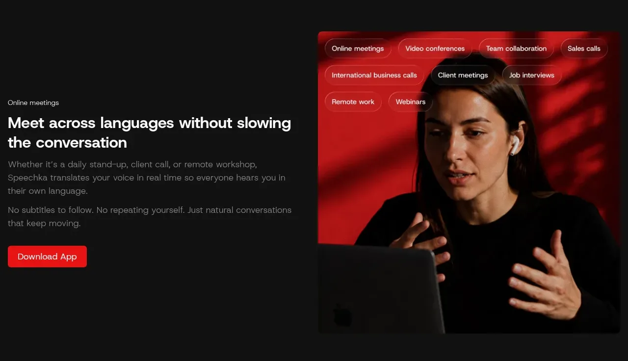 Meetings use case
Speechka · Hero
Meetings use case
Speechka · Hero
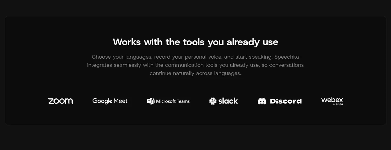 Works with familiar tools
Speechka · Logo cloud
Works with familiar tools
Speechka · Logo cloud
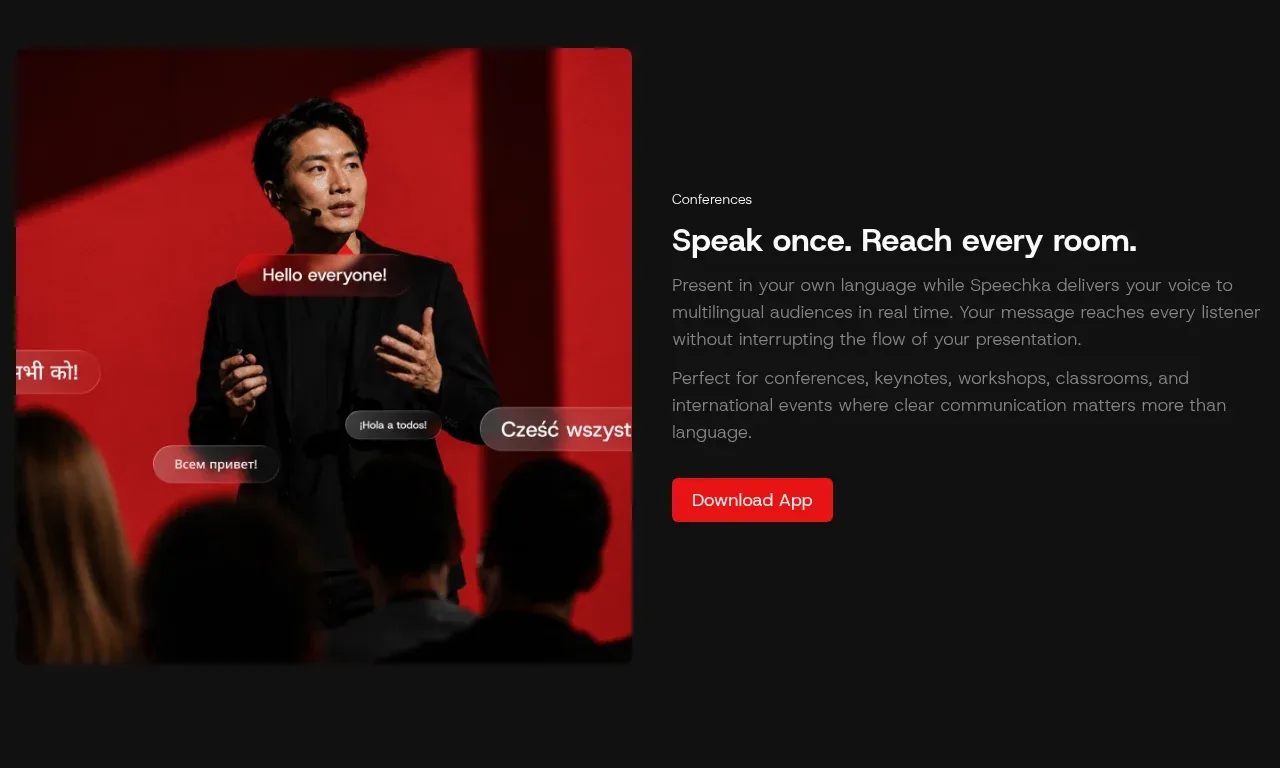 Conference use case
Speechka · Hero
Conference use case
Speechka · Hero
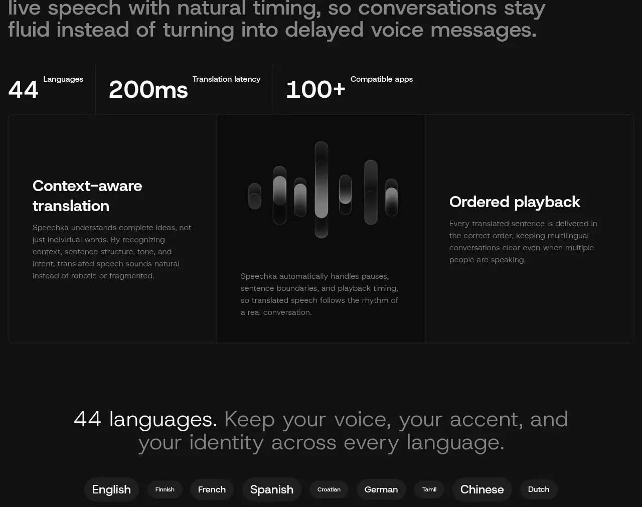 Conversation quality features
Speechka · Feature grid
Conversation quality features
Speechka · Feature grid
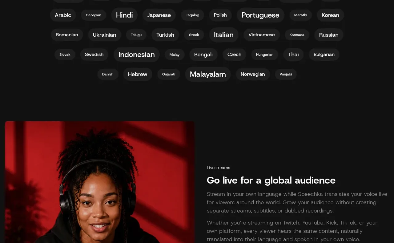 Language selection cloud
Speechka · Tabs & steps
Language selection cloud
Speechka · Tabs & steps
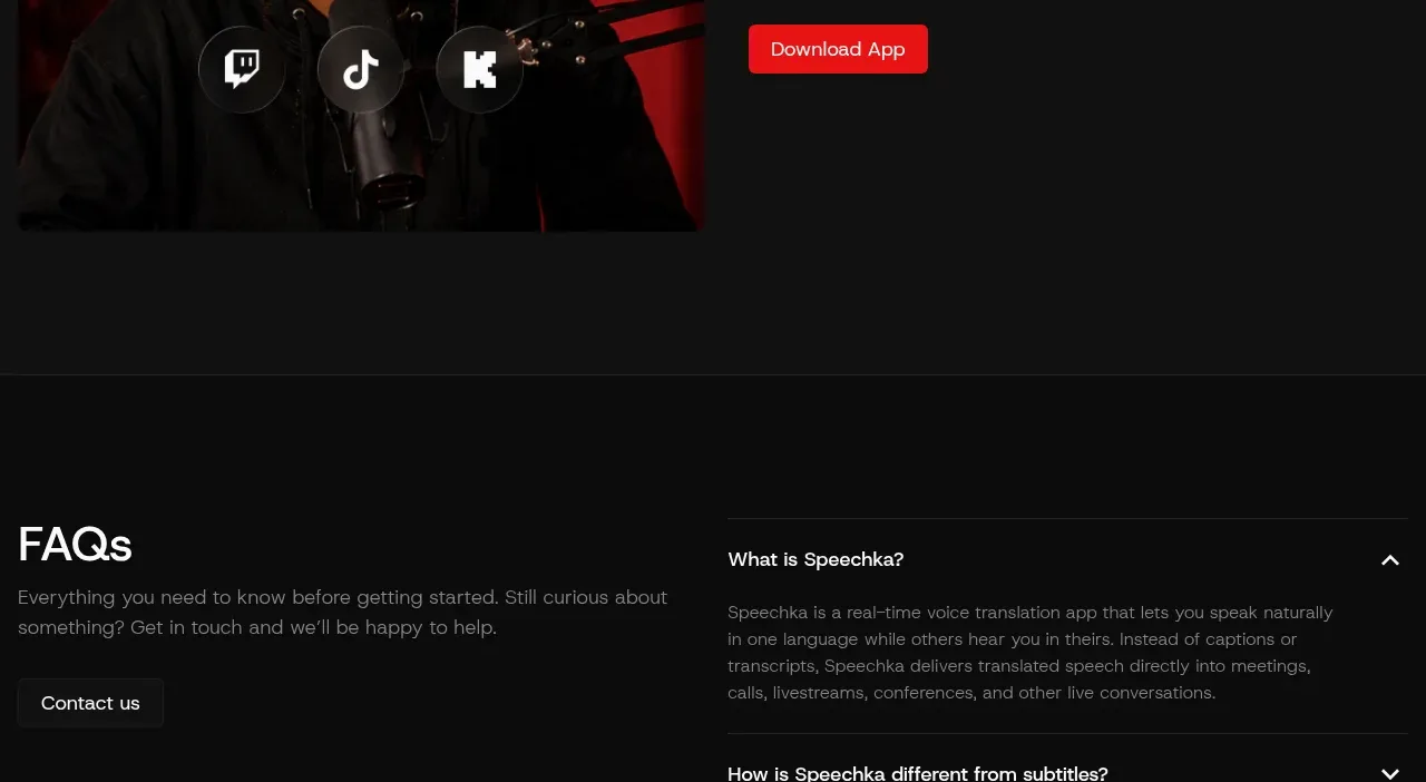 Livestreams use case
Speechka · Hero
Livestreams use case
Speechka · Hero
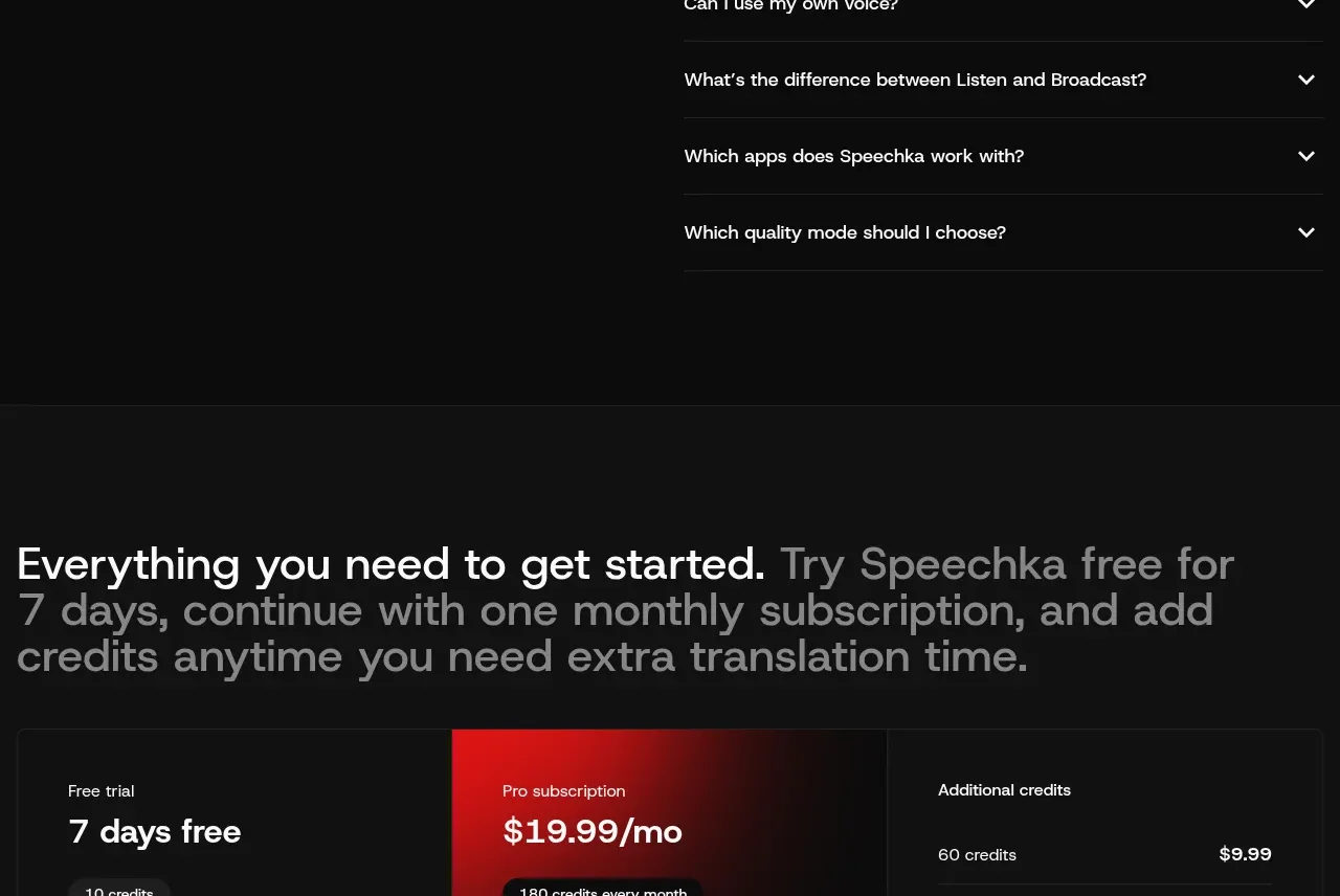 Frequently asked questions
Speechka · FAQ
Frequently asked questions
Speechka · FAQ
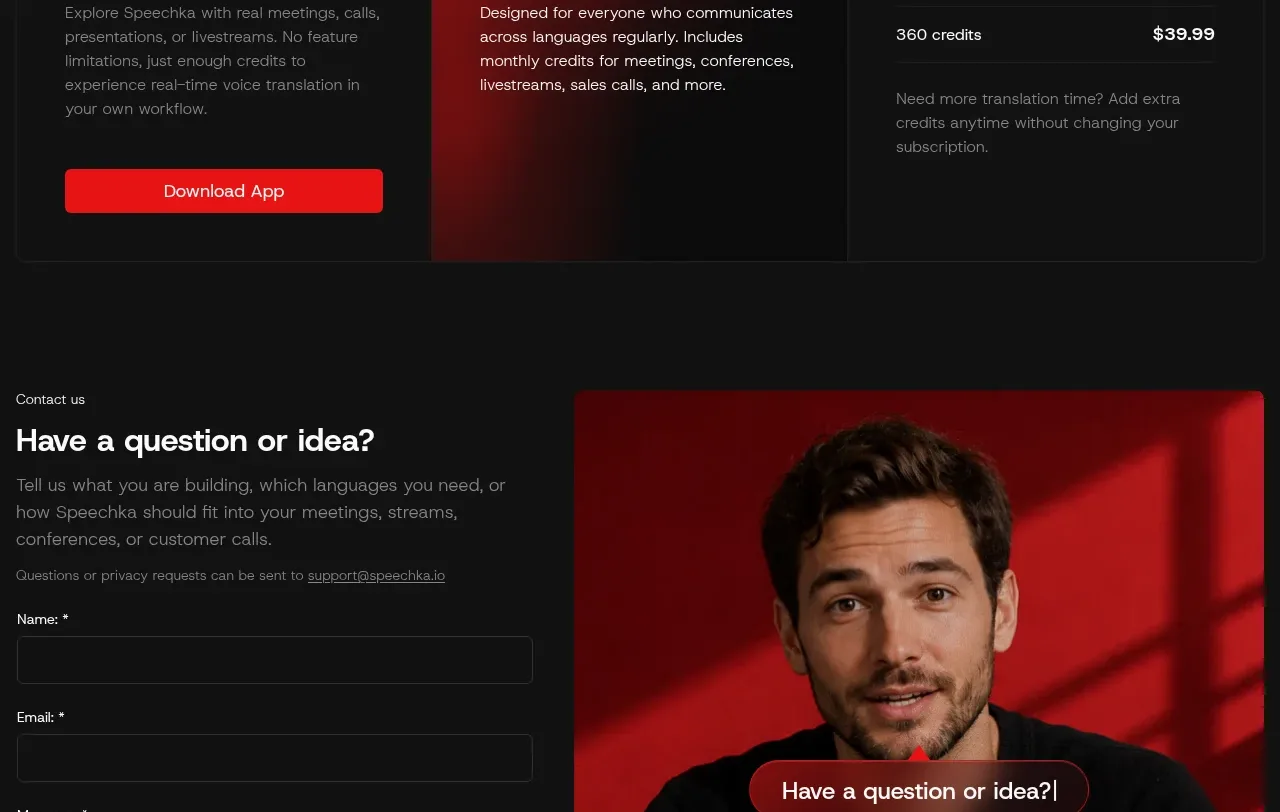 Trial and subscription plans
Speechka · Pricing table
Trial and subscription plans
Speechka · Pricing table