kage
kage
spira.ai
Design analysis
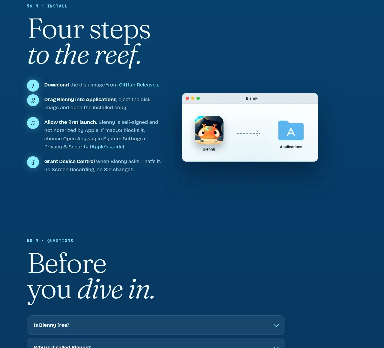
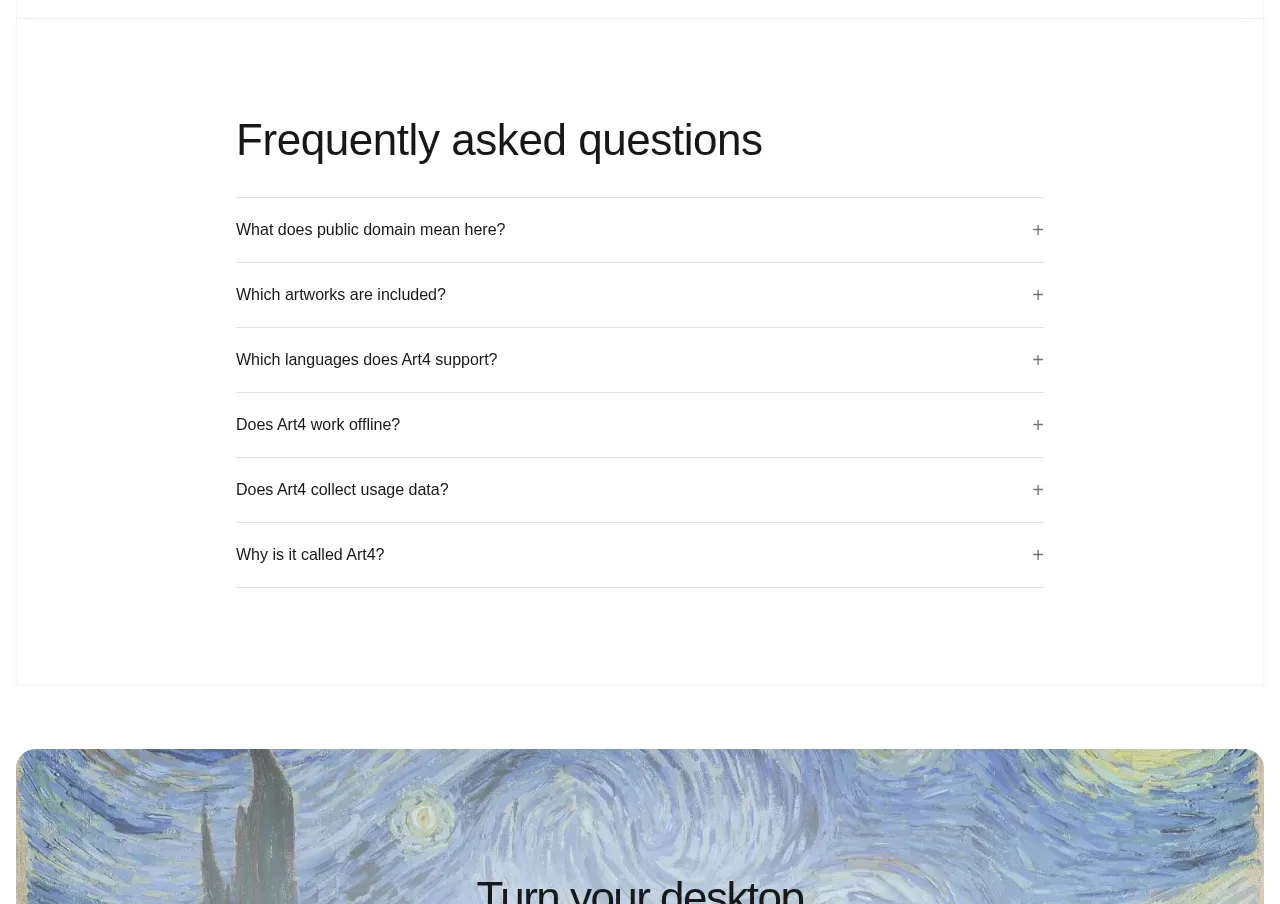
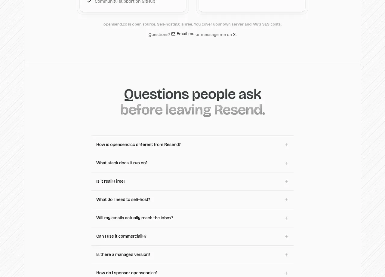
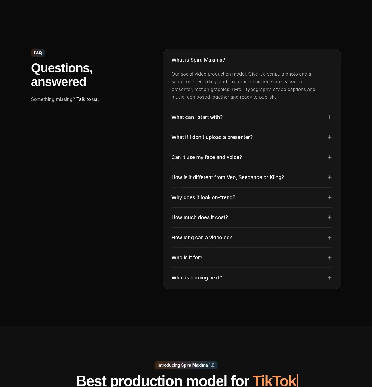
The FAQ uses a two-column composition: a fixed heading and support link on the left, and a large rounded accordion on the right. One answer is open to demonstrate the interaction.
Prompt preview
## Reference images

Study these alongside the description below: hierarchy, rhythm, spacing, colour. Build for the product you are asked about, using this design language.

- Component: https://kage-design-assets.t3.tigrisfiles.io/components/spira-maxima/726c84dd-363c-4980-b0d9-b04757b4422a-1791266567-9.webp
- Full page it was cut from: https://kage-design-assets.t3.tigrisfiles.io/screenshots/spira-maxima/726c84dd-363c-4980-b0d9-b04757b4422a-1791266451959-full.webp
- Component on Kage: https://kage.design/component/spira-maxima-faq

## Before you start
Ask what objections and support questions users have about the user's product, then apply these principles to that product.

Build a dark FAQ section in a two-column layout. The left column contains a small eyebrow, a large two-line heading, and a quiet contact/support link. The right column is a rounded panel with a near-black charcoal fill (#171819), thin border (#2a2b2c), and a vertical list of accordion rows. Each row should have a clear question, a plus/minus control, 18–22px vertical padding, and subtle dividers. Keep one item open initially with a readable 14–16px answer in muted gray. Use white headings, #d7d7d5 questions, and #999b9e answers; animate height and icon rotation gently. Stack columns on mobile.

Never: use logos, product names, copy, illustrations, or imagery from the reference.