kage
kage
spira.ai

Design analysis
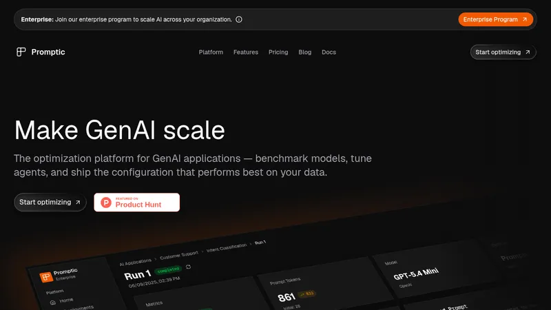
A long-form dark AI product page uses a near-black canvas, oversized white sans-serif headlines, and small tinted pill labels to create a clear editorial hierarchy. The hero establishes the product with a patterned backdrop and bright CTA, then the page shifts through a centered demo, tabbed workflow panel, use-case media, metric cards, competitor chart, comparison table, testimonial, FAQ, video showcase, and final CTA; spacing grows between major sections while cards and data modules introduce denser rhythms. Orange and blue accents appear as restrained glows, borders, active states, and gradients against charcoal surfaces, keeping the video-focused content prominent without adding visual clutter.
Prompt preview
## Reference images

Study these alongside the description below: hierarchy, rhythm, spacing, colour. Build for the product you are asked about, using this design language.

- Full page: https://kage-design-assets.t3.tigrisfiles.io/screenshots/spira-maxima/726c84dd-363c-4980-b0d9-b04757b4422a-1791266451959-full.webp
- Above the fold: https://kage-design-assets.t3.tigrisfiles.io/screenshots/spira-maxima/726c84dd-363c-4980-b0d9-b04757b4422a-1791266435253.webp
- Design on Kage: https://kage.design/designs/spira-maxima-landing-page

## Before you start
Ask the user what they are building, who it is for, and what brand assets they already have (name, colours, type). Wait for their answers before proceeding. Apply the reference's design language to their product, not to the reference product.

## Page structure
1. **Announcement bar:** Add a slim full-width launch or promotion strip at the very top, using a warm-to-cool orange/blue gradient, compact centered text, a small light CTA, and a close control.
2. **Navigation:** Place a floating or inset dark navigation row below it with a compact brand mark area, grouped dropdown links, pricing, a secondary sales link, a light primary app button, and a circular account/control button.
3. **Hero:** Use a tall centered hero on a near-black background with a subtle repeating abstract pattern. Stack a small status pill, product/category label, very large two-line white headline, muted supporting copy, and a high-contrast rounded CTA; finish with a quiet scroll cue.
4. **Model introduction:** On a plain black section, center a small tinted label and a large two-line statement, followed by a bordered, rounded media/demo frame with dark playback controls.
5. **Workflow section:** Add a left-aligned label and heading, then a wide rounded product panel. Put three numbered workflow tabs across its top, a large visual preview in the middle, and a bottom caption row with explanatory text plus tutorial and primary action buttons.
6. **Use cases:** Create a spacious two-column section with the label and heading on the left, a vertical list of use-case tabs with one bright active indicator and muted inactive items, and a tall phone-shaped social-video preview on the right with a soft reflection or secondary media fragment below it.
7. **Benefits and metrics:** Center a label, heading, and short explanation, then show three equal metric cards in one row. Use large numeric values, tiny uppercase category labels, short descriptions, and subtle orange/blue blurred imagery or gradients inside the cards.
8. **Readiness versus price chart:** Introduce a left-aligned heading, label, and explanatory paragraph, then render a wide dark scatter plot comparing post-readiness with price per second. Use faint grid lines, restrained axis labels, and a highlighted product point or badge.
9. **Comparison table:** Add another left-aligned labeled section with a concise heading and supporting line. Place a rounded dark table below with columns for model, output, duration, price, and feature availability; highlight the product row with a warm/cool gradient and use checkmarks or dashes for capabilities, followed by a small footnote.
10. **Customer stories:** Use a label and wide heading, then a two-column testimonial layout: a large quote card with attribution on the left, and a media card with a collage/video preview plus two compact outcome-stat cards on the right.
11. **FAQ:** Split the section into a compact left introduction with label, heading, and contact link, and a large accordion panel on the right. Show one expanded answer and multiple collapsed rows separated by fine rules, with plus/minus controls aligned to the far right.
12. **Video showcase:** Transition into a slightly lighter charcoal section. Center a label and headline with one keyword in orange, then place a large rounded widescreen video frame with a centered play button.
13. **Final CTA:** Return to a near-black section with a subtle warm brown/orange atmospheric glow. Center a label, two-line closing headline, supporting copy, and the same bright rounded CTA.
14. **Footer:** Finish with a large rounded, bordered footer container. Put the brand summary, social icon buttons, and policy links in the first column, then organize feature, model, comparison, and getting-started link groups across the remaining columns; end with a fine divider and centered copyright line.

## Design language
- Build hierarchy with very large bold sans-serif headlines, compact uppercase or sentence-case labels in small tinted pills, muted explanatory text, and repeated high-contrast CTA treatment.
- Use a near-black base around `#080808` and charcoal surfaces around `#151515` to make media and data modules feel embedded rather than boxed onto a white page.
- Keep the palette restrained: white text around `#F5F5F5`, secondary gray around `#999999`, warm orange around `#FF7A18`, and electric blue around `#36A9FF`; use orange/blue together mainly in glows, borders, active states, and soft gradients.
- Pair a clean modern sans-serif for everything, with heavy weights for hero and section headings and regular small text for descriptions. Scale from compact 10–12px metadata to roughly 48–64px desktop hero text, with responsive reductions on narrow screens.
- Use generous vertical spacing between major sections, but increase density inside workflow panels, tables, accordions, and metric cards. Let the page rhythm move from expressive media to increasingly factual comparison content, then back to testimonial and video.
- Treat borders as subtle one-pixel charcoal lines, approximately `#2A2A2A`, with occasional luminous blue/orange edge glow. Use medium rounded corners around 14–20px for cards and media, and fully rounded pills for buttons and labels.
- Keep shadows soft and atmospheric rather than heavy; use blurred radial gradients behind media, cards, and the final CTA instead of obvious drop shadows.
- Make primary buttons light or white with dark text and a thin warm/cool glow, while secondary buttons remain dark translucent pills with white text.
- Use media as the main proof: framed demos, phone previews, charts, tables, and video thumbnails should be large and carefully cropped, with playback controls kept minimal.
- For interaction, make tabs and accordion rows visibly stateful through a brighter border, warm accent, or expanded content. Preserve the same CTA wording style and placement logic throughout, and use restrained scroll or entrance motion rather than distracting animation.
- Keep desktop sections inside a wide centered container, generally around 1100–1250px, with text blocks constrained to readable widths. Collapse split layouts into one column on mobile while preserving section order and the most important media.

## Never
- Do not copy any logos, wordmarks, product names, copy, illustrations, photography, footage, chart labels, competitor names, or icon sets from the reference.
- Do not present the result as Spira Maxima or imply affiliation with it.
- Create original brand assets, content, examples, media placeholders, and data for the user's product while retaining only the structural and visual principles above.
Components from this page
All components
 Announcement bar and primary navigation
Spira Maxima · Navigation
Announcement bar and primary navigation
Spira Maxima · Navigation
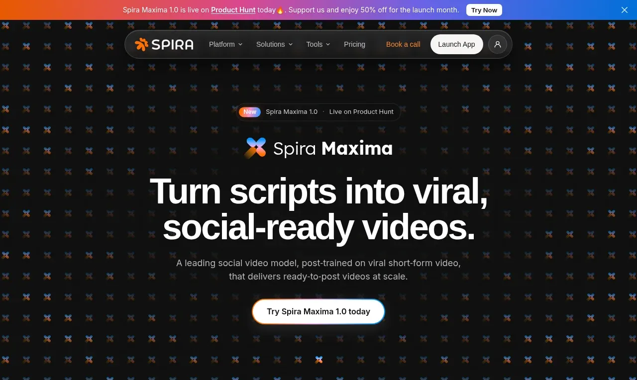 Social-video product hero
Spira Maxima · Hero
Social-video product hero
Spira Maxima · Hero
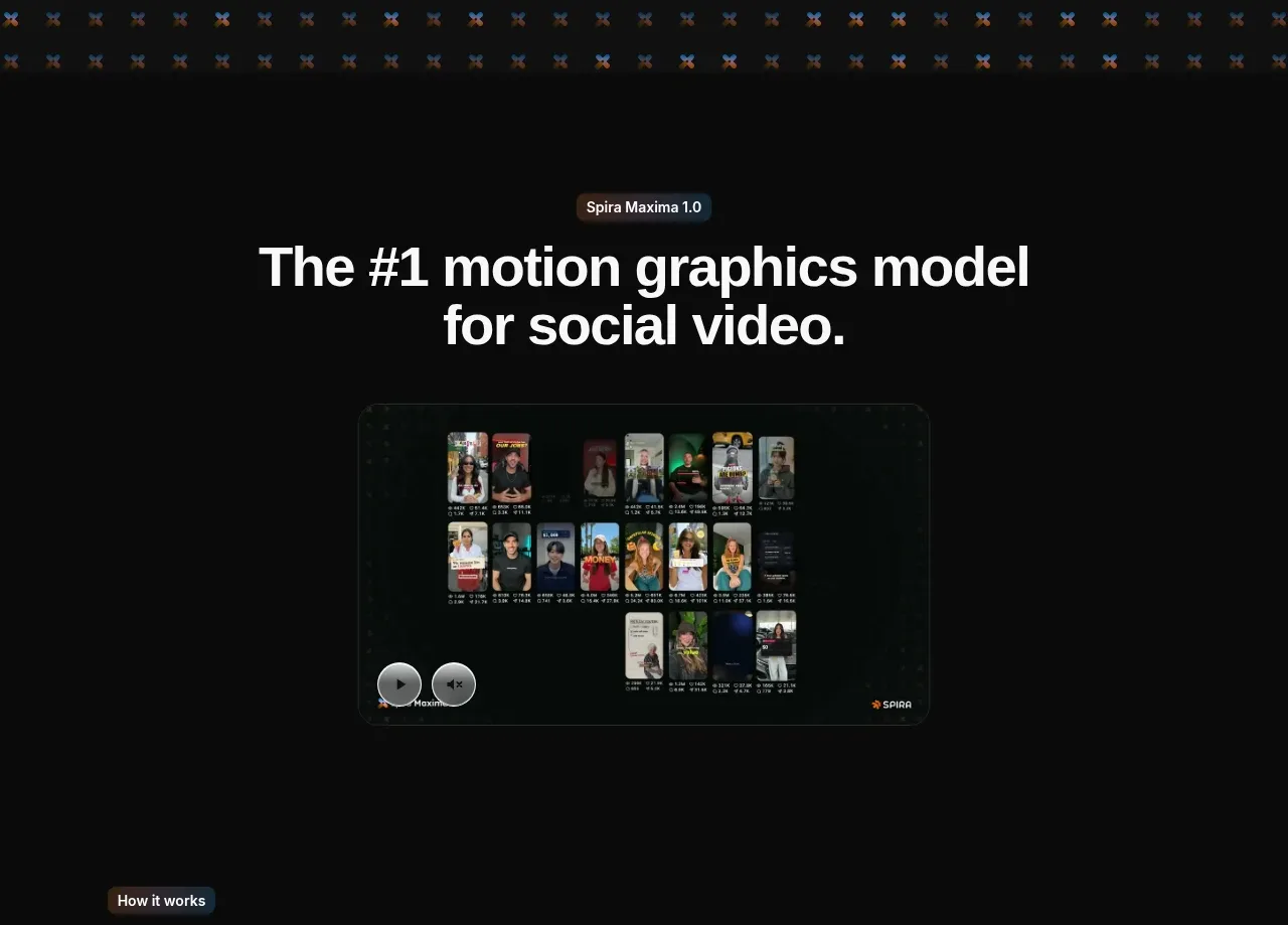 Model introduction and demo
Spira Maxima · Hero
Model introduction and demo
Spira Maxima · Hero
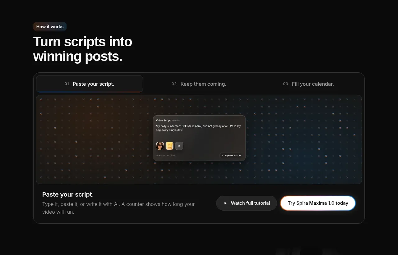 Script-to-output workflow tabs
Spira Maxima · Tabs & steps
Script-to-output workflow tabs
Spira Maxima · Tabs & steps
 Use-case selector with vertical video preview
Spira Maxima · Feature grid
Use-case selector with vertical video preview
Spira Maxima · Feature grid
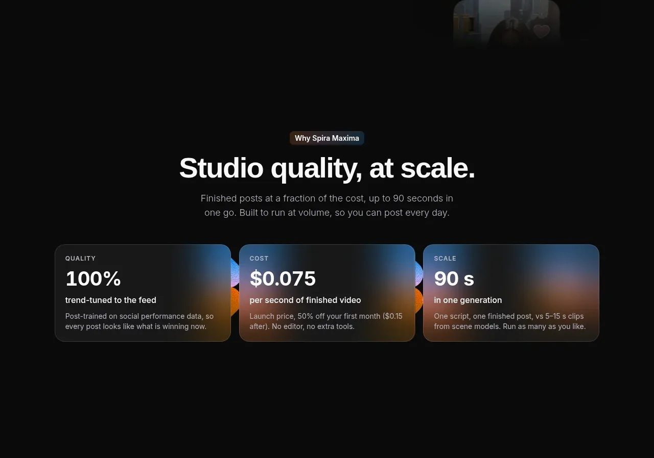 Quality, cost, and scale metrics
Spira Maxima · Stats
Quality, cost, and scale metrics
Spira Maxima · Stats
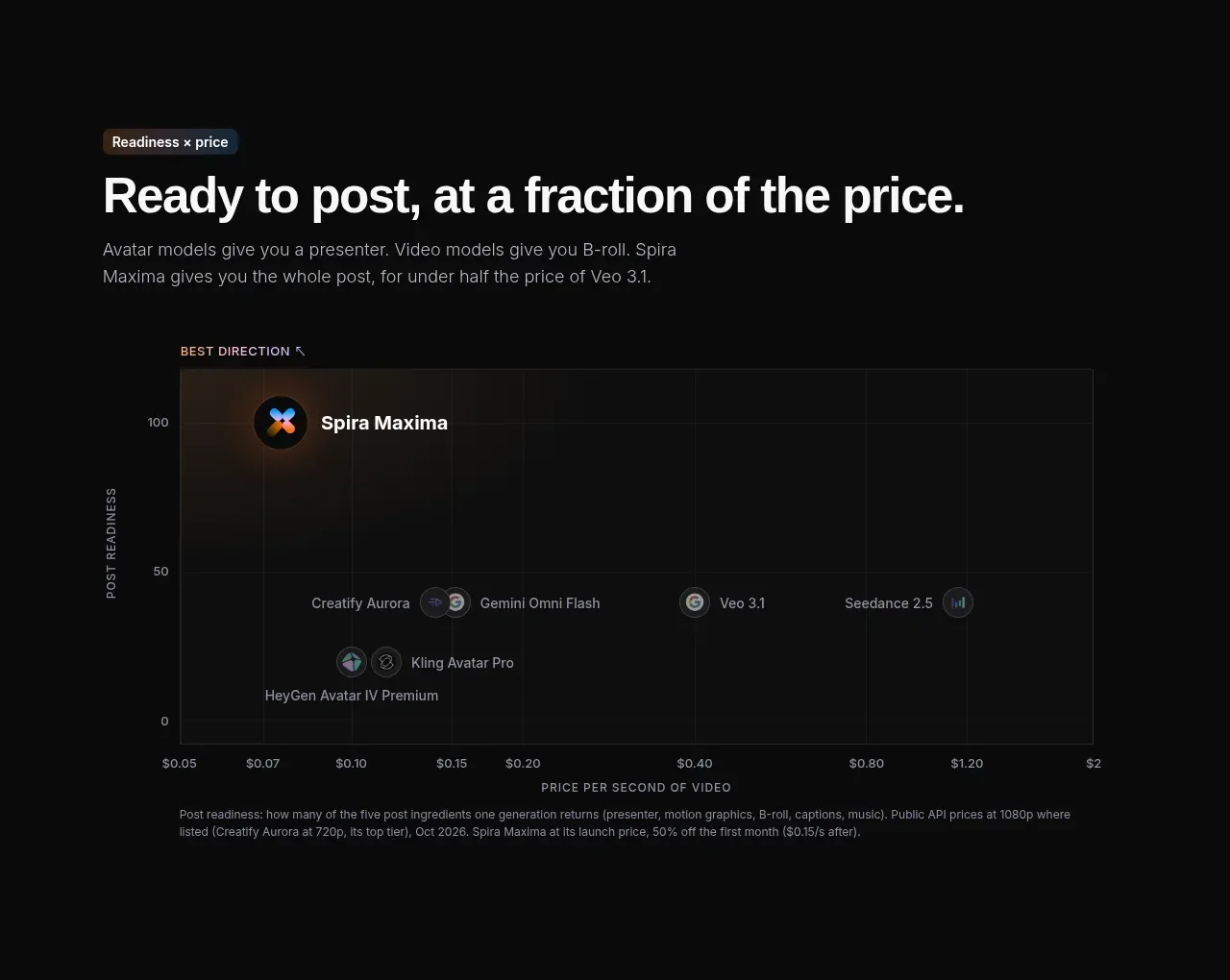 Value positioning scatter chart
Spira Maxima · Chart
Value positioning scatter chart
Spira Maxima · Chart
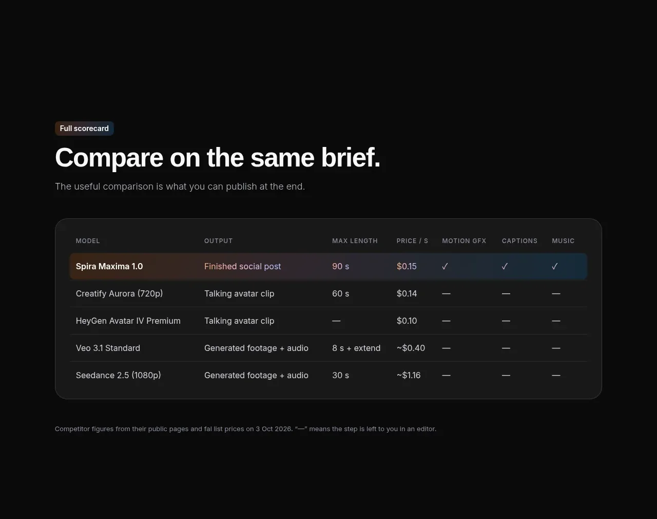 Feature comparison table
Spira Maxima · Table
Feature comparison table
Spira Maxima · Table
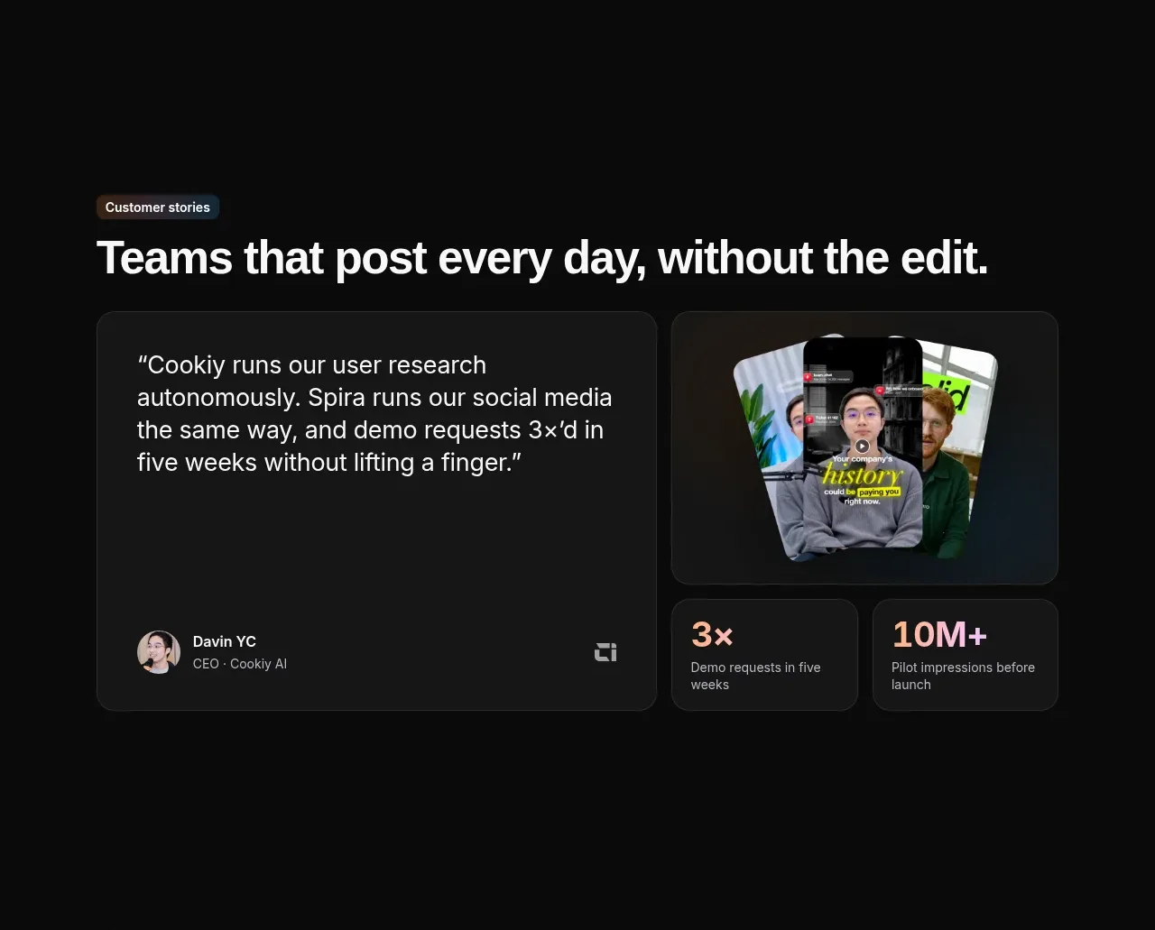 Customer story and proof points
Spira Maxima · Testimonials
Customer story and proof points
Spira Maxima · Testimonials
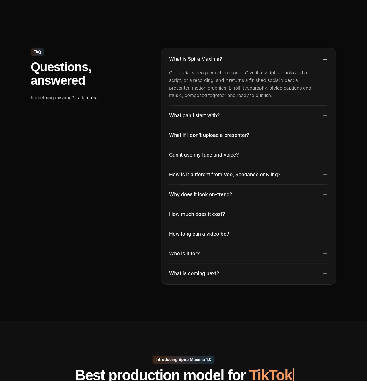 Frequently asked questions
Spira Maxima · FAQ
Frequently asked questions
Spira Maxima · FAQ
 Launch video showcase
Spira Maxima · Card
Launch video showcase
Spira Maxima · Card
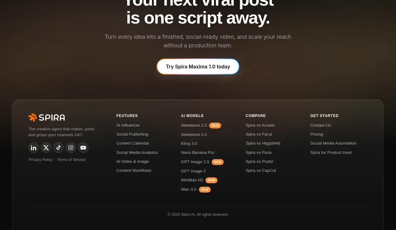 Final conversion CTA and footer
Spira Maxima · Footer
Final conversion CTA and footer
Spira Maxima · Footer