kage
kage
spira.ai

Design analysis
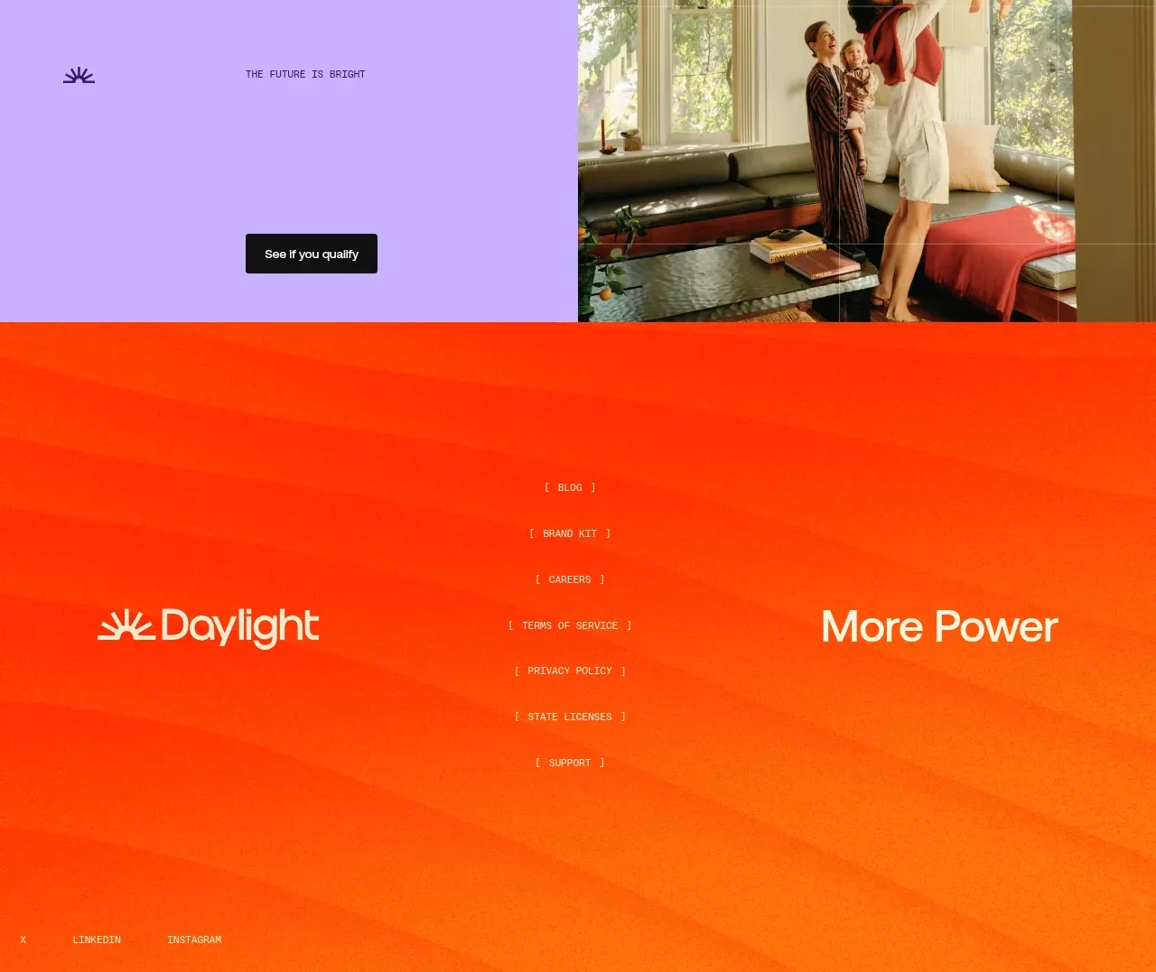
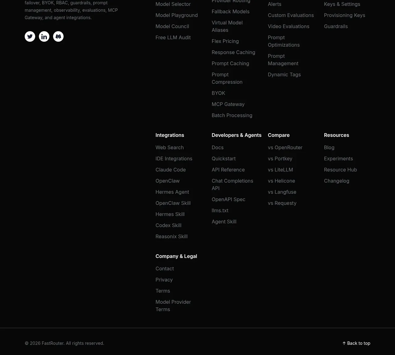
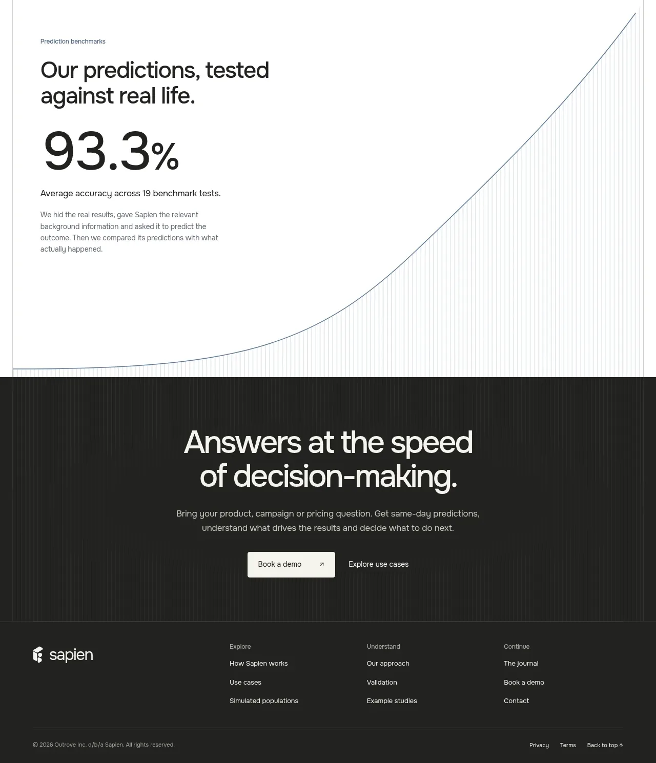
A warm, low-contrast CTA band repeats the primary action before transitioning into a contained multi-column footer. The footer balances brand description, link groups, social controls, and a quiet legal line.
Prompt preview
## Reference images

Study these alongside the description below: hierarchy, rhythm, spacing, colour. Build for the product you are asked about, using this design language.

- Component: https://kage-design-assets.t3.tigrisfiles.io/components/spira-maxima/726c84dd-363c-4980-b0d9-b04757b4422a-1791266567-11.webp
- Full page it was cut from: https://kage-design-assets.t3.tigrisfiles.io/screenshots/spira-maxima/726c84dd-363c-4980-b0d9-b04757b4422a-1791266451959-full.webp
- Component on Kage: https://kage.design/component/spira-maxima-footer

## Before you start
Ask what final action, footer links, legal requirements, and social channels belong to the user's product, then apply these principles to that product.

Build a closing section with a centered CTA band first: use a subtle warm brown-to-black gradient (#241b15 to #0c0d0d), a small eyebrow, a 40–52px headline, muted supporting copy, and one bright pill button. Follow it with a contained footer panel using a dark translucent surface, 1px border, and 18–24px radius. Inside, place a brand/about column, three or four concise link columns, and a bottom divider with copyright/legal links. Use 13–15px footer text, #9b9c9f muted copy, white headings, compact social icon buttons, and generous 32–48px padding. Keep the final CTA distinct from the utility footer and make columns collapse cleanly on mobile.

Never: use logos, product names, copy, illustrations, or imagery from the reference.