 kage
kage
spira.ai
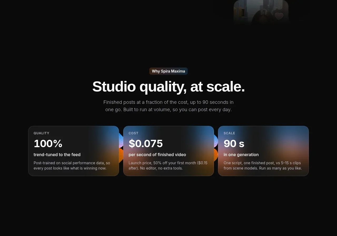
Design analysis
A centered claim is supported by three equal metric cards. Each card uses a large numeric value, a small label, and explanatory copy over a soft multi-colour glow.
Prompt preview
## Reference images

Study these alongside the description below: hierarchy, rhythm, spacing, colour. Build for the product you are asked about, using this design language.

- Component: https://kage-design-assets.t3.tigrisfiles.io/components/spira-maxima/726c84dd-363c-4980-b0d9-b04757b4422a-1791266565-5.webp
- Full page it was cut from: https://kage-design-assets.t3.tigrisfiles.io/screenshots/spira-maxima/726c84dd-363c-4980-b0d9-b04757b4422a-1791266451959-full.webp
- Component on Kage: https://kage.design/component/spira-maxima-stats

## Before you start
Ask which three measurable outcomes best prove the user's product value and what numbers are credible, then apply these principles to that product.

Create a centered metrics section with an eyebrow, a 40–54px heading, and a short supporting paragraph. Below, arrange three equal cards in a responsive grid. Each card should have a tiny uppercase category label, a large bold value, a concise qualifier, and a short explanatory sentence. Use a dark translucent card (#171819), 1px border (#2b2d2e), 14–18px radius, and very soft blurred gradient glows mixing warm orange (#ff7a23), cool blue (#36b7ff), and violet behind or inside the cards. Keep values visually dominant and copy muted. On mobile stack cards while preserving equal hierarchy.

Never: use logos, product names, copy, illustrations, or imagery from the reference.
More components
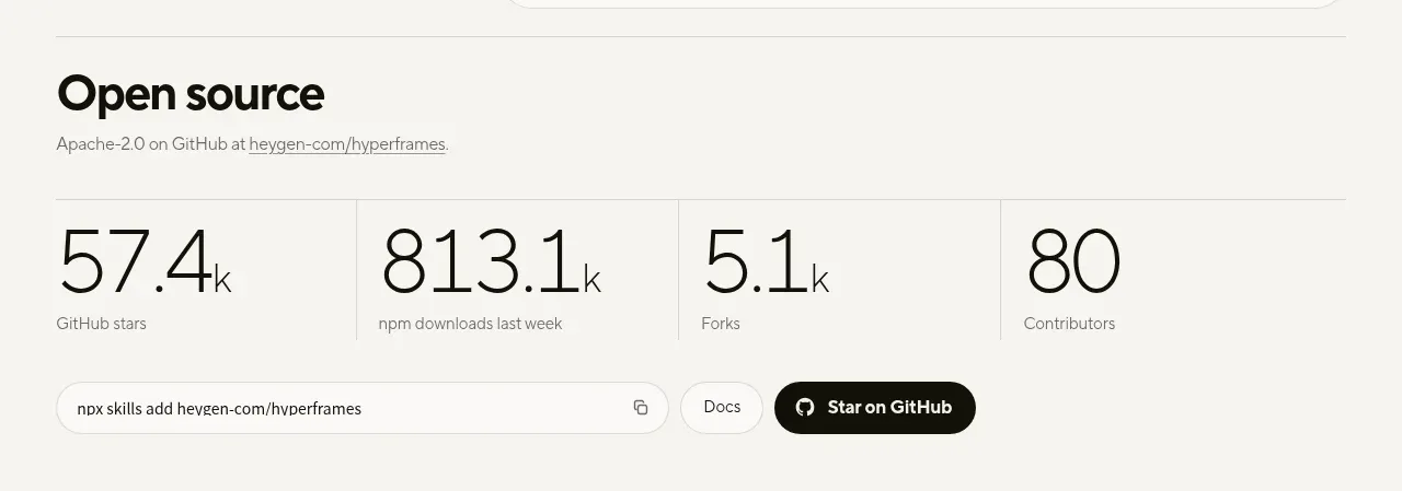
 Open-source proof and repository stats
HyperFrames Studio (Desktop) · Stats
Open-source proof and repository stats
HyperFrames Studio (Desktop) · Stats
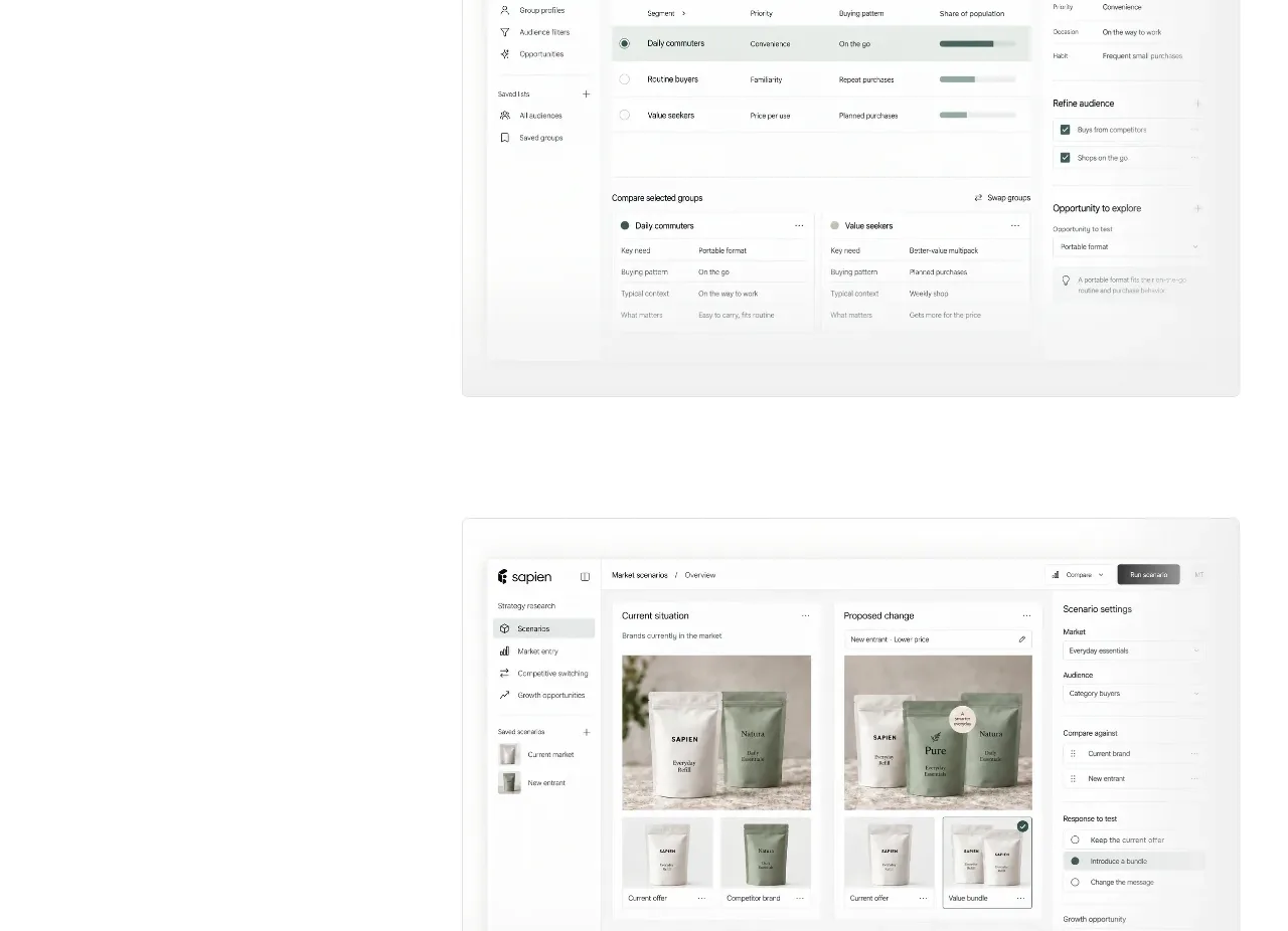
 Prediction benchmark statistic
Sapien · Stats
Prediction benchmark statistic
Sapien · Stats
P
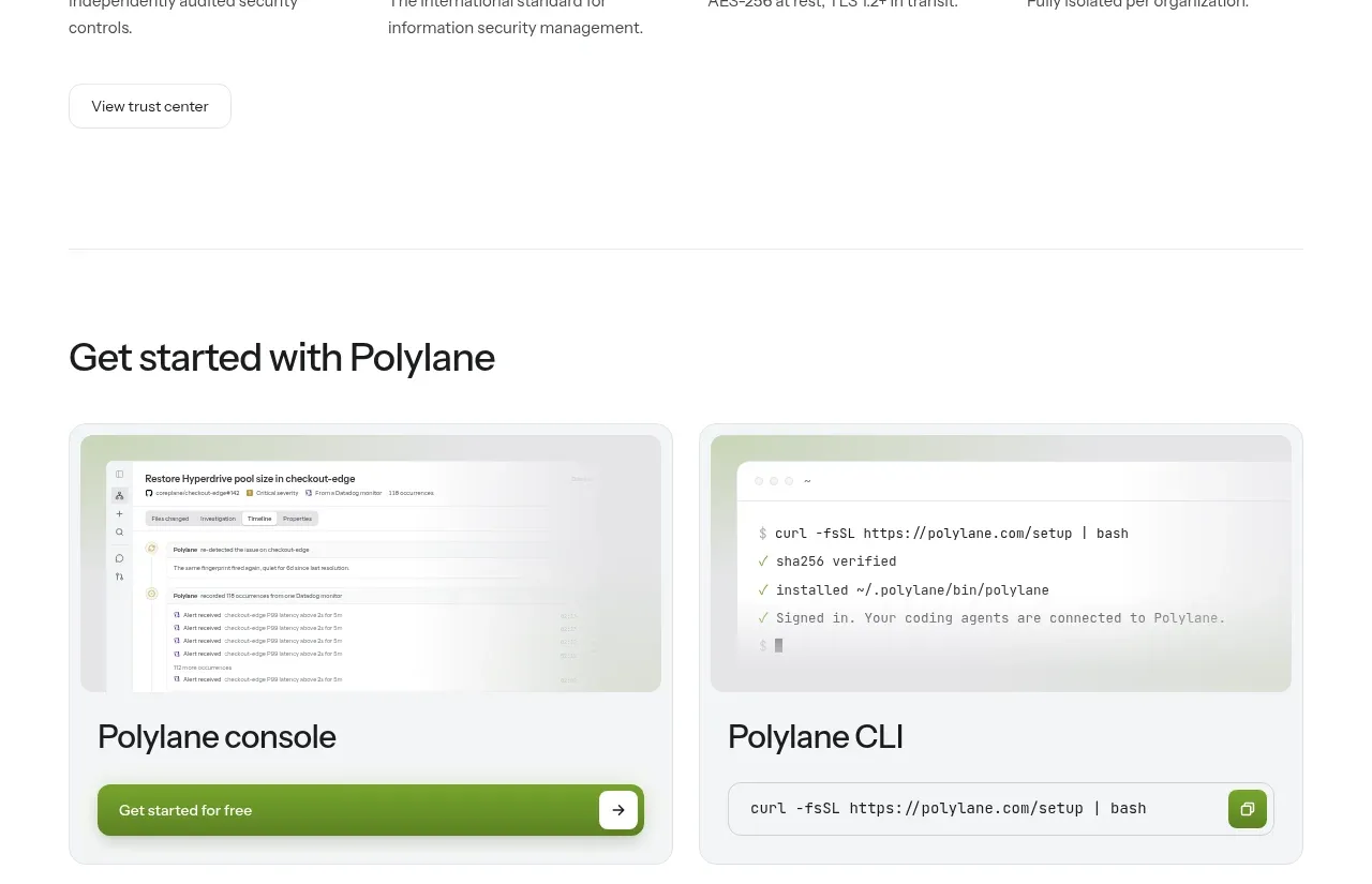
Security and trust assurances
Polylane · Stats

 Safety and control principles
Omnia Agent · Stats
Safety and control principles
Omnia Agent · Stats

 Customer proof and outcome grid
ColdIQ x Slack · Stats
Customer proof and outcome grid
ColdIQ x Slack · Stats

 Real-world proof section
Humalike x GTA RP · Stats
Real-world proof section
Humalike x GTA RP · Stats