 kage
kage
splitformac.com
Design analysis
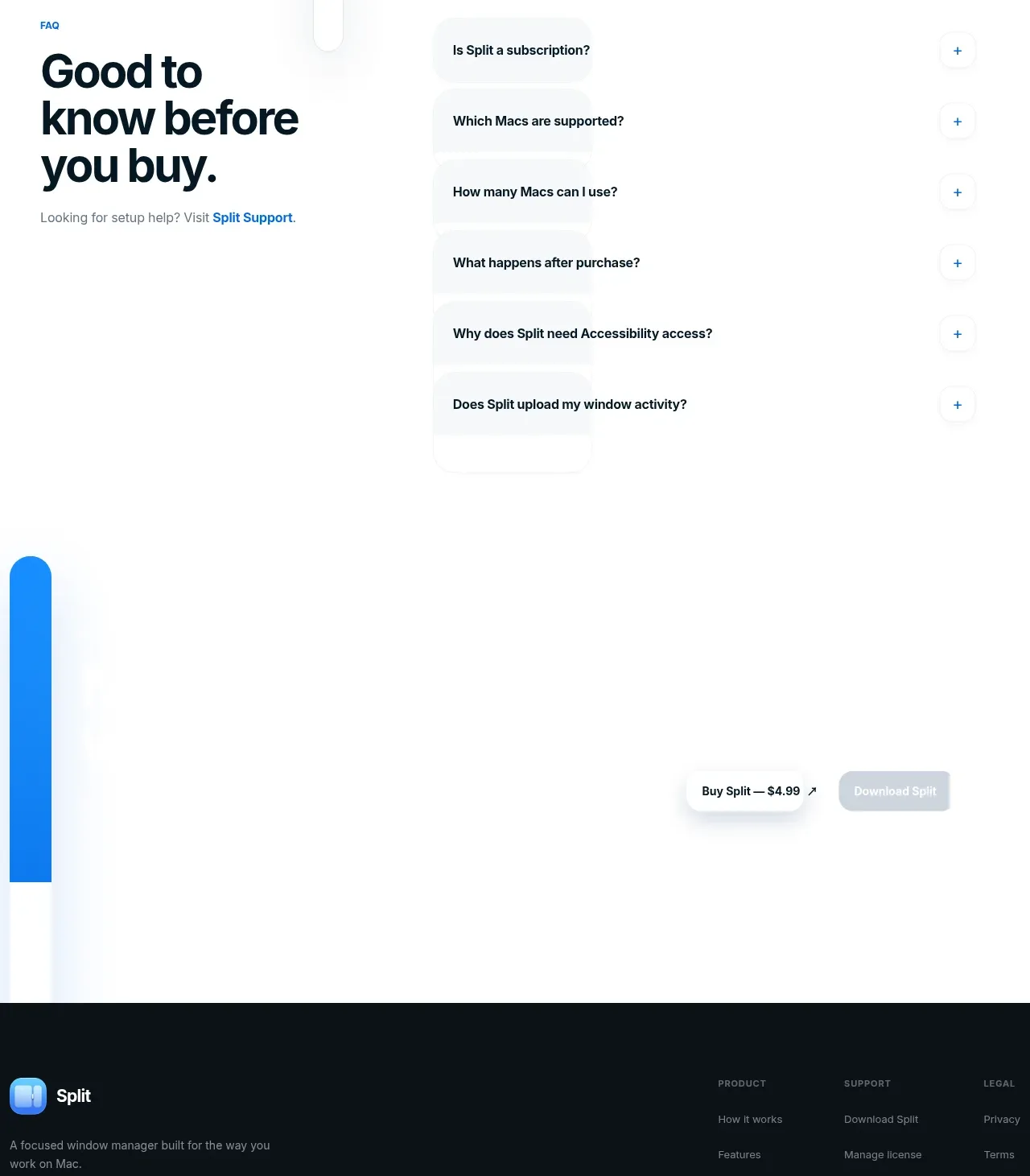
A quiet closing conversion band repeats the purchase action and pairs it with a secondary download action before the footer.
Prompt preview
## Reference images

Study these alongside the description below: hierarchy, rhythm, spacing, colour. Build for the product you are asked about, using this design language.

- Component: https://kage-design-assets.t3.tigrisfiles.io/components/split/8556c614-105f-4777-9be3-693330882192-1790402629-7.webp
- Full page it was cut from: https://kage-design-assets.t3.tigrisfiles.io/screenshots/split/8556c614-105f-4777-9be3-693330882192-1790402544582-full.webp
- Component on Kage: https://kage.design/component/split-cta

## Before you start
Ask what the user's product is, who it is for, and what their brand style should feel like. Apply the principles below to that product rather than copying this reference.

Build a minimalist closing CTA band with generous white space and actions aligned toward the right or centered depending on the product's conversion flow. Include a primary dark or near-black pill button with a concise purchase label and arrow, plus a disabled-looking or secondary pale button only when that action is genuinely unavailable. Use a subtle blue accent element or gradient as a visual anchor, but keep the CTA focused and uncluttered. Buttons should have 12–16px horizontal padding, 10–999px radius, clear hover/pressed states, and accessible contrast. Add a short reassurance line if users need context before acting.

Never use the reference's logos, product names, copy, illustrations, imagery, or exact visual assets.
More components

 Split closing CTA
godaylight.com · Call to action
Split closing CTA
godaylight.com · Call to action
 Network growth CTA
godaylight.com · Call to action
Network growth CTA
godaylight.com · Call to action

 Closing conversion banner
FastRouter.ai · Call to action
Closing conversion banner
FastRouter.ai · Call to action

 Final download call to action
Blenny · Call to action
Final download call to action
Blenny · Call to action

 Visual download call to action
Art4 · Call to action
Visual download call to action
Art4 · Call to action

 Sponsor call to action
opensend.cc · Call to action
Sponsor call to action
opensend.cc · Call to action