kage
kage
splitformac.com

Design analysis
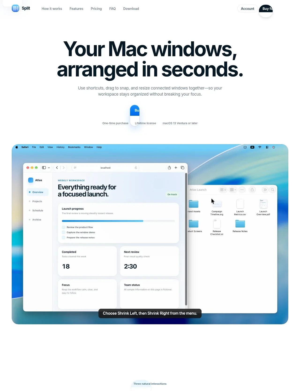
A calm, Apple-keynote-style one-pager: a huge tight-tracked navy grotesque headline over a single gray sentence, then a full-width rounded macOS demo with a floating dark caption pill. Down the page the rhythm is strictly one idea per viewport — short centered eyebrow/headline/sub blocks alternating with oversized product screenshots and two scroll-driven demo strips — before narrowing into a single $4.99 lifetime pricing card, a two-column FAQ accordion, and a dark footer that ends in a giant cropped "SPLIT YOUR SPACE" wordmark. Colour discipline is total: white canvas, near-black navy type, gray supporting copy, and one blue accent reserved for eyebrows, links and the primary pill.
Prompt preview
## Reference images

Study these alongside the description below: hierarchy, rhythm, spacing, colour. Build for the product you are asked about, using this design language.

- Full page: https://kage-design-assets.t3.tigrisfiles.io/screenshots/split/8556c614-105f-4777-9be3-693330882192-1790402544582-full.webp
- Above the fold: https://kage-design-assets.t3.tigrisfiles.io/screenshots/split/8556c614-105f-4777-9be3-693330882192-1790402541232.webp
- Design on Kage: https://kage.design/designs/split-landing-page

## Before you start
Ask the user what they are building, who it is for, and what brand assets they already have (name, logo, colours, type). Wait for the answers before writing any code. Everything below is applied to *their* product — the reference page only teaches the design language.

## Page structure
1. **Slim top nav** — logo mark + wordmark left, 4–5 plain text links center (How it works, Features, Pricing, FAQ, Download), a quiet "Account" text button and one dark pill CTA right. White bar, no border until scroll.
2. **Hero** — centered two-line display headline, one-sentence gray subtitle, then a CTA cluster: primary blue pill button with three 12px micro-labels under it (purchase model · license type · minimum OS).
3. **Hero demo** — full-width product screenshot in a large-radius rounded container with hairline border and soft ambient shadow; a dark caption pill pinned near its bottom edge names the exact interaction being shown.
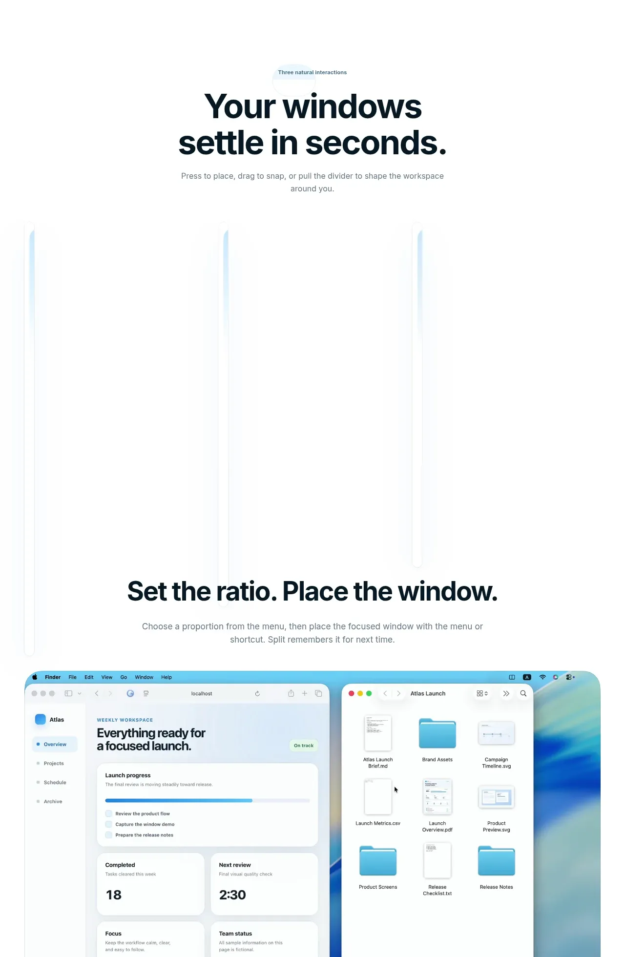
4. **Section intro + scroll demo** — small gray eyebrow ("Three natural interactions"), centered headline, one-sentence sub, then a tall scroll-driven demo strip where the product's windows move/snap as the user scrolls.
5. **Interaction 1** — centered headline ("Set the ratio. Place the window.") + one-sentence sub, followed by a full-width screenshot of the menu-driven placement flow.
6. **Interaction 2** — headline ("Drag into position. Release into place.") + sub, followed by a screenshot capturing an in-progress drag with a destination preview overlay.
7. **Interaction 3** — headline ("Move one divider. Keep both sides in sync.") + sub, followed by a screenshot of two panes resizing together around a divider.
8. **Workflows section** — blue eyebrow ("Built for repeat workflows"), centered headline, sub, then a second scroll-driven demo strip (swapping/switching windows).
9. **Platform section** — blue eyebrow ("Built around macOS"), centered headline, sub, then a darker demo panel showing OS-level integration.
10. **Pricing** — centered headline ("One price. Lifetime license.") + sub, then a single narrow card: app icon + plan name + small badge pill, one-line description, very large price, a toggle/control, six checklist rows with small check icons, and a fine-print checkout line.
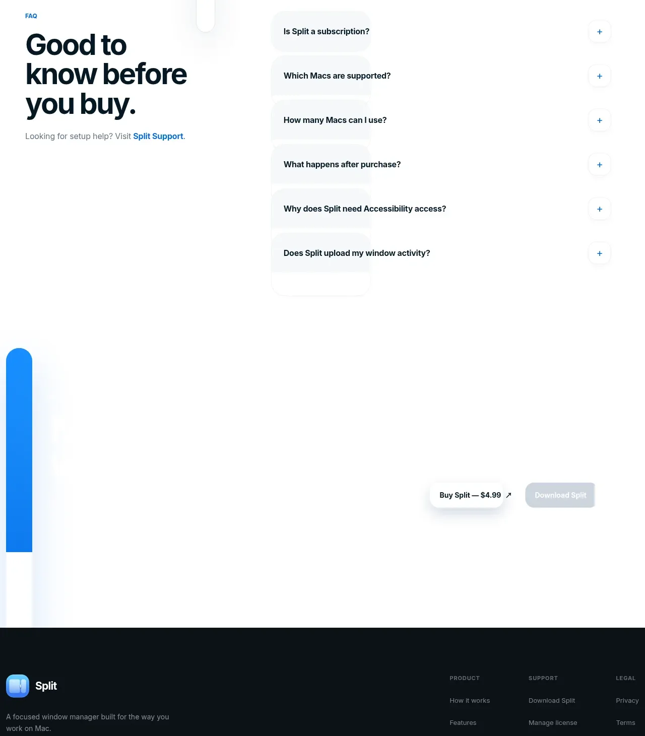
11. **FAQ** — two-column: left holds the headline ("Good to know before you buy.") plus a support link; right holds six accordion rows, each a rounded hairline bar with a plus icon.
12. **Pre-footer CTA** — centered pair of pills: light "Buy … — $4.99" and dark "Download …".
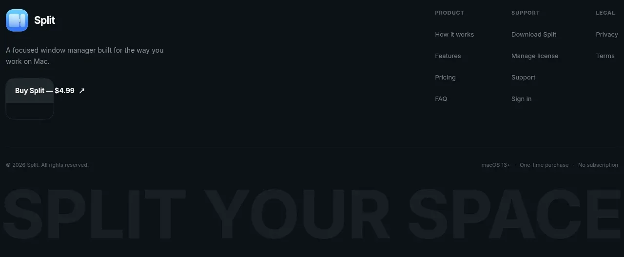
13. **Footer** — dark navy panel: logo + one-line description + buy pill on the left; three link columns (Product / Support / Legal); a legal row; finish with a giant display wordmark cropped by the bottom edge of the page.

## Design language
- Canvas is pure white (#FFFFFF); only the footer inverts. Hierarchy is carried by size and weight, not colour.
- One bold geometric-grotesque family throughout. Display headlines: tight tracking (−0.02 to −0.04em), line-height ~1.05, hero ~88px, section headlines ~48–56px, near-black navy (#0F1B2D).
- Body copy: 15–16px in muted gray (#67707E), max ~60ch, always one or two sentences per section. Eyebrows: 12–13px semibold, gray or blue.
- One accent colour only — bright blue (#0A7AFF) — used exclusively for eyebrows, inline links, the primary button and the app icon; never as large fills or section backgrounds.
- Product visuals sit in 20–24px-radius containers with 1px #E8ECF1 borders and a very soft, large-blur shadow; internal demo UI stays light with #F6F8FA panels and small blue data accents.
- Buttons are fully rounded pills: blue fill for primary, white/gray hairline for secondary, near-black ink pill for dark CTAs. Caption pills overlaying demos are ~90% opaque #0F1B2D with 13px white text.
- Rhythm: one idea per viewport — a short centered text block (≤640px wide) then one large visual; 120–160px vertical padding between sections; density stays airy until the pricing card tightens into a narrow single column.
- Motion: scroll-driven step demos where windows place, drag or resize in sync with scrolling, gentle ease-out; hover states limited to slight darkening or opacity shifts; no parallax elsewhere.
- Small UI details: check and plus icons at 12–13px in gray circles or hairline borders, "Lifetime"-style badge pills in soft tinted backgrounds, fine print at 12–13px gray.

## Never
- Do not reuse the Split name, logo, app icon, tagline, captions, the "SPLIT YOUR SPACE" sign-off, or the fictional "Atlas" workspace content and its copy.
- Do not imitate macOS menu bars, traffic-light buttons or Apple wallpapers for the user's product — rebuild all demos with the user's own product UI and brand.
- Never present the result as Split or reproduce its pricing, FAQ wording or footer links.
Components from this page
All components
 Top navigation
Split · Navigation
Top navigation
Split · Navigation
 Window management hero
Split · Hero
Window management hero
Split · Hero
 Three interaction demos
Split · Hero
Three interaction demos
Split · Hero
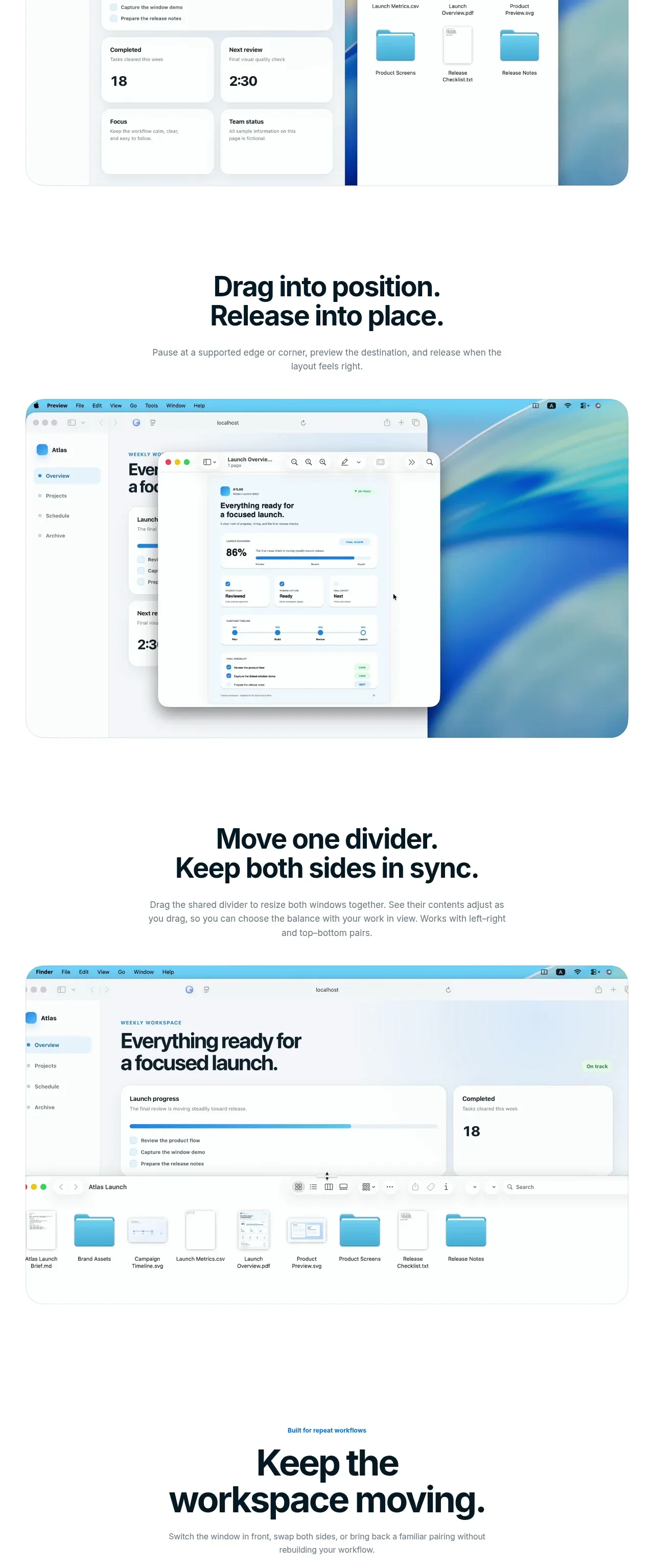 Workflow feature demonstrations
Split · Feature grid
Workflow feature demonstrations
Split · Feature grid
 Workspace continuity feature
Split · Feature grid
Workspace continuity feature
Split · Feature grid
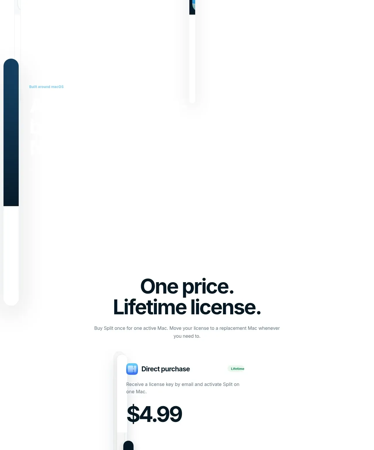 Single lifetime-license offer
Split · Pricing table
Single lifetime-license offer
Split · Pricing table
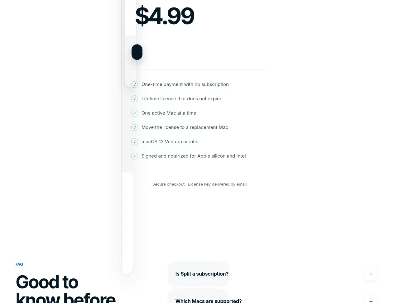 Pre-purchase FAQ
Split · FAQ
Pre-purchase FAQ
Split · FAQ
 Purchase and download CTA
Split · Call to action
Purchase and download CTA
Split · Call to action
 Dark site footer
Split · Footer
Dark site footer
Split · Footer