kage
kage
splitformac.com
Design analysis
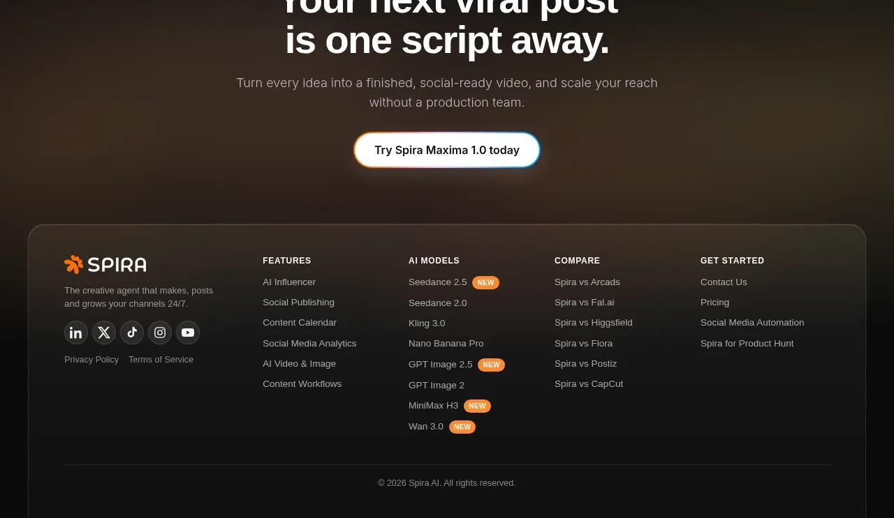
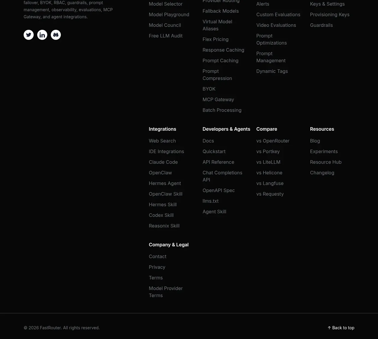
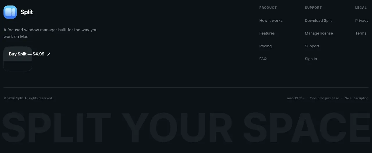
A dark footer closes the page with brand summary, purchase action, grouped navigation, legal links, and a low-contrast oversized brand statement.
Prompt preview
## Reference images

Study these alongside the description below: hierarchy, rhythm, spacing, colour. Build for the product you are asked about, using this design language.

- Component: https://kage-design-assets.t3.tigrisfiles.io/components/split/8556c614-105f-4777-9be3-693330882192-1790402629-8.webp
- Full page it was cut from: https://kage-design-assets.t3.tigrisfiles.io/screenshots/split/8556c614-105f-4777-9be3-693330882192-1790402544582-full.webp
- Component on Kage: https://kage.design/component/split-footer

## Before you start
Ask what the user's product is, who it is for, and what their brand style should feel like. Apply the principles below to that product rather than copying this reference.

Create a dark multi-column footer using a near-black/navy background around #090f13. Place the brand identity and a two-line product summary on the left, with a purchase CTA beneath. Group navigation into clear columns such as product, support, and legal, using 11–13px uppercase or small-label headings and muted links around #78828a. Add a thin divider near the bottom, then copyright and legal metadata in small text. A very large low-contrast typographic brand statement can sit at the bottom as an atmospheric layer, using #121b21 rather than a bright image. Preserve strong contrast for interactive links, include hover/focus states, and stack columns responsively.

Never use the reference's logos, product names, copy, illustrations, imagery, or exact visual assets.