kage
kage
squadroom.app

Design analysis
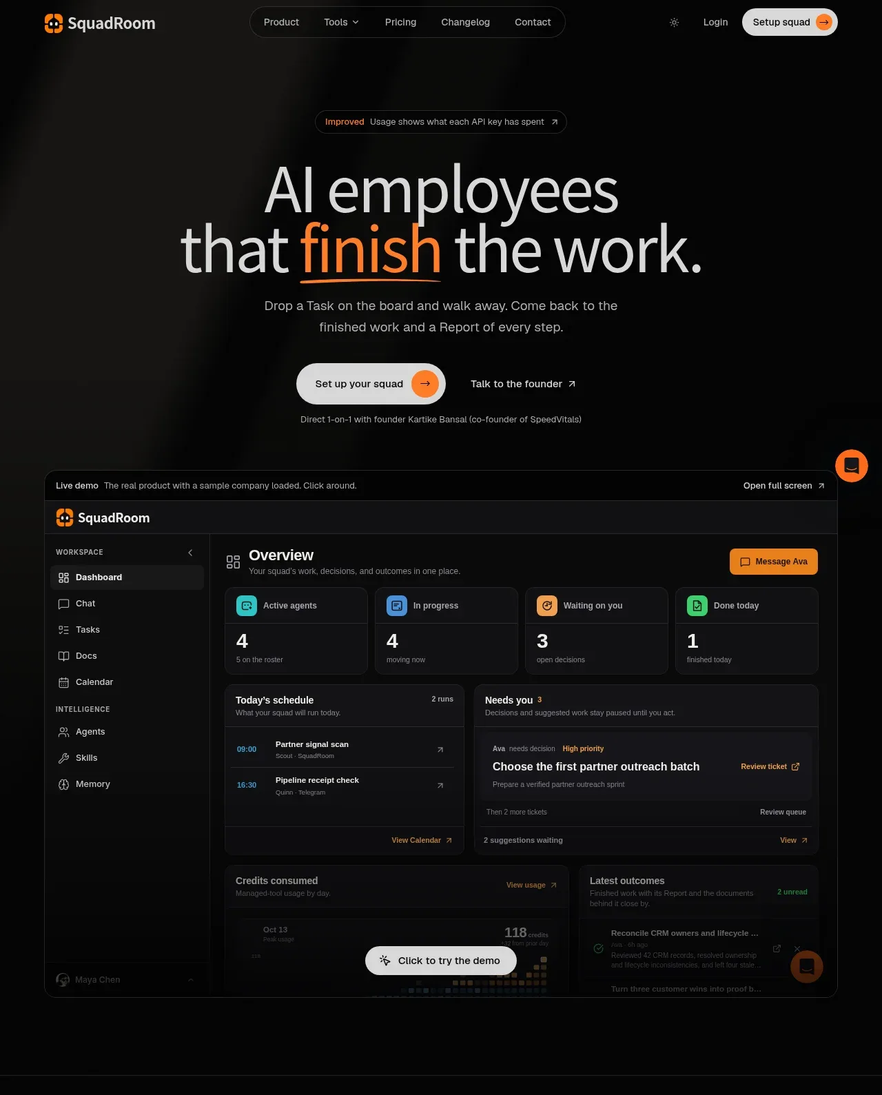
A long-form dark landing page uses near-black surfaces, fine gray borders, and restrained orange highlights to present an AI-workforce product as a tangible operating system. The hero is sparse and typographic, then the page shifts into dense product evidence: a live dashboard, numbered workflow, agent org chart, kanban/activity view, linked ticket-report-doc flows, billing and model routing, integrations, research, pricing, FAQ, and a light closing CTA; alternating two-column layouts and full-width framed UI panels keep the rhythm varied while preserving a technical, premium tone.
Prompt preview
## Reference images

Study these alongside the description below: hierarchy, rhythm, spacing, colour. Build for the product you are asked about, using this design language.

- Full page: https://kage-design-assets.t3.tigrisfiles.io/screenshots/squadroom/d449f1a3-a1d7-46c0-a9d5-0020447fa3ed-1791871247696-full.webp
- Above the fold: https://kage-design-assets.t3.tigrisfiles.io/screenshots/squadroom/d449f1a3-a1d7-46c0-a9d5-0020447fa3ed-1791871241612.webp
- Design on Kage: https://kage.design/designs/squadroom-landing-page

## Before you start
Ask the user what they are building, who it is for, and what brand assets they already have (name, colours, type, logos or other visual constraints). Wait for their answers before proceeding. Apply everything below to their product, not to the reference product, and use their content and brand assets rather than inventing a clone.

## Page structure
1. **Global header:** Place a compact brand mark and name at left, a centered pill-like navigation with product, tools, pricing, changelog and contact links, and small login plus high-contrast setup CTA controls at right.
2. **Hero announcement and headline:** Start with a small bordered update pill, then a very large centered two-line headline with one warm accent word underlined or coloured. Follow with a concise supporting paragraph and two actions, keeping generous empty space around the content.
3. **Live product demo:** Embed a wide, dark framed application preview directly below the hero. Include a demo notice bar, app header, left sidebar navigation, overview heading, KPI cards, schedule and decision panels, usage/outcome panels, and a floating or inline “try the demo” prompt.
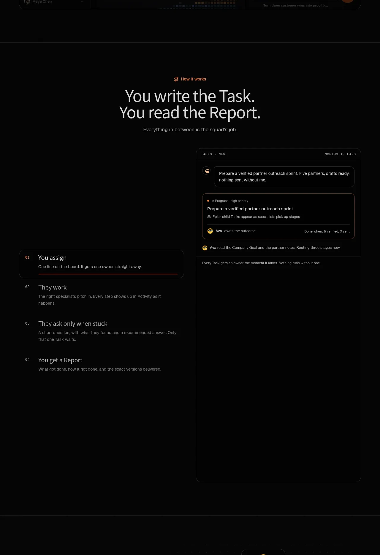
4. **Workflow explainer:** Introduce the process with a small orange eyebrow, centered headline and subtitle. Use a tall two-column composition: numbered steps on the left—assign, work, ask when stuck, receive a report—and a large task-detail/product panel on the right.
5. **Agent squad section:** Use a horizontal split layout with a short explanatory heading and link on the left, and an organizational tree on the right. Show one lead agent routing into several specialist cards, using distinct small avatar colours and status indicators.
6. **Sprint board section:** Add a brief explanatory line above a wide row of tall, mostly empty product columns. Show TODO, in progress, blocked, done and activity feed states with small coloured status dots and understated labels.
7. **Proof and traceability section:** Introduce the idea with a left-aligned heading and link, then alternate connected UI examples and explanatory copy: a ticket asking for a decision, a report showing the result, and a versioned document preserving outputs. Use thin connector lines and generous vertical spacing.
8. **Billing and model-routing section:** Present a heading about direct billing and a short paragraph, followed by a two-panel technical diagram. The first panel maps agents to model providers and editable settings; the second is a monospaced-looking monthly bill summary.
9. **Integrations and chat section:** Center an eyebrow, large two-line headline and supporting copy. Add an integration link, two rows of compact pill-shaped tool chips, three short capability notes, then a lower split panel with a chat transcript on the left and connection-scope permission controls on the right.
10. **Research section:** Use a two-column feature row with a framed social/web research results panel on the left and heading, explanation, link and source chips on the right.
11. **Pricing section:** Build a split layout with the plan explanation, pricing/changelog notes and link on the left, and a large bordered pricing card on the right. Make the price prominent, list benefits in two columns with orange check marks, and finish with a light CTA button.
12. **FAQ section:** Place a large “questions answered” heading and contact link on the left, with a vertical stack of wide bordered accordion rows and chevrons on the right.
13. **Closing CTA:** End with a large light-gray rounded panel against the dark page. Put the final heading, supporting copy, primary orange CTA, secondary text link and small reassurance on the left; show a compact dark task UI preview on the right.

## Design language
- Use a near-black foundation around `#050505` to `#0a0a0a`, with slightly lighter black panels around `#101010`; let the page feel like a premium operations console rather than a decorative marketing site.
- Build hierarchy almost entirely with type scale, spacing and alignment: oversized light-weight headlines, small uppercase or monospaced metadata, compact body copy, and orange eyebrow labels. Keep hero and major feature headlines around 48–68px on desktop, section headings around 36–52px, and dense UI text around 10–14px.
- Pair a clean modern sans-serif for headlines and body copy with a restrained mono or letter-spaced treatment for panel headers, timestamps, labels and billing details. Use sentence-case interface labels and avoid excessive bold weight.
- Use warm orange around `#ff751f` as the only strong brand accent. Reserve it for one hero word, eyebrows, links, active borders, status details and primary actions; use muted green, blue, cyan, yellow and magenta only as small semantic indicators inside product mockups.
- Keep contrast controlled: primary text is soft white around `#e8e8e8`, secondary text is gray around `#858585`, and dividers are barely visible gray around `#242424`. Avoid broad white backgrounds except for the final CTA panel.
- Treat borders as a core visual system. Use 1px gray outlines, subtle inner highlights, dark fills, and small radii around 8–14px for panels; reserve larger 20–24px rounding for the closing CTA. Avoid prominent drop shadows and gradients; use faint glows or soft background light only behind major sections.
- Alternate page rhythm deliberately: sparse centered hero, dense dashboard evidence, tall editorial workflow, diagrammatic squad section, wide empty-state board, connected proof cards, technical billing panels, integrations and chat, then practical pricing and FAQ. Separate major sections with thin horizontal rules and generous vertical padding.
- Make product evidence look functional rather than illustrative: use realistic tables, cards, status dots, tabs, timestamps, permission toggles, reports and version controls. Keep mockups dark, tightly gridded and text-led.
- Use two-column layouts for explanatory features, with copy typically occupying 35–45% and the UI evidence 55–65%. Let large panels extend visually across the grid while keeping consistent page margins.
- Style buttons as compact pills with high contrast. Use off-white or light-gray fills for primary conversion actions in dark areas, orange fills for the strongest CTA moments, and small circular arrow affordances inside buttons.
- Keep interaction cues restrained: use chevrons for accordions, underlined or arrow-ended links, hover states that brighten borders and orange accents, and subtle panel transitions. If animated, prefer slow reveal, connection-line drawing, or status changes over bouncy effects.
- Preserve responsive behavior: collapse navigation and multi-column product panels into readable vertical stacks, keep the hero centered, allow integration chips to wrap, and retain the section order and contrast hierarchy on mobile.

## Never
- Do not use any logos, wordmarks, product names, copy, illustrations, photography or icon sets from the reference.
- Do not reproduce the reference company, its AI-agent names, sample data, dashboard labels, pricing language or exact UI contents.
- Do not present the result as SquadRoom or imply affiliation with it.
- Do not turn the page into a generic black hero: carry the full evidence-led progression through workflow, product panels, integrations, pricing, FAQ and the final light CTA using the user’s own product content.
Components from this page
All components
 Minimal product navigation
SquadRoom · Navigation
Minimal product navigation
SquadRoom · Navigation
 AI workforce hero with live demo
SquadRoom · Hero
AI workforce hero with live demo
SquadRoom · Hero
 Task-to-report workflow
SquadRoom · Feature grid
Task-to-report workflow
SquadRoom · Feature grid
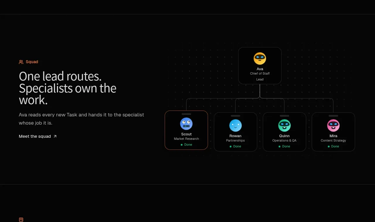 Agent team routing diagram
SquadRoom · Feature grid
Agent team routing diagram
SquadRoom · Feature grid
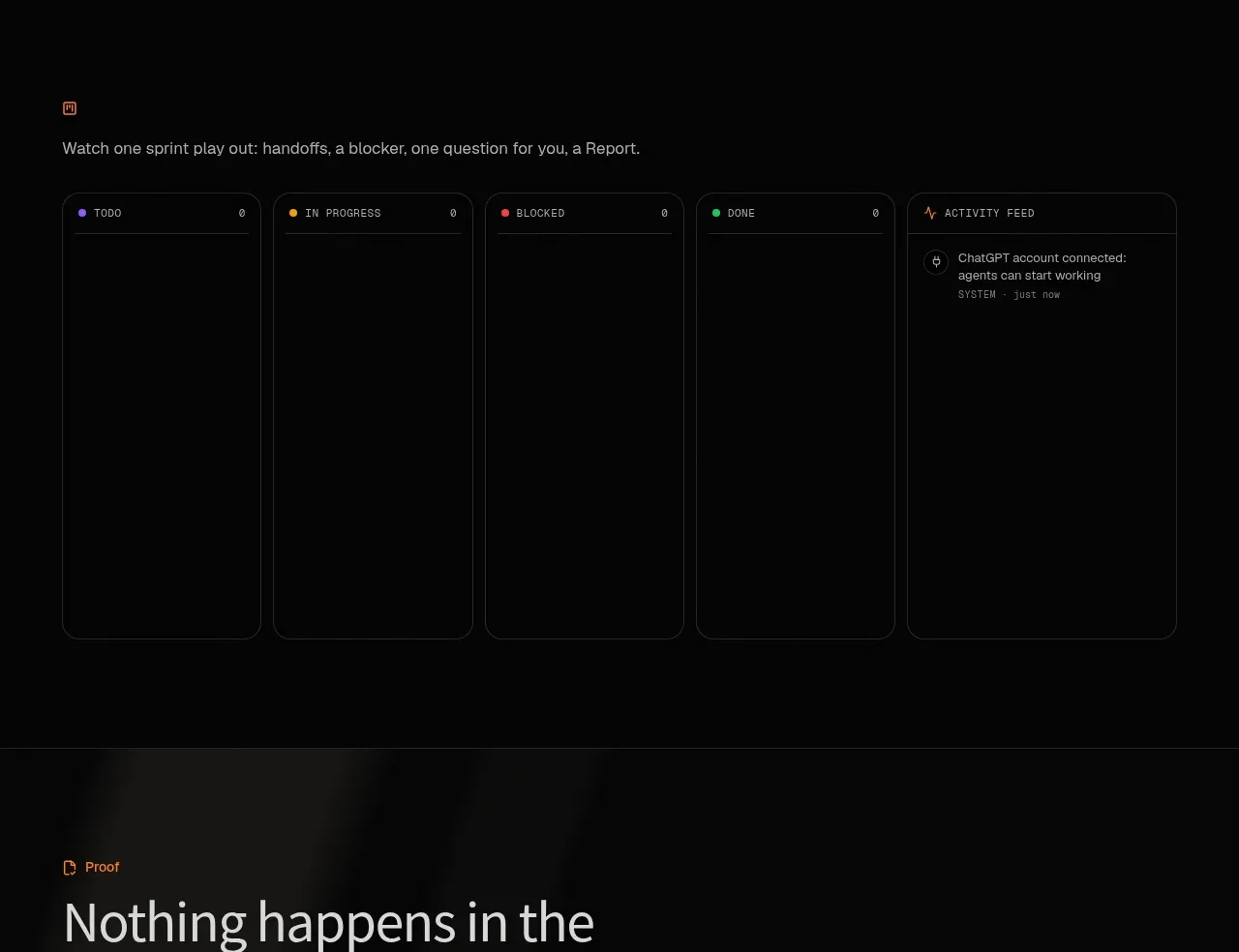 Operational board preview
SquadRoom · Gallery
Operational board preview
SquadRoom · Gallery
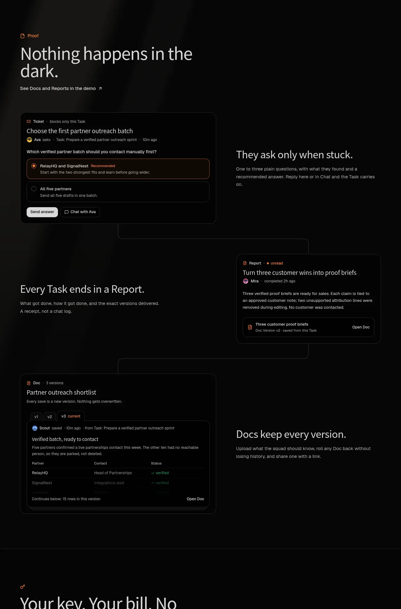 Proof, reports, and versioned docs
SquadRoom · Feature grid
Proof, reports, and versioned docs
SquadRoom · Feature grid
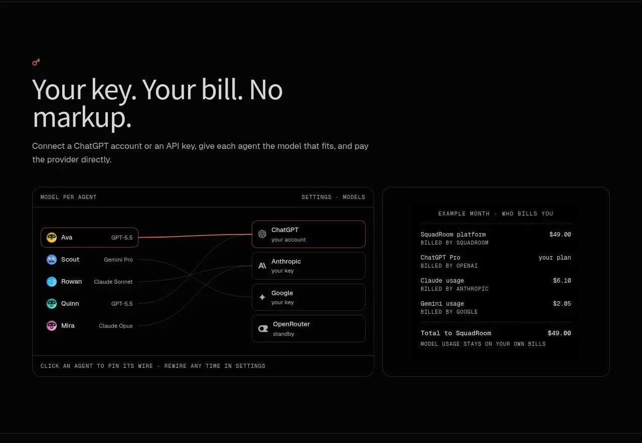 Model routing and transparent billing
SquadRoom · Feature grid
Model routing and transparent billing
SquadRoom · Feature grid
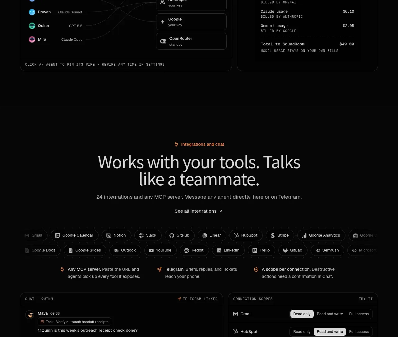 Customer research capture
SquadRoom · Feature grid
Customer research capture
SquadRoom · Feature grid
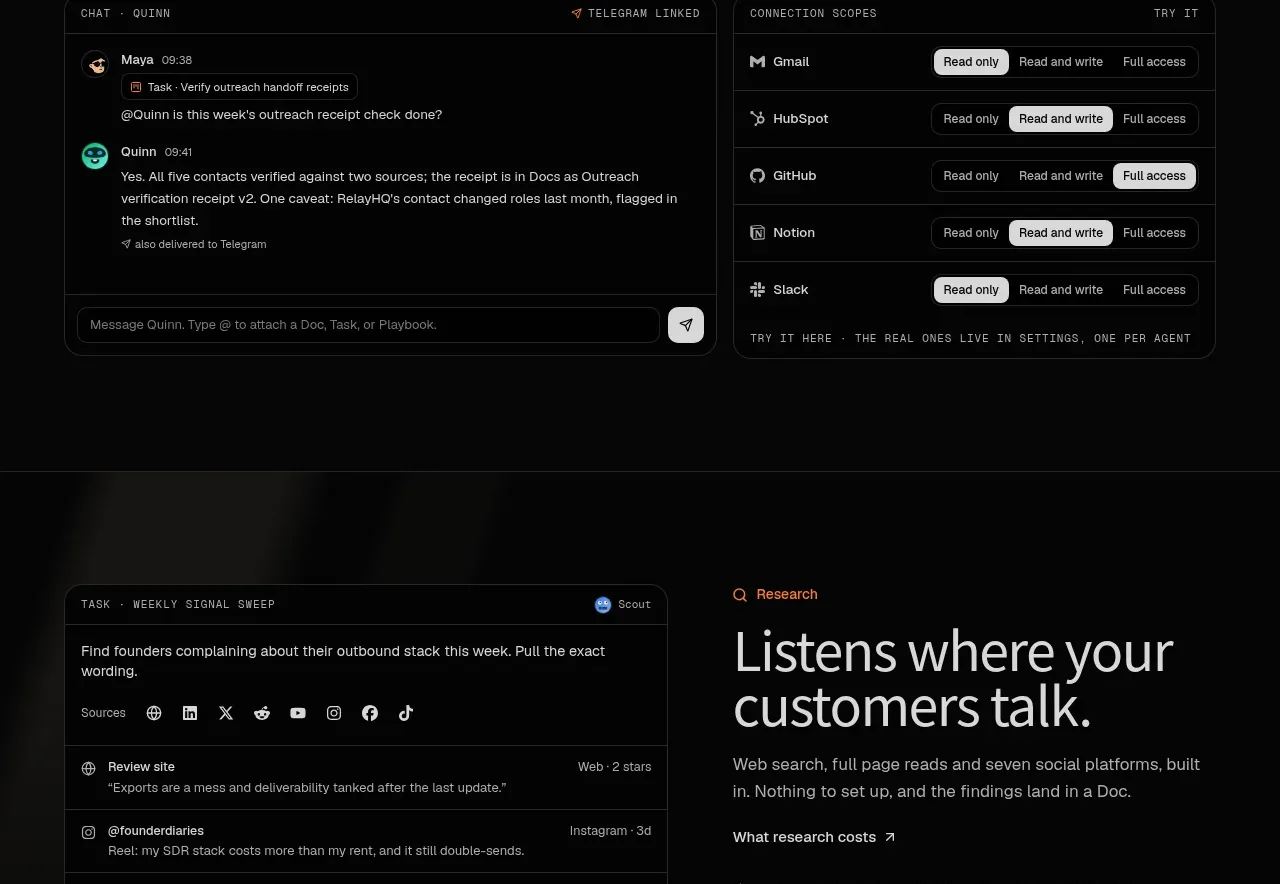 Single-plan pricing
SquadRoom · Pricing table
Single-plan pricing
SquadRoom · Pricing table
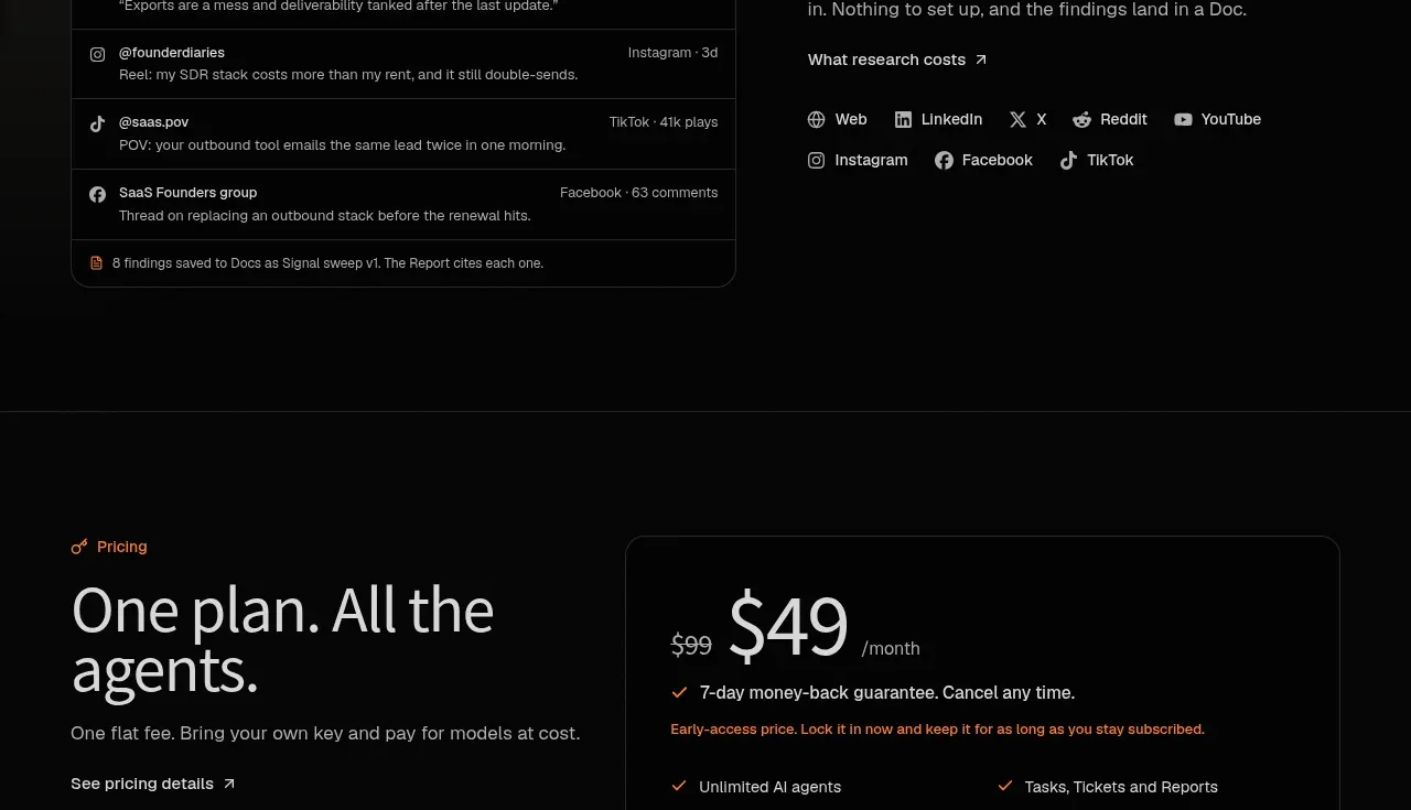 Questions answered
SquadRoom · FAQ
Questions answered
SquadRoom · FAQ
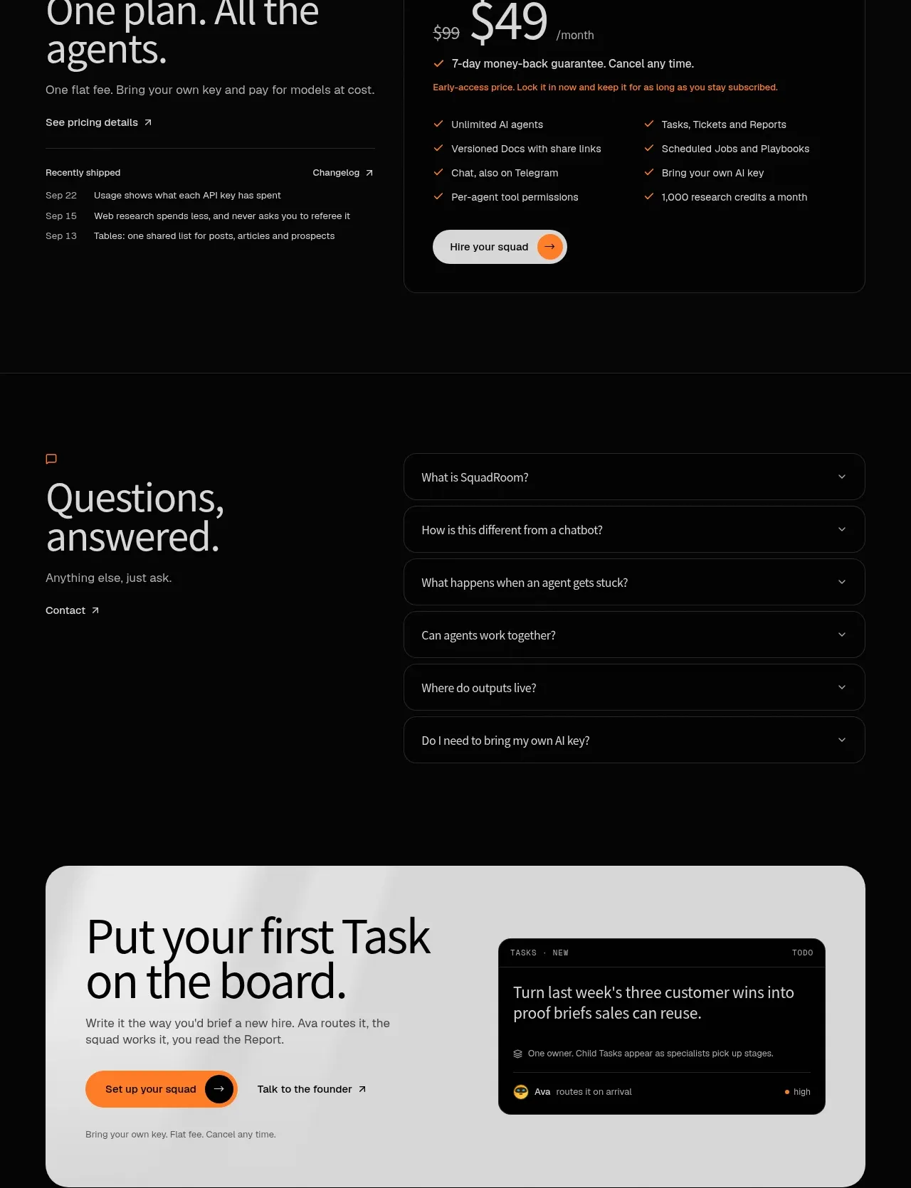 First-action conversion banner
SquadRoom · Call to action
First-action conversion banner
SquadRoom · Call to action