kage
kage
squadroom.app
Design analysis
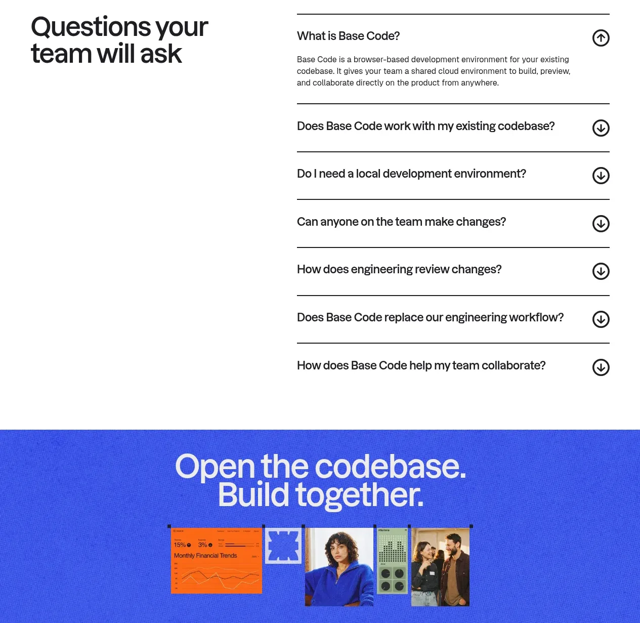
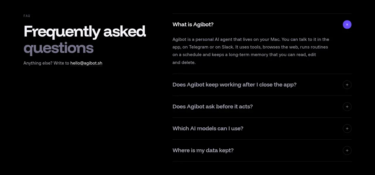
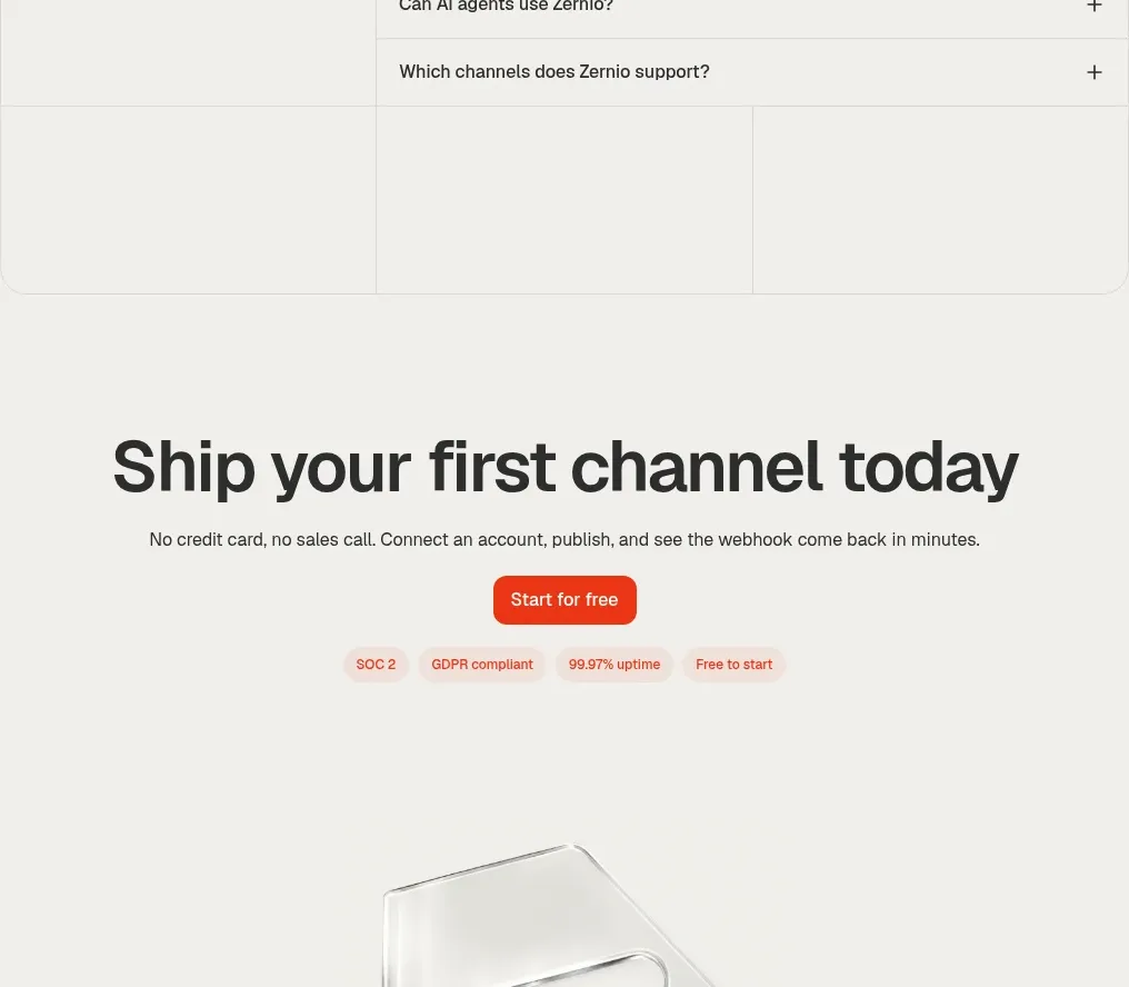
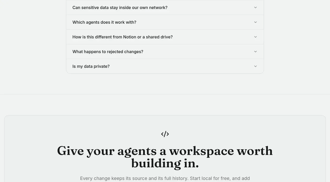
A simple FAQ band uses a strong left-side heading and a clean stack of bordered accordion rows on the right.
Prompt preview
## Reference images

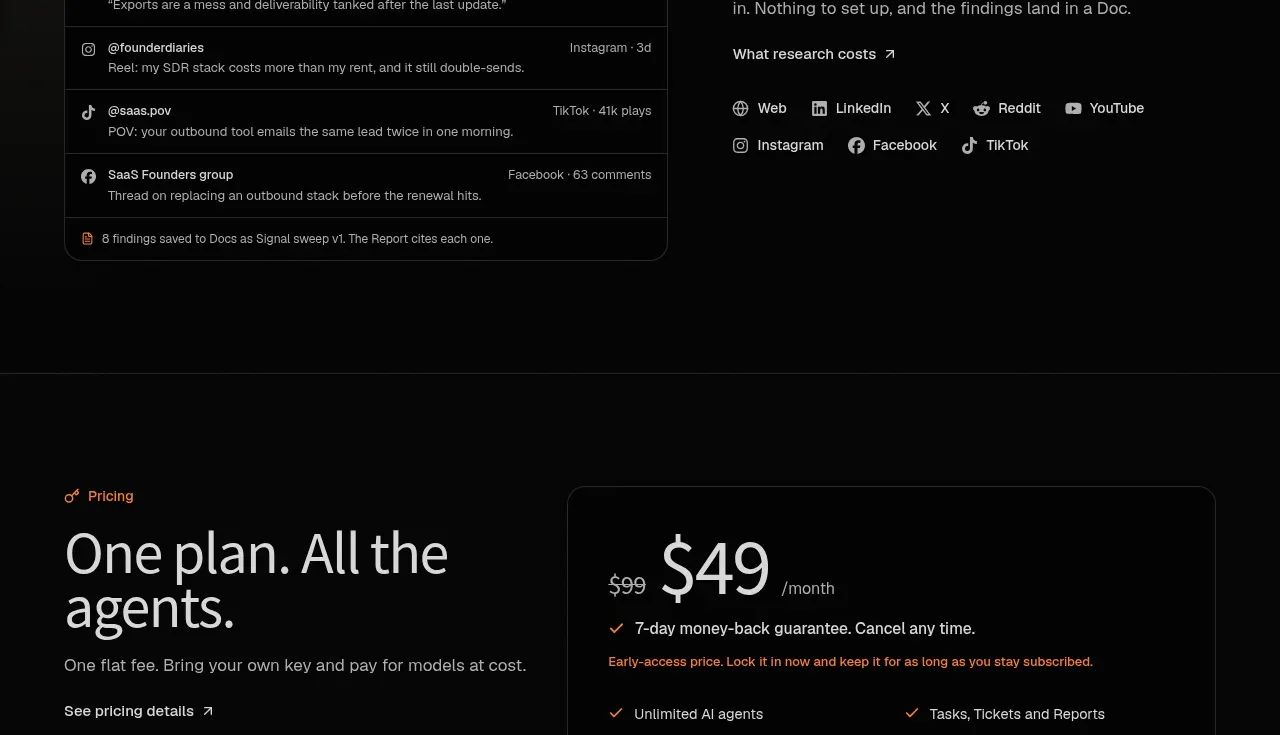
Study these alongside the description below: hierarchy, rhythm, spacing, colour. Build for the product you are asked about, using this design language.

- Component: https://kage-design-assets.t3.tigrisfiles.io/components/squadroom/d449f1a3-a1d7-46c0-a9d5-0020447fa3ed-1791871294-9.webp
- Full page it was cut from: https://kage-design-assets.t3.tigrisfiles.io/screenshots/squadroom/d449f1a3-a1d7-46c0-a9d5-0020447fa3ed-1791871247696-full.webp
- Component on Kage: https://kage.design/component/squadroom-faq

## Before you start
Ask what objections and practical questions users have before adopting the product. Turn those into original, concise FAQ entries.

Create a dark FAQ section with a two-column layout: a left heading block with a small icon or eyebrow, large two-line title, supporting sentence, and contact link; a right stack of six rounded accordion rows. Use #070707 background, #e5e5e1 headings, #8e8e89 copy, and #242424 borders. Each row should be about 48–56px tall with 16px horizontal padding, 12–14px text, and a small chevron aligned right.

Implement accessible accordion behavior with button semantics, keyboard support, visible focus rings, and smooth height transitions. Keep closed rows compact, and let the open answer use a slightly brighter border. On mobile, stack the heading above the list.

Never: use logos, product names, copy, illustrations, or imagery from the reference.