kage
kage
subscrr.app
Design analysis
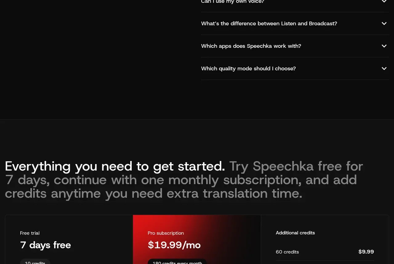
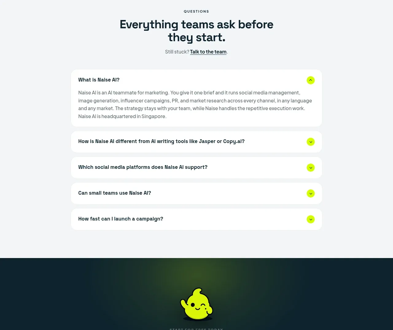
A split FAQ layout pairs a large section title with a simple list of questions, each separated by fine rules and ending in a visible plus affordance.
Prompt preview
## Reference images

Study these alongside the description below: hierarchy, rhythm, spacing, colour. Build for the product you are asked about, using this design language.

- Component: https://kage-design-assets.t3.tigrisfiles.io/components/subscrr/31e8b1bf-7154-4569-a65b-7b8da9be3511-1790316327-10.webp
- Full page it was cut from: https://kage-design-assets.t3.tigrisfiles.io/screenshots/subscrr/31e8b1bf-7154-4569-a65b-7b8da9be3511-1790316149312-full.webp
- Component on Kage: https://kage.design/component/subscrr-faq

## Before you start
Ask which objections and support questions matter most for the user's product. Use those real questions rather than generic filler.

Build a two-column FAQ section on the ivory background. Place a small eyebrow and large heading on the left; place a vertically stacked accordion list on the right. Each row should have a bold question, a right-aligned plus icon, and a thin divider. On activation, animate the plus into a minus and reveal the answer without shifting unrelated content abruptly. Use 34–44px heading type, 14–16px questions, 24–28px vertical row padding, and dividers around `#deded7`. Keep the layout stacked on mobile and ensure controls have visible keyboard focus.

Never: use logos, product names, copy, illustrations, or imagery from the reference.