kage
kage
subscrr.app
Design analysis
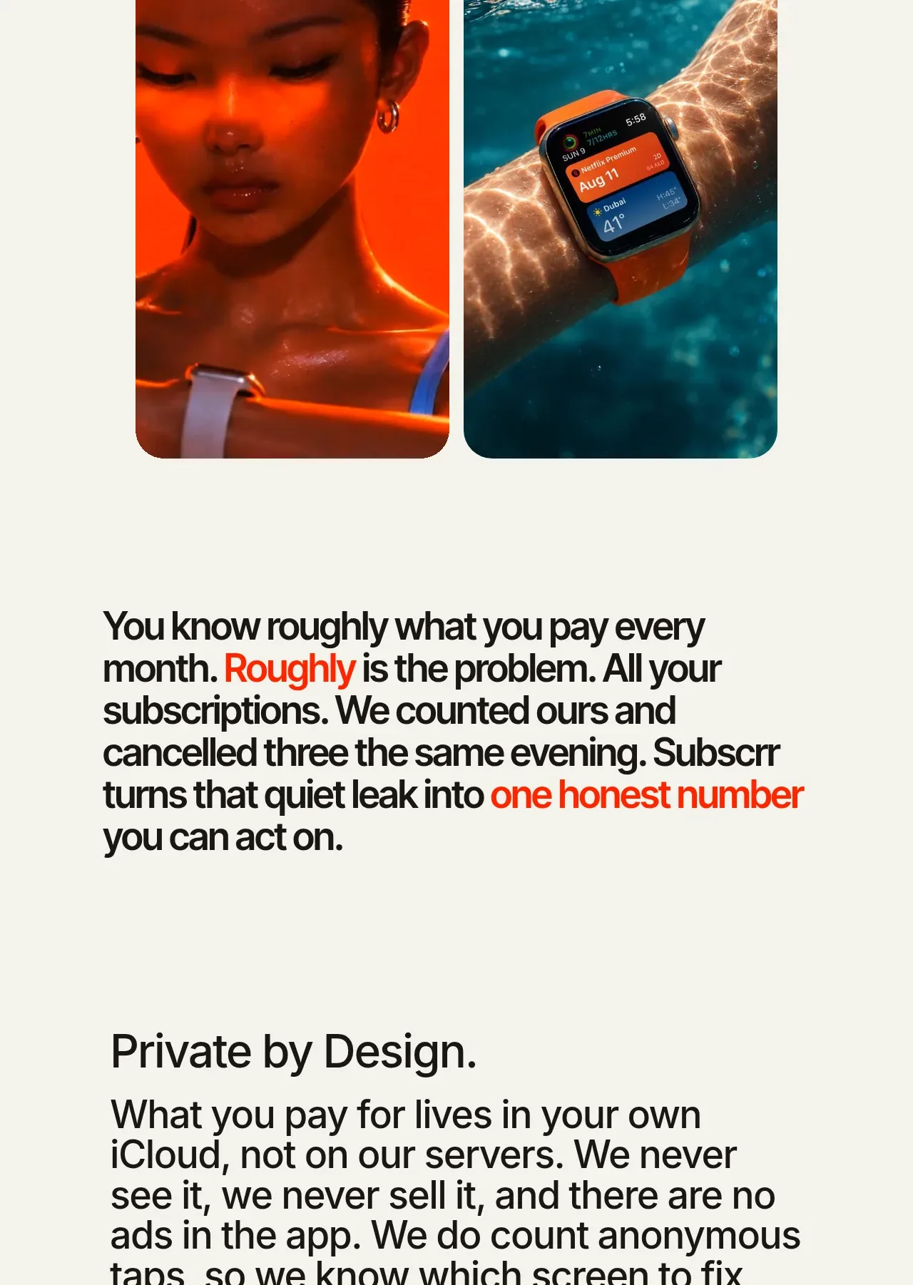
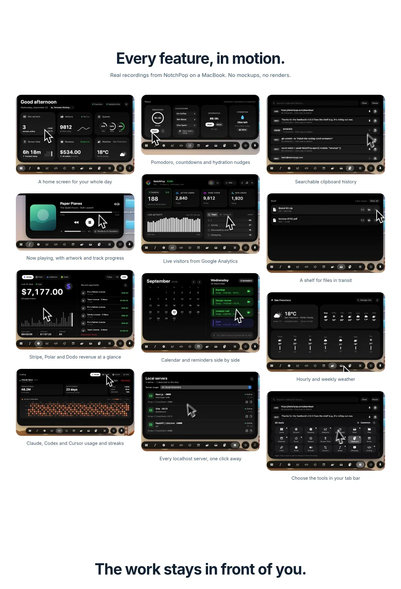
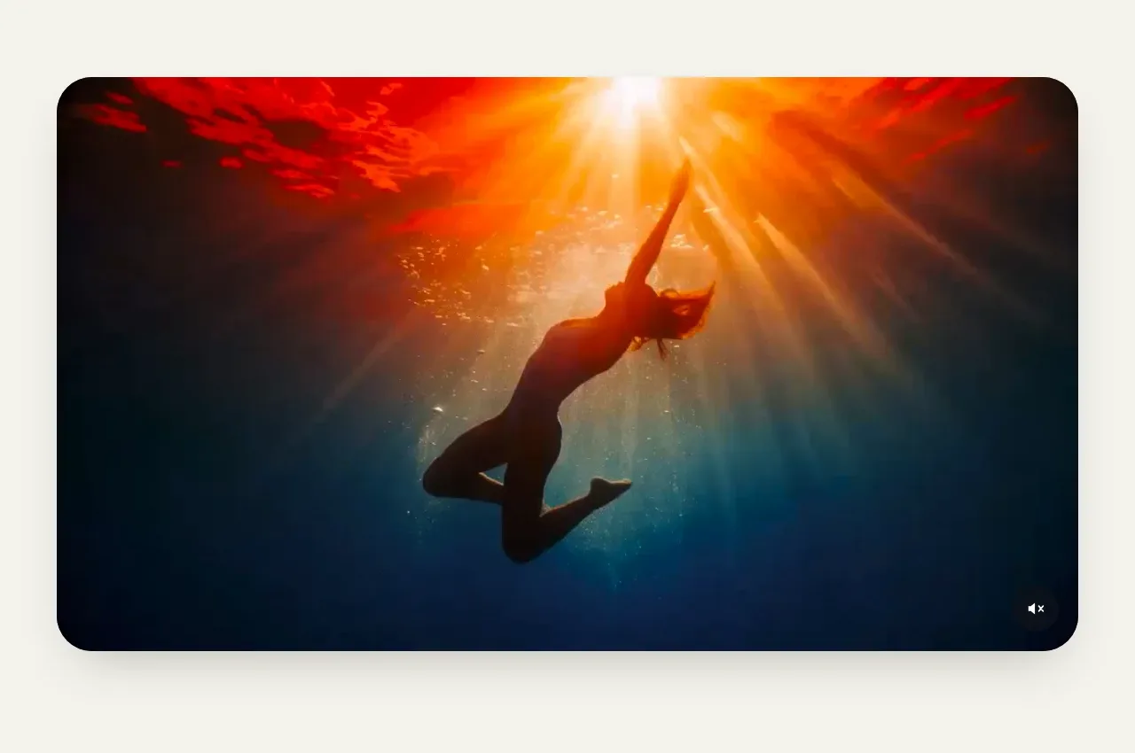
A single wide, heavily rounded visual creates a cinematic pause after the hero and uses the full content width without extra chrome.
Prompt preview
## Reference images

Study these alongside the description below: hierarchy, rhythm, spacing, colour. Build for the product you are asked about, using this design language.

- Component: https://kage-design-assets.t3.tigrisfiles.io/components/subscrr/31e8b1bf-7154-4569-a65b-7b8da9be3511-1790316324-2.webp
- Full page it was cut from: https://kage-design-assets.t3.tigrisfiles.io/screenshots/subscrr/31e8b1bf-7154-4569-a65b-7b8da9be3511-1790316149312-full.webp
- Component on Kage: https://kage.design/component/subscrr-gallery

## Before you start
Ask what the user's product should demonstrate and whether the visual is a video, animation, or product screenshot. Adapt the treatment to the user's brand.

Create a full-width media panel with generous horizontal margins and a 28–32px corner radius. Use a strong, edge-to-edge visual with a cinematic crop and a small unobtrusive mute/control affordance in one corner. Keep the surrounding section the same warm ivory as the page, with substantial whitespace above and below. Preserve a 16:9-ish desktop ratio, use `overflow: hidden`, and ensure the media has a tasteful darkened overlay only where controls or text need contrast. Controls should be minimal and appear on hover or focus.

Never: use logos, product names, copy, illustrations, or imagery from the reference.