kage
kage
subscrr.app
Design analysis
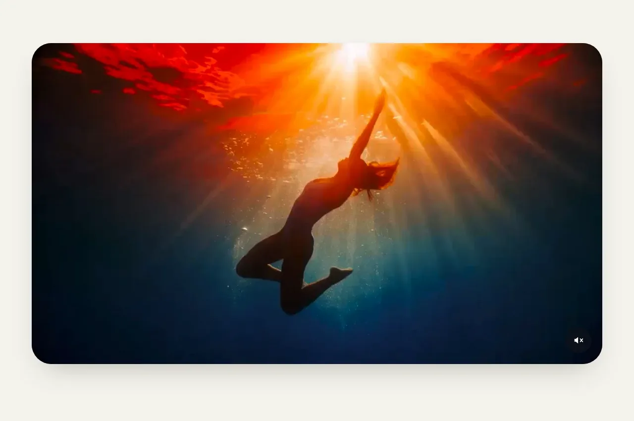
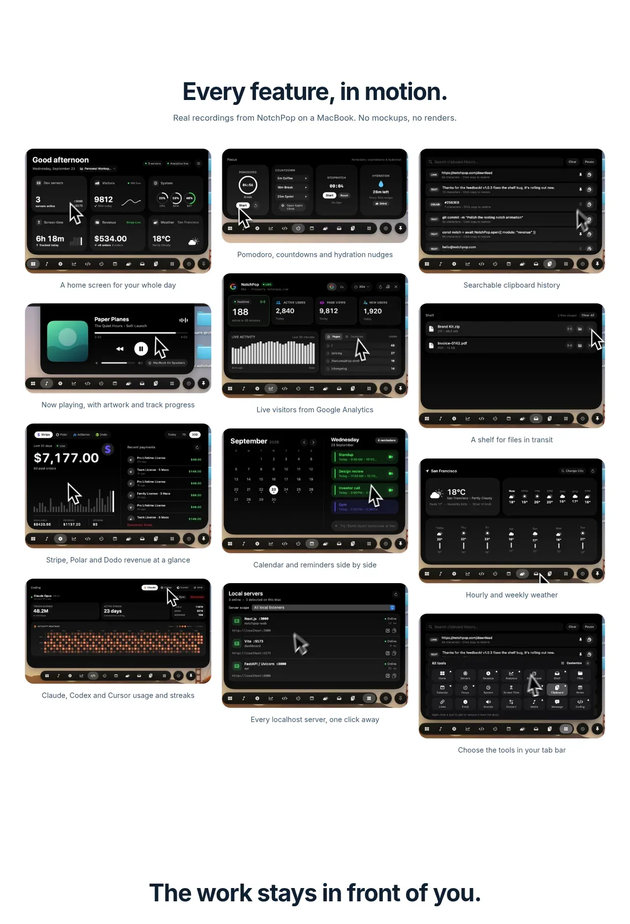
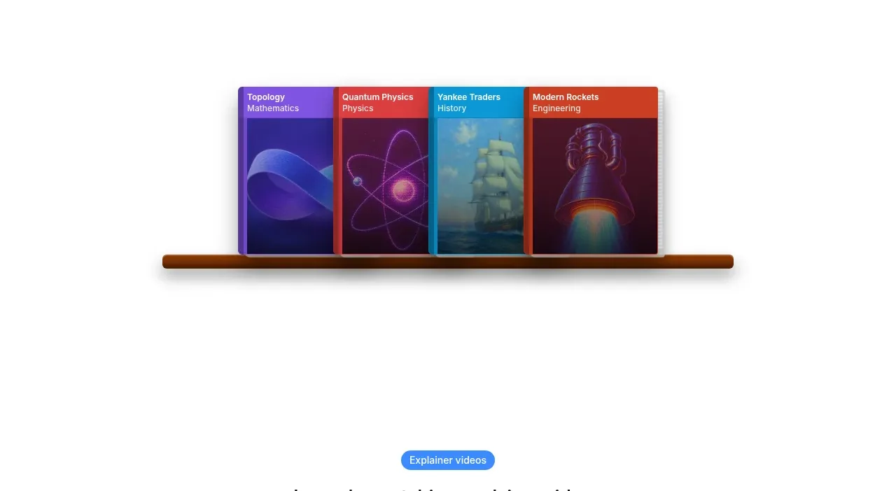
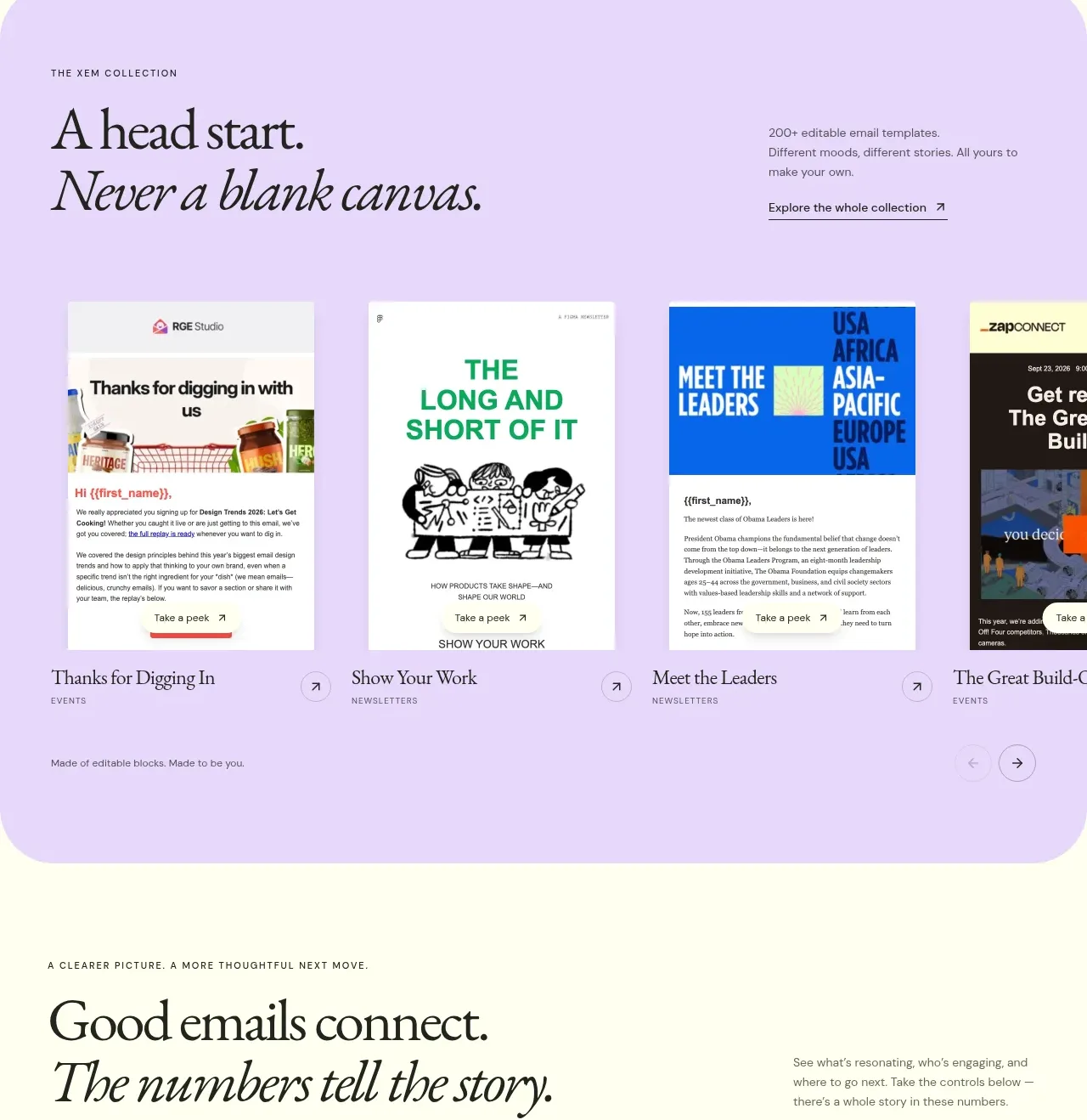
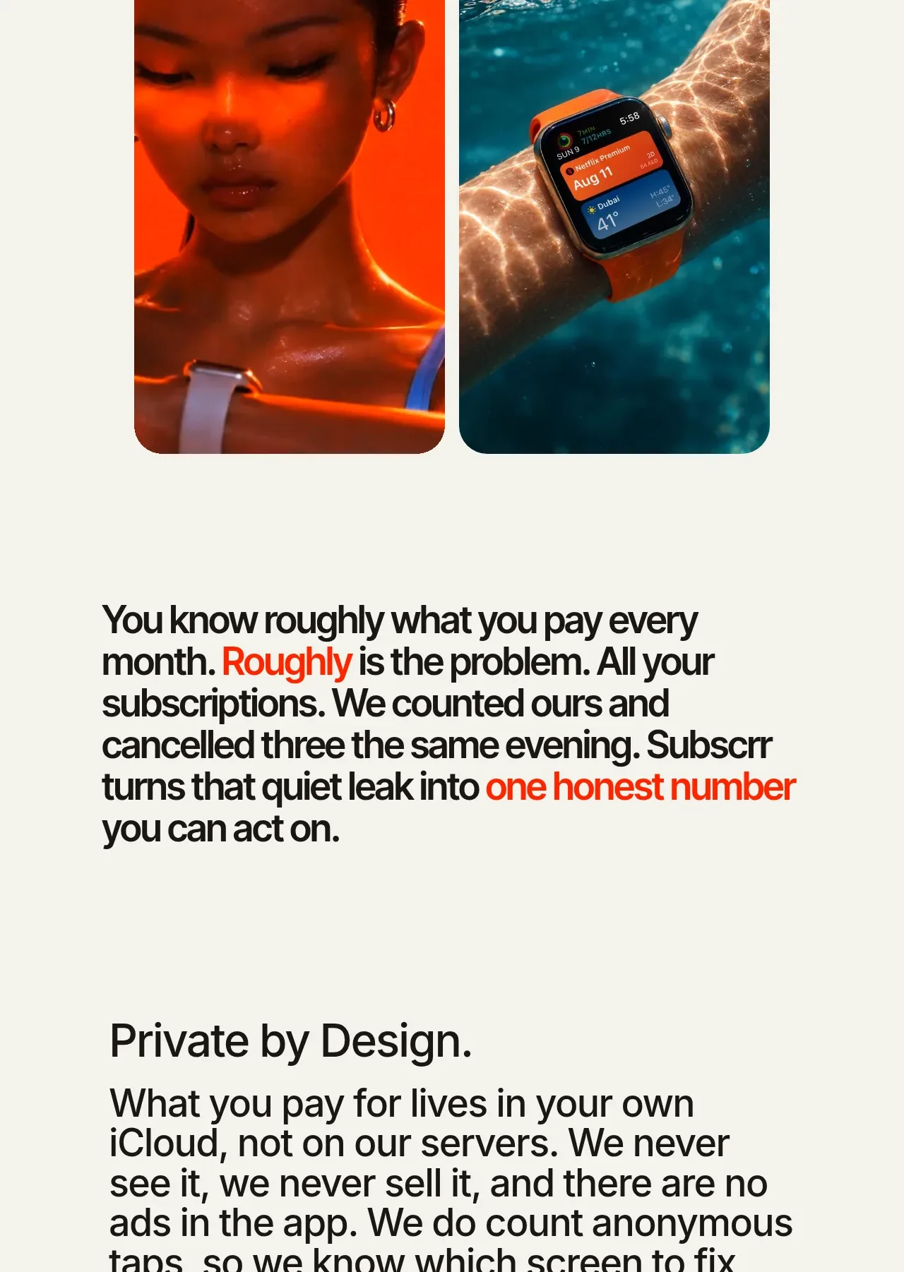
A centered wearable-focused headline is followed by two tall, equally weighted rounded images, making the companion experience feel tangible and lifestyle-oriented.
Prompt preview
## Reference images

Study these alongside the description below: hierarchy, rhythm, spacing, colour. Build for the product you are asked about, using this design language.

- Component: https://kage-design-assets.t3.tigrisfiles.io/components/subscrr/31e8b1bf-7154-4569-a65b-7b8da9be3511-1790316326-7.webp
- Full page it was cut from: https://kage-design-assets.t3.tigrisfiles.io/screenshots/subscrr/31e8b1bf-7154-4569-a65b-7b8da9be3511-1790316149312-full.webp
- Component on Kage: https://kage.design/component/subscrr-gallery-2

## Before you start
Ask whether the user's product has a wearable, mobile, or physical companion and what user context should be shown. Use that context to choose the layout.

Build a centered showcase section with an eyebrow, a large two-line heading, a concise explanatory paragraph, and a two-column gallery below. Make both gallery items equal width and height, with 26–30px corner radii, `overflow:hidden`, and a consistent object-fit crop. Use generous top and bottom padding, ivory background, black display type, and muted supporting text. On mobile, stack the gallery items while keeping their aspect ratios. Add subtle hover scale or focus treatment only if the images are interactive.

Never: use logos, product names, copy, illustrations, or imagery from the reference.