 kage
kage
tailwindcss.com

Design analysis
A compact, editorial code showcase that uses oversized rounded panels, dense syntax-highlighted text, and a restrained grid to make technical examples feel like polished product design. The surrounding feature cards and generous whitespace give the code visual weight without overwhelming the page.
Prompt preview
## Reference images

Study these alongside the description below: hierarchy, rhythm, spacing, colour. Build for the product you are asked about, using this design language.

- Component: https://kage-design-assets.t3.tigrisfiles.io/components/tailwindcss-com/8ea80760-a5bd-4198-8781-a7bb4737c216-1789073868-4.webp
- Full page it was cut from: https://kage-design-assets.t3.tigrisfiles.io/screenshots/tailwindcss-com/8ea80760-a5bd-4198-8781-a7bb4737c216-1789073837-full.webp
- Component on Kage: https://kage.design/component/tailwindcss-code-block

## Before you start
Ask the user what their product is, who it is for, and what visual brand they want to use. Then apply the principles below to create an original code showcase for that product rather than copying the reference.

## Design language
Build a responsive code-block feature section that presents several code examples as a small composition of framed panels, suitable for a developer tool, API, framework, or technical product.

### Layout and alignment
- Use a wide, centered container with a clear max-width, approximately 1180–1280px on desktop.
- Arrange three code panels in a horizontal grid on large screens: a wider panel on the left, a narrower central panel, and a wider panel on the right. Let the center panel show a UI preview or compact data example if that better communicates the product.
- Place the panels inside a very light neutral canvas with narrow gutters, consistent outer alignment, and a subtle editorial grid feel.
- Use a fixed or minimum panel height around 380–430px on desktop; allow content to crop or scroll discreetly rather than making the whole section excessively tall.
- On tablet and mobile, collapse to one column or a horizontal carousel with intentional overflow. Never allow code to become unreadably compressed.
- Keep all panel content aligned to a shared top edge and use generous whitespace around the composition.

### Code panel styling
- Give each panel a near-black navy/slate background, approximately #171923 or #151821, with a slightly lighter top chrome strip around #20232d.
- Add a 1px border in a low-contrast cool gray such as #d9dce2 around the outer card and a subtle inner highlight.
- Use large rounded corners, approximately 14–18px, with a soft shadow like 0 10px 24px rgba(15, 23, 42, 0.08).
- Include three small circular window controls in the top bar, approximately 10–12px each, using muted slate tones such as #47505f; keep them decorative unless the product requires real controls.
- Present code in a monospace font at roughly 12–14px with a 1.65–1.8 line height. Include line numbers in a narrow, muted column around #697181.
- Use syntax colours sparingly: cool gray for punctuation, lavender or pink around #e8a8cf for tags and selectors, pale blue around #9fd7ea for values, warm cream around #e8e4d9 for plain code, and muted green around #a9d7b1 for comments.
- Give code enough horizontal padding, around 20–28px, and preserve indentation. On narrow screens, use horizontal scrolling inside the panel.

### Typography and hierarchy
- Use a modern sans-serif for surrounding headings and labels, with a clean, slightly technical character.
- Keep any section eyebrow small, uppercase, and tracked out, around 11–12px with a saturated accent colour.
- Use a strong dark heading around #111318, approximately 30–48px depending on context, with tight line-height and modest letter-spacing.
- Use supporting copy in a neutral gray such as #525761, around 15–18px with a 1.5–1.7 line height.
- Do not compete with the code: the surrounding UI should be quiet, while the panel syntax provides the visual energy.

### Spacing and surface treatment
- Use a warm off-white page background, approximately #fafaf9 or #ffffff, with faint structural rules around #eceef0.
- Use a 6–8px spacing rhythm, with approximately 16–24px panel padding and 32–64px section spacing.
- If adding feature labels or descriptions below/alongside the code, keep them in separate white cards with thin gray borders, 12–16px radius, and restrained padding.
- Use only subtle shadows; the composition should feel crisp, precise, and lightweight rather than glossy.

### Interaction and responsive behaviour
- If the code is interactive, provide a compact copy button in the panel chrome with a clear hover, focus, and copied state. Keep it secondary to the code.
- Support keyboard focus with a visible 2px accent outline and maintain sufficient contrast for all syntax and controls.
- Allow panel tabs, language switches, or example selectors only when they help users understand the code; style active states with a dark fill or thin accent underline.
- Preserve line numbers and syntax readability at every breakpoint. Use overflow-x-auto rather than wrapping long code lines.
- Respect reduced-motion preferences and avoid distracting animated code or decorative effects.

## Never
- Never use logos, product names, proprietary copy, illustrations, or imagery from the reference.
- Never reproduce the reference’s exact code, text, layout proportions, or branding.
- Never use fake screenshots or unrelated stock photography as a substitute for meaningful product-specific code.
- Never make syntax colours so bright that they reduce readability or turn the component into a neon theme.
- Never hide essential code behind an inaccessible interaction or rely on colour alone to communicate state.
More components
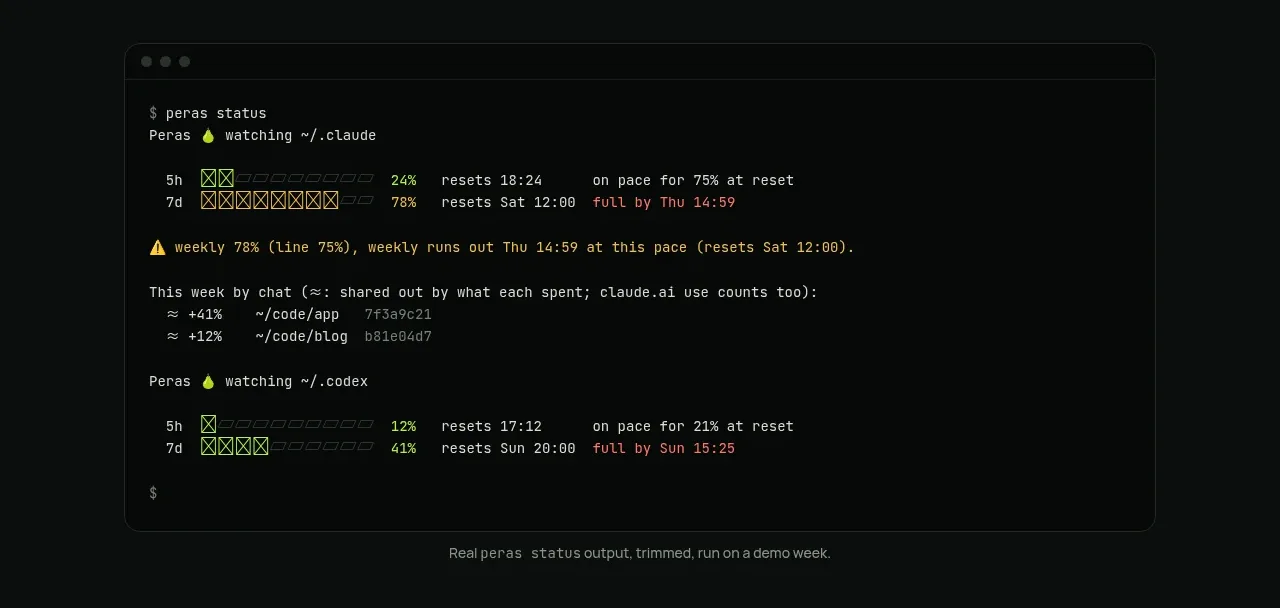
 Terminal status proof
Peras · Code block
Terminal status proof
Peras · Code block
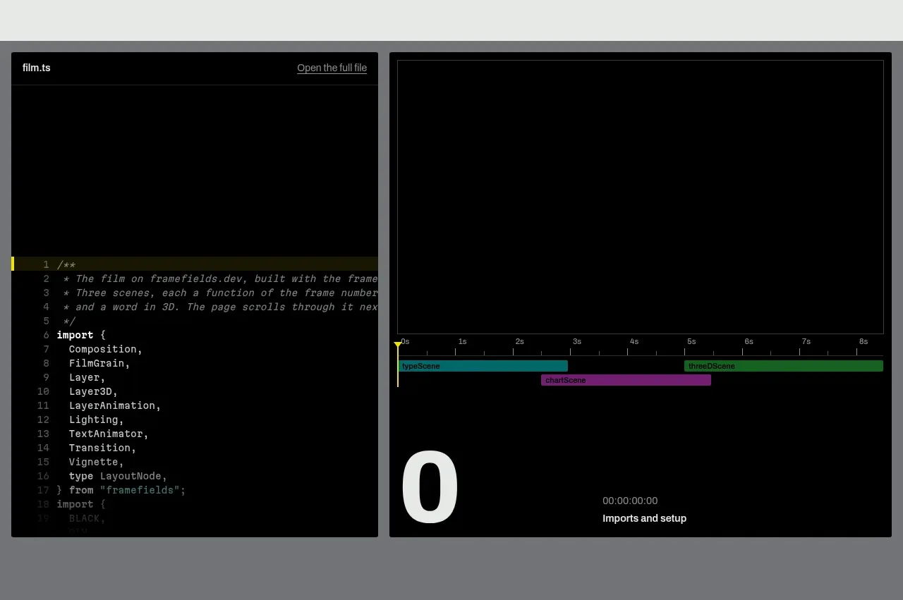
 Live render and code preview
Framefields · Code block
Live render and code preview
Framefields · Code block
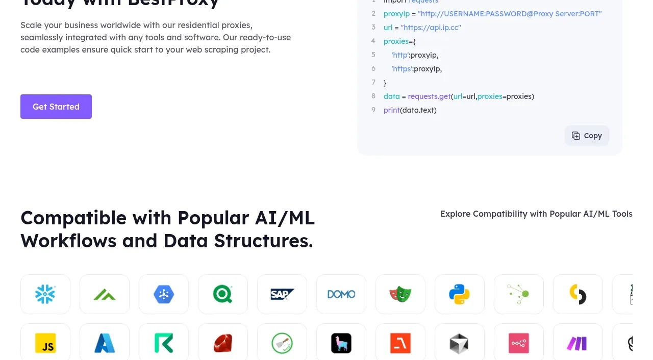
 Developer integration
bestproxy.com · Code block
Developer integration
bestproxy.com · Code block
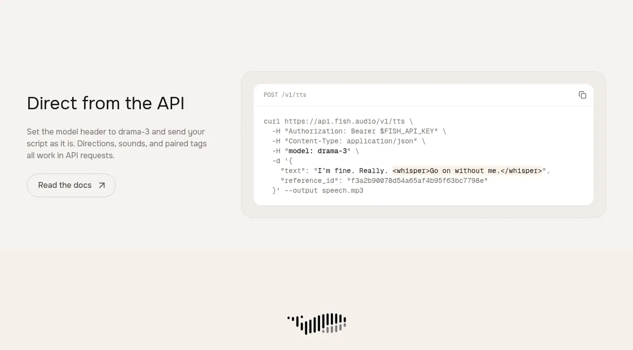
 API integration example
Fish Audio Drama 3 · Code block
API integration example
Fish Audio Drama 3 · Code block
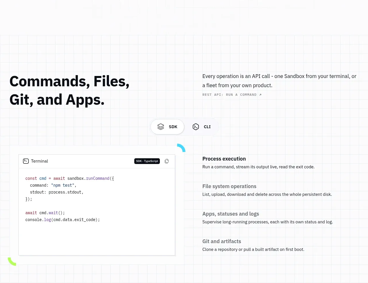
 Commands and API surface
AI Sandboxes by Buddy · Code block
Commands and API surface
AI Sandboxes by Buddy · Code block
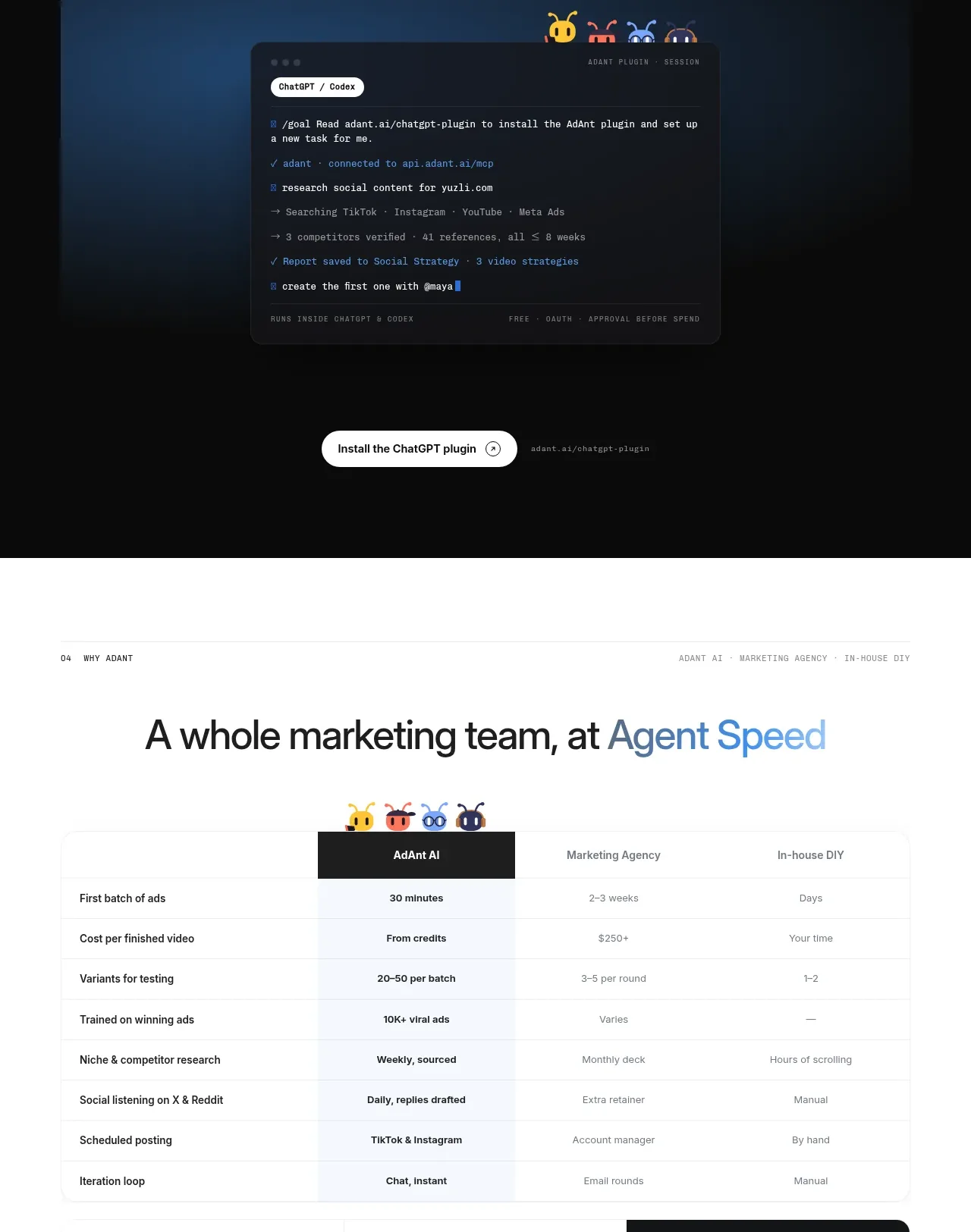
 Chat workspace plugin showcase
AdAnt 2.0 · Code block
Chat workspace plugin showcase
AdAnt 2.0 · Code block