 kage
kage
takweemai.com

Design analysis
A large dark rounded panel creates a decisive closing moment with centered headline, reassurance, and two contrasting actions.
Prompt preview
## Reference images

Study these alongside the description below: hierarchy, rhythm, spacing, colour. Build for the product you are asked about, using this design language.

- Component: https://kage-design-assets.t3.tigrisfiles.io/components/takweem-ai/0f53cdf8-216d-4033-bf99-d7586d054974-1791439462-9.webp
- Full page it was cut from: https://kage-design-assets.t3.tigrisfiles.io/screenshots/takweem-ai/0f53cdf8-216d-4033-bf99-d7586d054974-1791439356553-full.webp
- Component on Kage: https://kage.design/component/takweem-cta

## Before you start
Ask the user what final action matters most, what reassurance reduces friction, and how the brand should feel at the moment of conversion. Then build an original closing CTA.

- Place a centered content block inside a wide dark panel with generous internal padding and large rounded corners.
- Use a large light serif heading, one or two lines of supporting copy, and two buttons: a light primary button and a transparent outlined secondary button.
- Keep the panel isolated from surrounding content with ample whitespace and avoid adding unnecessary imagery.
- Use #181818 or #171717 for the panel, #ffffff/#f7f7f4 for heading and primary button, muted #c9c9c4 for supporting copy, and a #5b5b58 outline for the secondary action; radius 18–24px.
- Center actions, ensure strong contrast, and stack buttons on small screens.

Never: use logos, product names, copy, illustrations, or imagery from the reference.
More components
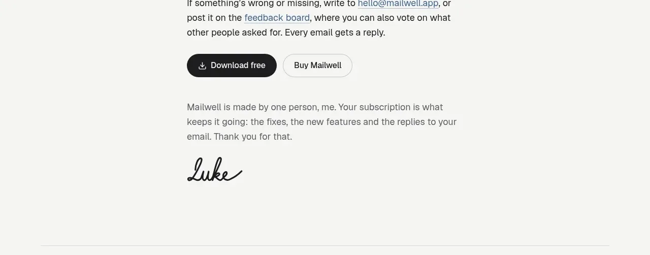
 Trial and purchase call to action
Mailwell · Call to action
Trial and purchase call to action
Mailwell · Call to action
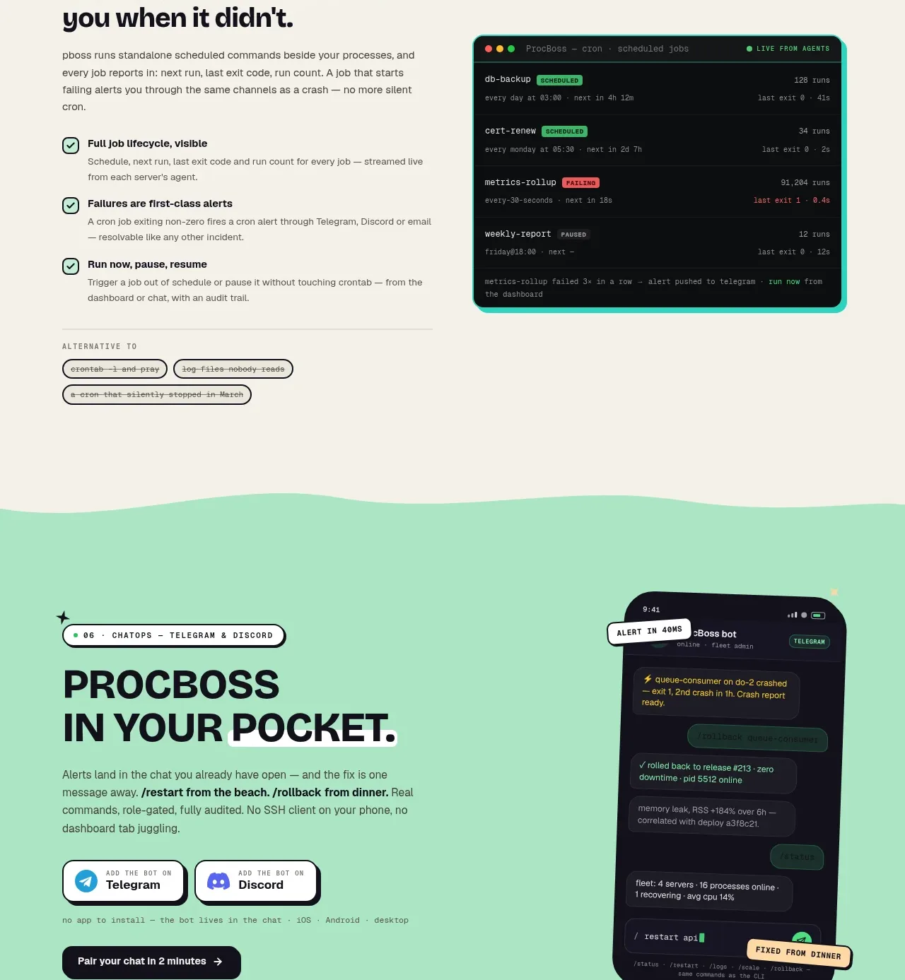
 Pocket alerts call to action
ProcBoss · Call to action
Pocket alerts call to action
ProcBoss · Call to action
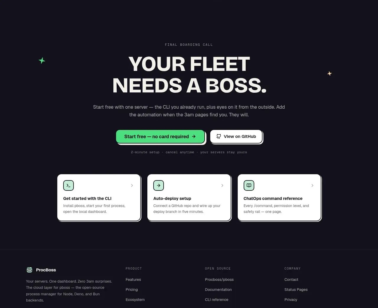 Dark final conversion band
ProcBoss · Call to action
Dark final conversion band
ProcBoss · Call to action
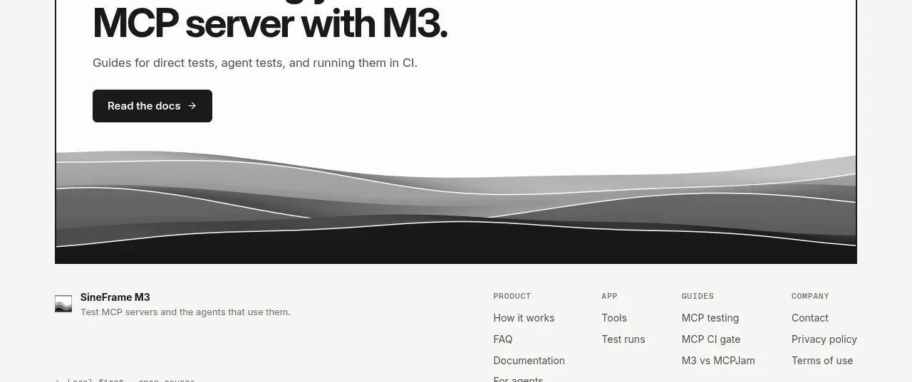
 Documentation call to action
SineFrame M3 · Call to action
Documentation call to action
SineFrame M3 · Call to action
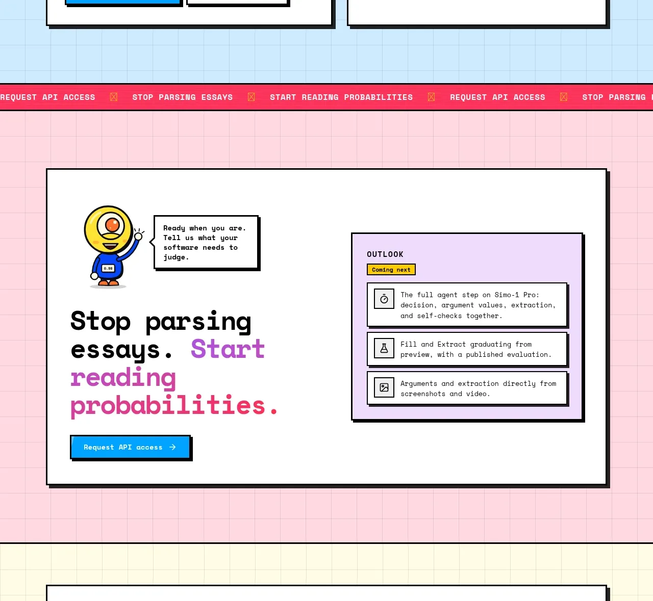
 Conversion call to action
Simo · Call to action
Conversion call to action
Simo · Call to action
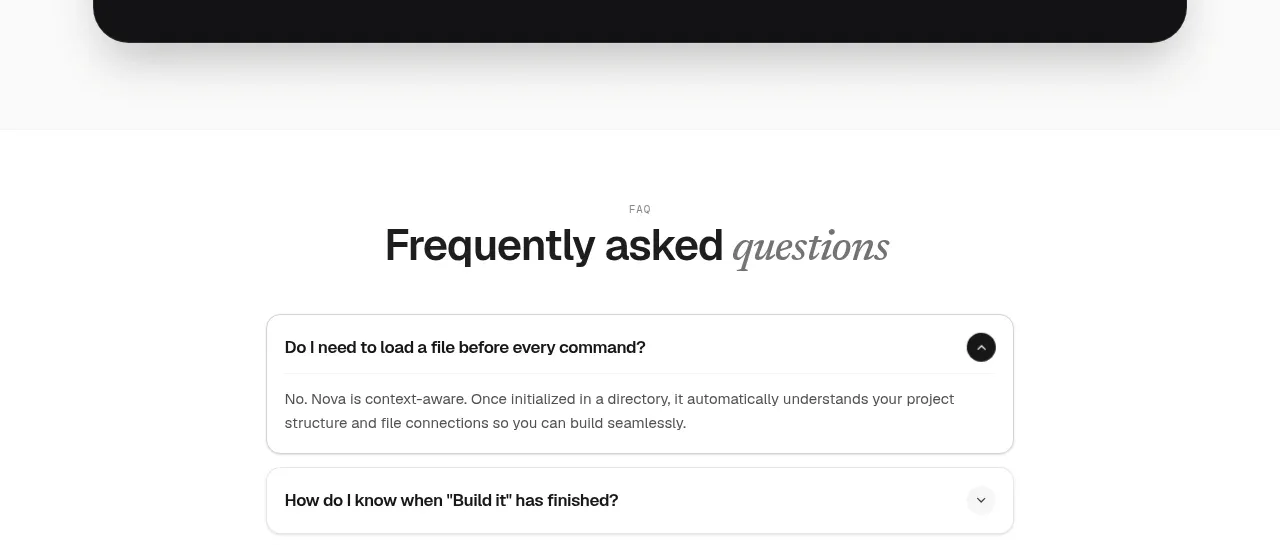
 Install command CTA
NOVA CLI v1.0 · Call to action
Install command CTA
NOVA CLI v1.0 · Call to action