kage
kage
takweemai.com

Design analysis
An editorial, almost entirely monochrome landing page that pairs a large classical serif display face with quiet sans-serif UI text on a warm off-white ground. The story is carried by realistic product mockups — a week calendar, an approval feed, a daily brief — each framed in thin-bordered white cards rather than illustrations, with numbered serif eyebrows (01/02/03) pacing the alternating feature rows. Density shifts deliberately down the page: airy hero and feature spreads, a tight multilingual prompt-chip marquee, a compact four-column pricing grid, a two-column FAQ with a sticky serif title, and a full-bleed near-black serif closing band.
Prompt preview
## Reference images

Study these alongside the description below: hierarchy, rhythm, spacing, colour. Build for the product you are asked about, using this design language.

- Full page: https://kage-design-assets.t3.tigrisfiles.io/screenshots/takweem-ai/0f53cdf8-216d-4033-bf99-d7586d054974-1791439356553-full.webp
- Above the fold: https://kage-design-assets.t3.tigrisfiles.io/screenshots/takweem-ai/0f53cdf8-216d-4033-bf99-d7586d054974-1791439352699.webp
- Design on Kage: https://kage.design/designs/takweem-landing-page

## Before you start

Ask the user what product they are building, who it is for, and what brand assets they already have (name, colours, type). Wait for the answers before writing any code. Everything below is a design language to be applied to *their* product — not a template to be filled with this reference's name, copy or screenshots.

## Page structure

1. **Announcement bar** — full-width strip at the very top: one line of promo copy with a highlighted promo code, an underlined inline link, and a close button on the right.
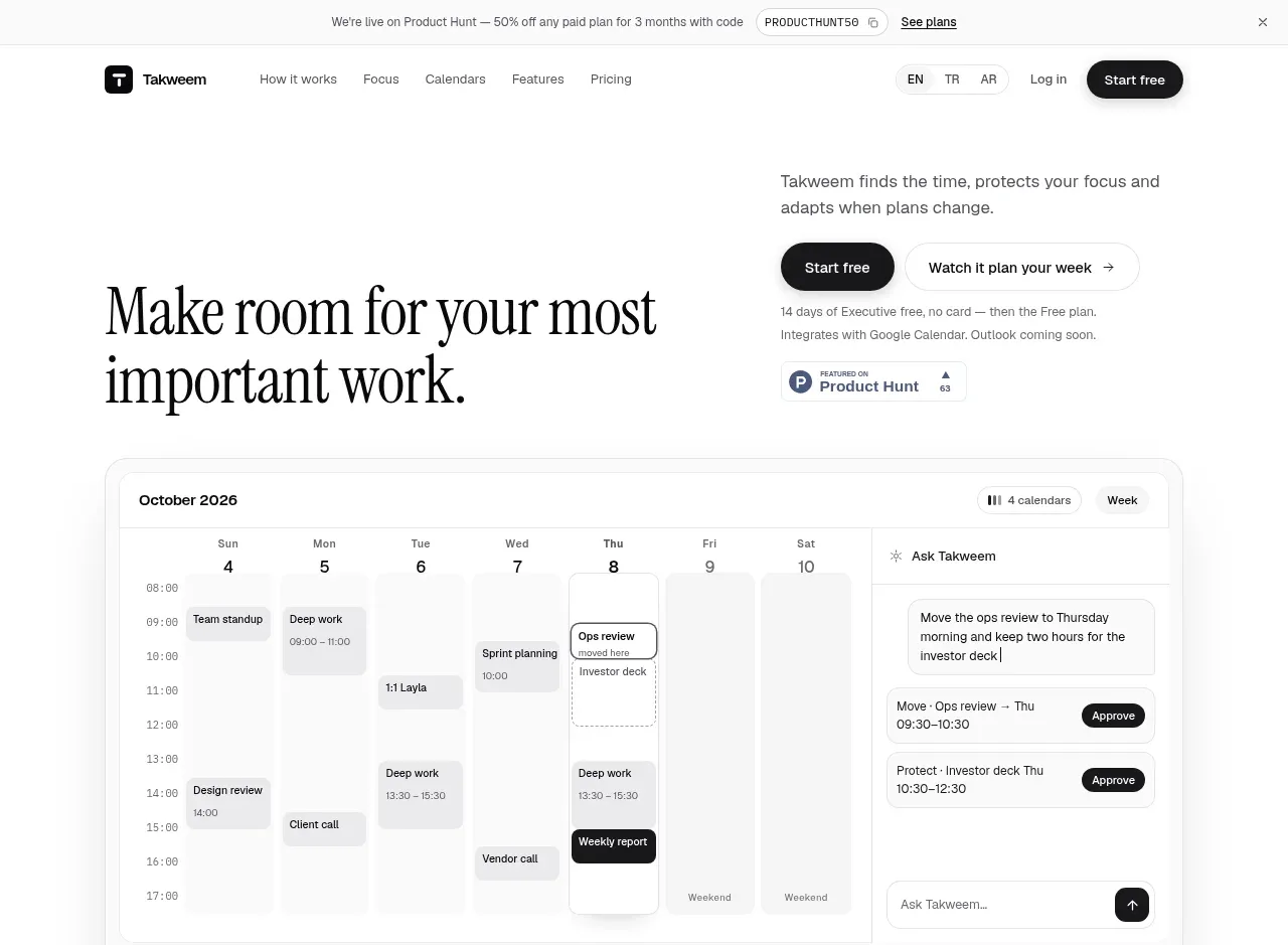
2. **Navigation** — logo left; centre-left nav links (5 items); right side has a small language switcher (three codes separated by dividers), a text "Log in" link, and one solid dark pill CTA. Sticky, white, hairline bottom border.
3. **Hero (split)** — left column: a two-line serif display headline. Right column, top-aligned: a short sans-serif value proposition, then two buttons (solid dark pill + ghost pill with an arrow), a two-line fine-print note about the trial and integrations, and a small third-party badge. Asymmetric: text block right, big empty space keeps it calm.
4. **Product mockup card** — full-container rounded white card with a realistic product UI: a week calendar grid (time gutter, muted event blocks, one inverted black event) plus an assistant sidebar with suggestion cards, "Approve" pill buttons and an input field. Caption chips under the card. This is the proof, placed immediately under the hero.
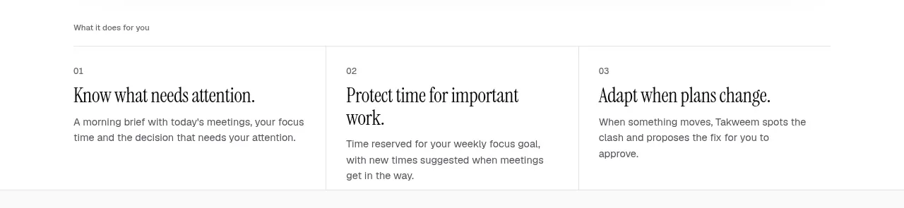
5. **Three-column summary** — small uppercase eyebrow ("What it does for you"), then three equal columns numbered 01/02/03, each with a serif headline and one short paragraph. Hairline vertical dividers between columns.
6. **"See it work" band (light gray ground)** — eyebrow + serif headline left, paragraph below, then a numbered 3-step list (bold step name + one line). Right side: a chat-style mockup card showing a typed request, a proposed event card with metadata chips, approve/other-times buttons and a follow-up line. Section background shifts to a slightly darker neutral to mark a new act.
7. **Alternating feature rows ×3** — each row: left text column with an italic serif eyebrow ("01 *Every morning*", "02 *Focus protection*", "03 *When plans change*"), a large serif headline, a paragraph, and (on some) a short checkmark list; right side a product-UI mockup card (daily brief with stat trio and a bar chart; an autopilot change feed with Undo buttons; a connected-calendars list with status labels and a conflict card). Under the third row, two inline stats ("Google Calendar — 10 accounts — sync, both directions"). Text left, mockup right, consistent alignment.
8. **Control statement** — smaller serif headline section: "You stay in charge" eyebrow, headline, paragraph, and a mockup approval feed card where each row pairs a change with an action pill (Approve / Approve all / Confirm cancel?) and a muted "Blocked" row.
9. **Prompt-chip marquee** — two rows of pill chips with real example requests, alternating English, Turkish and Arabic (right-to-left) text with tiny language tags. Full-bleed band between hairline rules; let it scroll horizontally.
10. **Capability grid** — serif headline "Built around how you already work", then a 3×2 grid of quiet cards: serif card title, two-line description. Even height, hairline borders, no icons.
11. **Pricing** — centred serif "Plans" title, one-line subtext, a Monthly/Annual toggle pill with a "Save up to 19%" badge. Four plain-bordered columns (Free, Basic, Executive, Teams): plan name, one-line description, big price with small unit, a pill CTA (the popular plan gets a dark CTA and a "Most Popular" badge aligned in its header row), then a checkmark feature list. Fine print lines below about currency and cancellation.
12. **FAQ** — two columns: left a sticky serif title ("Questions we get asked"), right a stack of bold sans questions with multi-line gray answers, separated by hairline rules. Six Q&As covering trust, language, data and limits.
13. **Closing CTA band** — full-bleed near-black rounded block: centred large serif headline in white, two lines of small white subtext, and two buttons (white pill + dark outlined pill).
14. **Footer** — logo + one-sentence tagline left; three link columns (Product, Company, Legal); bottom line with copyright and corporate attribution. All small gray sans text on the light ground.

## Design language

- **Palette is near-monochrome.** Warm off-white page ground `#FAF9F6`, pure white cards `#FFFFFF`, near-black text and solid buttons `#141414`, muted body gray `#6F6C68`, hairline borders `#E7E4DE`, warm beige-gray for calendar/event blocks `#EDEAE4`. There is no accent colour — hierarchy is built from weight, size and inversion (black blocks on white, white on black) instead of hue. If the user's brand has an accent, allow it only in tiny doses (badges, links); never in large surfaces.
- **Type pairing carries the whole identity.** A classical serif (Newsreader / Source Serif 4 class) for every headline and eyebrow, tight leading (~1.05) and sizes from ~72px hero down to ~20px card titles; a neutral sans (Inter class) at 14–16px for all body, UI and pricing text. Eyebrows are italic serif with a number prefix ("02 *Focus protection*") — reuse this pattern as the section marker instead of icons.
- **Hierarchy without decoration.** No gradients, no illustrations, no icon sets. Serif headline + gray sans paragraph + one pill button is the standard section opener. Numbers (01/02/03) sequence the narrative and appear in both the summary grid and the feature rows.
- **Proof by product mockup.** Every claim is paired with a believable UI card: thin 1px border, 12–16px radius, flat white surface, tiny gray metadata chips, realistic times and names. Build mockups in HTML/CSS (not images) using the same type scale, and let one element in each mockup be inverted black to show state (a moved event, a primary Approve).
- **Rhythm and density shift by act.** Hero and feature rows are airy (~120–160px section padding); the marquee band and capability grid are tighter; pricing is compact and centred; FAQ is a dense two-column stack. Alternate a light-gray band (#F2F0EC) behind the "see it work" act to break the white page.
- **Buttons and pills.** Solid near-black pill (white text) is the only primary; ghost pill with hairline border is secondary; tiny pill chips inside mockups for actions (Approve, Undo, Approve all). Radius ~999px for buttons, 12–16px for cards, 8px for small chips.
- **Interactive details.** Marquee rows of example prompts scroll slowly and pause on hover; pricing toggle switches prices; FAQ works as an accordion or long-form list with hover-darkened rules; approve/undo rows in mockups can have a one-frame hover state. No parallax, no big animations.
- **Dark closing band.** Full-width near-black `#141414` rounded block with centred white serif display text — the only dark surface on the page, so it lands as the final beat. Mirror it only once more (e.g. footer stays light).
- **Trust in the fine print.** Small gray lines under hero, pricing and footer state trial terms, data location and legal entities; a structured legal footer column (privacy, terms, data, refunds) is part of the design language.

## Never

- Never reuse the reference's name (Takweem), logo, wordmark, tagline, marketing copy, example event names or FAQ text.
- Never copy the Product Hunt badge, promo codes, prices or plan names from the reference.
- Never present the result as this product or imply any affiliation; apply the language to the user's own product, name and brand assets only.
Components from this page
All components
 Product Hunt announcement bar
Takweem AI · Banner
Product Hunt announcement bar
Takweem AI · Banner
 Primary navigation
Takweem AI · Navigation
Primary navigation
Takweem AI · Navigation
 Calendar assistant hero
Takweem AI · Hero
Calendar assistant hero
Takweem AI · Hero
 Three product outcomes
Takweem AI · Feature grid
Three product outcomes
Takweem AI · Feature grid
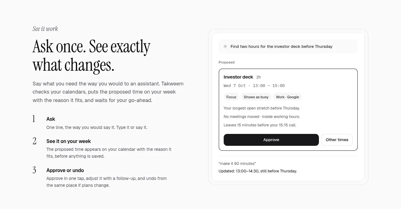 Ask once workflow explainer
Takweem AI · Feature grid
Ask once workflow explainer
Takweem AI · Feature grid
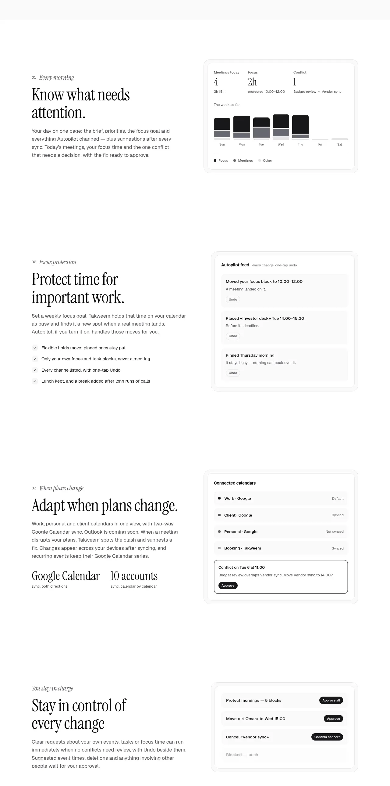 Product capability stories
Takweem AI · Feature grid
Product capability stories
Takweem AI · Feature grid
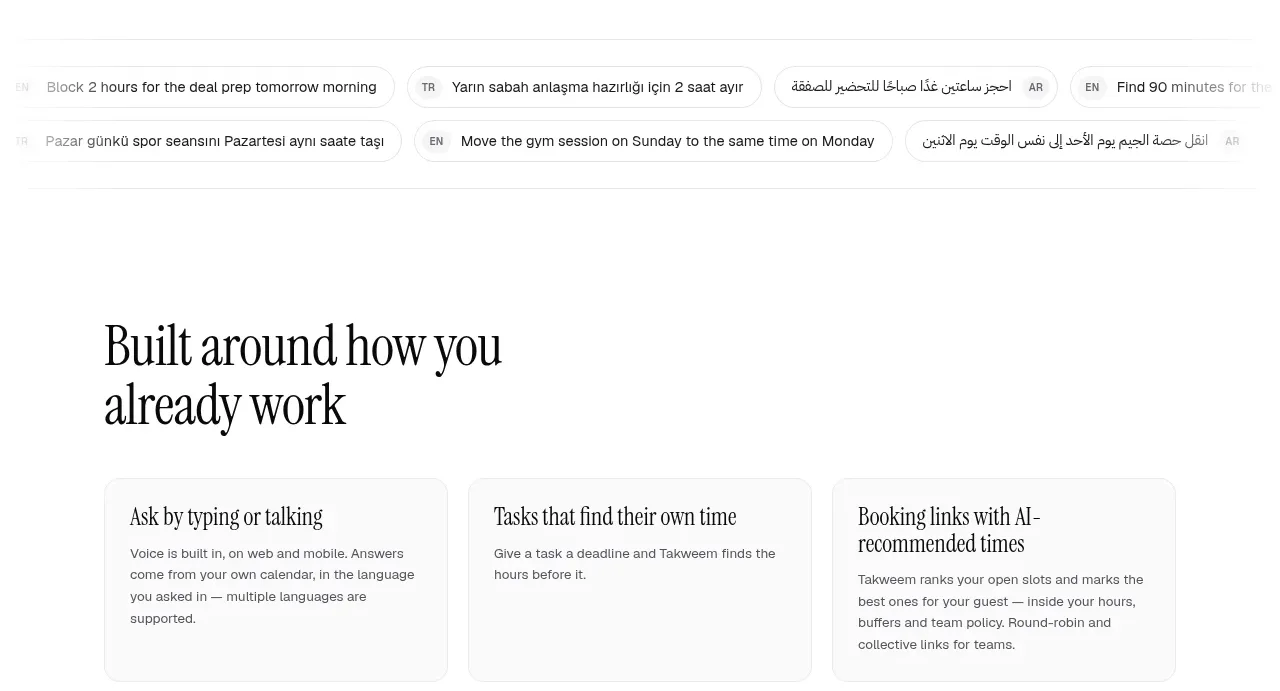 Supporting feature cards
Takweem AI · Feature grid
Supporting feature cards
Takweem AI · Feature grid
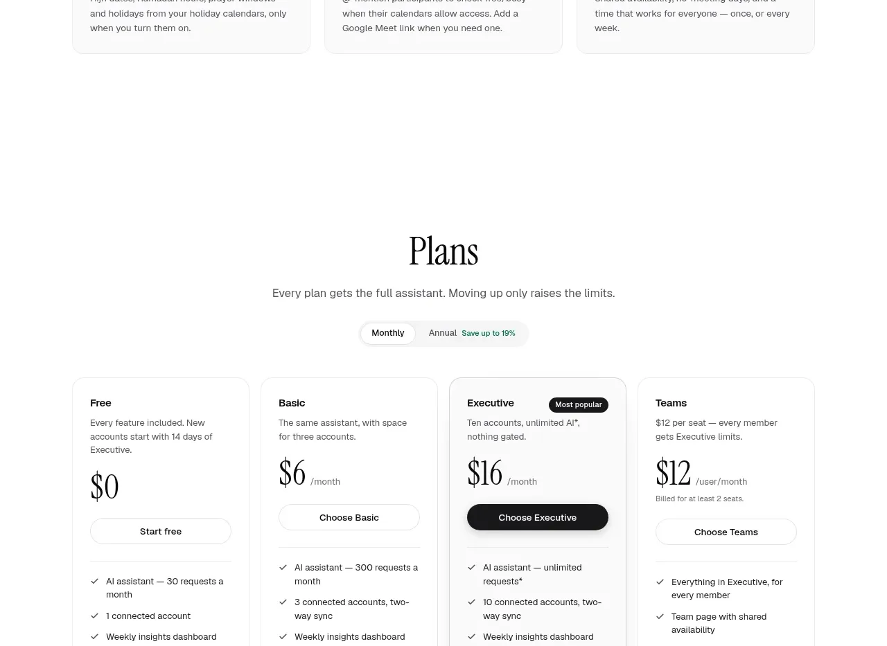 Plans and pricing
Takweem AI · Pricing table
Plans and pricing
Takweem AI · Pricing table
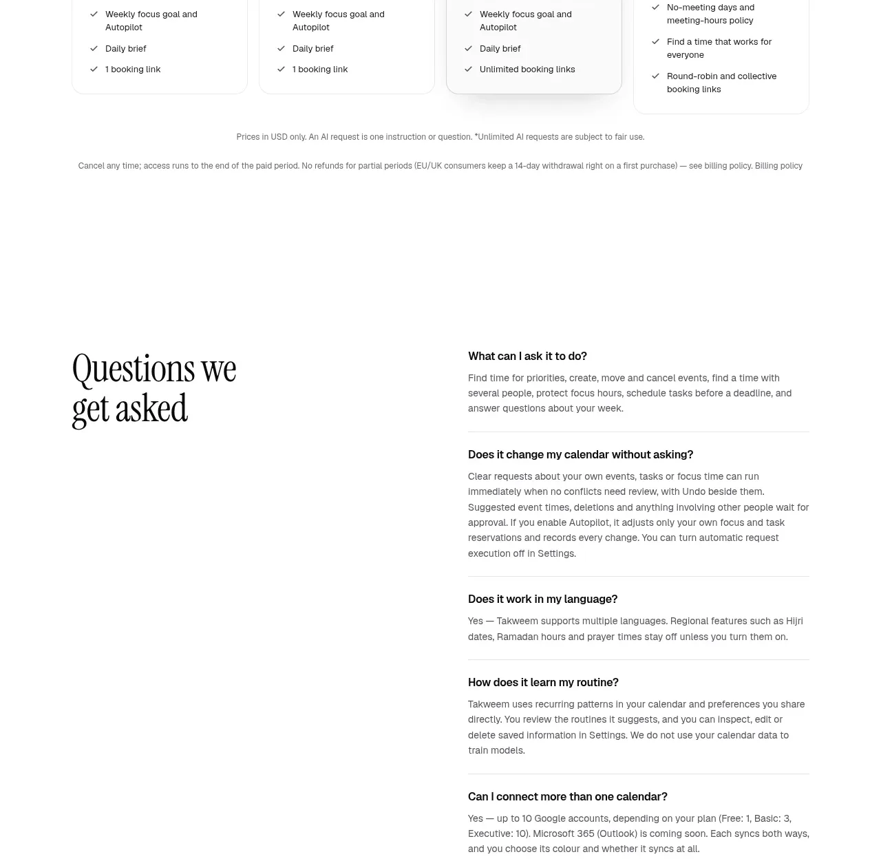 Frequently asked questions
Takweem AI · FAQ
Frequently asked questions
Takweem AI · FAQ
 Final conversion call to action
Takweem AI · Call to action
Final conversion call to action
Takweem AI · Call to action
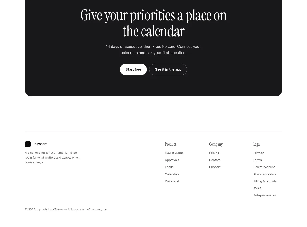 Site footer
Takweem AI · Footer
Site footer
Takweem AI · Footer