kage
kage
takweemai.com
Design analysis
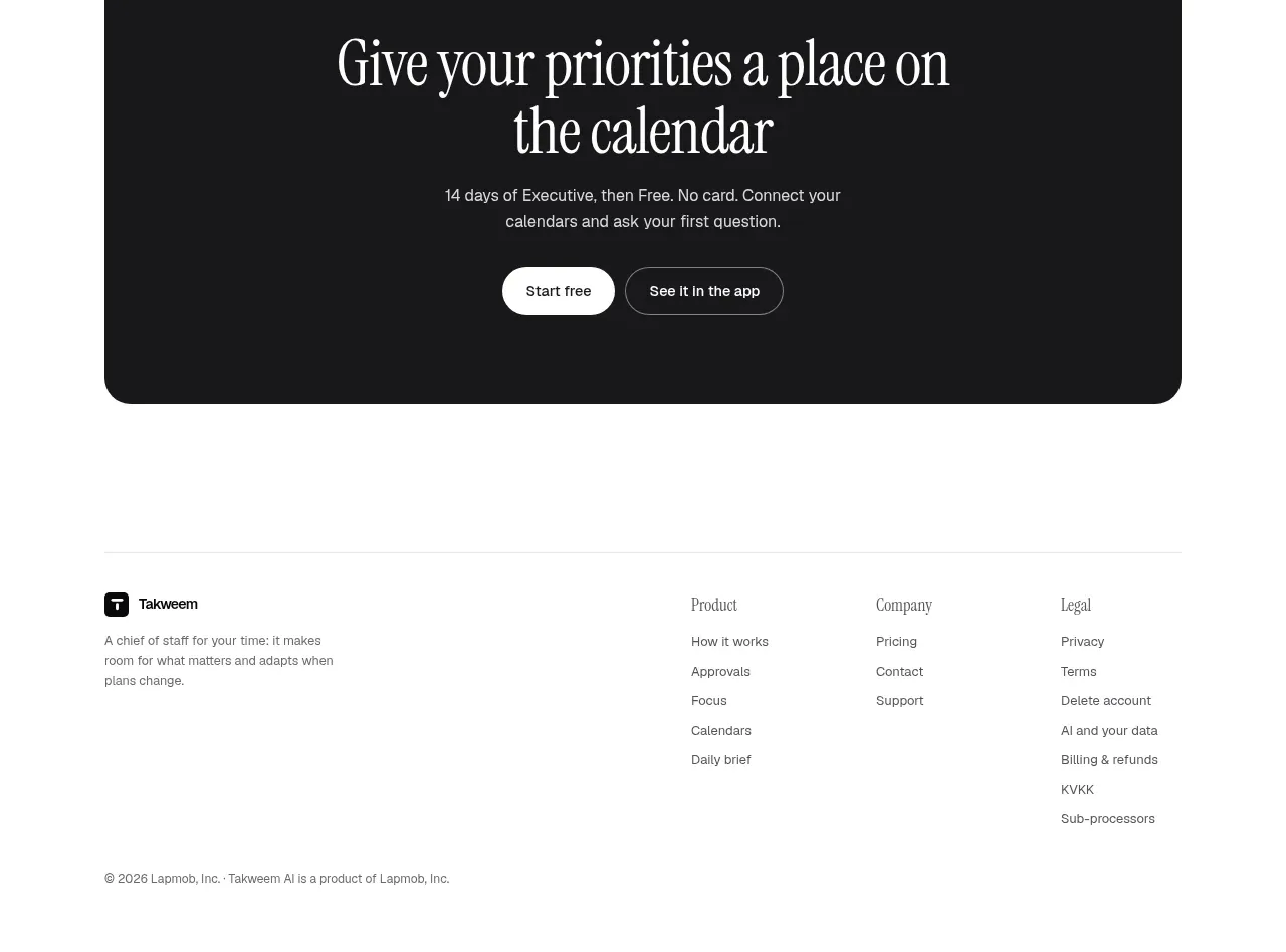
The footer closes with a compact brand statement, grouped navigation columns, and a low-contrast copyright/legal line separated by a fine rule.
Prompt preview
## Reference images

Study these alongside the description below: hierarchy, rhythm, spacing, colour. Build for the product you are asked about, using this design language.

- Component: https://kage-design-assets.t3.tigrisfiles.io/components/takweem-ai/0f53cdf8-216d-4033-bf99-d7586d054974-1791439462-10.webp
- Full page it was cut from: https://kage-design-assets.t3.tigrisfiles.io/screenshots/takweem-ai/0f53cdf8-216d-4033-bf99-d7586d054974-1791439356553-full.webp
- Component on Kage: https://kage.design/component/takweem-footer

## Before you start
Ask the user what brand statement, navigation groups, support links, legal links, and social destinations their product needs. Then create an original footer following these rules.

- Start with a thin top rule and a centered max-width footer grid.
- Put a small brand lockup and one-sentence positioning statement in the first column; place grouped links in clearly labeled columns beside it.
- Use small sans-serif labels and links, generous row spacing, and low visual contrast for secondary information.
- Finish with a quiet copyright/legal row aligned to the container edge.
- Use #ffffff or #fcfcfa, #171717 for headings, #676762 for links/body, and #e5e5df for rules; avoid large decorative blocks.
- Make columns collapse into a readable stacked layout on mobile, with adequate tap targets.

Never: use logos, product names, copy, illustrations, or imagery from the reference.