 kage
kage
thestory.run
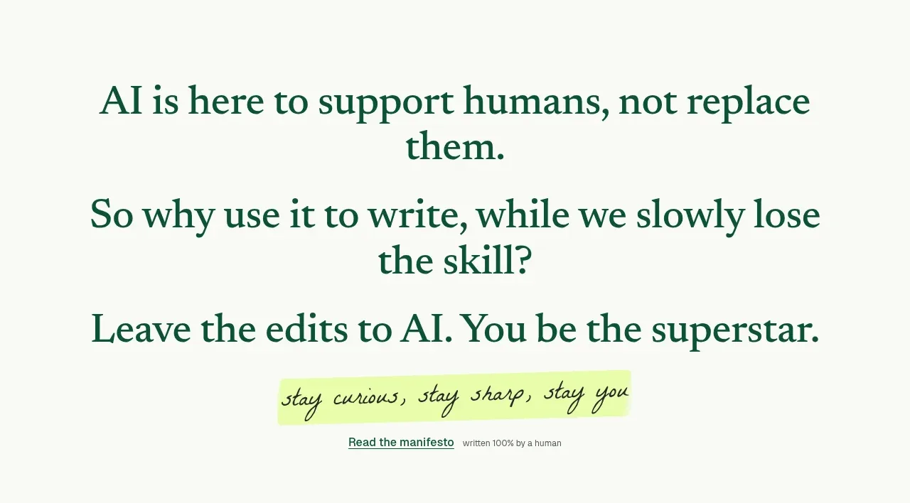
Design analysis
A large, high-contrast statement reframes the product’s purpose before a handwritten lime-highlighted phrase and a small manifesto link. It is memorable because it uses very little content with strong typographic scale.
Prompt preview
## Reference images

Study these alongside the description below: hierarchy, rhythm, spacing, colour. Build for the product you are asked about, using this design language.

- Component: https://kage-design-assets.t3.tigrisfiles.io/components/thestory-run/30e08e83-50b8-4774-b650-1d7663d8d1f5-1790143353-3.webp
- Full page it was cut from: https://kage-design-assets.t3.tigrisfiles.io/screenshots/thestory-run/30e08e83-50b8-4774-b650-1d7663d8d1f5-1790143267493-full.webp
- Component on Kage: https://kage.design/component/thestory-run-cta

## Before you start
Ask what belief your product wants to champion and what action should follow from that belief. Translate that belief into the user's own language.

Create a manifesto-style statement section. Stack two or three centered serif statements with very large type, deep green text, and generous vertical spacing. Let one short handwritten or italic phrase sit on a pale lime highlight strip beneath the statements, followed by a small text link. Keep the background warm off-white and avoid cards, borders, or decorative clutter. Use responsive line lengths so the statements remain readable on mobile. Add a subtle hover treatment to the link and preserve strong keyboard focus.

Never use logos, product names, copy, illustrations, or imagery from the reference.
More components
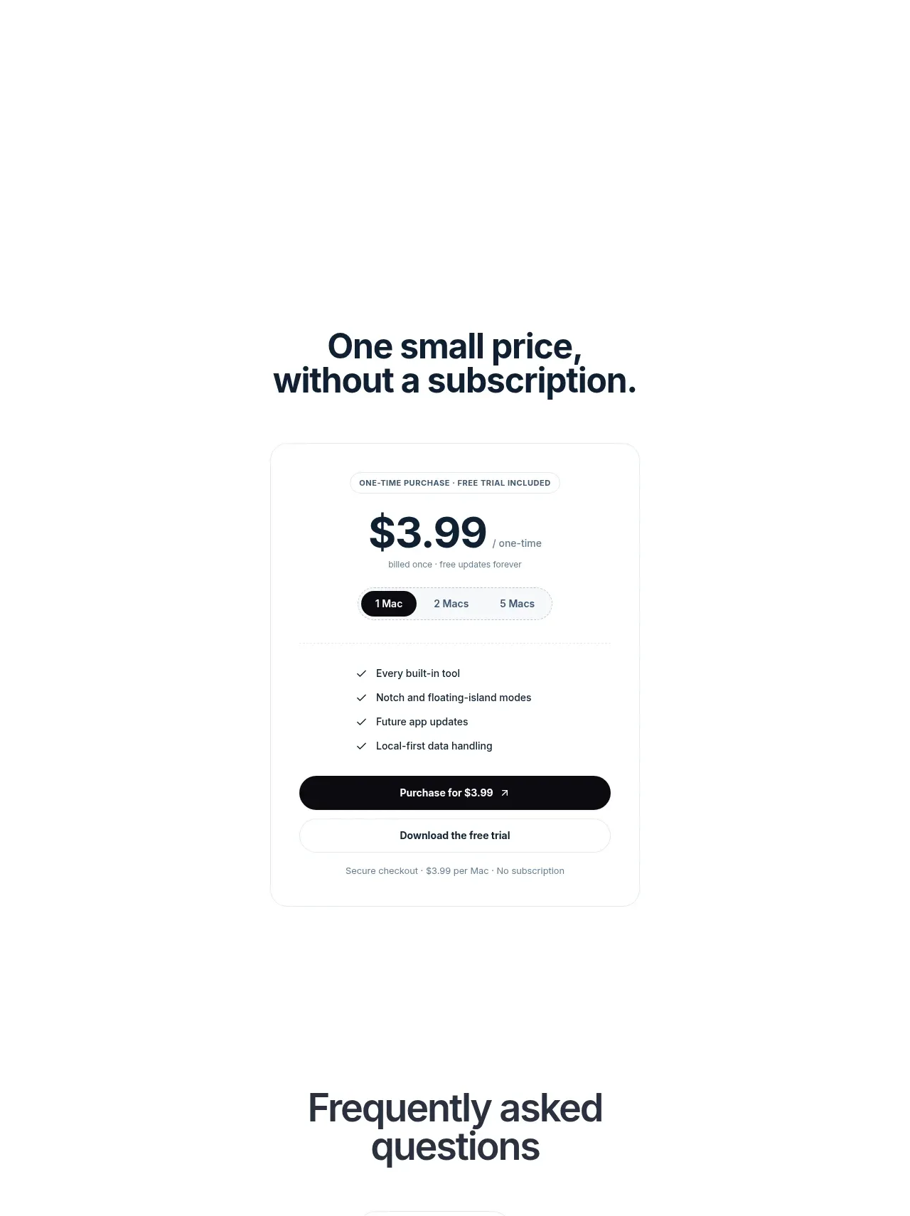
 Visual closing product statement
NotchPop · Call to action
Visual closing product statement
NotchPop · Call to action
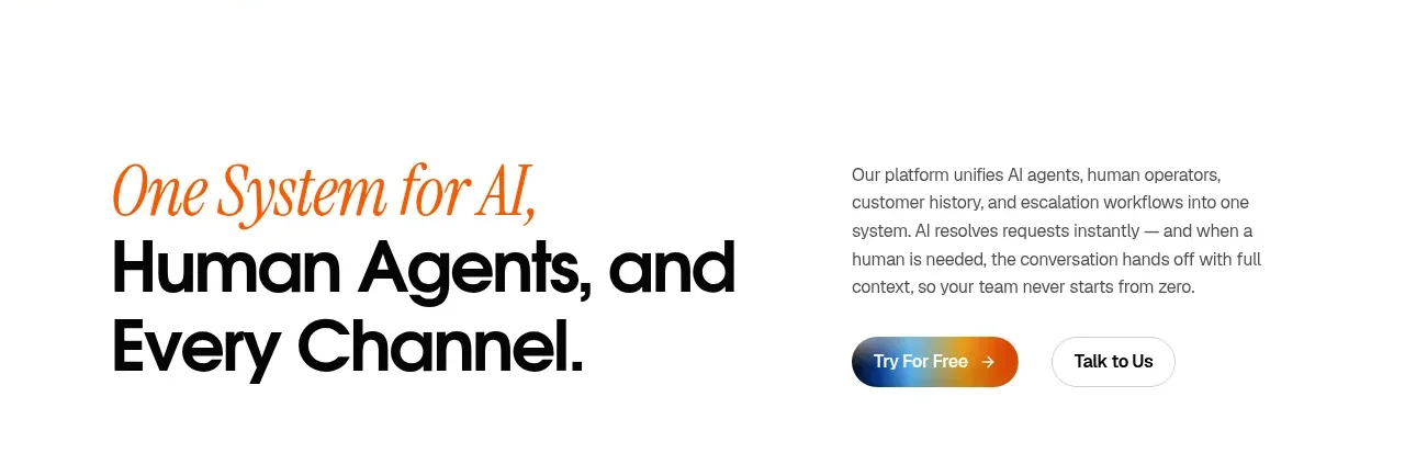
 System positioning statement
IntellAgents.io · Call to action
System positioning statement
IntellAgents.io · Call to action
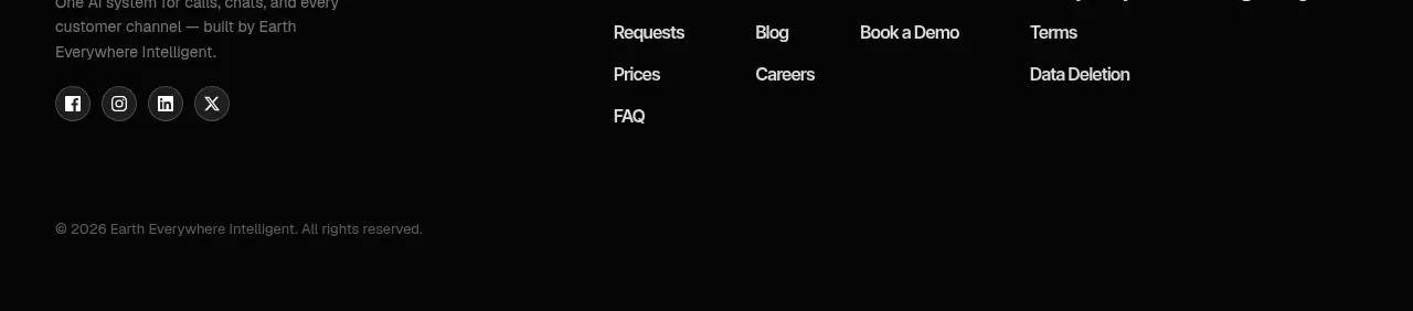 Final conversion banner
IntellAgents.io · Call to action
Final conversion banner
IntellAgents.io · Call to action
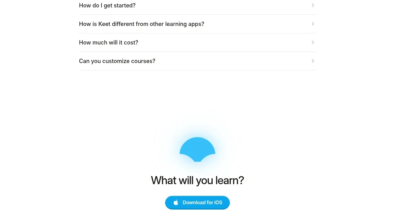
 Final app-download call to action
Keet · Call to action
Final app-download call to action
Keet · Call to action
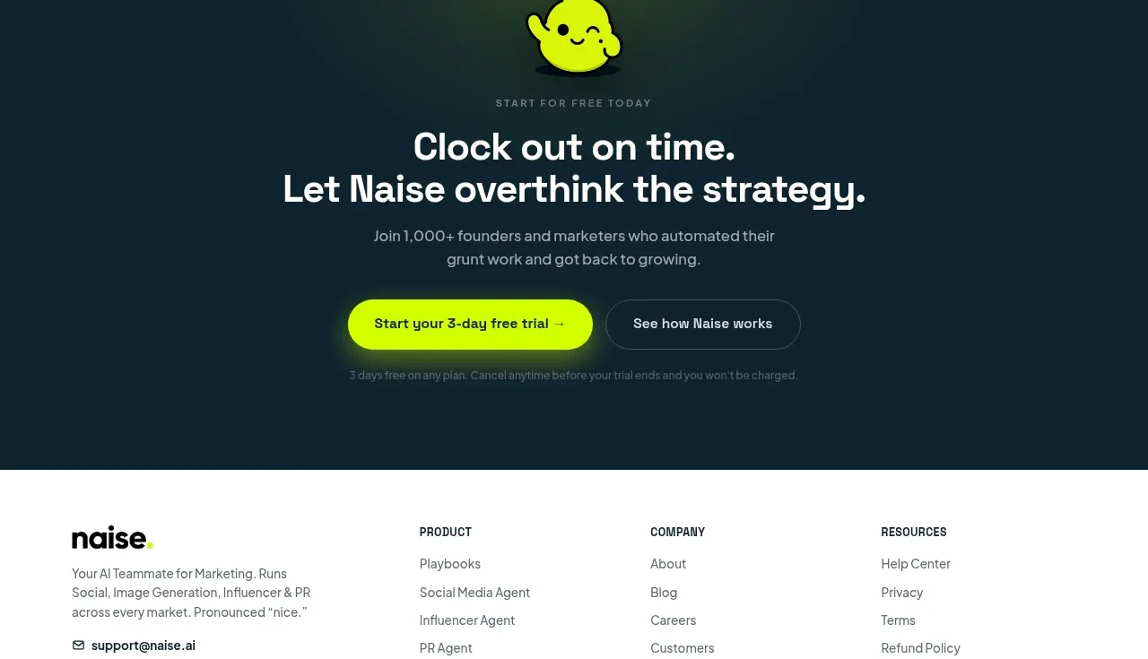
 Dark conversion call to action
Naise AI · Call to action
Dark conversion call to action
Naise AI · Call to action
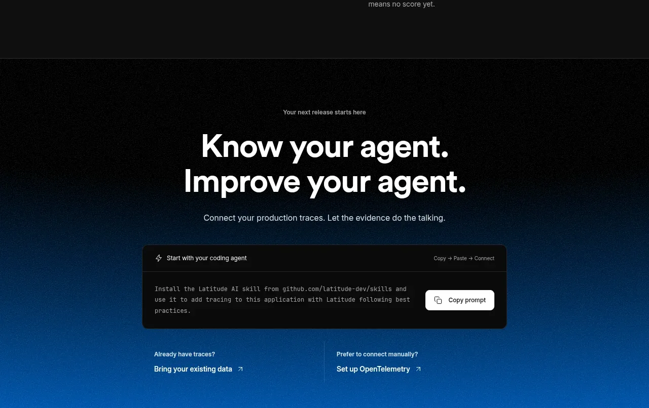
 Connect data and start improving
AgentScore · Call to action
Connect data and start improving
AgentScore · Call to action