kage
kage
thestory.run
Design analysis
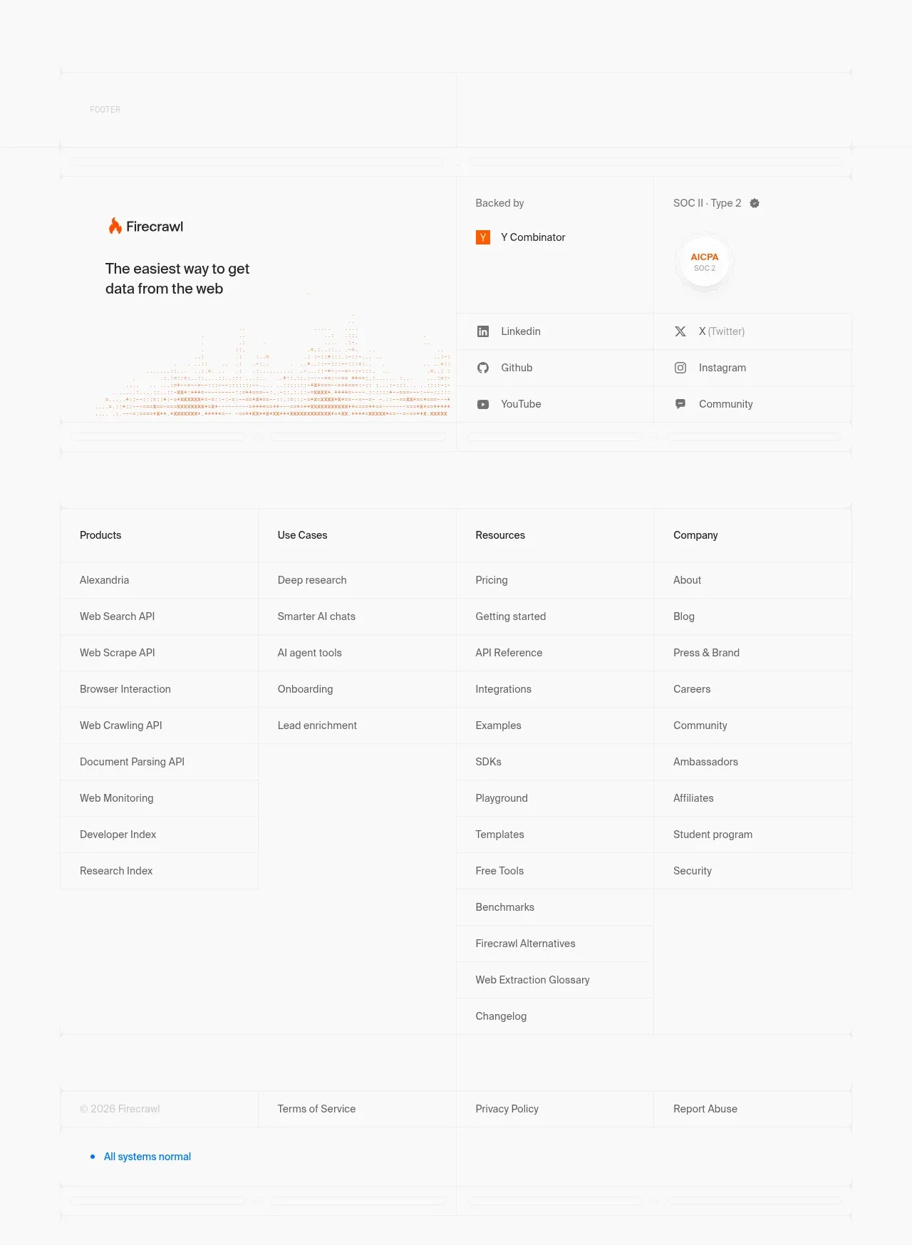
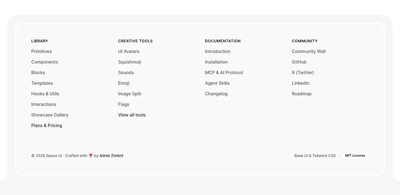
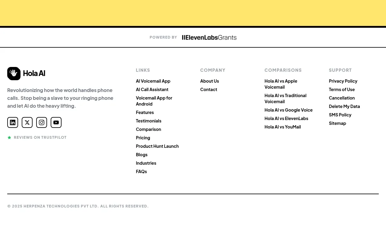
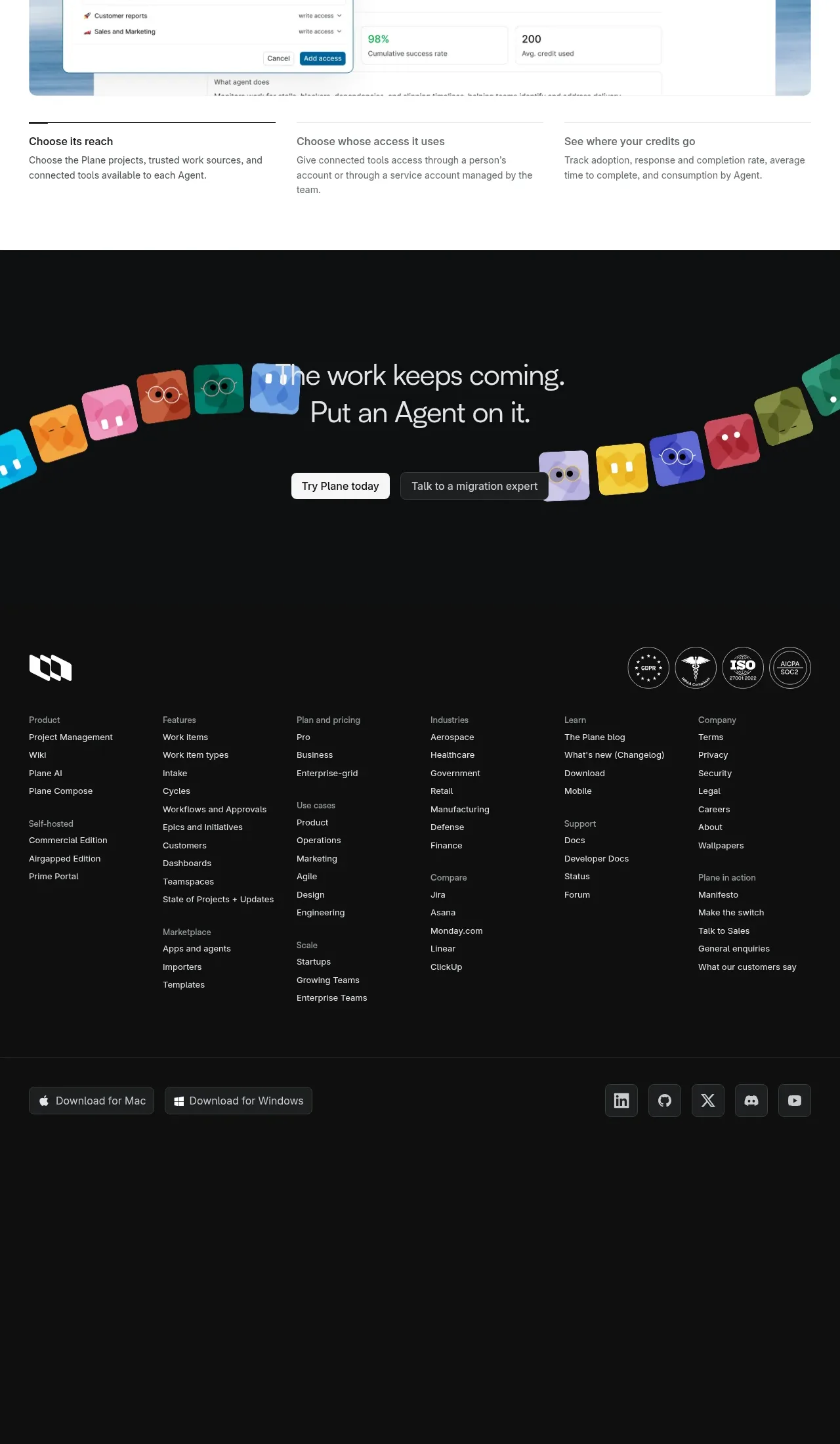
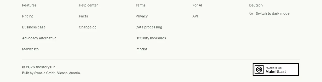
The closing area combines a short maker/company proof block, a final low-pressure signup CTA, and a multi-column utility footer. Fine rules and modest typography keep the ending informative without competing with the page’s main story.
Prompt preview
## Reference images

Study these alongside the description below: hierarchy, rhythm, spacing, colour. Build for the product you are asked about, using this design language.

- Component: https://kage-design-assets.t3.tigrisfiles.io/components/thestory-run/30e08e83-50b8-4774-b650-1d7663d8d1f5-1790143356-11.webp
- Full page it was cut from: https://kage-design-assets.t3.tigrisfiles.io/screenshots/thestory-run/30e08e83-50b8-4774-b650-1d7663d8d1f5-1790143267493-full.webp
- Component on Kage: https://kage.design/component/thestory-run-footer

## Before you start
Ask what company or maker proof is appropriate, what final conversion action matters, and which legal, product, and resource links are required. Tailor the closing hierarchy to the user's trust needs.

Build the closing area as three compact layers: a maker/company credibility block with optional image or media, a final CTA with an eyebrow, large serif invitation, supporting line, and one dark-green button, then a footer separated by a fine horizontal rule. Use a five-column desktop link grid that collapses cleanly on mobile, plus a bottom row for copyright, location or legal metadata, and a small optional trust badge. Keep the background warm off-white, use charcoal text, deep green action styling, muted grey secondary links, 1px dividers, and restrained 10–14px radii. Include hover and focus states for every link and ensure the footer remains readable at small sizes.

Never use logos, product names, copy, illustrations, or imagery from the reference.