kage

Design analysis
An editorial B2B landing page built on a cream canvas that alternates with near-black full-width bands, so the page reads as a sequence of distinct chapters rather than one continuous scroll. Hierarchy is carried by a two-typeface system: a grotesk sans for large headlines and a monospaced face for uppercase eyebrow labels, card titles and micro-copy, which gives the page a technical, call-sheet feel that suits a cold-calling service. Proof is done almost entirely with drawn product-UI mockups — a calendar with booked-call blocks, a live call console, approval queues, charts — where lavender, mint green and red are used semantically inside the mockups rather than decoratively elsewhere. Big numeric stat cards (71%, 121%, 11%, 0) and testimonial cards with oversized "%" figures create rhythm changes between dense mockup sections and sparse text sections like Our Promise and the FAQ accordion. The lavender pill CTA repeats identically down the page, anchoring every chapter.
Prompt preview
## Reference images

Study these alongside the description below: hierarchy, rhythm, spacing, colour. Build for the product you are asked about, using this design language.

- Full page: https://kage-design-assets.t3.tigrisfiles.io/screenshots/throxy/4d577be3-3944-4c06-b2f6-094c0e693ab7-1793253814515-full.webp
- Above the fold: https://kage-design-assets.t3.tigrisfiles.io/screenshots/throxy/4d577be3-3944-4c06-b2f6-094c0e693ab7-1793253809414.webp
- Design on Kage: https://kage.design/designs/throxy-landing-page

# throxy-style editorial landing page

## Before you start
Ask the user what product or service they are building, who it is for, and what brand assets they already have (name, logo, colours, fonts). Wait for the answers before writing any code. Everything below is a design language to apply to *their* product — do not reproduce throxy's name, copy, testimonial content or illustrations.

## Page structure
Build a single long marketing page with the following sections, in order:

1. **Header** — slim top bar: small wordmark left of centre, one dark pill button ("Strategy Call"-style CTA) on the right. No nav menu items in between; keep it sparse.
2. **Hero** — two columns. Left: a "backed by / trusted" badge chip, then a large three-line headline with a full stop punch, a short paragraph, and a lavender pill CTA with a left arrow icon. Right: a light grey calendar-grid mockup showing week columns with coloured event blocks (purple and green) labelled as booked meetings. The mockup is the hero visual.
3. **Proof section (light)** — left column: eyebrow label + large headline + paragraph, then a 2×2 grid of stat cards (large number + small uppercase caption) on soft grey cards. Right: a dark rounded product mockup of a live call console — caller avatar, waveform bars, an "SDR NOTE" text block, action buttons (one red, one green, one dark), and a small stats table below (rows with labels and right-aligned values). End with a dark pill CTA.
4. **Dark band 1** — full-width near-black section: headline ("We book the meetings. You choose which ones to take." pattern: statement + counterpoint), paragraph, then a 3-up row of dark product-mockup cards: (a) a qualification checklist with pass/skip statuses, (b) a meeting approval list with accept/skip buttons, (c) a mini calendar of upcoming meetings. Each card gets a bolded lead-in sentence + short caption below.
5. **Testimonials (still inside the dark band)** — eyebrow label "Testimonials", then a 3-up grid of dark cards: each has an industry tag, an oversized statistic ("%") or a longer quote, a short testimonial paragraph, and an avatar + name + role + company in uppercase mono. Vary the card composition so the row isn't mechanical.
6. **Light interlude** — headline, then two stacked rows each a soft grey card with a bold feature title + one-line description, then a repeated lavender CTA.
7. **Dark band 2 (anti-patterns)** — headline "Most X overwhelm. Most Y disappoint." pattern, then 3-up cards each containing a small chart or UI fragment (a line chart with an annotation chip, a horizontal stacked time bar with legend, a calendar with a red "low quality lead" block) and a caption card below starting with a bolded category word.
8. **Tabbed feature panel** — a pill-shaped segmented tab row (5 mono uppercase tabs, one active) sitting on the light background, above a very large dark rounded panel: headline + paragraph + "Book Call →" text link, and below it a large abstract visual of horizontal bars/columns in grey with green, purple and white highlighted bars.
9. **Ramp-up timeline** — eyebrow label, headline "Live within a week. Meetings within the month." pattern, then 4 small mockup cards in a row (a checklist, a config panel, an email draft, a tile grid), each followed by a "DAY n" / "WEEK n" label, a bold step name and a two-line caption.
10. **Split value panel** — a large rounded container split in two: left dark with headline, paragraph and lavender CTA; right lavender with three stacked floating chips (icon + mono label) that step across like layered cards.
11. **Our Promise** — editorial break: small heading left, then a single narrow column of long-form paragraphs on the plain background. No cards, no mockups — a deliberate slow-down.
12. **FAQ** — large "FAQs" heading, then an accordion list with mono uppercase questions and chevrons, thin divider lines.
13. **AI-link chips** — a centred row of 4 small pill buttons linking to external assistants.
14. **Footer** — near-black: logo, two link columns (Company, Solutions), minimal.

## Design language
- **Canvas rhythm:** alternate full-width light and dark bands to create chapters: light hero → light proof → dark band (features + testimonials) → light → dark band → light to the end, with one final dark footer. Never place two dark bands adjacent without a light break.
- **Colour:** cream/off-white background (~#F0EEE8), near-black ink and dark-band background (~#1B1A17), lavender accent (~#C7BCF2) reserved for the primary CTA and hero mockup blocks, mint green (~#B7E8B0) as a secondary success/accent, red (~#D9534F) only inside mockups as a warning state. Grey card fills (~#E8E6E0 on light, ~#262521 on dark). Accents live inside the UI mockups; the page chrome stays neutral.
- **Type pairing:** a grotesk sans (e.g. Inter/Neue Haas style) for headlines and body, paired with a monospaced face for all uppercase micro-labels: eyebrow section labels, card titles, stat captions, FAQ questions, tab labels. Headlines large (~56–72px) with tight leading and full-stop sentence rhythm ("Statement. Counterpoint."); body small (~14–15px) and low-contrast grey.
- **Eyebrow labels:** every major section starts with a mono uppercase label preceded by a short dash/line ("— TESTIMONIALS", "— RAMP-UP TIMELINE"). Consistent placement top-left.
- **Mockups as proof:** replace photography with hand-built product UI mockups in CSS. Give them large radius (~16–20px), subtle borders (#2E2C28 on dark, #DDD9D0 on light), and realistic micro-copy in mono. Use status colours semantically (green = booked/pass, purple = scheduled, red = rejected).
- **Stats:** big numbers (~40–56px) with tiny uppercase mono captions underneath, on soft grey cards. Testimonial cards repeat this with an oversized "%" glyph.
- **CTAs:** one persistent lavender pill button with a left-arrow icon, reused verbatim at every conversion point; dark pill buttons as secondary CTAs. No gradients, no shadows heavier than a soft ambient on mockups.
- **Density:** mockup and card sections are dense; the "Our Promise" section is intentionally sparse — a single narrow text column — to reset the reader before FAQ.
- **Interaction:** keep motion minimal — accordion open/close on FAQ and tabs with a smooth active-pill swap; hover states on cards are a slight border lighten. No parallax or decorative animation.

## Never
- Do not use throxy's name, logo, wordmark, or any of its copy, headlines, testimonial quotes or person names.
- Do not reuse the Y Combinator badge or reference any accelerator.
- Do not copy the specific mockup contents (James Harrington, the calendar, the qualification checklist wording) — build equivalent mockups with the user's own product domain.
- Never present the result as throxy or imply their endorsement.
Components from this page
All components
 Minimal top navigation
throxy · Navigation
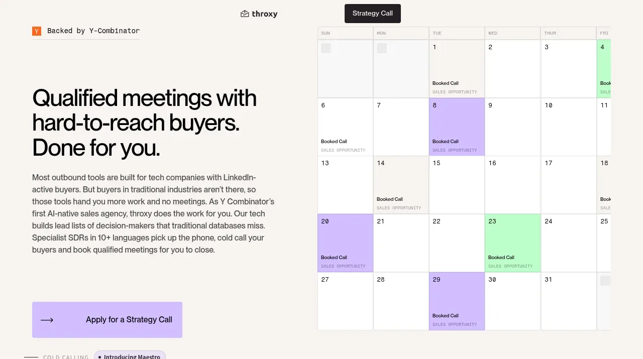 Buyer-focused hero with calendar visual
throxy · Hero
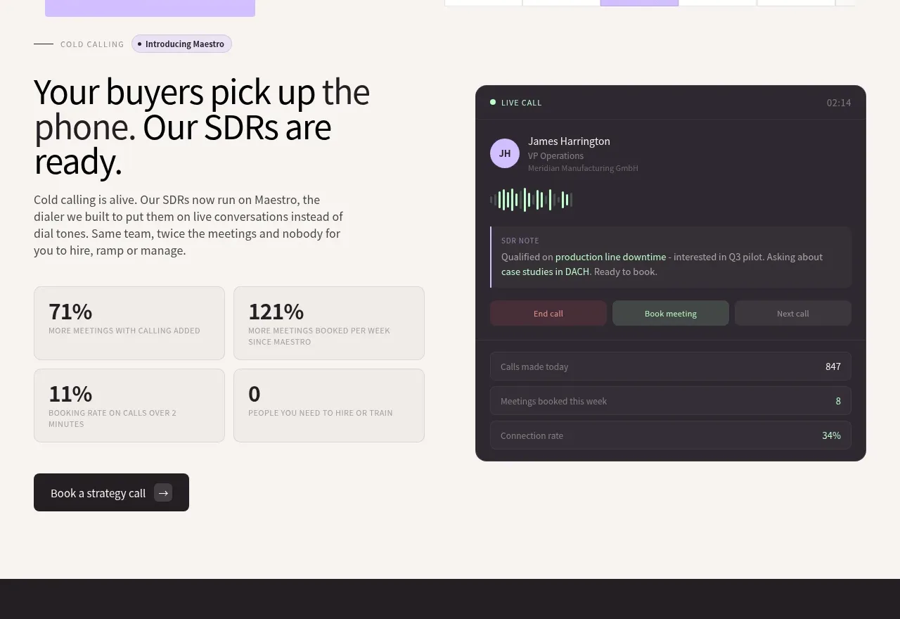 Cold-calling performance section
throxy · Feature grid
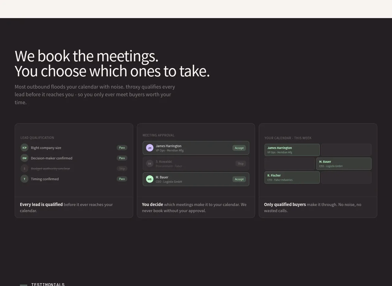 Qualification workflow cards
throxy · Feature grid
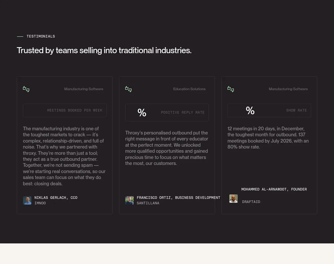 Industry trust testimonials
throxy · Testimonials
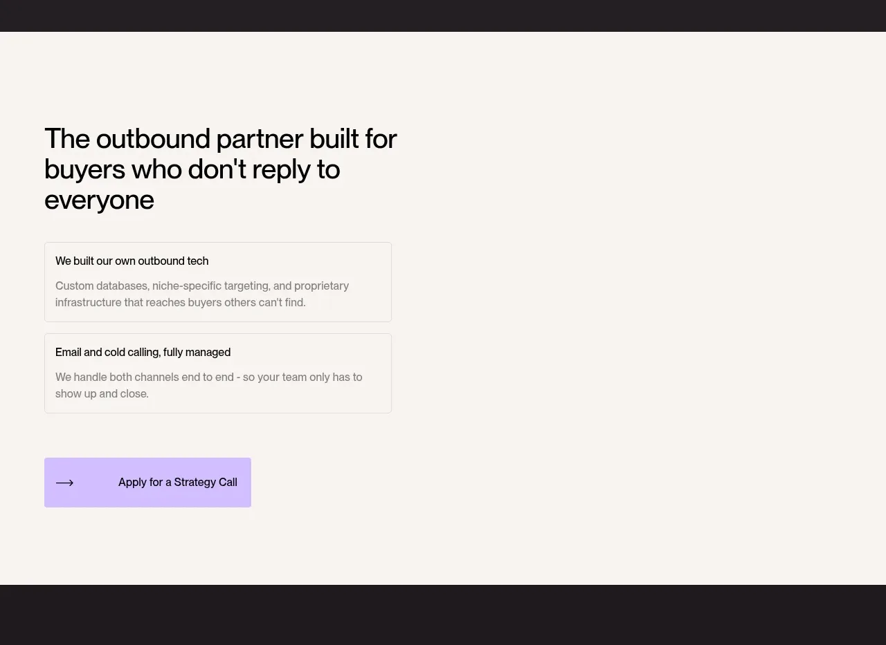 Outbound partner benefits
throxy · Feature grid
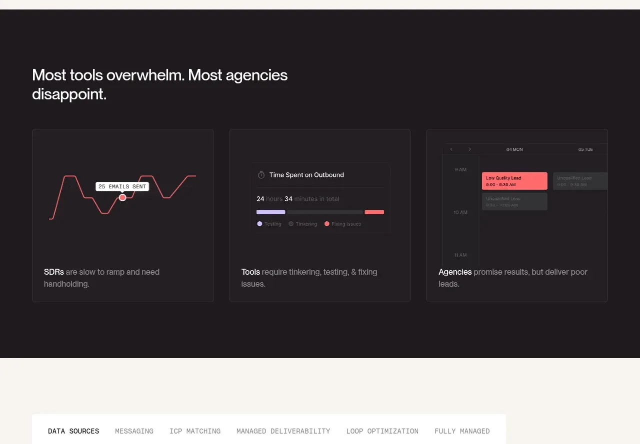 Why alternatives disappoint
throxy · Feature grid
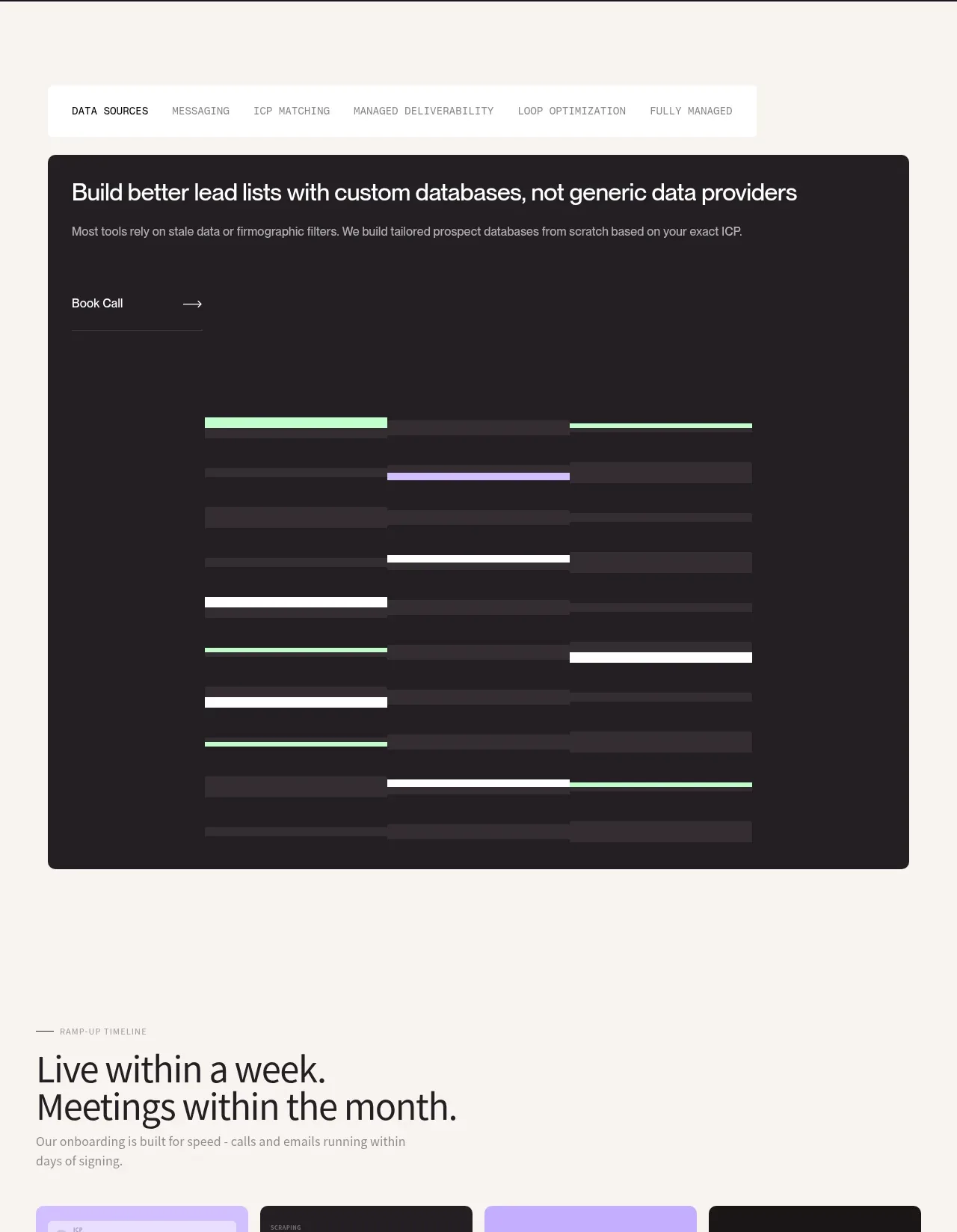 Custom data sources workflow
throxy · Tabs & steps
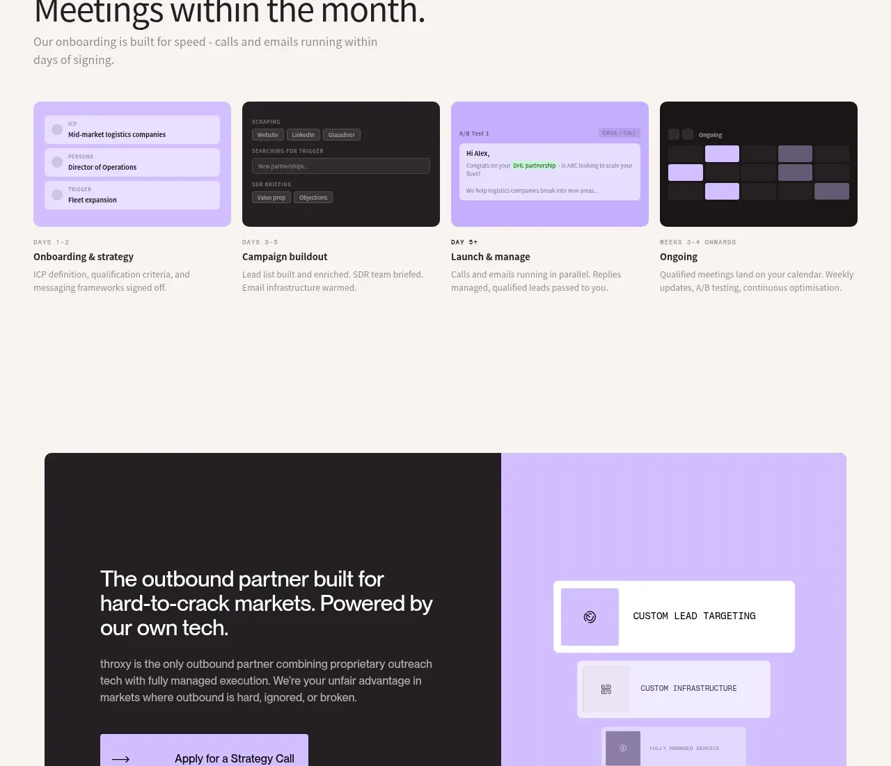 Rapid onboarding timeline
throxy · Feature grid
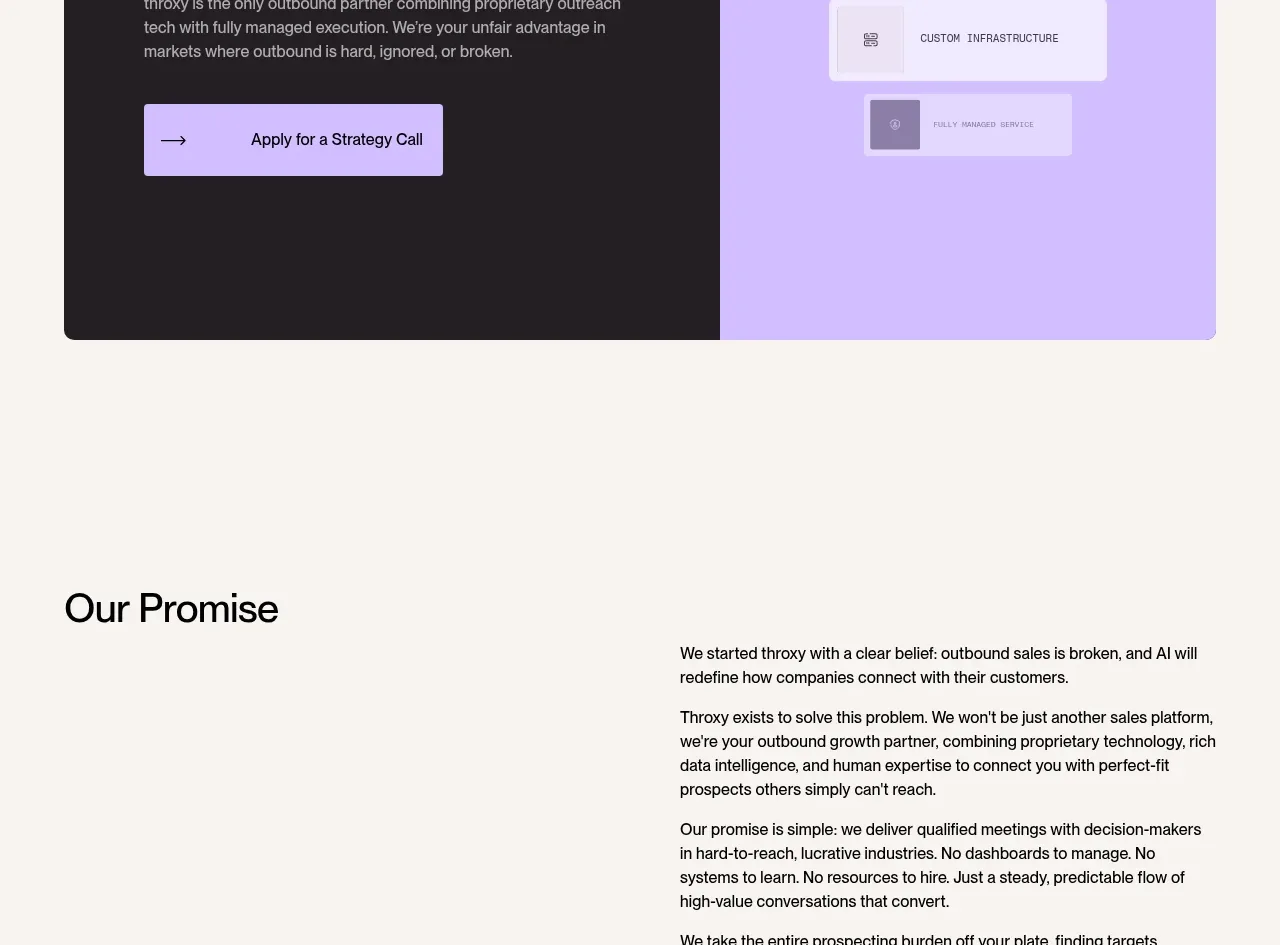 Split final conversion panel
throxy · Call to action
 Brand promise statement
throxy · Card
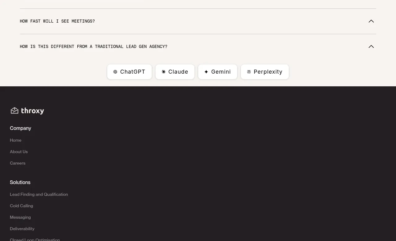 Frequently asked questions
throxy · FAQ