 kage
kage
tinykpi.app
Design analysis
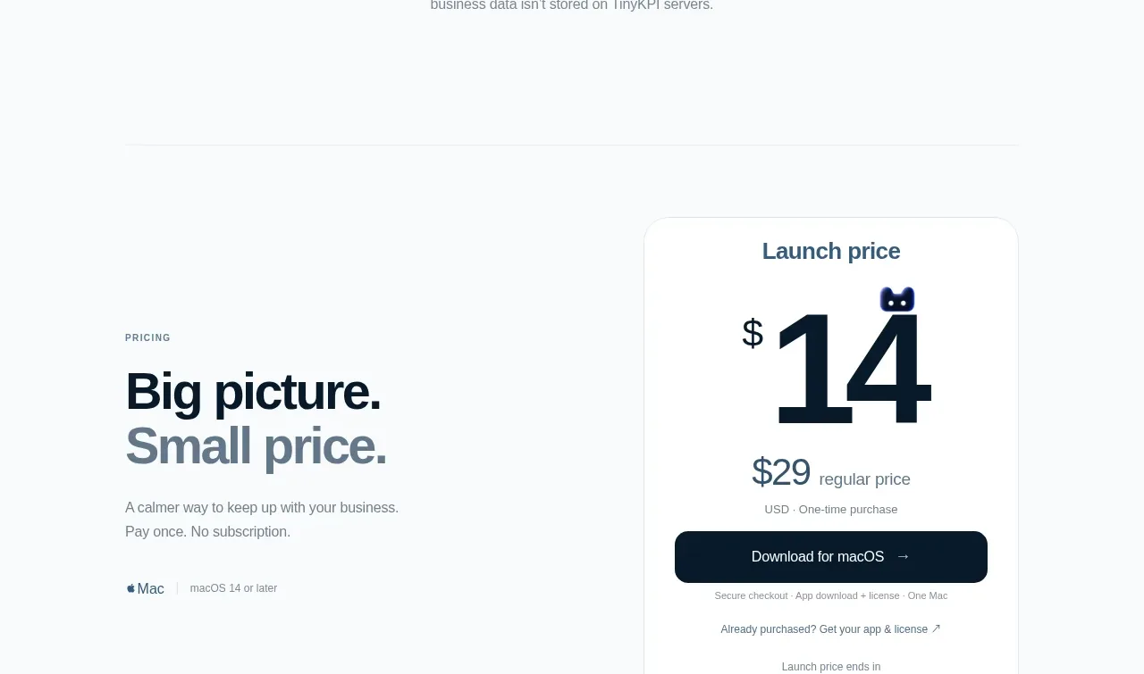
A quiet centered trust section uses a lock icon, eyebrow, large headline, and concise explanation to make local data handling a central differentiator. A fine divider below separates it from commercial content.
Prompt preview
## Reference images

Study these alongside the description below: hierarchy, rhythm, spacing, colour. Build for the product you are asked about, using this design language.

- Component: https://kage-design-assets.t3.tigrisfiles.io/components/tinykpi/a5c6b072-2fc8-4798-bcd8-9bd0bf616d58-1789711473-7.webp
- Full page it was cut from: https://kage-design-assets.t3.tigrisfiles.io/screenshots/tinykpi/a5c6b072-2fc8-4798-bcd8-9bd0bf616d58-1789711371888-full.webp
- Component on Kage: https://kage.design/component/tinykpi-cta

## Before you start
Ask what privacy promise the user's product can credibly make and what proof supports it, then apply these principles to that product.

Create a centered privacy/trust callout with a small lock or security icon, an uppercase eyebrow, a large two-line headline, and a short paragraph explaining the data boundary. Use a lot of vertical breathing room and a thin divider near the bottom. Keep the design editorial and calm: page background #f8fafc, icon in pale blue-gray, heading #10202c with one line or phrase in slate #74838d, body #77858e, and a max text width around 500px. Avoid badges or exaggerated security claims; if appropriate, add a compact secondary proof link below the paragraph.

Never use logos, product names, copy, illustrations, or imagery from the reference.
More components
 Final customer experience call to action
intercom.com · Call to action
Final customer experience call to action
intercom.com · Call to action
 App download conversion
Lull · Call to action
App download conversion
Lull · Call to action

 Centered final call to action
ApplySeed · Call to action
Centered final call to action
ApplySeed · Call to action
F
Final conversion call to action
Fide Island · Call to action

 Inline conversion banner
QAgent · Call to action
Inline conversion banner
QAgent · Call to action

A
Final signup call to action
Axiom · Call to action