kage
kage
tinykpi.app
Design analysis
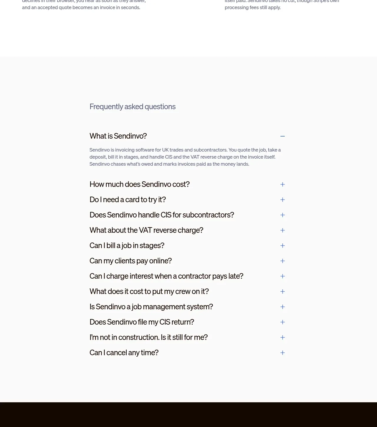
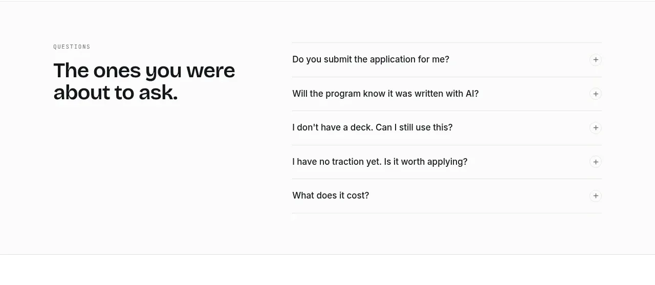
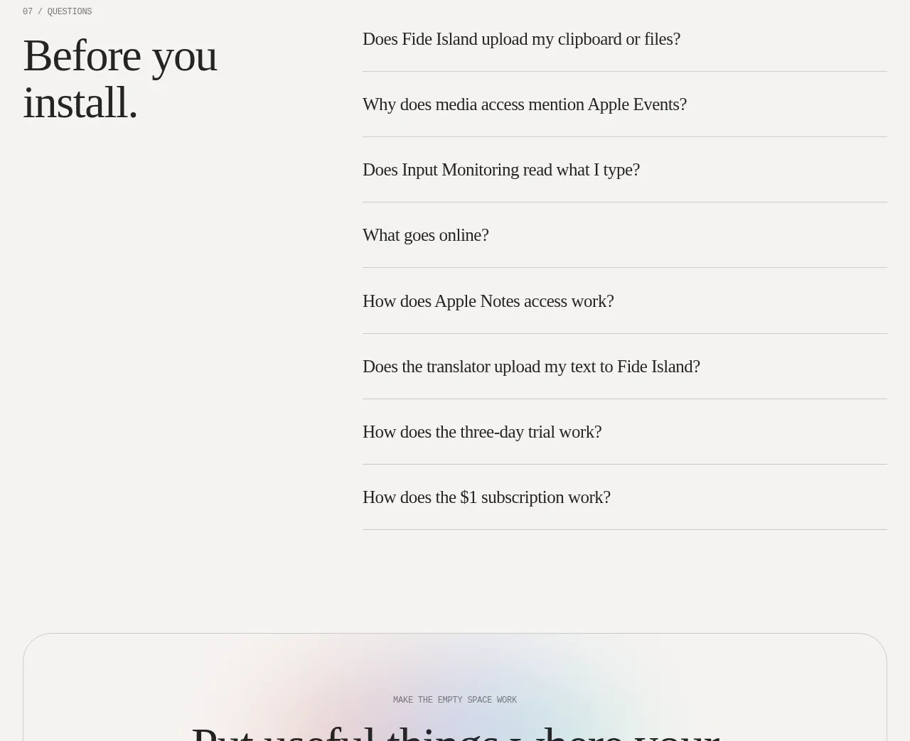
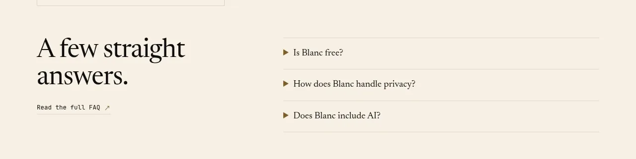
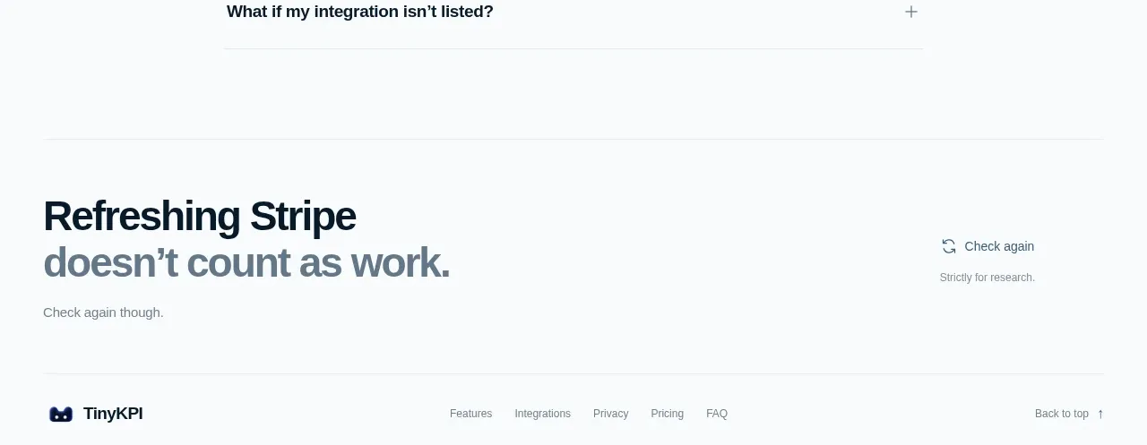
A centered FAQ heading introduces a narrow list of full-width accordion rows. Thin rules, bold questions, and right-aligned plus controls make the section easy to scan while keeping answers hidden until requested.
Prompt preview
## Reference images

Study these alongside the description below: hierarchy, rhythm, spacing, colour. Build for the product you are asked about, using this design language.

- Component: https://kage-design-assets.t3.tigrisfiles.io/components/tinykpi/a5c6b072-2fc8-4798-bcd8-9bd0bf616d58-1789711474-9.webp
- Full page it was cut from: https://kage-design-assets.t3.tigrisfiles.io/screenshots/tinykpi/a5c6b072-2fc8-4798-bcd8-9bd0bf616d58-1789711371888-full.webp
- Component on Kage: https://kage.design/component/tinykpi-faq

## Before you start
Ask what questions users have before adopting the user's product, then apply these principles to that product.

Create an FAQ section with a centered small eyebrow and strong heading, followed by a narrow max-width accordion list. Each row should have a bold 14–16px question on the left, a plus/minus control on the right, and fine horizontal dividers in #e2e7ea. Give rows 56–68px height, comfortable horizontal padding, and a subtle hover background. Expanding an item should reveal a muted answer with a smooth height transition while preserving keyboard and screen-reader semantics. Use #10202c headings, #77858e answers, and an off-white #f8fafc background.

Never use logos, product names, copy, illustrations, or imagery from the reference.