 kage
kage
tiun.io

Design analysis
A final compact CTA repeats the system-level value proposition over a large violet gradient field and offers two clear next steps.
Prompt preview
## Reference images

Study these alongside the description below: hierarchy, rhythm, spacing, colour. Build for the product you are asked about, using this design language.

- Component: https://kage-design-assets.t3.tigrisfiles.io/components/tiun/82cad29c-5bdb-4fc9-91ef-0bee36475f7f-1789538802-11.webp
- Full page it was cut from: https://kage-design-assets.t3.tigrisfiles.io/screenshots/tiun/82cad29c-5bdb-4fc9-91ef-0bee36475f7f-1789538671428-full.webp
- Component on Kage: https://kage.design/component/tiun-cta

## Before you start
Ask what the user's strongest final promise is and which two actions matter most at the end of the page. Tailor the message and button labels accordingly.

Create a full-width closing CTA with a dark left side and a soft violet-to-purple glow or halftone field on the right. Use a concise two-line headline, generous padding, and two horizontally aligned buttons. Keep the primary button white with near-black text, and the secondary button dark with a subtle border. Use #050505, #8B5CF6, and a faint lavender highlight; do not let the gradient reduce text contrast. Set the headline around 28–40px, with 32–56px internal spacing and a 16–24px radius if the banner is contained.

Never: use the reference logo, product name, exact copy, illustrations, or imagery.
More components

 Mobile app conversion CTA
Payflip · Call to action
Mobile app conversion CTA
Payflip · Call to action

 Final download call to action
Grimo AI · Call to action
Final download call to action
Grimo AI · Call to action

 Download conversion panel
Kilo Code for iOS and Android · Call to action
Download conversion panel
Kilo Code for iOS and Android · Call to action
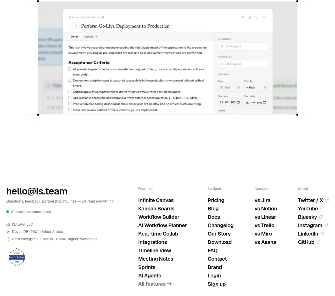
 Final conversion CTA
is.team · Call to action
Final conversion CTA
is.team · Call to action

 Studio closing call to action
FATHER · Call to action
Studio closing call to action
FATHER · Call to action

 Final conversion panel
Idlen · Call to action
Final conversion panel
Idlen · Call to action