kage
kage
tiun.io

Design analysis
A near-black, full-length product landing page uses a strict thin-line grid to organize a long sequence of feature narratives, product UI previews, testimonials, comparisons, and footer navigation. Large white sans-serif headlines alternate with tiny uppercase mono labels and muted gray body copy; the rhythm shifts from spacious hero and conceptual diagrams to dense two-column feature modules, tables, and dashboard panels, with restrained purple glows used mainly for emphasis and CTAs.
Prompt preview
## Reference images

Study these alongside the description below: hierarchy, rhythm, spacing, colour. Build for the product you are asked about, using this design language.

- Full page: https://kage-design-assets.t3.tigrisfiles.io/screenshots/tiun/82cad29c-5bdb-4fc9-91ef-0bee36475f7f-1789538671428-full.webp
- Above the fold: https://kage-design-assets.t3.tigrisfiles.io/screenshots/tiun/82cad29c-5bdb-4fc9-91ef-0bee36475f7f-1789538664811.webp
- Design on Kage: https://kage.design/designs/tiun-landing-page

## Before you start
Ask the user what they are building, who it is for, and which brand assets they already have, including product name, colours, type choices, logo, and imagery. Wait for their answers before designing. Apply the system below to their product, not to the reference product.

## Page structure
1. **Header:** A very compact fixed-looking black bar with a small circular mark and wordmark at left and a rounded hamburger control at right, separated from the page by hairline borders.
2. **Hero:** Center a small announcement badge above a large two-line headline, short supporting paragraph, primary light CTA, and dark secondary developer/MCP-style action. Add a soft purple atmospheric glow behind the lower edge of the headline.
3. **Trust strip:** Place a small centered investor/customer-support caption above a two-column by three-row logo grid, using low-contrast monochrome marks and thin dividers.
4. **Problem statement:** Use a spacious bordered section with a tiny uppercase eyebrow and a large left-aligned paragraph explaining the complexity problem; let text, rather than imagery, carry the section.
5. **Solution introduction:** Repeat the eyebrow-plus-headline pattern with supporting copy, then show a wide, dark technical system diagram with faint vertical grid lines, thin connector paths, and small pill labels.
6. **Integration CTA:** Create a shallow horizontal section with headline and paired buttons on the left, while a purple halftone/radial glow fills the right side.
7. **Integration logo grid:** Follow with a three-column by two-row bordered grid of integration marks, evenly centered and very subdued.
8. **Testimonials:** Present two offset testimonial cards in a larger bordered matrix. Alternate the text blocks and brand/name areas so the composition feels editorial rather than like a uniform card stack.
9. **Authentication overview:** Introduce a numbered feature chapter with a large headline, then a two-column feature row: explanation and authentication UI preview. Follow with a second row for profile/account UI, and finish with a narrow capability strip listing MFA, SMS, email, SSO, and provider options.
10. **Payments overview:** Start another numbered chapter with a large headline. Show rows for billing plans and checkout components, pairing explanatory copy on the left with dark product panels on the right. Add a merchant-of-record comparison section beneath, including CTA pills and a four-column fee comparison table with one highlighted column.
11. **Customer database overview:** Use another chapter headline, then a row pairing user-management copy with a dashboard screenshot. Add a second row for event/session tracking and a pricing-style UI panel, followed by a four-cell utility grid for transactional email, invoice history, plan management, and data APIs.
12. **Analytics overview:** Add a headline and short paragraph, then a four-tab role selector for business, engineering, product, and marketing. Below it, center a dark conversational analytics interface with an example question, loading/result text, suggested prompts, and a purple role chip.
13. **Case studies:** Use a compact case-study module with a vertical 01/02/03 selector on the left and a large result story on the right, including a muted oversized customer name, quantified outcome, supporting paragraph, and attribution.
14. **Closing CTA:** Repeat the split layout from the integration CTA: strong two-line statement and light/dark buttons on the left, large purple textured glow on the right.
15. **Footer:** Use a bordered footer with the compact brand lockup, compliance/trust marks, five link columns, and a small copyright line. Keep the density higher here while retaining the same hairline grid.

## Design language
- Build hierarchy with a very large geometric sans-serif headline, usually two lines, paired with tiny uppercase mono or technical labels and small muted sans-serif body copy.
- Use a nearly black base around `#050505` or `#000000`, white headlines around `#F4F4F4`, and secondary text in `#777777` to `#A0A0A0`. Keep most logos and UI previews gray rather than bright.
- Reserve saturated purple, approximately `#7C3CFF` to `#A875FF`, for localized glows, halftone fields, active chips, selected states, and occasional highlighted table cells. Do not turn the whole page into a purple gradient.
- Establish a strict modular grid with 1px borders around `#1A1A1A` to `#242424`; allow vertical and horizontal rules to continue across sections. Use generous outer margins and consistent content columns.
- Keep corners mostly square or subtly rounded. Use small pills only for CTAs, badges, tags, and compact controls. Avoid heavy shadows; rely on contrast, borders, and dark panel fills.
- Change rhythm down the page: begin with a spacious, centered hero; move into editorial text and a conceptual diagram; then increase density through feature rows, dashboards, comparison tables, testimonials, and footer navigation.
- Treat product UI previews as dark inset panels with restrained gray labels, thin separators, compact forms, dashboards, and cards. Make them feel like interface evidence rather than decorative illustrations.
- Use atmospheric effects sparingly: soft purple bloom, grain or halftone texture, and faint technical grid lines should sit behind content without reducing legibility.
- Make interactions quiet and functional: light buttons invert against the black canvas, secondary buttons remain dark with borders, active tabs/chips use purple, and hover states should brighten borders or text rather than add large motion. If adding motion, use slow glow drift and subtle panel transitions.
- Keep the page responsive by collapsing two-column feature rows and comparison grids into one column while preserving the chapter labels, borders, and alternating content rhythm.

## Never
- Do not copy any logos, wordmarks, product names, copy, illustrations, photography, interface text, or icon sets from the reference.
- Do not present the result as tiun or imply affiliation with it.
- Do not reproduce the exact MCP badge, customer marks, testimonial identities, fee values, dashboard data, or case-study claims; replace them with original, product-specific content supplied by the user.
- Do not add generic stock imagery or a large decorative illustration style that conflicts with the restrained technical grid.
Components from this page
All components
 Minimal utility navigation
tiun. · Navigation
Minimal utility navigation
tiun. · Navigation
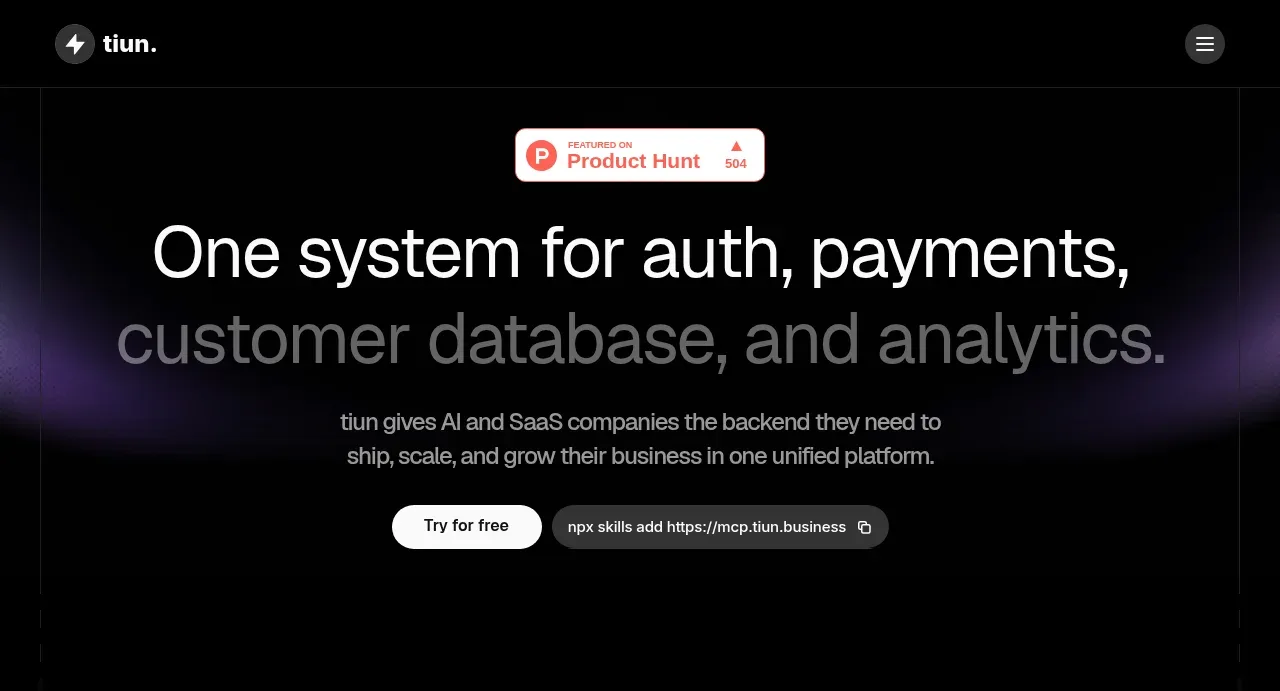 System-level product hero
tiun. · Hero
System-level product hero
tiun. · Hero
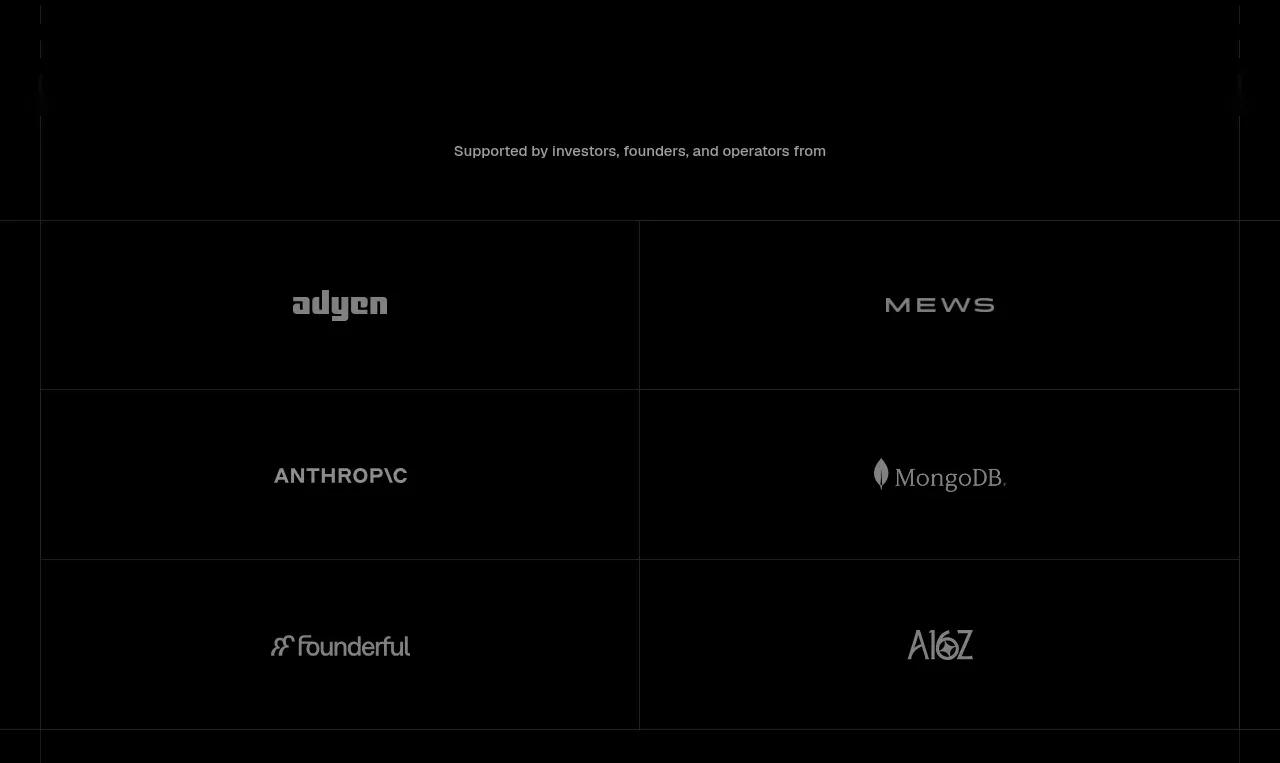 Investor and ecosystem proof
tiun. · Logo cloud
Investor and ecosystem proof
tiun. · Logo cloud
 Problem and unified solution narrative
tiun. · Feature grid
Problem and unified solution narrative
tiun. · Feature grid
 Integration and agent workflow
tiun. · Feature grid
Integration and agent workflow
tiun. · Feature grid
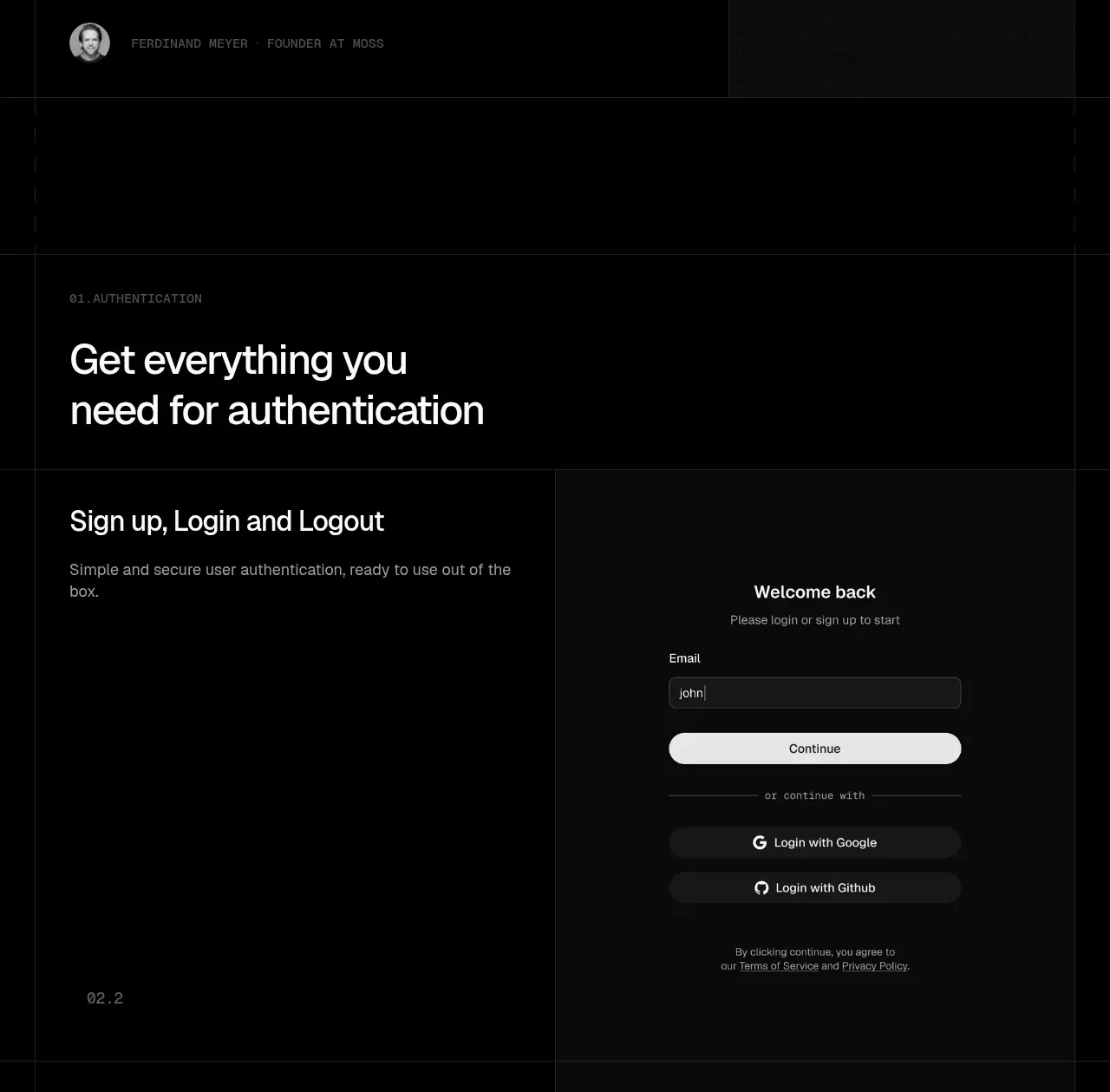 Builder testimonials
tiun. · Testimonials
Builder testimonials
tiun. · Testimonials
 Authentication product capabilities
tiun. · Feature grid
Authentication product capabilities
tiun. · Feature grid
 Billing and checkout capabilities
tiun. · Feature grid
Billing and checkout capabilities
tiun. · Feature grid
 Customer data and user management
tiun. · Feature grid
Customer data and user management
tiun. · Feature grid
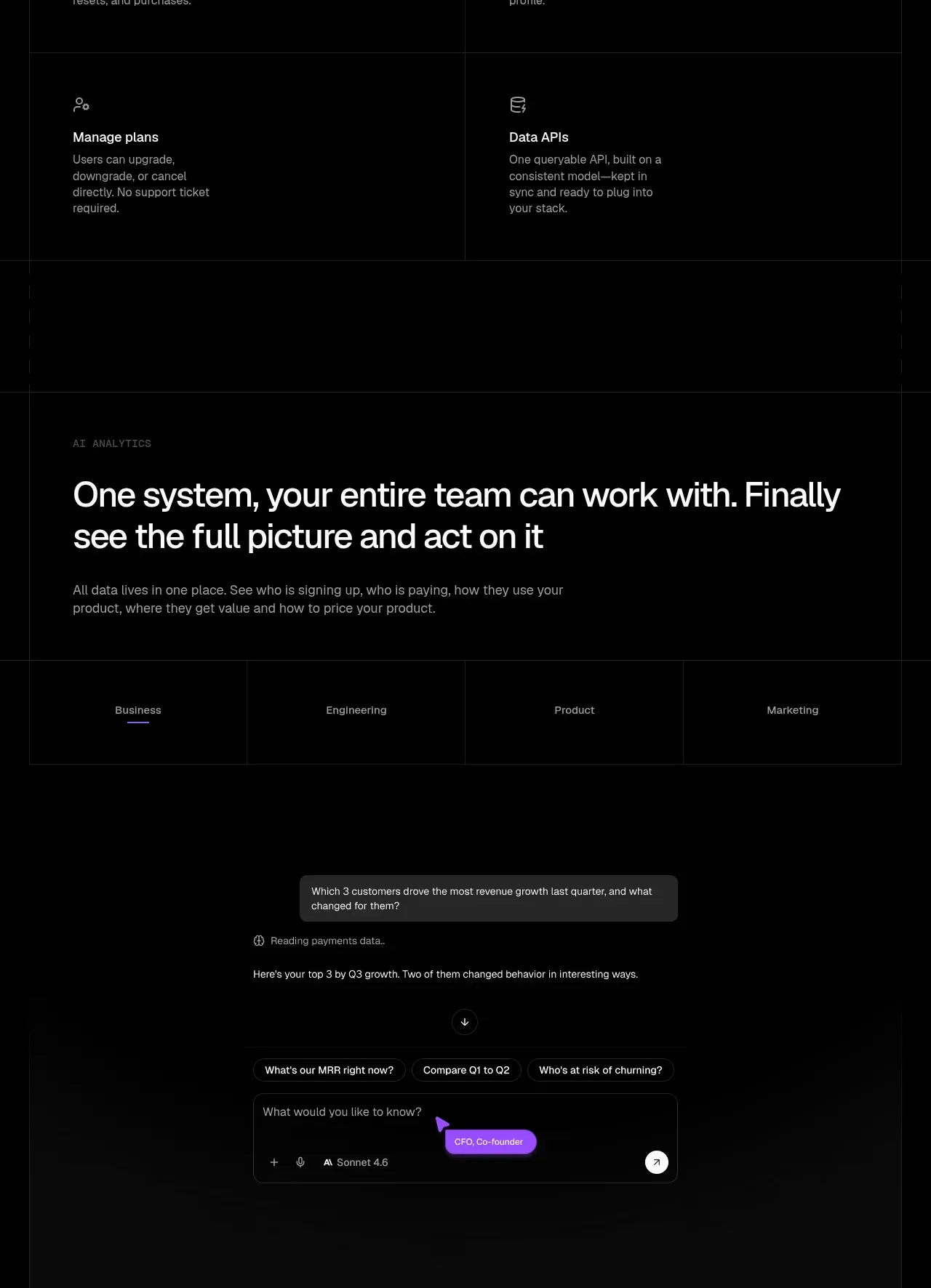 Analytics and agent insight workspace
tiun. · Chart
Analytics and agent insight workspace
tiun. · Chart
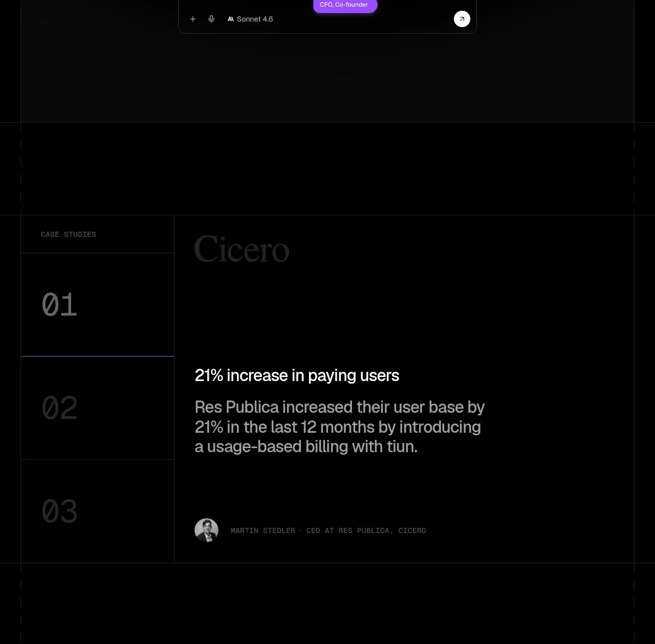 Customer case study
tiun. · Card
Customer case study
tiun. · Card
 Final conversion banner
tiun. · Call to action
Final conversion banner
tiun. · Call to action