 kage
kage
together.ai
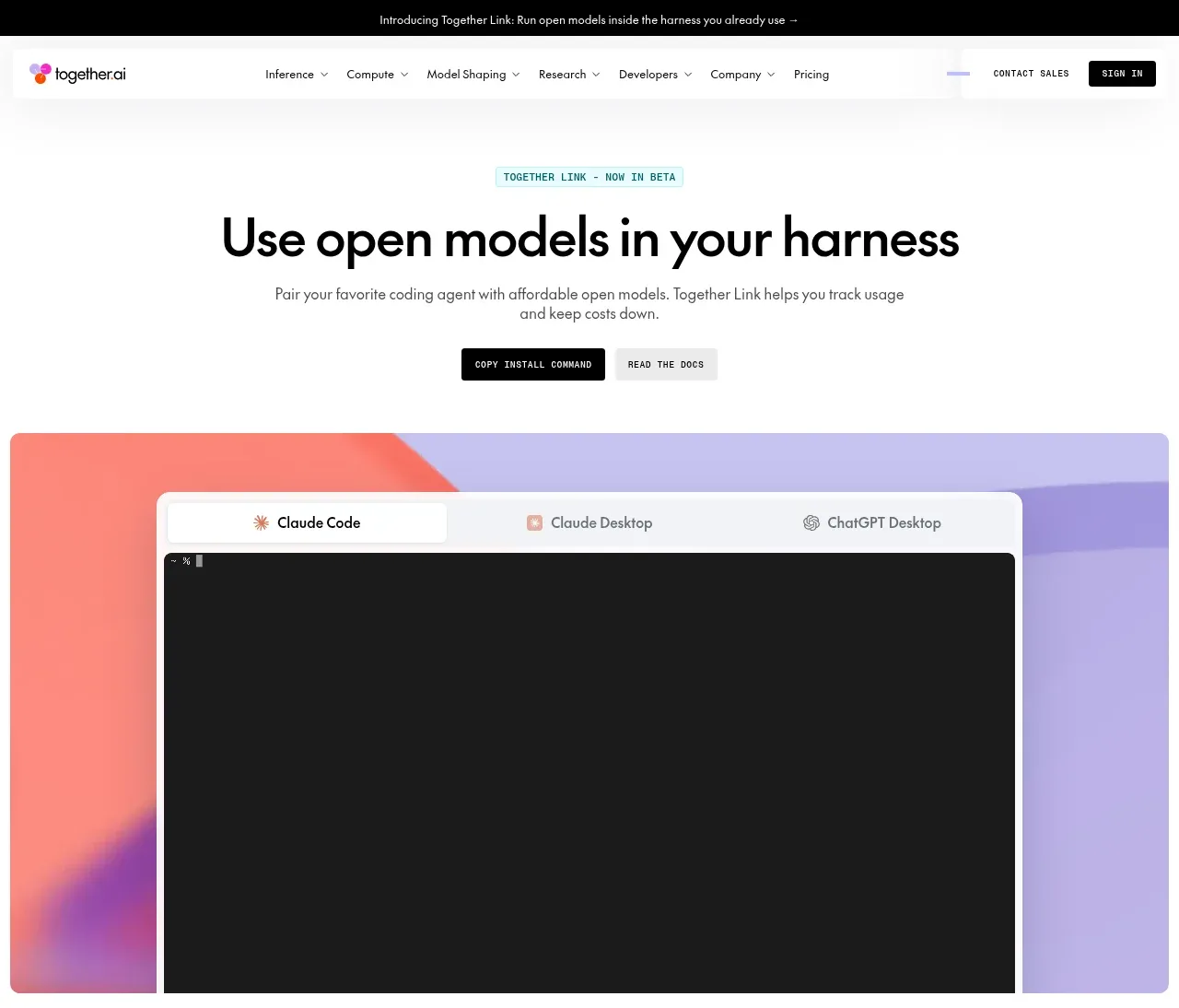
Design analysis
The hero uses a centered eyebrow, oversized headline, short explanatory copy, two compact actions, and a large colorful product/demo panel with tabs and a dark terminal surface.
Prompt preview
## Reference images

Study these alongside the description below: hierarchy, rhythm, spacing, colour. Build for the product you are asked about, using this design language.

- Component: https://kage-design-assets.t3.tigrisfiles.io/components/together-link/c83e90db-1751-48ac-9cb1-70c29bd77b17-1791612068-1.webp
- Full page it was cut from: https://kage-design-assets.t3.tigrisfiles.io/screenshots/together-link/c83e90db-1751-48ac-9cb1-70c29bd77b17-1791612038251-full.webp
- Component on Kage: https://kage.design/component/together-link-hero

## Before you start
Ask what the user's product, brand, key promise, and primary conversion goal are, then apply these principles to that product.

Create a centered hero below the header. Use a small uppercase tinted eyebrow, a bold black headline with tight tracking, concise supporting text, and two adjacent actions: one solid dark primary button and one pale secondary button. Below it, add a wide rounded demonstration frame with a soft abstract gradient background, a white tab strip, and a dark code/terminal viewport. Keep the hero spacious and editorial: max-width about 860px, headline around 42–52px desktop, copy around 15px, and 28–40px gaps between text, buttons, and demo. Use white, near-black `#111111`, pale aqua `#d8f7f6`, lavender `#bbb5ee`, coral `#ff7d70`, and purple accents. Use 8–12px radii and hide or simplify the terminal on mobile. Tabs should visibly indicate the active option.

Never: use logos, product names, copy, illustrations, or imagery from the reference.
More components
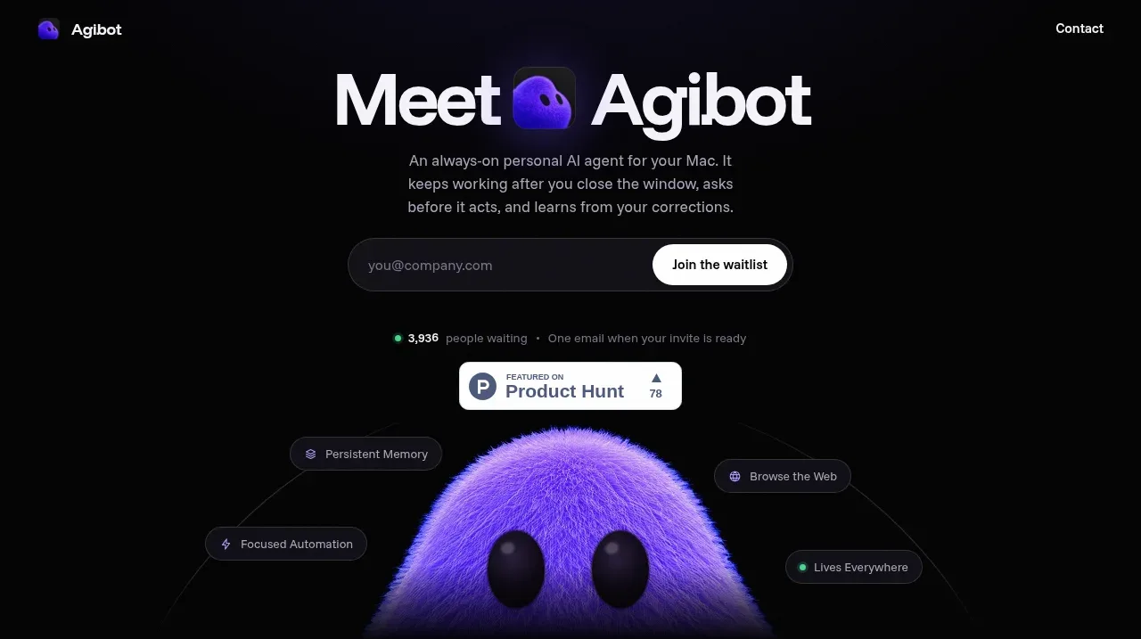
 Waitlist hero with character visual
Agibot · Hero
Waitlist hero with character visual
Agibot · Hero
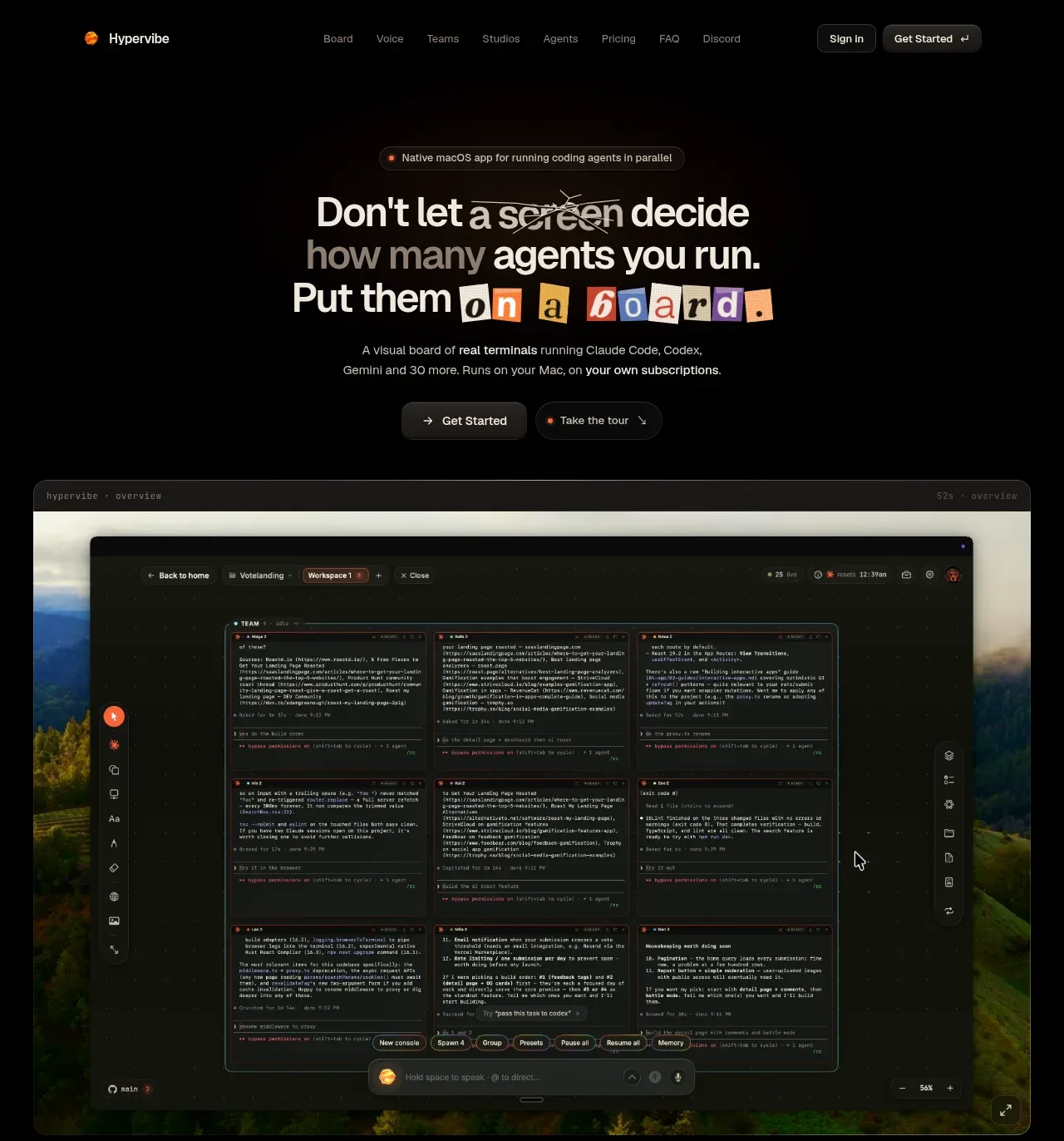
 Hero with product visual
Hypervibe · Hero
Hero with product visual
Hypervibe · Hero
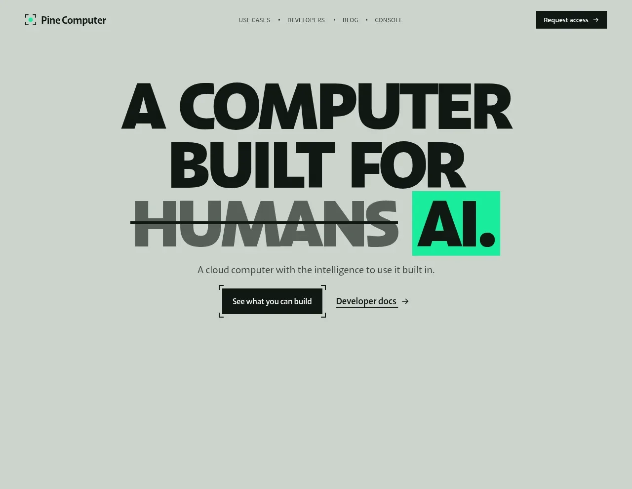
 Oversized human-first hero
Pine Computer · Hero
Oversized human-first hero
Pine Computer · Hero
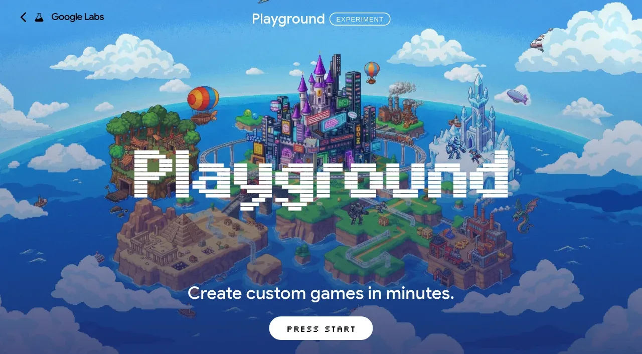
 Pixel-art world hero
Playground by Google Labs · Hero
Pixel-art world hero
Playground by Google Labs · Hero
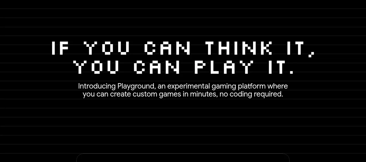 Introductory product statement
Playground by Google Labs · Hero
Introductory product statement
Playground by Google Labs · Hero
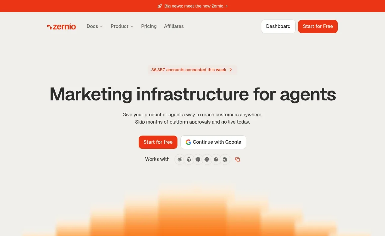
 Marketing infrastructure hero
Zernio · Hero
Marketing infrastructure hero
Zernio · Hero