kage
asktori.ai
Design analysis
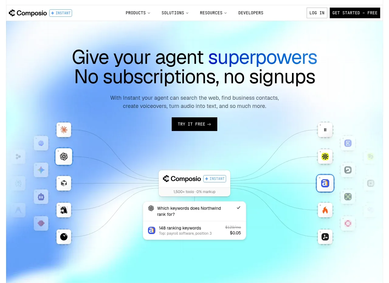
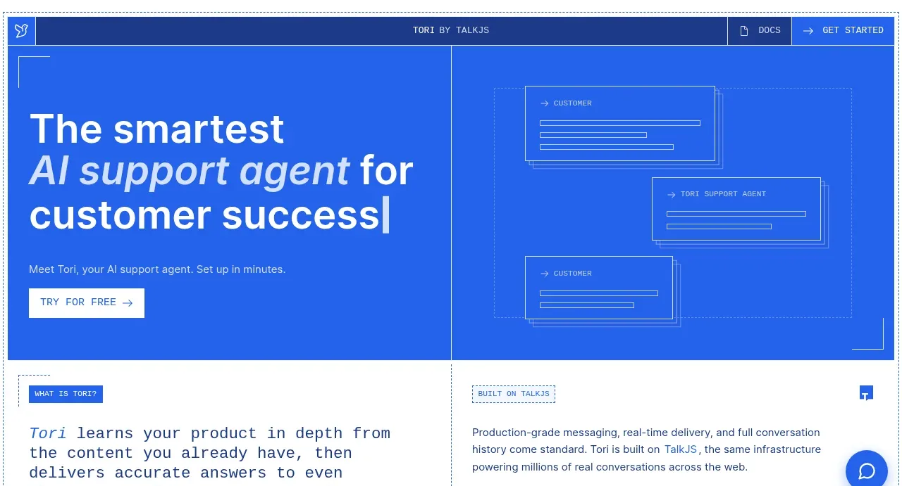
The hero uses a saturated blue split layout: a large editorial headline and compact CTA on the left, balanced by abstract outlined support-flow panels on the right.
Prompt preview
## Reference images

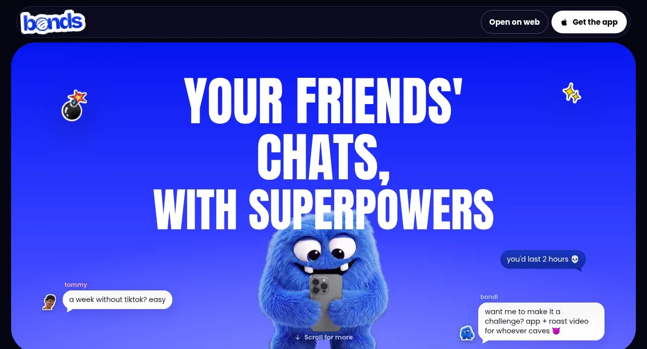
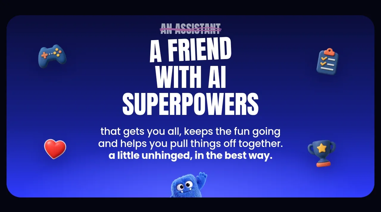
Study these alongside the description below: hierarchy, rhythm, spacing, colour. Build for the product you are asked about, using this design language.

- Component: https://kage-design-assets.t3.tigrisfiles.io/components/tori/b048b964-21ef-4db6-a2d8-4a588d44e320-1792476375-1.webp
- Full page it was cut from: https://kage-design-assets.t3.tigrisfiles.io/screenshots/tori/b048b964-21ef-4db6-a2d8-4a588d44e320-1792476172861-full.webp
- Component on Kage: https://kage.design/component/tori-hero

## Before you start
Ask what the user's product, audience, and brand are, then apply the principles below to create an original hero for that product.

Create a wide split hero directly beneath the navigation, using a vivid cobalt blue near #2160e8 with generous 22–30px page padding. Put a large left-aligned headline in a bold sans serif, roughly 42–58px, with one phrase emphasized in a lighter italic or contrasting blue tint. Add a short supporting sentence around 13px and a crisp white primary button with a small arrow. On the right, create an abstract, non-branded interface-flow visual from thin outlined cards and connector lines rather than a literal product screenshot. Use a clear vertical divider or strong column rhythm, generous whitespace, and a minimum height around 300px. Include subtle bracket/corner details and ensure responsive stacking on narrow screens.

Never use logos, product names, copy, illustrations, or imagery from the reference.