kage
asktori.ai
Design analysis
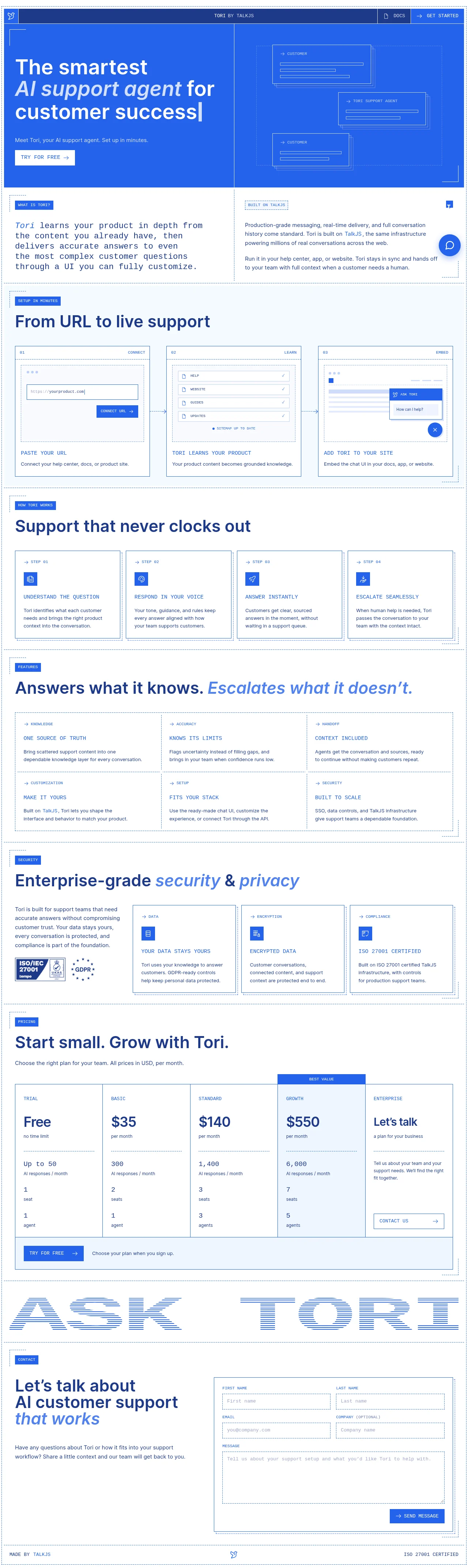
The design uses a structured grid approach, moving from a wide, high-impact hero section to smaller, modular content blocks. Hierarchy is established through contrasting backgrounds, oversized headings, and the strategic use of the primary blue color. Content density increases as the page progresses through multiple rows of uniform, feature-focused cards, maintaining a clean, professional rhythm throughout.
Prompt preview
## Reference images

Study these alongside the description below: hierarchy, rhythm, spacing, colour. Build for the product you are asked about, using this design language.

- Full page: https://kage-design-assets.t3.tigrisfiles.io/screenshots/tori/b048b964-21ef-4db6-a2d8-4a588d44e320-1792476172861-full.webp
- Above the fold: https://kage-design-assets.t3.tigrisfiles.io/screenshots/tori/b048b964-21ef-4db6-a2d8-4a588d44e320-1792476169849.webp
- Design on Kage: https://kage.design/designs/tori-landing-page

## Before you start
Ask the user what they are building, who it is for, and what brand assets (name, colors, type) they already have. Wait for the answers. All of the following is to be applied to that new product.

## Page structure
**Navigation Bar:** A minimal sticky navigation bar across the top. It should feature a logo on the left and simple links (e.g., Features, Pricing) on the right, with a primary Call-to-Action button (CTA).
**Hero Section:** A full-width, high-contrast section. It features a very large, centered headline to state the core value proposition, followed by a brief sub-heading and a prominent primary CTA button.
**How It Works Section (3-Step):** A section presenting a process or key features in a three-column layout. Each step should be contained within a distinct card or block, emphasizing a clear progression.
**Feature Grid 1 (Support that never stops):** A content section featuring a full grid of four uniform feature cards. These cards should be balanced in height and width, presenting a clear, scannable list of benefits.
**Feature Grid 2 (Answers what it knows):** A section that continues the modular card pattern, utilizing another grid of four uniform cards to detail specific capabilities or knowledge domains.
**Feature Grid 3 (Enterprise Grade):** Another four-column card grid, similar to the previous sections, but focused on professional or enterprise-level benefits.
**Comparison/Detail Section:** A complex grid or structured comparison section, potentially resembling a simplified table or a row of contrasting feature blocks, offering deeper detail or tiers of service.
**Final CTA/Footer:** The page concludes with a final, branded call-to-action area, often featuring the logo and a final prompt to sign up or learn more.

## Design language
**Layout and Rhythm:** The page transitions smoothly from large, impactful blocks (Hero) to structured, modular content grids (4-column cards), maintaining consistent breathing room (whitespace) between sections to prevent clutter.
**Color Treatment:** The dominant palette is a clean combination of bright blue (for CTAs and accents, approximating #007BFF), pure white (for backgrounds), and deep gray/black (for primary text). Blue is used sparingly but intentionally to guide the user's eye and signal interactivity.
**Typography:** Use a clean, modern sans-serif font. Hierarchy is built using drastic size scaling for headlines, transitioning to smaller, dense body copy within feature cards. Sub-headings within cards are clear and mid-sized.
**Components:** Reliance on highly standardized component cards. These cards should feature a small, appropriate icon, a bolded title, and a short, digestible paragraph description.
**Borders and Shadow:** Minimalist application of borders. Cards should utilize soft shadows or subtle borders to lift them off the background without looking heavy.
**Density:** The page manages high information density (many cards) by pairing it with generous vertical whitespace between sections.

## Never
Do not use any logos, wordmarks, product names, specific copy, illustrations, photography, or icon sets from the reference. Never present the result as the specific product from the reference.
Components from this page
All components
 Compact utility navigation
Tori · Navigation
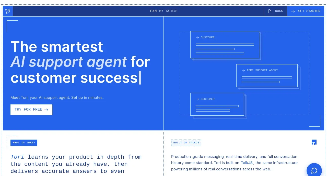 Blue product promise hero
Tori · Hero
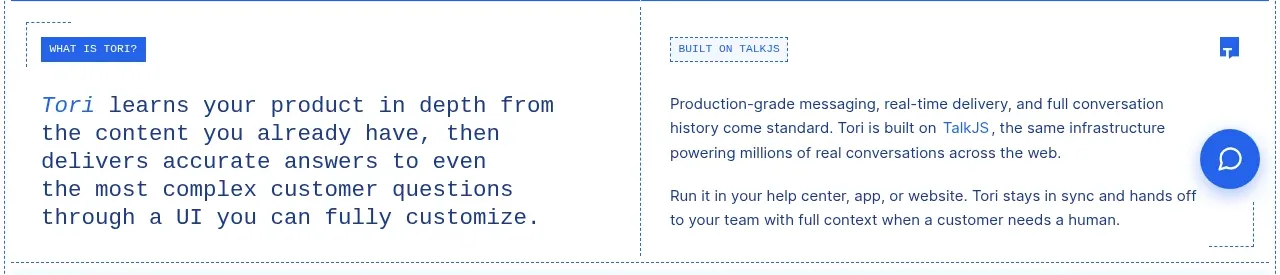 Positioning and platform split
Tori · Feature grid
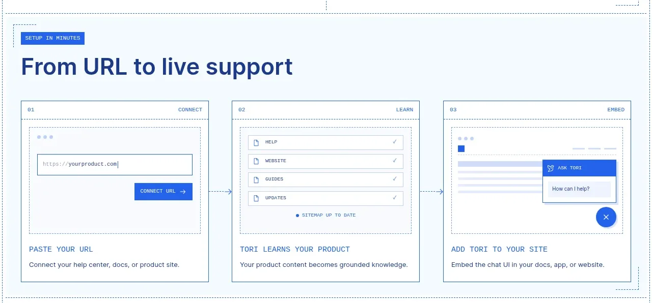 Three-step setup workflow
Tori · Feature grid
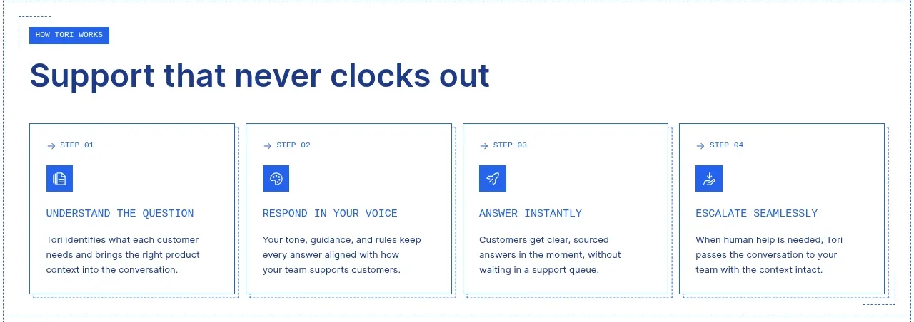 Always-on support process
Tori · Feature grid
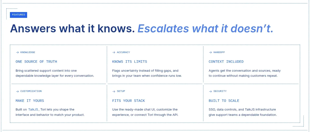 Capability matrix
Tori · Feature grid
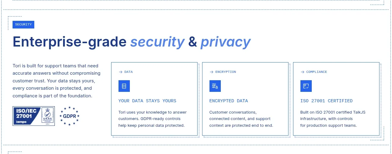 Enterprise security and privacy
Tori · Feature grid
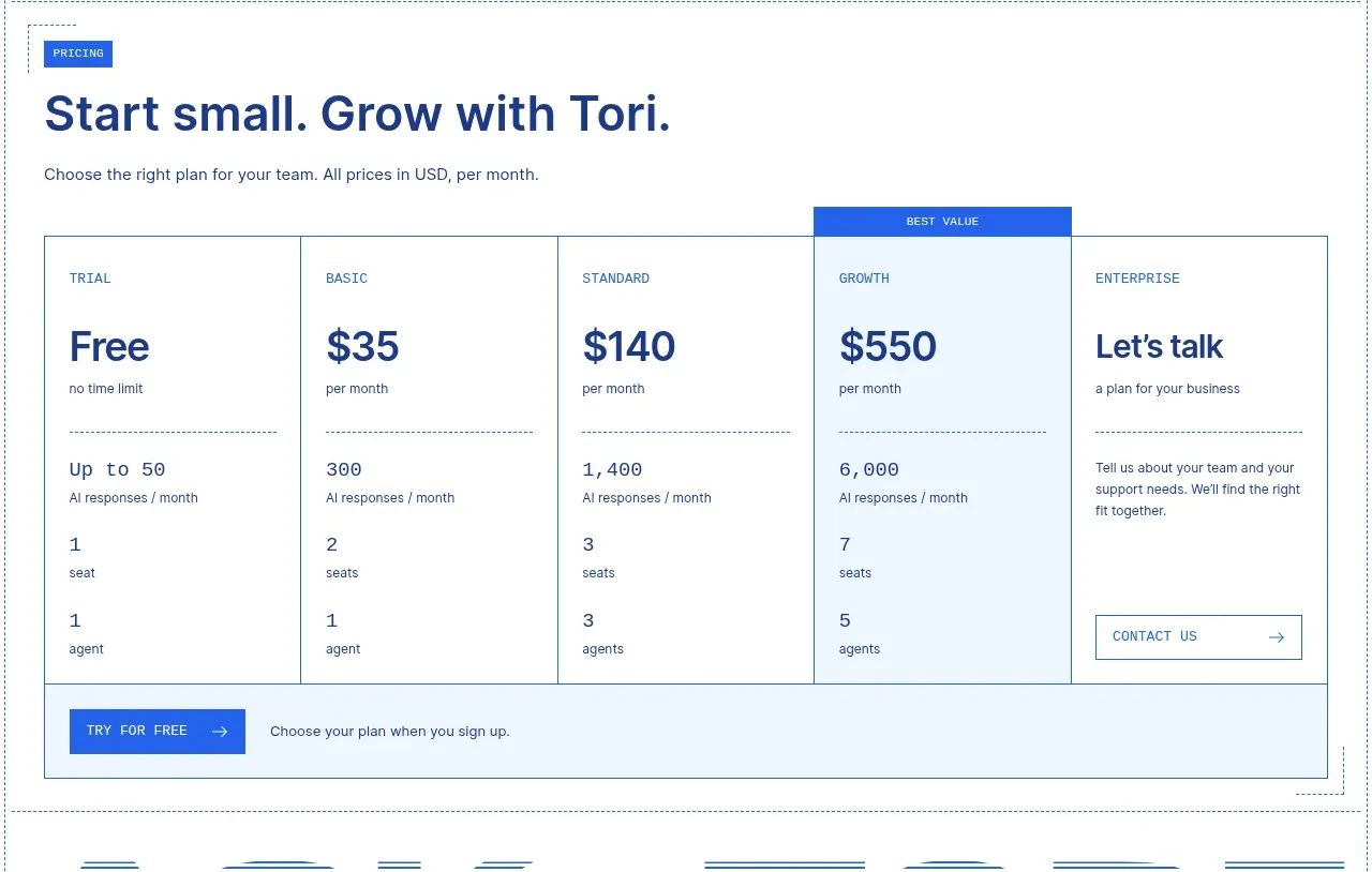 Five-tier pricing table
Tori · Pricing table
 Oversized typographic transition
Tori · Call to action
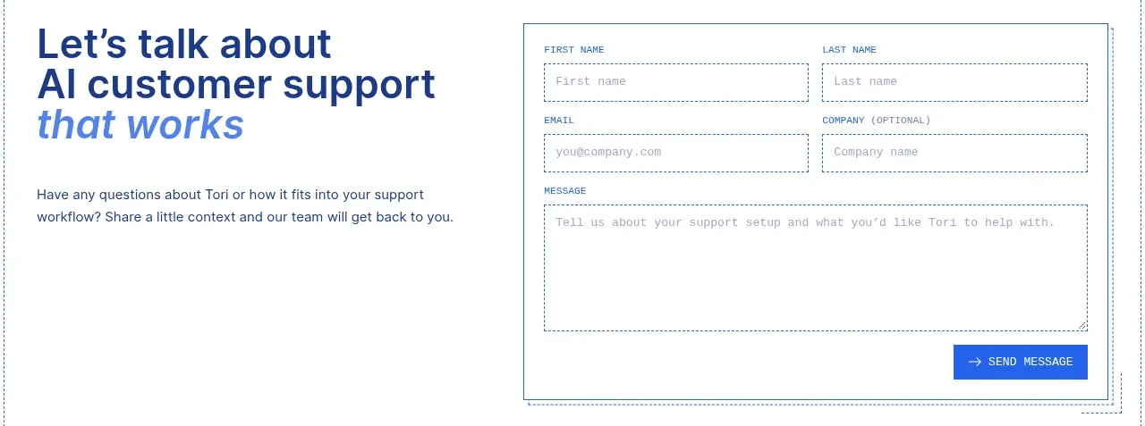 Contact conversion form
Tori · Form
 Minimal certification footer
Tori · Footer