kage
kage
trycase.dev

Design analysis
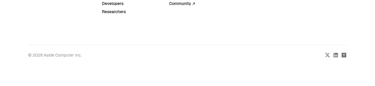
A very compact footer closes the page with the brand at left and a single row of utility links at right. The quiet treatment maintains the product's focused, developer-oriented tone.
Prompt preview
## Reference images

Study these alongside the description below: hierarchy, rhythm, spacing, colour. Build for the product you are asked about, using this design language.

- Component: https://kage-design-assets.t3.tigrisfiles.io/components/trycase/bc7fc0fa-2eda-4dd0-a163-94201d1f5c68-1789452163-5.webp
- Full page it was cut from: https://kage-design-assets.t3.tigrisfiles.io/screenshots/trycase/bc7fc0fa-2eda-4dd0-a163-94201d1f5c68-1789452104312-full.webp
- Component on Kage: https://kage.design/component/trycase-footer

## Before you start
Ask the user what legal, support, social, and product links their website needs and what brand tone the footer should convey. Build an original compact footer using these principles.

Create a minimal dark utility footer.

- Use a near-black background around `#111111` and a 1px top border around `#292929`.
- Keep the footer short, around 48–72px, with a centered max-width container and horizontal alignment between a small brand treatment and a row of utility links.
- Use 11–13px typography. Set the brand slightly brighter around `#d9d9d9` and links muted around `#777777`; brighten links on hover and focus.
- Include only the essential destinations: product navigation, documentation/support, privacy or terms, and optionally a short status or release link.
- Maintain generous horizontal spacing and wrap cleanly on mobile; on narrow screens, allow the links to move below the brand rather than shrinking below legibility.

### Never
- Never use the reference logo, product name, links, or copyright copy.
- Never add a large secondary CTA or a visually heavy newsletter form unless the user's product needs one.
- Never let the footer introduce a new color system or compete with the page content.